I'm kind of a shy person so I haven't shared any of my work online yet (except for cgc exercises and an unrelated model) but I've started to think it might be productive to share my humble models, textures and some 2d art.
ssmurfmier1985 You're right about the steel. More roughness variance and emphasis on the hammer marks will probably make it better. Thanks!
I've been wondering if I could model the weapons of the character in a day since the day I drew the sketches of them. It turns out I can :D
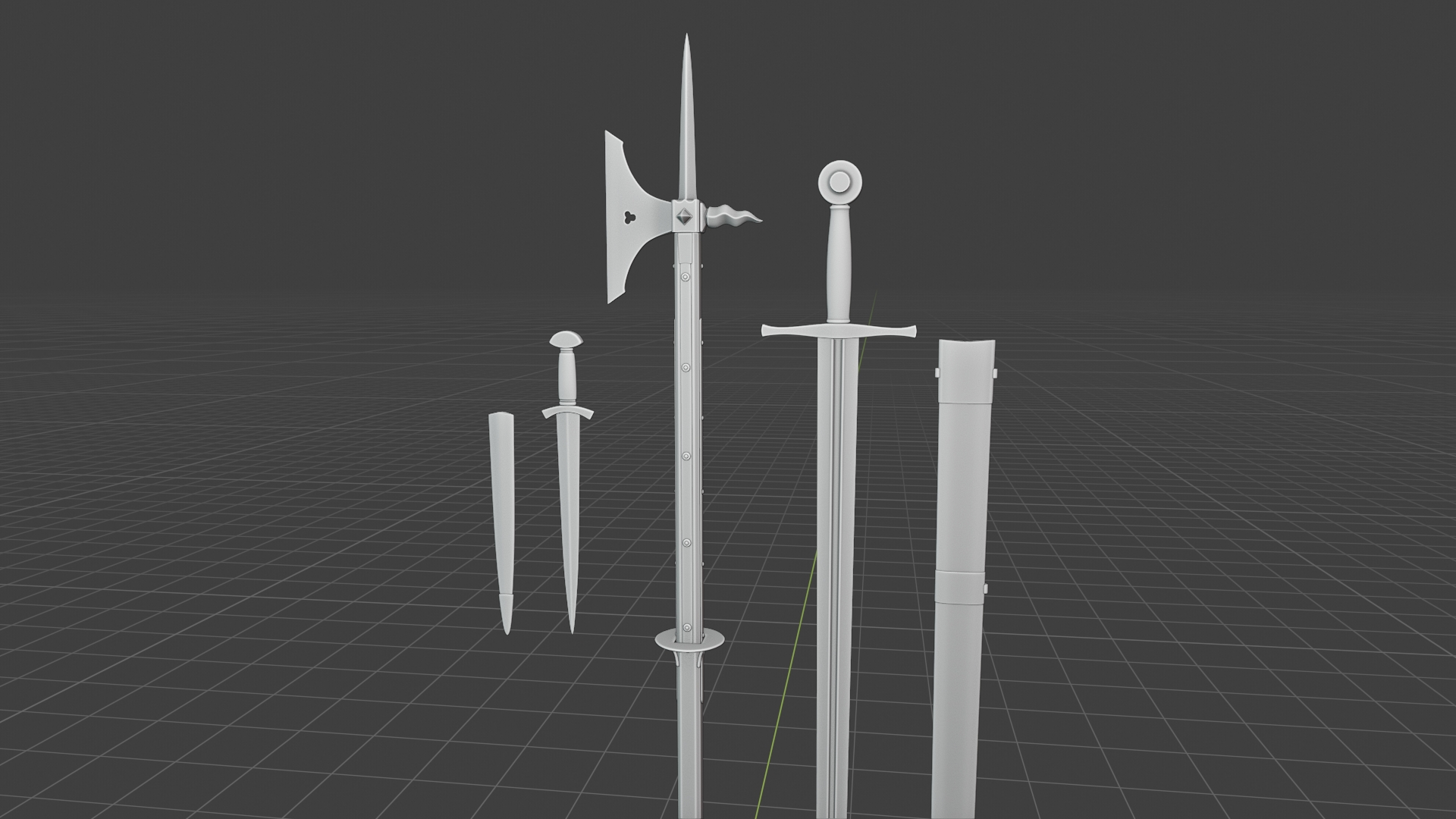
I modeled a spike instead of a hammer for the poleaxe because the topology was a bit tricky (I also skipped some small details) I think I could have solved it but I want to spend as little time as possible on this. Back to retopo tomorrow...
CGC Community Discord server has really made me inactive on the forums :D Time for some updates.
I changed the rough steel material a lot. Going to add some scratches before texturing my character ( thanks to ![]() thecabbagedetective 's advice) I might end up changing some other values too.
thecabbagedetective 's advice) I might end up changing some other values too.

Also created a gambeson material using my fabric material from earlier.
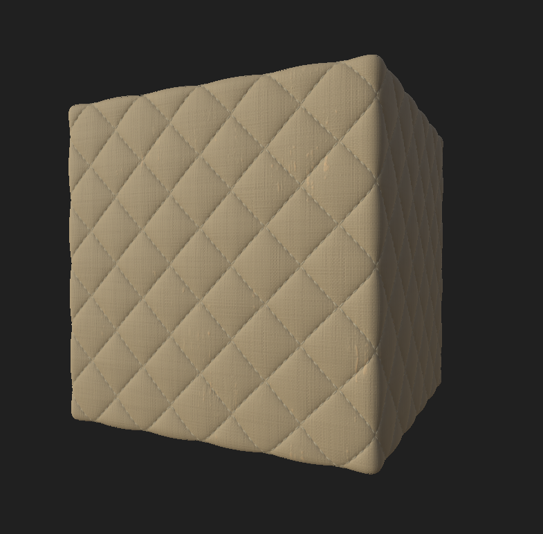
It's going look less like a sofa once put in place :D
And you might have seen the finished retopo on the live critique stream.
https://sketchfab.com/3d-models/man-at-arms-6690efae50d34fdf999b982b573f6c2b
And after some more inactivity, I'm back on the forums.
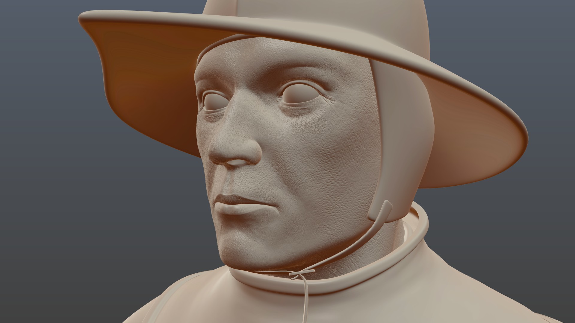
Since my last post, I learned how to rig my character (I took the week after the live critique stream a bit slow to relax) sculpted the wrinkles for the boots, pants and the gambeson again, sculpted micro details of the face, did some partial retopo on the pants and the boots to capture more of the detail with fewer polygons, pretty much finalized the low poly and the high poly models (except the weapons and the belt) and lastly modeled a belt.
Here's the facial details.
And the belt.

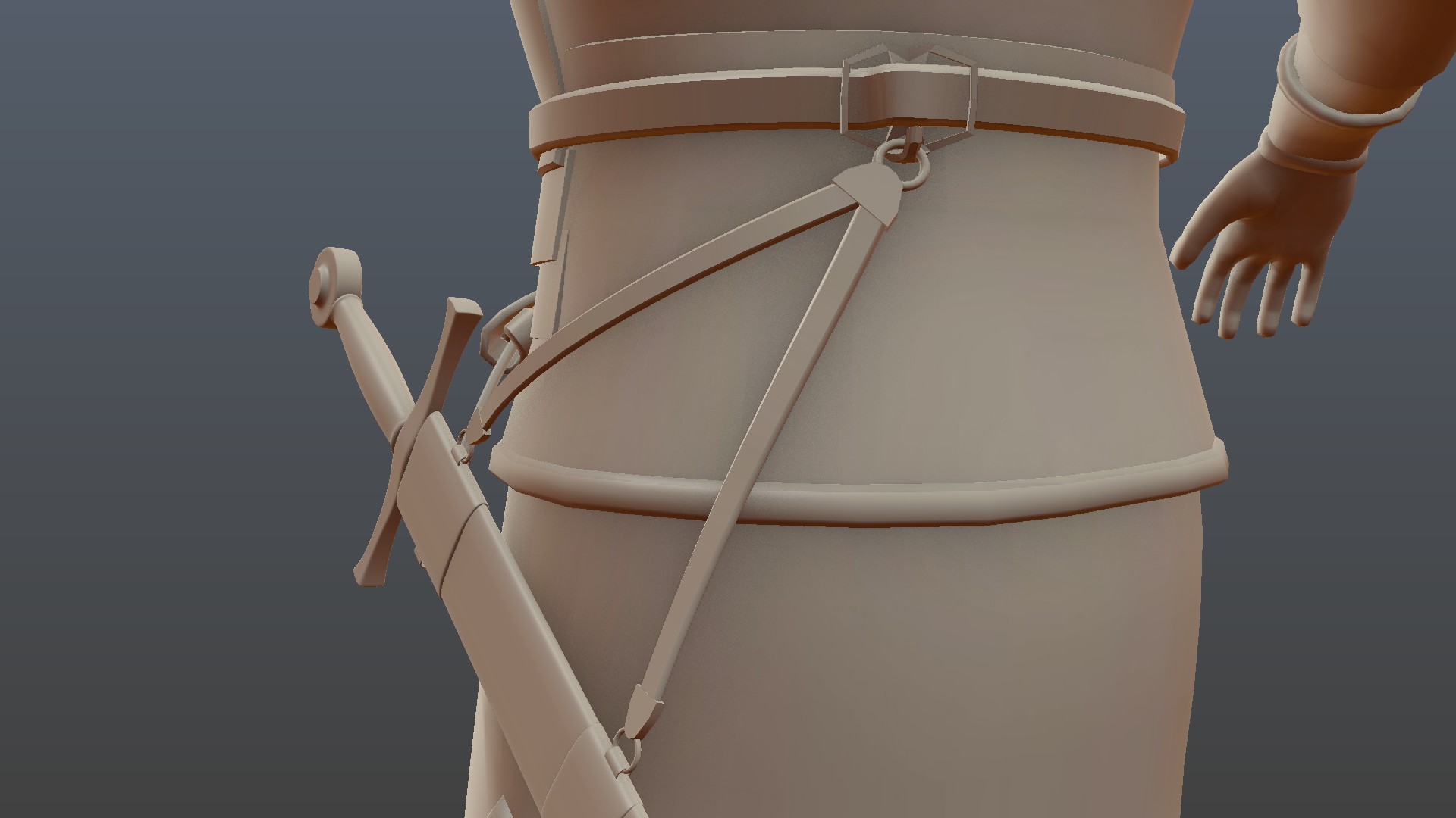
I tweak the curves a bit more as it's not final.
Hopefully, in two days at most, I'll finalize the weapons' and the belt's models, uv unwrap everything and look into texturing the eyes and the eyebrows. After that, I'll finalize my materials (setting up the sliders, making some adjustments) and start texturing.
This is taking much longer than I anticipated but finally I'm at the texturing stage.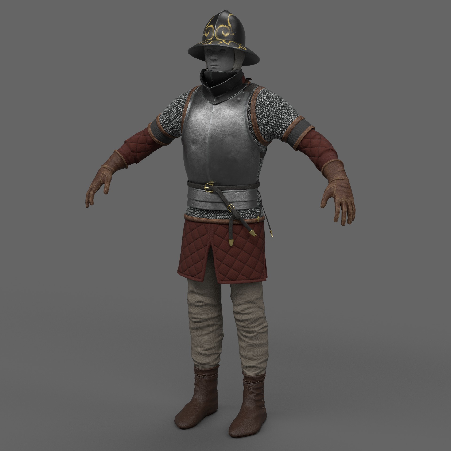
 Yesterday, I just put in the materials I made previously (they also needed some adjustments) And today, I detailed the breastplate, the straps and some of the leather bits.
The helmet's paint is just placeholder to see how the colors look like. It will have some floral details and a latin motto/phrase written on a scroll like thing. The bevor (neck protection) might also have some similar detailing.
Rendered with the built in Iray. It looks flat because it's just HDRI lighting.
@theluthier @jlampel May I ask for some critique/direction if you can spare the time? I'm kinda struggling about the color scheme.
mmalhomsi Thanks! I guess I could have matched it better to the reference. Comparing it now, the pants seem to be tighter, the wrinkles seem to be finer/thinner and focused more around the knees.
Here's my reference https://armstreet.com/store/armor/medieval-hosen-hound-of-war
@drgnclw Have you watched the wrinkles video in the concept section? I watched it recently and it really helps.
![]() silentheart00 Thanks for reminding me that. I'll watch it after I'm done with this project. Funnily enough, 2d drawing courses and tutorials can help with sculpting :D
silentheart00 Thanks for reminding me that. I'll watch it after I'm done with this project. Funnily enough, 2d drawing courses and tutorials can help with sculpting :D
@drgnclw Been following this on the Discord and my Lord has it come a long way, the materials along are making me jealous.
@theluthier Thanks! Seeing a lot of different colors together kinda scared me that day because I haven't textured a character before. The day after that I was more comfortable with my color choice. Now I can see some stuff that I can improve but they are either about design or the base materials I'm using (for example the fabric texture doesn't look good up close) At this point, I need a time machine to fix them :)
I have two specific questions, though.
https://i.pinimg.com/originals/68/4e/d5/684ed52be886afdc3a9b553721446a8d.jpg Here's my main inspiration for the helmet's painting. The gold paint's reflection kind of looks metallic to me. I don't know what kind of a paint/material it is and the only way I can get a similar result is using a metallic value of .6-.7. Would it be acceptable or is there another solution for this?
It's obviously a WIP. I'm going to refine the lines a lot more and add some leaves like the reference and change the text's color :)
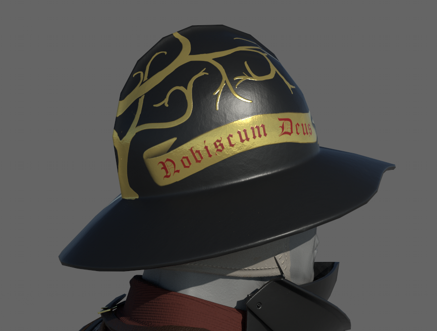

And my second question is about the pants' color. I used a greenish blue to get some contrast with other colors ( mmalhomsi gave me the advice on the Discord server) and I think it looks fine. However, I had the thought of using lighting to get that contrast instead of changing the color scheme. I'm really inexperienced with lighting, though. Would it be worthwhile to try?
@drgnclw The helmet reference is very interesting. I love the detail and elegance of the design. While I'm not an expert in medieval soldiers or armor, my impression is that this particular helmet feels a bit flashy next to the humble earth tones of the rest of the outfit. My first thought is to make the helmet a similar texture and material to the breast-plate.
BUT if you're set on this helmet, my advice is to not leave out any detail. I know you've said it's a WIP and you'll be adding the leaves. It feels WIP next to the reference which has tons of variation in the gold color and surface quality (like your breast-plate has already). So make sure you nail the detail and I think you'll arrive at a quality worthy of the reference.
I think you're close to the metallic quality. Honestly it looks like your HDRI (or lack of HDRI?) may be the problem. It doesn't seem like there's enough for the gold to reflect realistically. An HDRI will provide that world of reflection where the default grey scene + lamps do not provide enough for realistic reflection.
As for the pants, I think both the tope and dark green are good choices. I prefer the tope personally. But either way should be fine imo.