This May, all Blender Live Events will be dedicated to community critiques. That means each week in May we will select a handful of Citizen Pro members' Blender projects to critique live during a stream.
If you would like the focused eyes and insight of Kent and Jonathan Lampel to help push your Blender Art to the next level, please submit one of your projects to this thread. Both of us specialize in modeling, texturing, shading, and lighting of which we're most apt to critique. But I'm confident I could convince Wayne Dixon to guest-host an animation critique if we get interest in that.
NOTE: All active Citizen members have access to watch these live critique sessions and submit art to be critiqued in this thread.
![]() williamatics
williamatics
Yeah, but I'm a free member, so it's pretty much the same thing as far as me not being able to be critiqued by the instructor, but if anyone else wants to critique it, they can.
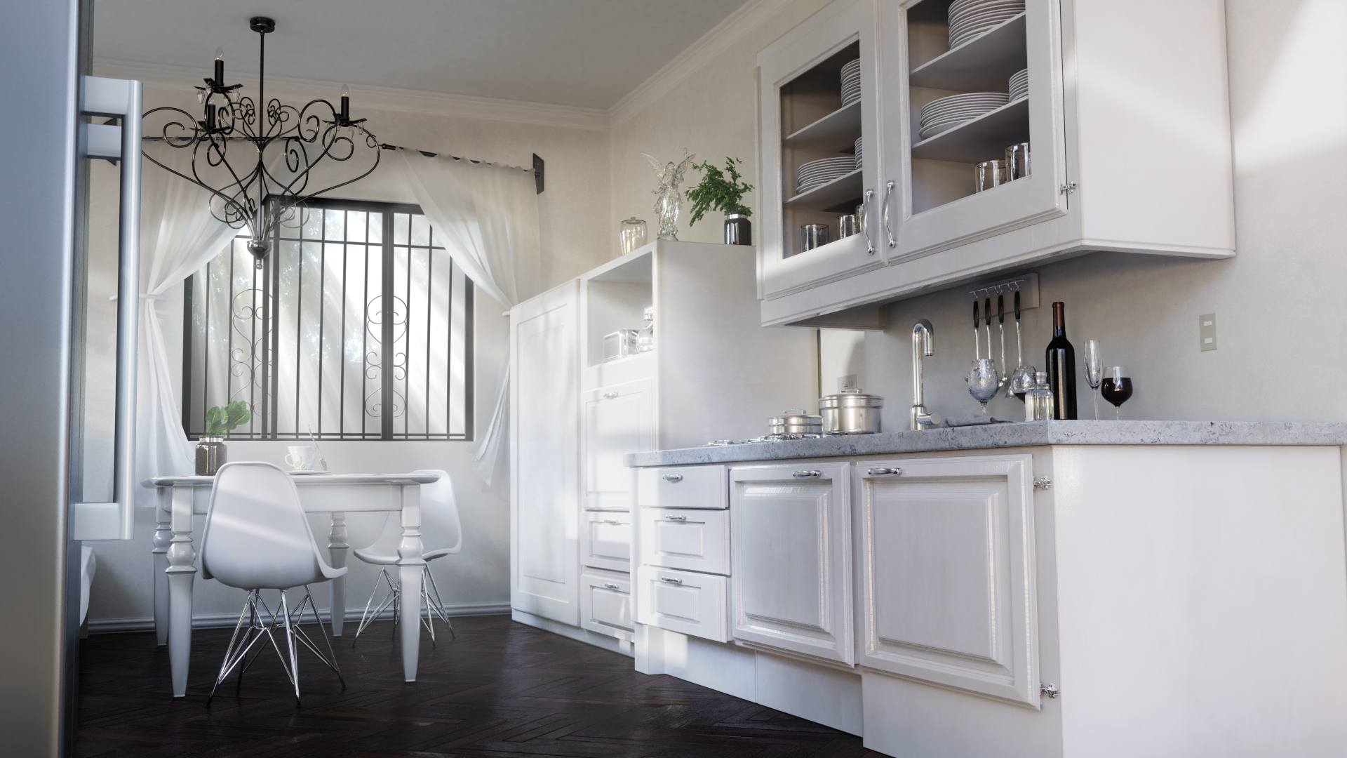
@jlampel Yes, I want to be able to get that realistic lighting feel, white and soft, I've never known how to describe it, I can only point to some renders as examples. I used Filmic, it is a must use for interior scenes, but my kitchen render still feels kinda cartoonish and too colorful to me, it degrades the realism.
Also I've always felt there must be something in compositing that you can do to get a neutral white balance to your render, maybe de-saturate the colors? but never been able to quite achieve it in Blender, though in V-Ray is as easy as ticking a box on the V-Ray Physical Camera.
Here's Bertrand Benoit explaining his process:
Another attempt at the "neutral look". I'll try it with another scene some other time. This one has served its purpose.
@cgcookiedough All I can think of right now is that the animation is choppy and the displacement textures are weird. Try making it really subtle.
![]() williamatics
williamatics
Ok. Thanks for the feedback. I guess I did go a little crazy on how high those displacement maps were. I was trying to mimic leather.
@cgcookiedough Good work! The lock mechanism looks good. After that, I think all the camera movement is a bit disorienting (maybe what you were going for?). I had to watch it a few times before I knew exactly what I was looking at. Particularly that first 180 degree turn. We see the wrapping start to pan away, and then suddenly it's screening our entire view. You're putting the viewer's focus on the new thing, and then shoving the old thing in their face. It happens towards the end again as the headphones come out. It feels like they should be the focal point, but they are quickly obscured again. I would slow the camera down and be sure each piece gets adequate screen time upon reveal. Also, I think the white box is supposed to be styrofoam, but it's a bit too glossy. It would need more roughness if styrofoam is what you're going for. It's definitely a cool idea that could be real slick with a few refinements.
pprocyonlotor
Thank you! I will do that. That helps a lot. The white stuff is actually meant to be cloth. I might add in some seams or something so it is more apparent. That was the first version of it that I did. After I get that stuff in there, it should look really slick. I am actually going to be selling some of those cases. I've got a 3D printer, so I will 3D print the stuff. After I get that animation looking good, I can use that on the product listing.
Hey,
I'm working on the trailer of my first short film. I'm not aiming for something photo-realistic.
Right now I'm focused on the environment and the lighting. I'd like to have your feedback on the way the environment looks and feel and the lighting of the scene.
Thanks,
One of my first renders. Modeled after Hans Memling's Chalice of St. John the Baptist. What do you think?

ppako974
If you wanted, you could make so some of the wood in the background has knots and holes in it. You can make so there is a piece of wood that's like half way broken. Also, if they have tires, and a tree, you can make the tree a little bit thicker and make a tier swing. You could but the swing on the branch that is facing towards the camera.
![]() baukepost Here's the file I was messing with earlier, hope that helps!
baukepost Here's the file I was messing with earlier, hope that helps!
![]() dostovel If you'd still want to make some materials for it, that would be amazing :). You can have the model as long as you credit me if you posted it anywhere.
dostovel If you'd still want to make some materials for it, that would be amazing :). You can have the model as long as you credit me if you posted it anywhere.
![]() baukepost Sure, I'd like to practice getting it as close to as the photo of the real life controller.
baukepost Sure, I'd like to practice getting it as close to as the photo of the real life controller.
Also on a fun note, I made my working playlist public since we talked about it in the chat: https://open.spotify.com/user/1264419378/playlist/6RN7ZLeVepbJQwU2NCKLvp?si=AW2Ao8JnSfyfBlMYeOQOUQ
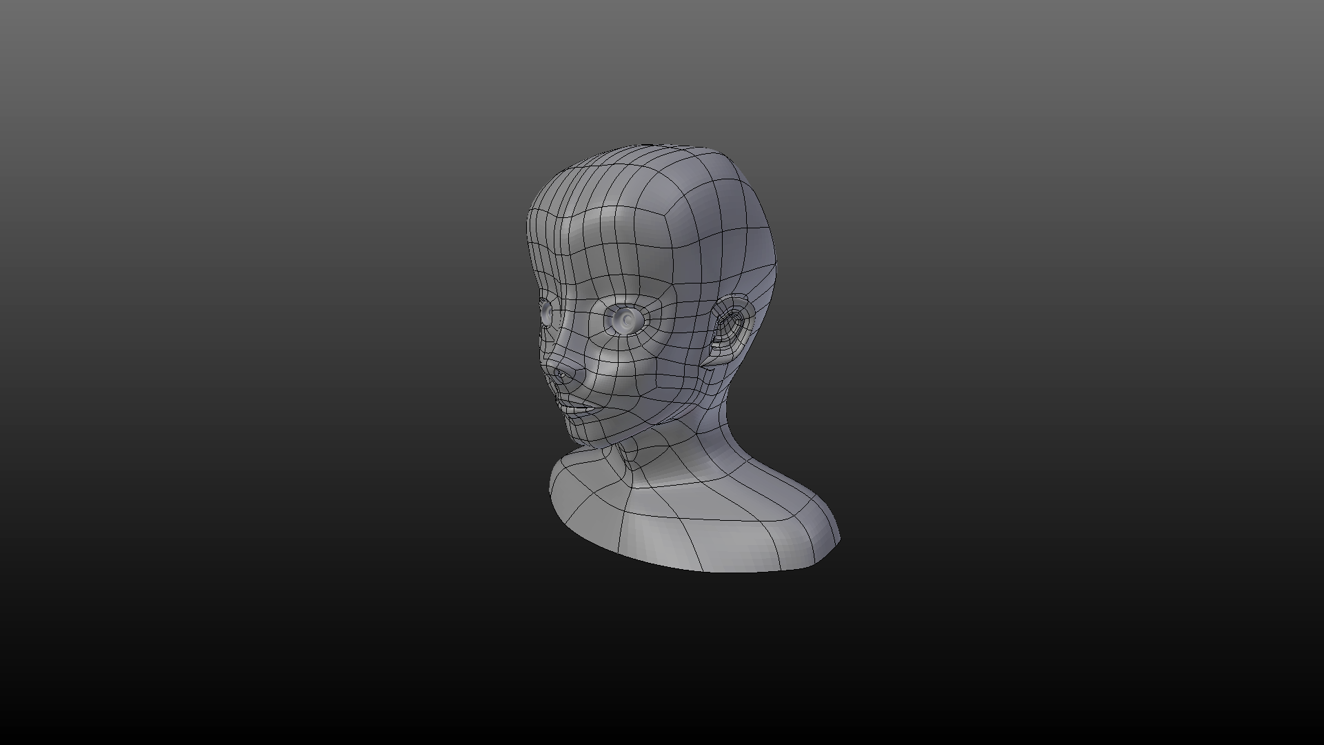
My very first human head: https://skfb.ly/6yUpL
I made this by following the course "Blender Mesh Modeling Bootcamp" of Jonathan Lampel.
I tried to model it by my own with the course as a support rather than copy the instructor to get the exact same result at the end.
And here is the result... This human thing... witch looks like a doll or an android ^^'.
I know there is a LOT of mistakes, the proportions aren't good, and i'm not very aware about human anatomy...
My goal is to be able to model Anything
What advice can you give me to improve myself at modeling in general?
Ps: i HIGHLY recommand this course to people who wants to improve, i was definitly unable to make this the last week !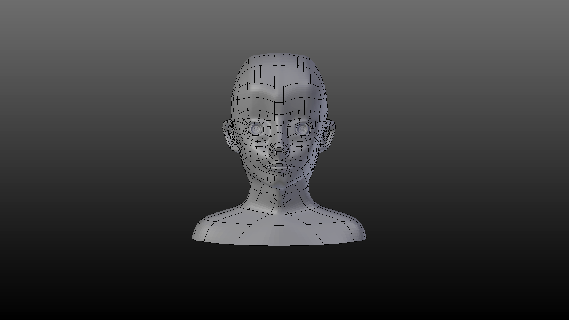
That's how I follow courses! I watch a lesson, then try to do what the instructor did.
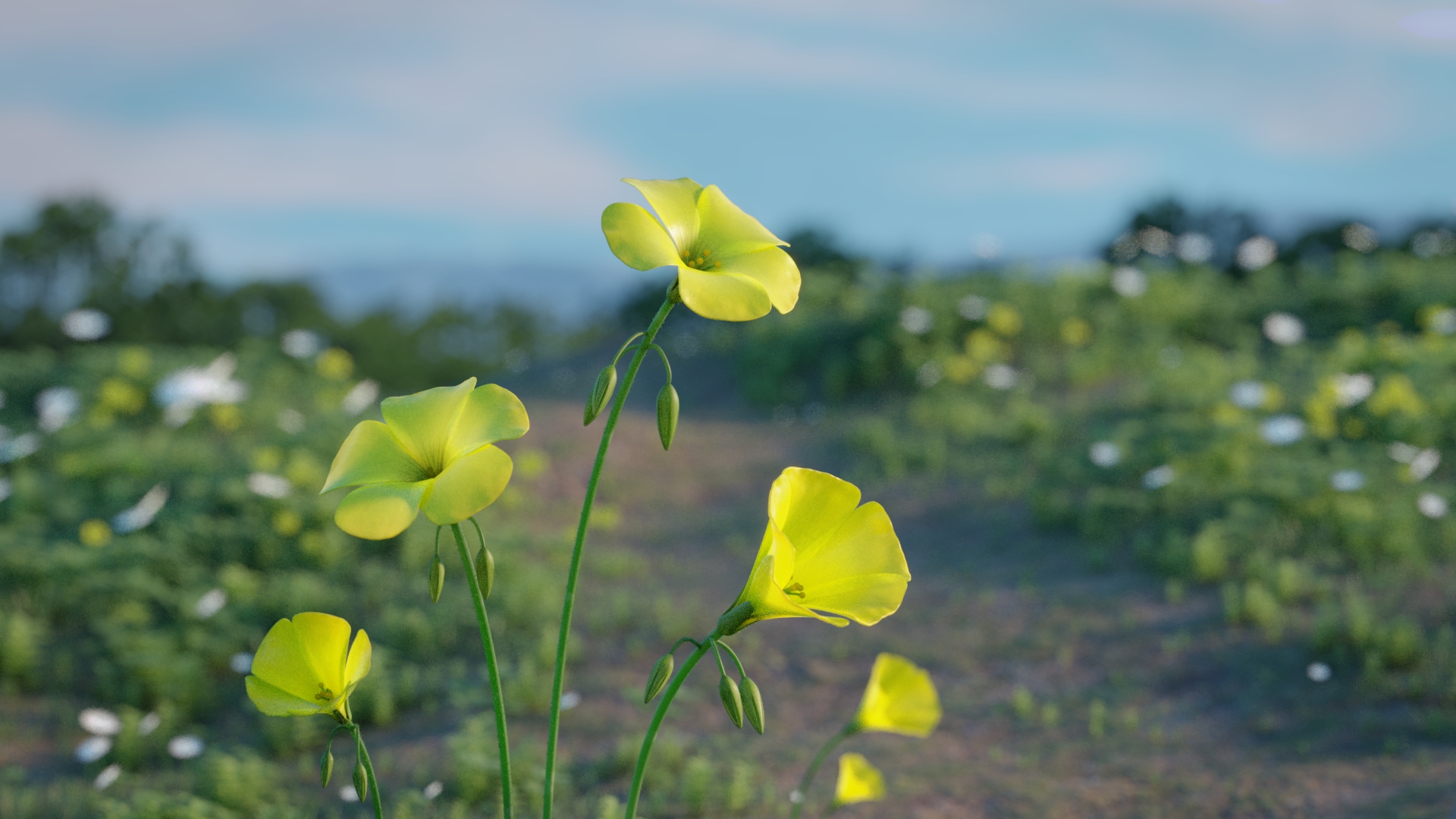
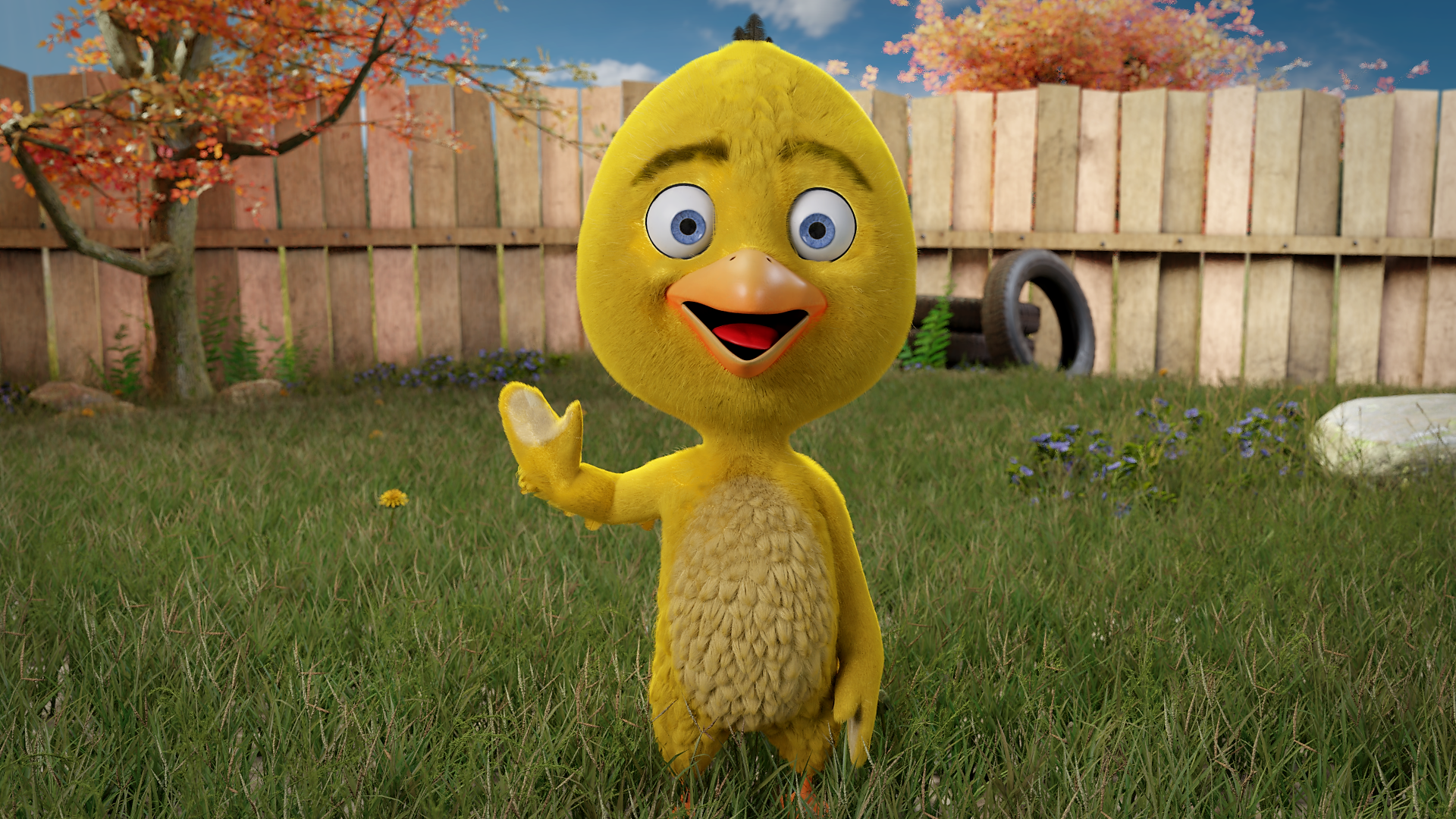
I found some extra time and made this simple scene. Took me about 3 days to make in total, but only on my free time throughout the week.
I tried to achieve the early morning mood of being on a hike or some travels, and spotting these beautiful yellow flowers as the sun start to creep over the peak of the horizon.
Always looking to improve, so tear my heart out with some critiques, if you so desire!