(Okay, a little bit frustrated with myself cause this is the second time i wrote this, the first time i accidentally closed the tab and all the typing, gone T__T should've copy-pasted it onto notepad!)
Hello! I've been a member for a bit here, watching a couple of courses and submitting a few exercises. I started 3D modelling in Blender back in January, and while it was great for good while, it started slowing down around March/April, and eventually it was difficult to find motivation to learn at all, I've barely learned anything in the last few months, I only have my laziness to blame.
But, once I've heard that Blender 2.8 had an expected release date, plus a CG Cookie Class to come alongside the release (The treasure chest course was a bonus!) I decided to rekindle the flame!
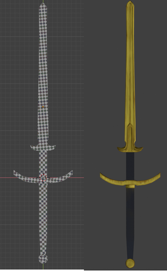
I'm quite a beginner, so i'm keeping my homework simple, i picked one of my favorite sword designs to model, the Zweihänder!
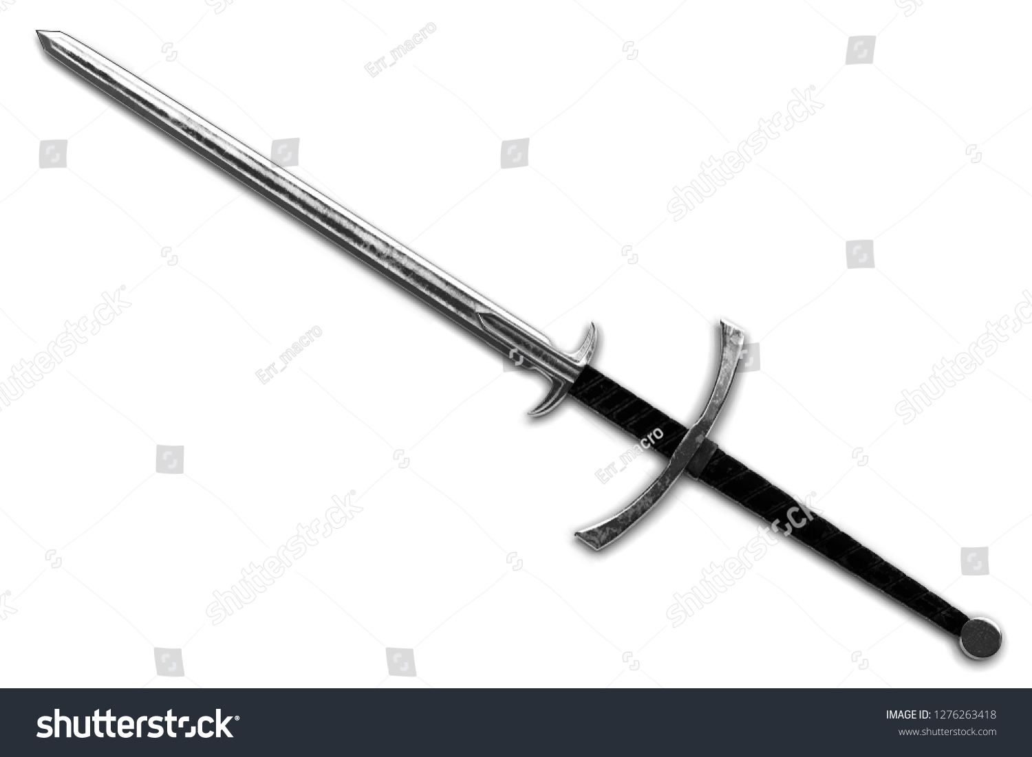 picture courtesy of shutterstock (found via google)
As you can see, nothing too crazy. This is just the base design I'm going for, i'll be looking at extra images to see if i can add on to it without too much difficulty, but it might just end up as it is as well, i'm not sure.
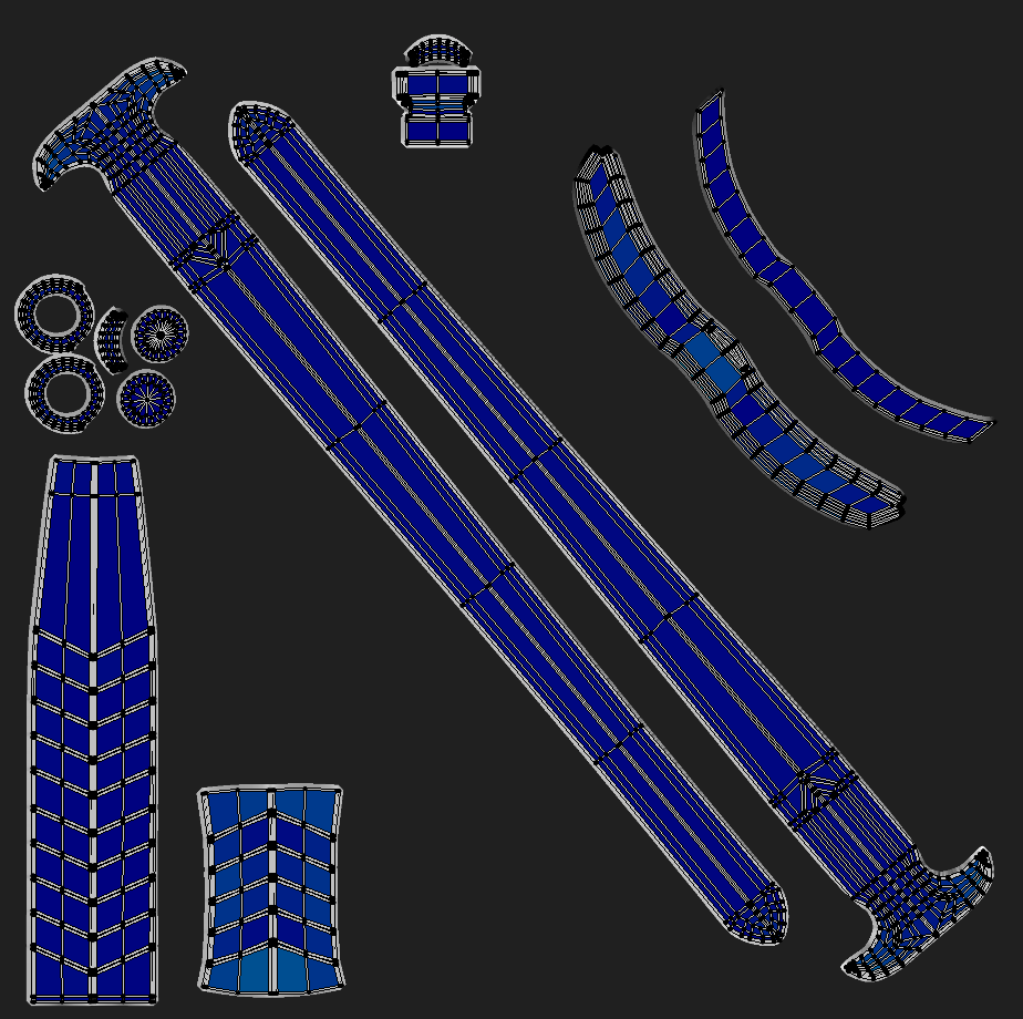
This is what i have so far, i am running into some issues (they're both similar i think) i'll post them in a reply instead.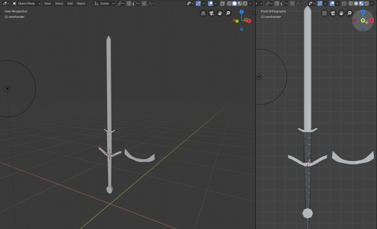
Oh curses, the pictures are out of order! You guys need to have a thread preview so i can see what it looks like before i post it! :P
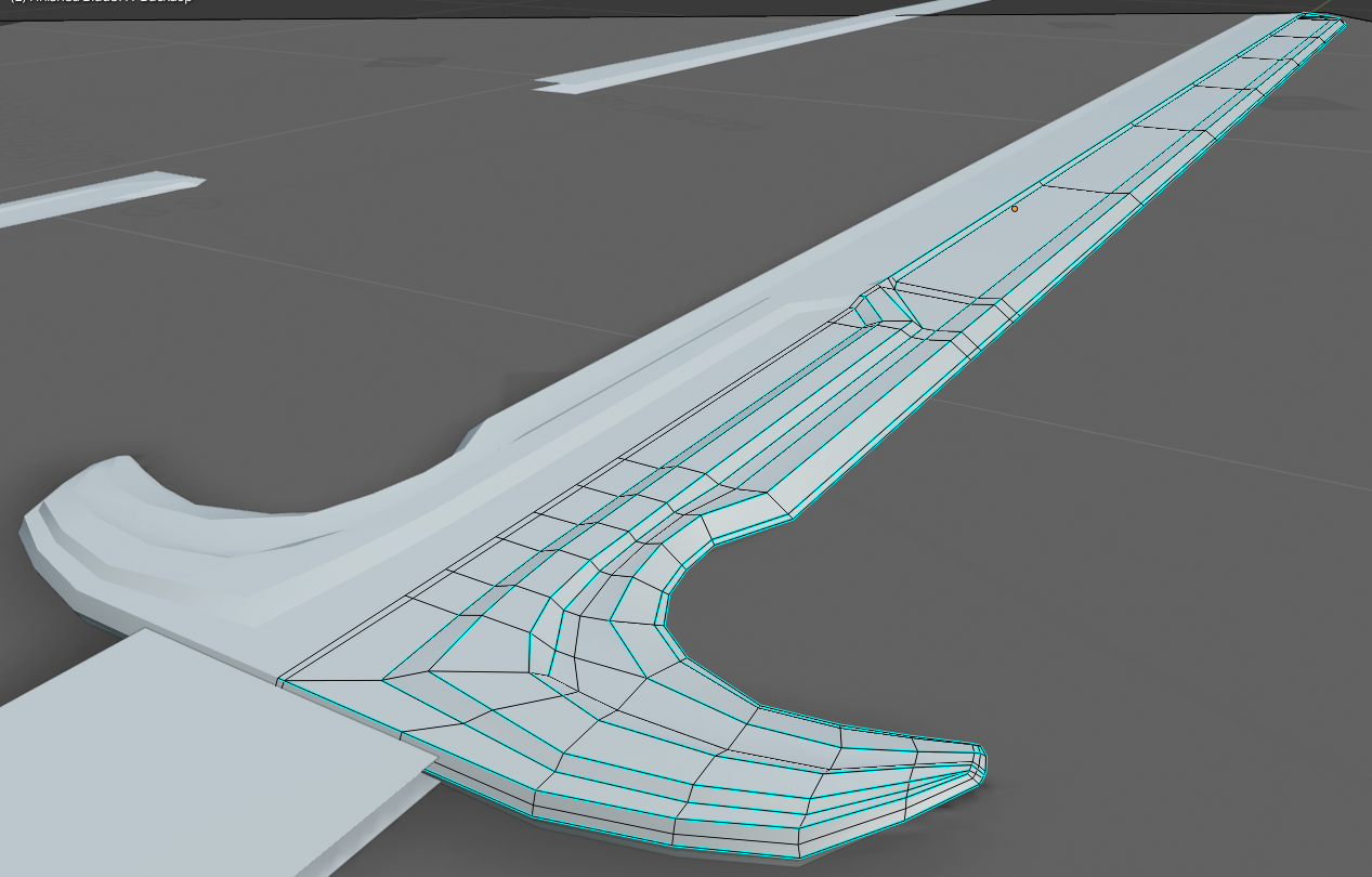
Anyway, i think i've run into a possible issue (#1)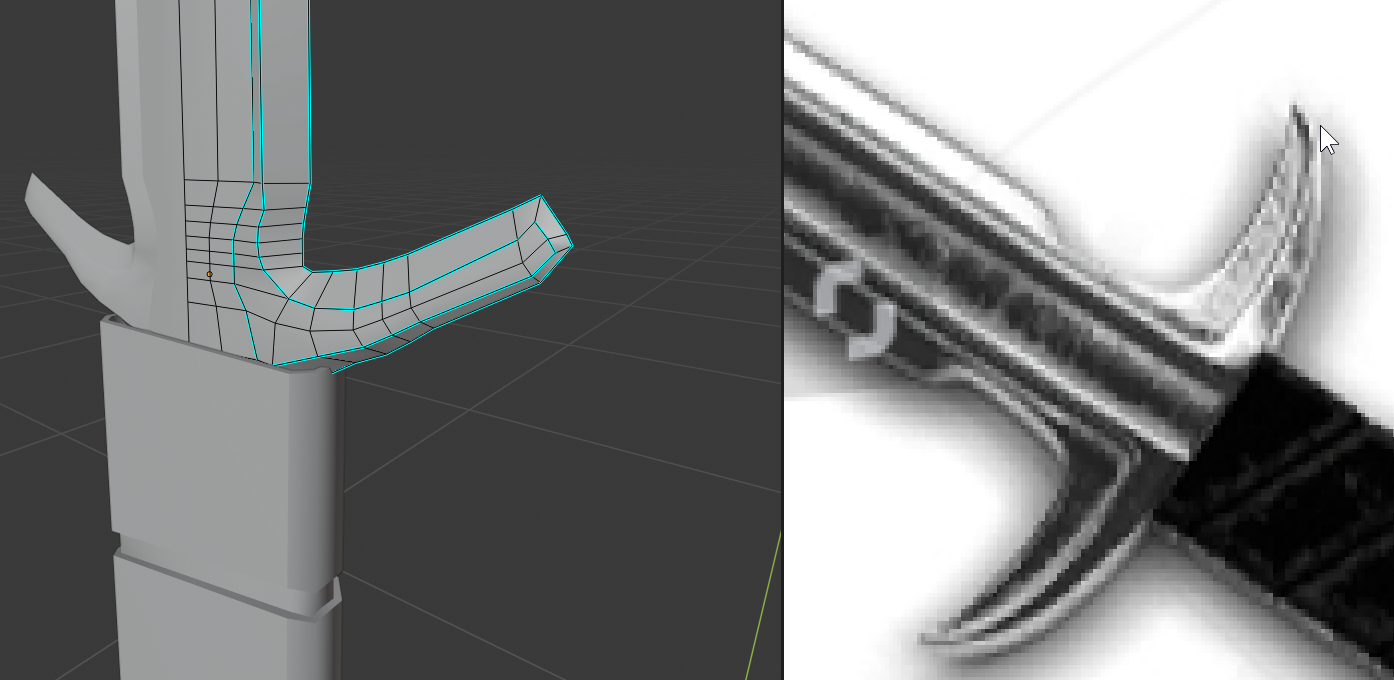 This "Hilt" type part just after the upper grip, i cant seem to get the shape quite right, its looks like another blade, what do you guys suggest i should do? also, there might be too much geometry as well, im not sure, but it still looks quite low poly with all these edges, maybe i'm not arranging them correctly
Then issue (#2)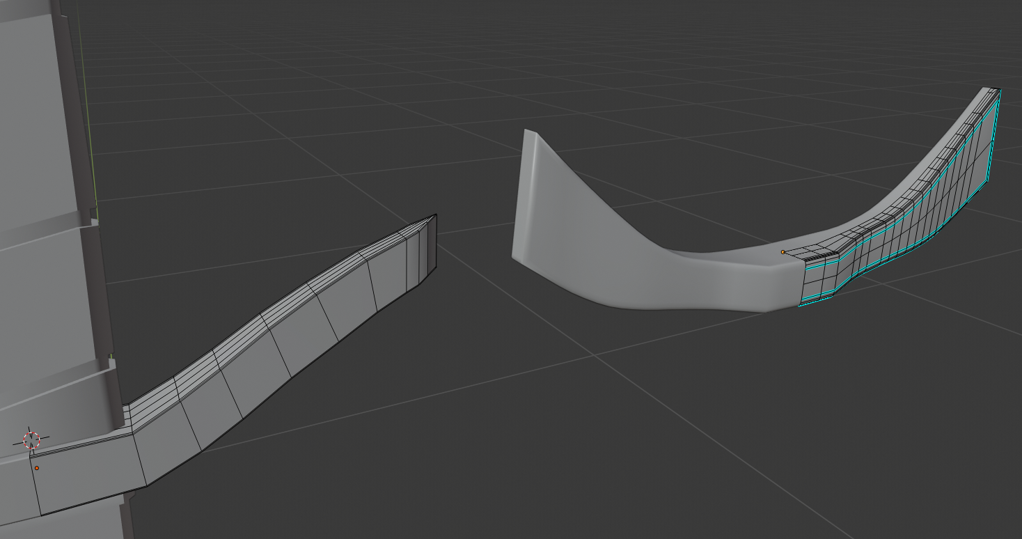 The lower hilt, the one on the left is simple, but isn't too accurate to the image, the one on the right is geometry arrangement nightmare?! but it looks closer to whats on the image, i've been trying to fix the mess on the right one of the right for a bit, but in the end i might just remake it, it's a simple part after all...
It's been a busy week, but on friday i have most of the day free, so im going to try and fix alot (and read the advice from this thread if im given any!) Good luck to everyone in the class!
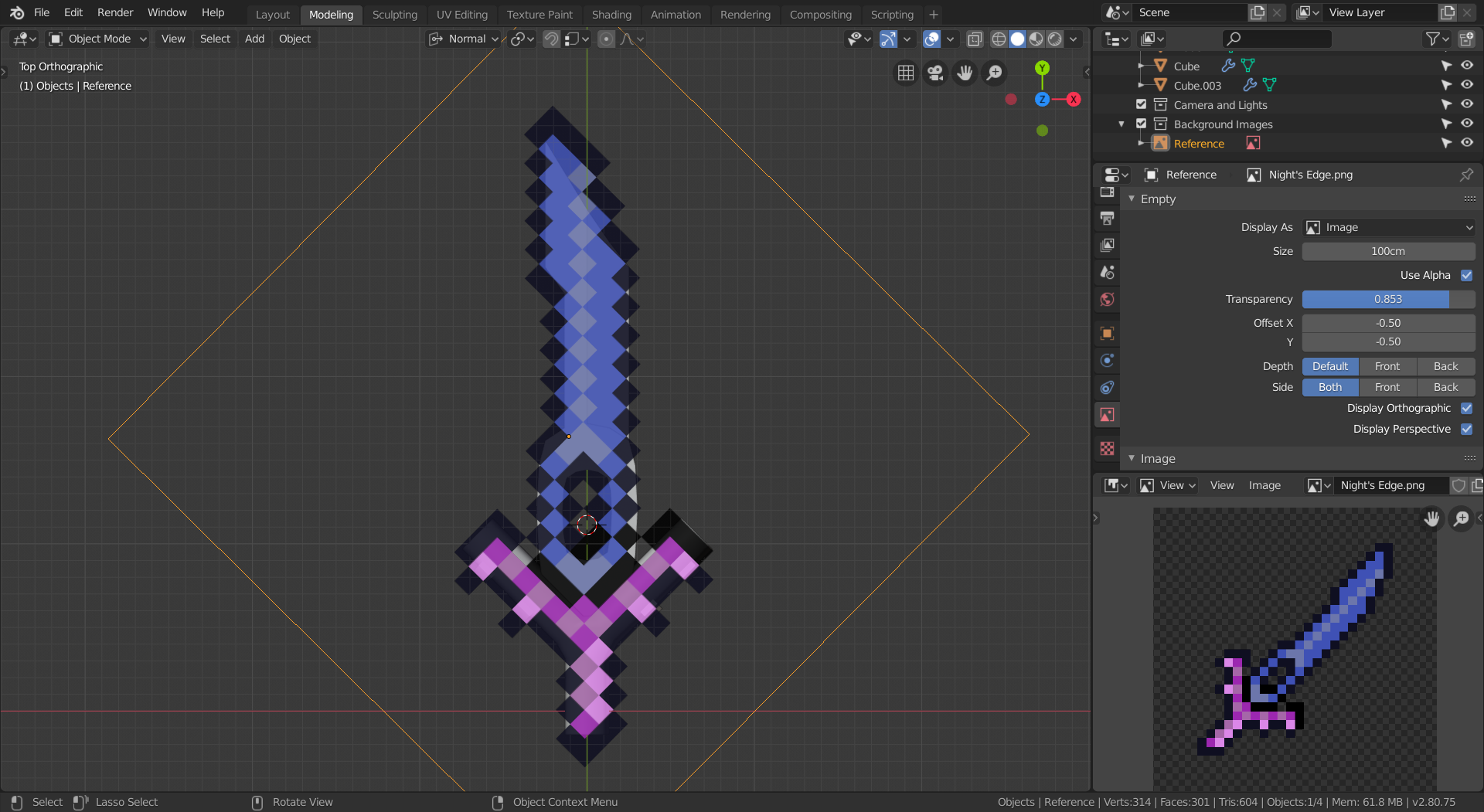
![]() syaz For issue #1, try modeling the top view first, and then adding thickness and sharpness after it matches on top. For issue #2, the one on the left looks better. In fact, with the right arrangement, you could do it with even less edge loops. just align them until they match. In order to "match them to the top view", add an image empty and set the image to be the reference image you're using. Move, rotate, and scale it until it matches up with the sword. Then, move it above the sword and change the transparency so that you can see the model behind it. The end result should look something like this:
syaz For issue #1, try modeling the top view first, and then adding thickness and sharpness after it matches on top. For issue #2, the one on the left looks better. In fact, with the right arrangement, you could do it with even less edge loops. just align them until they match. In order to "match them to the top view", add an image empty and set the image to be the reference image you're using. Move, rotate, and scale it until it matches up with the sword. Then, move it above the sword and change the transparency so that you can see the model behind it. The end result should look something like this:
Paging @drgnclw . He makes swords and weapons all the time. Maybe he could help.
![]() syaz You definitely have way too many vertices there. Every vert counts, if they are not defining a shape, they are useless. Do what Williams suggested first, then "draw" the main shape of the sword in 2D using each vert to define the shape, use as less as possible. When you are finished you can then move them in the Z direction, use a mirror modifier to get the other half for free.
syaz You definitely have way too many vertices there. Every vert counts, if they are not defining a shape, they are useless. Do what Williams suggested first, then "draw" the main shape of the sword in 2D using each vert to define the shape, use as less as possible. When you are finished you can then move them in the Z direction, use a mirror modifier to get the other half for free.
I definitely agree with what ![]() jack07 has to say, but just remember that "low poly" doesn't have a strict vert count, so whilst I'd definitely recommend getting rid of non-silhouette defining verts - especially if later down the line you decide to convert this into a game asset - it's not the biggest issue if you don't. As long as you're not using a subsurf modifier (though of course feel free to use the others) you're all set!
jack07 has to say, but just remember that "low poly" doesn't have a strict vert count, so whilst I'd definitely recommend getting rid of non-silhouette defining verts - especially if later down the line you decide to convert this into a game asset - it's not the biggest issue if you don't. As long as you're not using a subsurf modifier (though of course feel free to use the others) you're all set!
Thanks for the advice guys! I'll get to it tomorrow, about to head to bed soon, will try to see what i can do tomorrow.
![]() syaz Looking at your reference image If I had to model this, I might break it down into separate elements based on height from the center of the blade. To address problem #1, if we think of the sharp edge that goes all the way around the blade as the "ground" you could just model that with as few vertices as needed. Then using the knife tool, you could trace the outline of the next level "up" of details, and then extrude that detail section. Then, go back and make the mesh all triangles or quads before moving on to cutting and extruding the next level of details.
syaz Looking at your reference image If I had to model this, I might break it down into separate elements based on height from the center of the blade. To address problem #1, if we think of the sharp edge that goes all the way around the blade as the "ground" you could just model that with as few vertices as needed. Then using the knife tool, you could trace the outline of the next level "up" of details, and then extrude that detail section. Then, go back and make the mesh all triangles or quads before moving on to cutting and extruding the next level of details.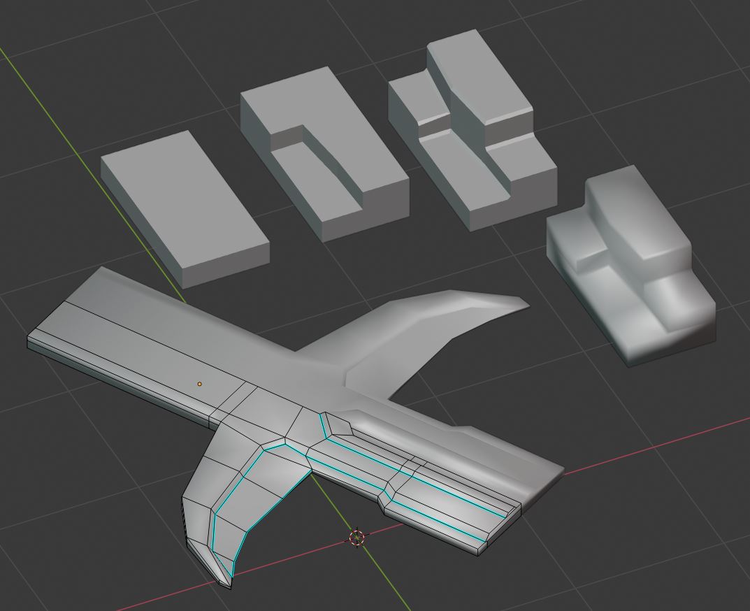
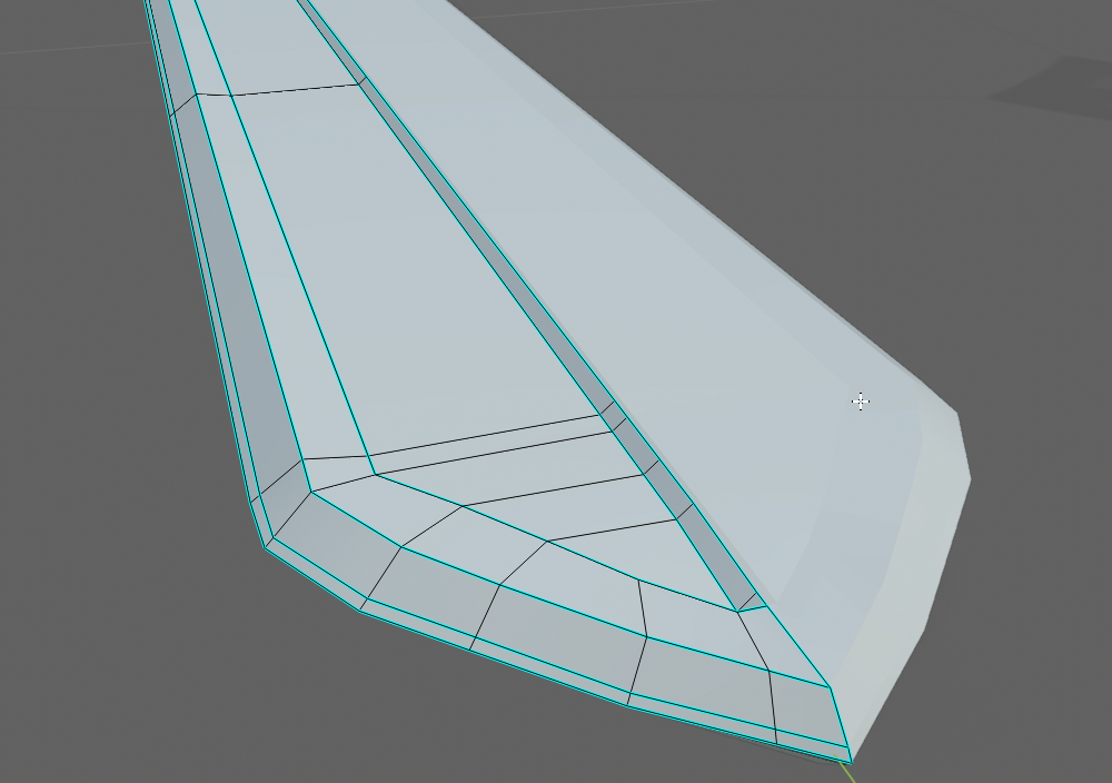
As for challenge #2 It looks like you might be adding loop cuts before you need to. In your geometry nightmare picture the profile and shape look good, it just has far too many edge loops in all three directions. I'd suggest making the piece again but setting some mental limit to the number of edge loops to start and see if you can't get the shape while staying below that number. This is with seven vertical edge loops to give you an idea. From here, we could smooth it more by beveling one of the loops if we wanted too.
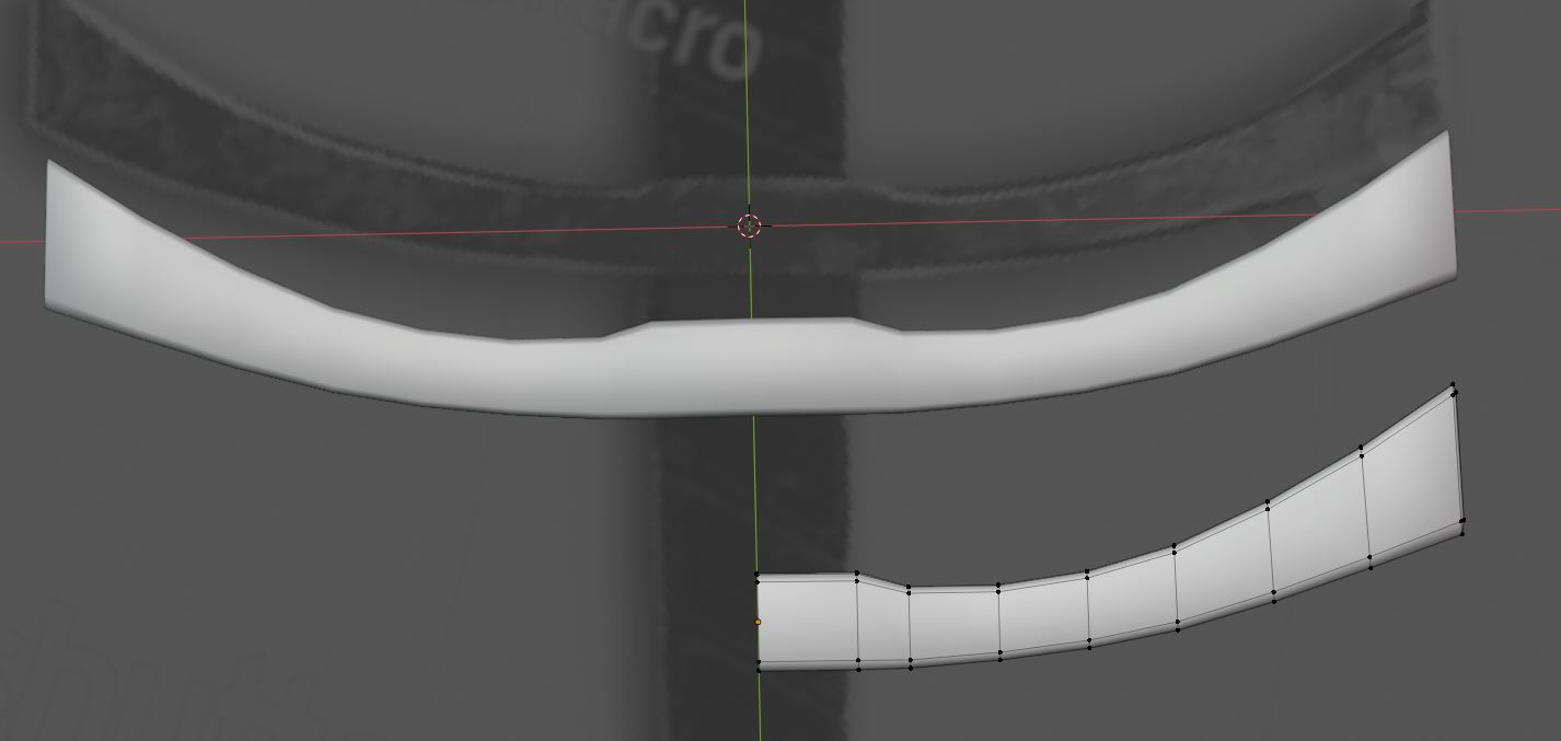
![]() syaz Looks like people have been very helpful already :) That second set of quillons, horns, parrying hooks or whatever they might be called, look like they have an edge and certainly their ends are sharp points. I'd suggest insetting the fuller instead of pushing the faces in. I also have a couple more suggestions. Notice how long is the grip compared to yours. And if you're going for a stylized look, making the whole blade wider is a good starting point.
syaz Looks like people have been very helpful already :) That second set of quillons, horns, parrying hooks or whatever they might be called, look like they have an edge and certainly their ends are sharp points. I'd suggest insetting the fuller instead of pushing the faces in. I also have a couple more suggestions. Notice how long is the grip compared to yours. And if you're going for a stylized look, making the whole blade wider is a good starting point.
Greatswords are one of my favorite types of swords. I'll keep track of your your work. Good luck!
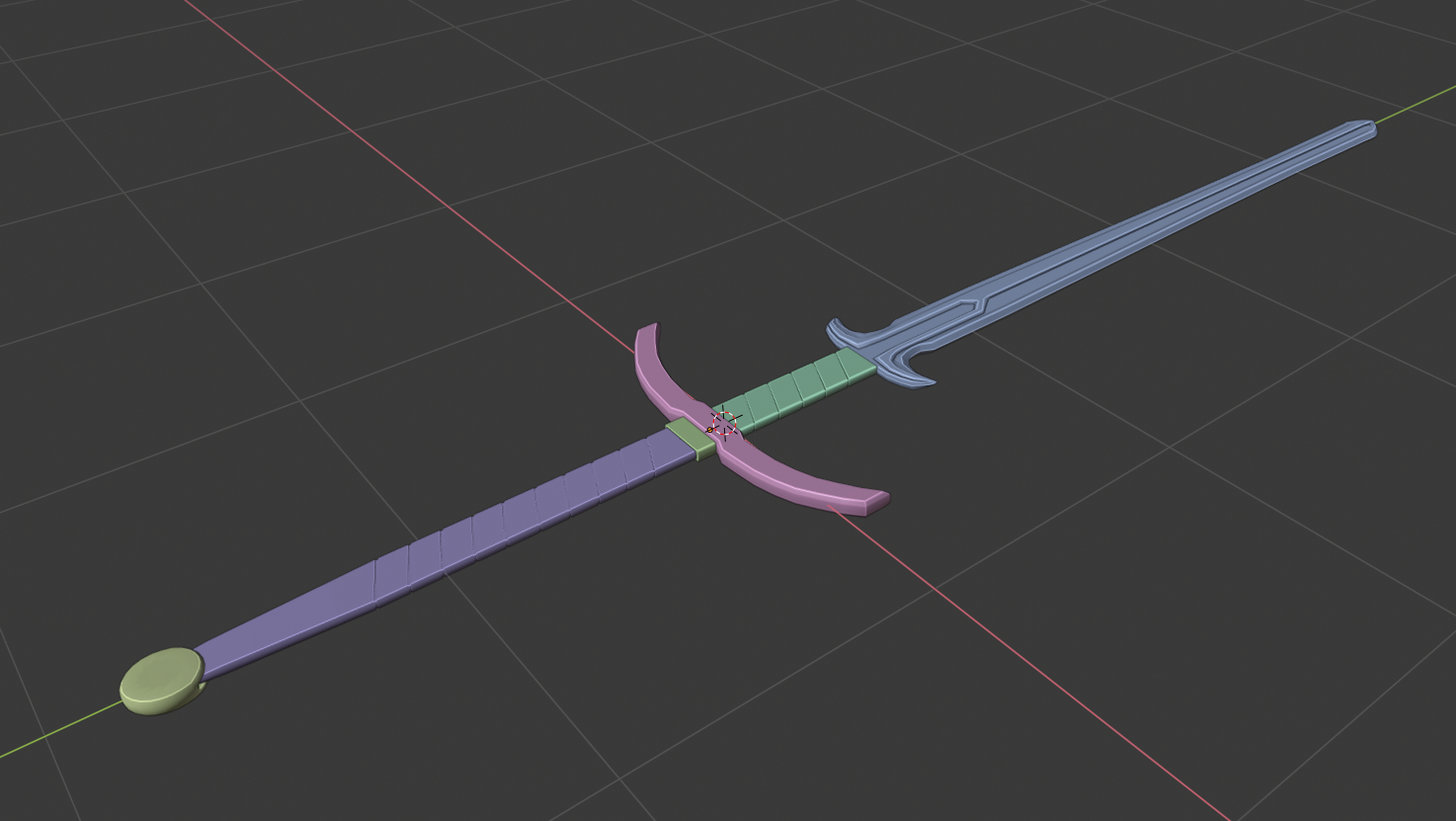
Thank you all again so much for the advice, it's been really helpful, and in the end this is what i have for the blade only (i've scrapped and remade it a ton, maybe im overthinking some stuff but it was one hell of a day of just thinking)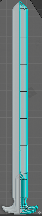 I might have overdone the mark sharps, here's more shots
Some feedback would be nice! (still too much/too little geometry, messy topology, poorly arranged vertices, too much mark sharps etc) At the moment,I think the lower curve (Parry hook?) looks too low poly, not sure what i can do there.
Sunday's coming up, now i have to model the rest which should be a simple job (?)---Hopefully!
![]() syaz You might wanna remove those edge loops (or at least some of them) in the middle of the blade, as they don't affect the silhouette of the sword.
syaz You might wanna remove those edge loops (or at least some of them) in the middle of the blade, as they don't affect the silhouette of the sword.
![]() thecabbagedetective Oh right! That was left over from when i wanted to attempt to add wear (like metal chipped from the sword) but it didn't go too well, i forgot to remove them, thanks for the reminder! :P
thecabbagedetective Oh right! That was left over from when i wanted to attempt to add wear (like metal chipped from the sword) but it didn't go too well, i forgot to remove them, thanks for the reminder! :P
Homework Week 1 Submission
Here we have the finished product! If i had to criticize myself, I'd say the blade doesn't look sharp enough, the parry hook (?) and the hilt is a bit low poly and you can really tell and i think the overall sword is a bit flat (might look better from other angles, though) doesn't look sharp enough
It's about 10pm Sunday my time as of writing this, 2 hours till midnight, it was really fun modelling this though, even though it's simple shape overall. I can't wait to start texturing and shading, cause i've never really utilized them properly yet (Just simple pictures on boxes for textures and simple colors with shading)
![]() syaz Glad I could be of help, and your finished work is looking nice, glad you're happy with it!
syaz Glad I could be of help, and your finished work is looking nice, glad you're happy with it!
![]() syaz Welcome to the class! I'm glad to hear about your motivation rekindling lately.
syaz Welcome to the class! I'm glad to hear about your motivation rekindling lately.
You've done excellent work this week. I never knew about the "Zweihänder" till this. You got some really good advice from peers already. Shoutout to ![]() williamatics and @ghujelk for getting into Blender to demonstrate their advice 🤘
williamatics and @ghujelk for getting into Blender to demonstrate their advice 🤘
I've got 2 criticisms: One is that the handle of the sword seems way too flat to be comfortable or accurate to the real thing. This video has a guy handling the sword and though it doesn't appear to be cylindrical, it's got more depth than I see in your model.
Second (small note), The blade edge seems to blunt compared to the real thing. Seems like there would be a more gradual sharpness from the center of the blade to the edge.
All things considered, it's a B+ from me. I'm quite impressed by the quality of your modeling skills as a beginner! Keep up the good work into texture and shading :)
@theluthier Thank you so much Kent! I agree, it does seem a bit flat, i didn't think to watch a video of a guy handling it to be honest, should've done that! But im super proud of the grade i got regardless, i look forward to texturing and shading!
![]() syaz Good effort! I second Kent in his critique. But hey, it's a good effort nonetheless. Now apply the critique to future projects. You got this!
syaz Good effort! I second Kent in his critique. But hey, it's a good effort nonetheless. Now apply the critique to future projects. You got this!
Homework Week 2 Submission
 (EDIT: Picture Changed, rendered out in workbench with matcap instead to have some small amount of shine!)
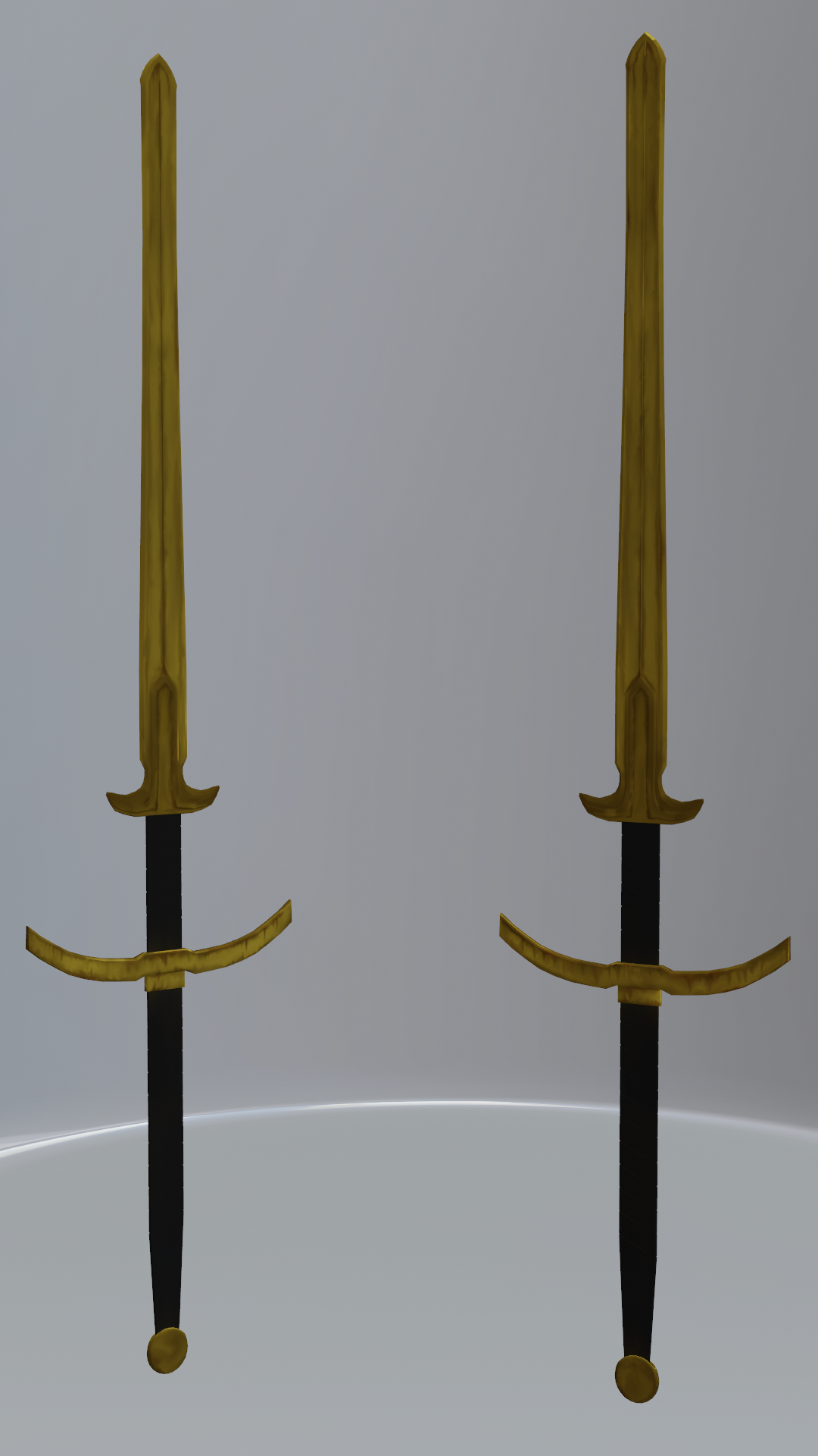
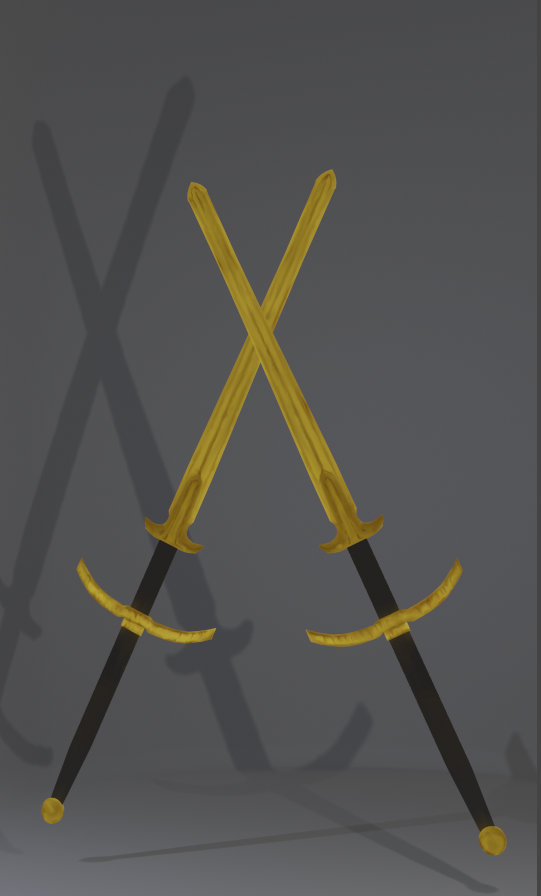
Here's the final product for week 2!
I was thinking about making the texturing simple as well, but since my week 1 submission was already simple, i decided to add a mini fantasy theme to week 2; A Ceremonial Golden Zweihander that was stored and never used, just tucked away to rust and gather dust (Probably not that creative but i like the idea)
This took a bit, especially the guard (which im personally pleased with, looks really rusty) the blade kinda looks off without shaders but i tested some to add shine and it looks pretty good with them, cant wait to dive into shaders next week, I tried adding dirt but you can barely see the dirt on the handles.
Also used loads of smearing for painting, may have overdone it infact, loved the smudge tool in photoshop so i went ham here
As for the UV's, nothing too difficult, i could probably optimize the space usage but i was ok with what i got, haven't had too much trouble painting in the end.
Apologies for zero WIP shots, i was quite busy throughout the week.
Extra Pictures
![]() syaz Looks cool! It's kind of hard to see the handle wrap as more than a solid color right now but when we get to shading and lighting they should probably stand out more.
syaz Looks cool! It's kind of hard to see the handle wrap as more than a solid color right now but when we get to shading and lighting they should probably stand out more.
![]() syaz I really like the backstory you've created in your head. Doing that helps so much to breath life into anything you create. I think it's plenty creative - It doesn't take much honestly. Good work, Syazwi!
syaz I really like the backstory you've created in your head. Doing that helps so much to breath life into anything you create. I think it's plenty creative - It doesn't take much honestly. Good work, Syazwi!
You got me thinking about gold rusting...and if it did in fact rust. Apparently it doesn't:

BUT don't let me rain on your parade!😅 This gold can rust and your details definitely read like rust, so nice job there. You've earned an A in my book 👍
the blade kinda looks off without shaders
Indeed a gold shader with this detail will look great!
@theluthier curses! maybe i should've realized that fact after the only result from searching rusted gold is from a video game (dark souls' rusted gold coin)...oh well!
I still enjoyed painting the rust, though :)
Thanks for the A as well! the last minute polishing on sunday night was worth it!