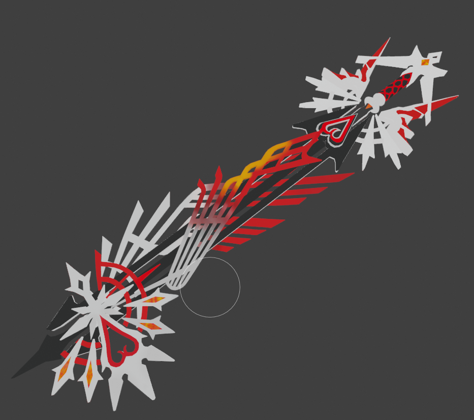
Hi I'm not sure of myself but for now I'm staying on this keyblade
In the past I have already tried a keyblade less detailed and I decided to try a new keyblade harder to challenge me
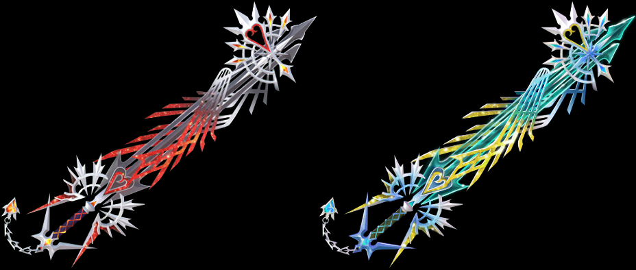
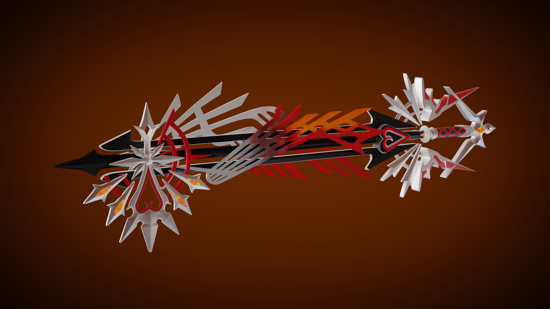
As a KH player, I can tell you made justice to the Ultima Keyblade! Nice work!
@jamesle Your texture looks great! You continue to do a good with this complex asset. Definitely doing the KH design justice. It's an A for me this week 👏
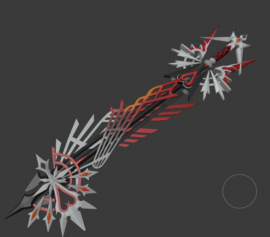
The meterial creation part of this could be interesting and a challenge. I don't see much surface quality in the reference - and I'm sure as a video game with a particular art style, there's not much to inform a material. Like is anything shiny metal? What kind of material is the colored portions? Painted metal or is it glowing?
Personally I'd like to see you make some definitive choices about the material surface quality. I'm looking forward to seeing what you do!
jjamesley oh man, you make me wanna play KH again! Good job on the key blade, love it ❤️
jjamesley Sorry, late the the party. Looks good! I'm also curious what kind of material decisions you'll make to have this sword really pop.
jjamesley Love the color palette! It's a busy model that can be hard to read at a glance but the colors invite you in to explore and understand the structure. Great work.
jjamesley Very colourful, love it! The only thing I could think is that you could've maybe given it a stronger rim light? To compliment its 3D nature.
jjamesley good work, and i would like to echo Aaron's view on rim light. it does look bit flat when there is not noticeable highlights.
jjamesley Nice job finishing out the class strong! ccthulusan put it best:
It's a busy model that can be hard to read at a glance but the colors invite you in to explore and understand the structure
My initial impression is that the materials are pretty simple overall, appearing almost default if I didn't know better. But the busy-ness of the model makes me wonder if the simpler material is more appropriate. If there was noticeable metal bits and noticeable glowy parts, maybe it would be too busy as a whole.
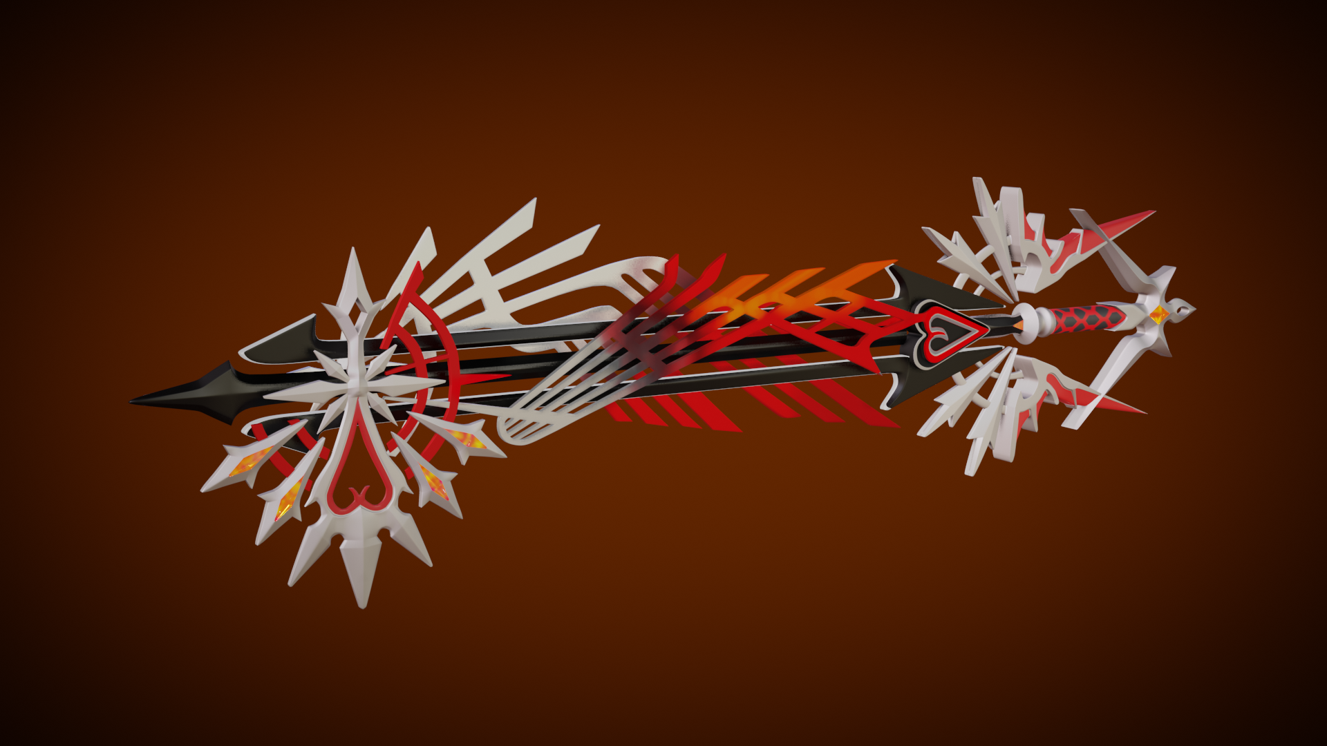
You've earned an A from me this week. Though I'm still curious about exploring the materials a bit further. Would you be willing to let me download your final .blend to possibly mess around with the material during the stream tomorrow? If so, please pack your .blend file to include the textures (File > External Data > Pack all into .blend) then save with a new file name adding "_packed" in the name. Then use dropbox or google drive to provide a download link for me.