A portable canon for all your Pirates needs. I'm always like modeling military stuff and I decided to put a Destroyer's canon on my treasure chest ... to protect the GOLD! I followed some tips from the course and made some small changes to the design to make it my own.
Tomorrow I'll start with the modeling of the wood of the chest and after that the canon and skull.
Looking forward to any feedback for now.
![]() tijnkroon I love how the cannon looks well used. Poor souls who tried to open that thing!
tijnkroon I love how the cannon looks well used. Poor souls who tried to open that thing!
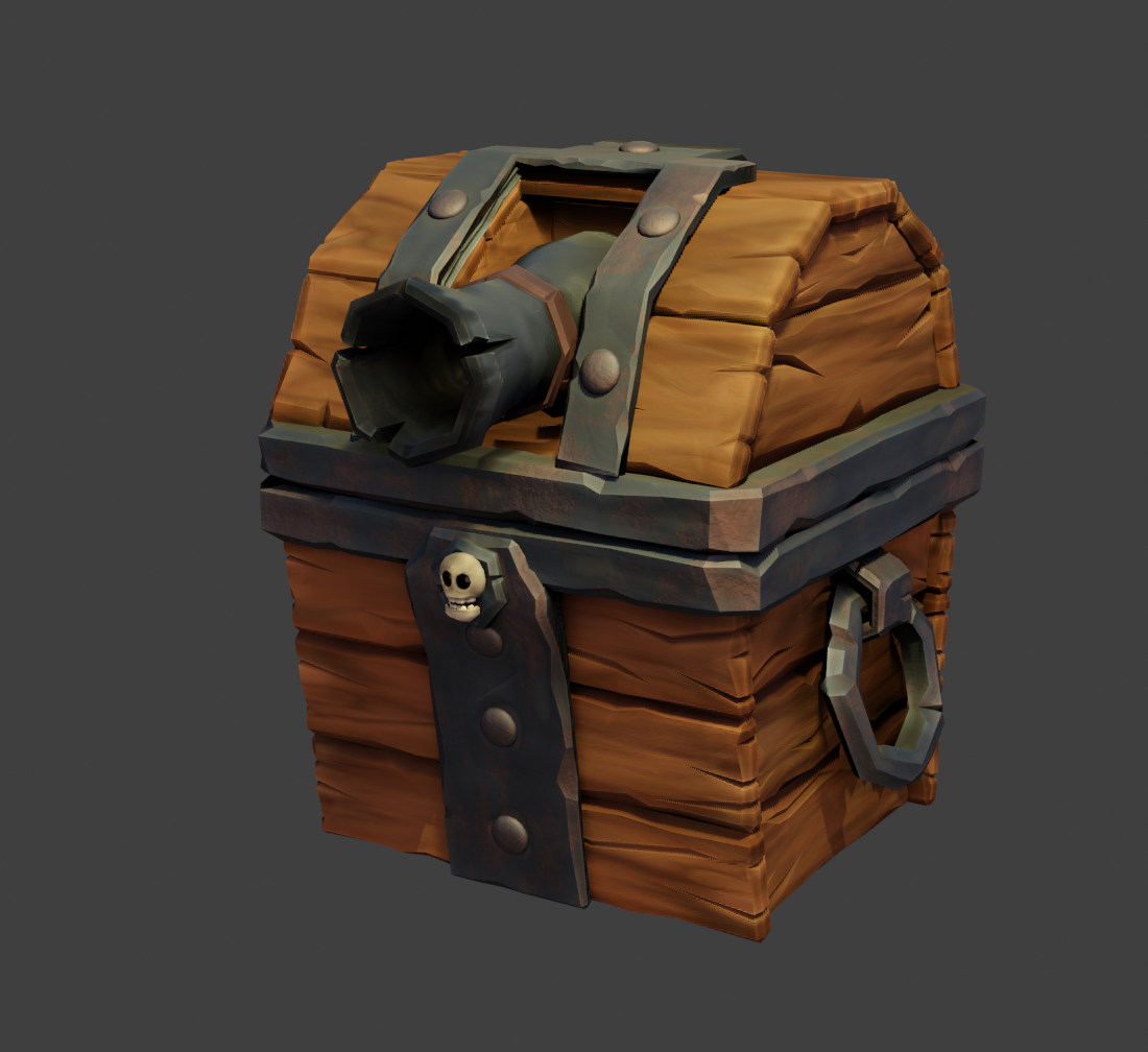
here is the chest with a bit of shading. I putted some rust on the steel and edited a noise texture to make more variations in the wood. 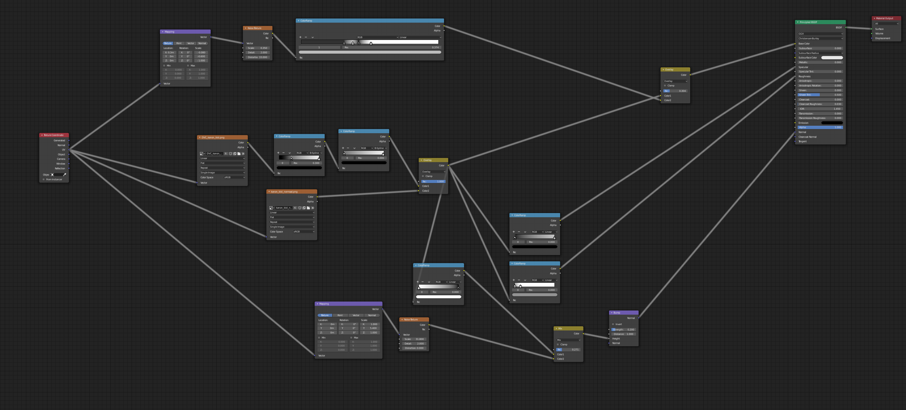 the nodes of the wood.
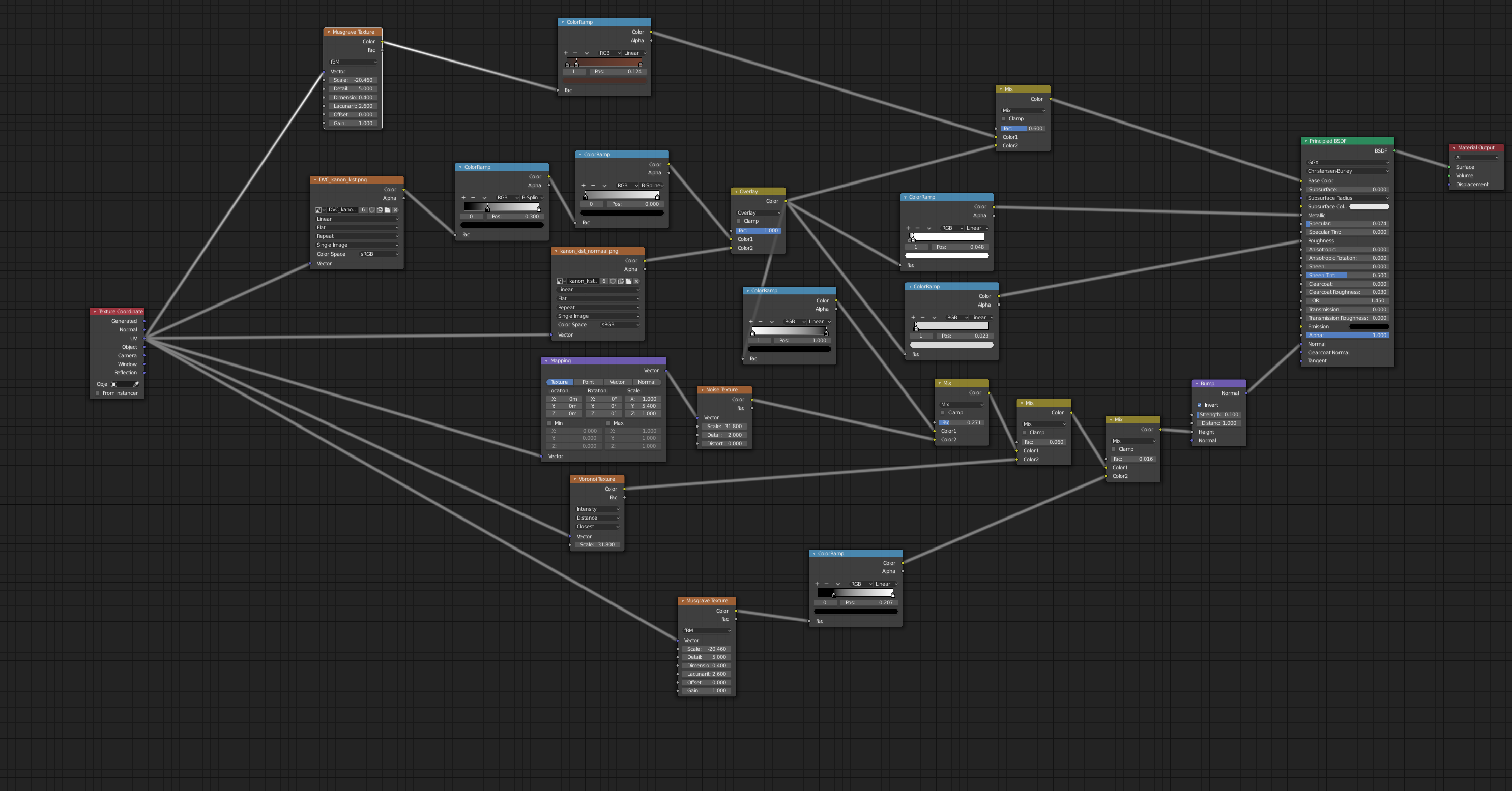 And this is the steel nodes.
![]() tijnkroon Nice job finishing the class. You wrapped up your treasure chest quite well. Overall the materials' reflectivity is subtle which gives it a more of a diffuse look, kinda like claymation. So to me the wood doesn't appear laquered and the metal doesn't read obviously like metal *at first glance*. However as I study it closer I certainly can tell it's metal and non-laquered wood is plenty reasonable.
tijnkroon Nice job finishing the class. You wrapped up your treasure chest quite well. Overall the materials' reflectivity is subtle which gives it a more of a diffuse look, kinda like claymation. So to me the wood doesn't appear laquered and the metal doesn't read obviously like metal *at first glance*. However as I study it closer I certainly can tell it's metal and non-laquered wood is plenty reasonable.
Personally I like to see more reflectivity involved mostly because I think reflections make for more interesting renders. BUT this is a subjective preference and not a rule by any means. The only other note I have is that the edge wear and tear is subtle where I would recommend to increase the effect to draw more attention to the lovely geometric details.
In conclusion, all my notes are subjective. You've more than accomplished the assignment and you finish the class with another A. Nice work, Tijn!
BC1-1908 Homework submission week 3 , Tijn Kroon
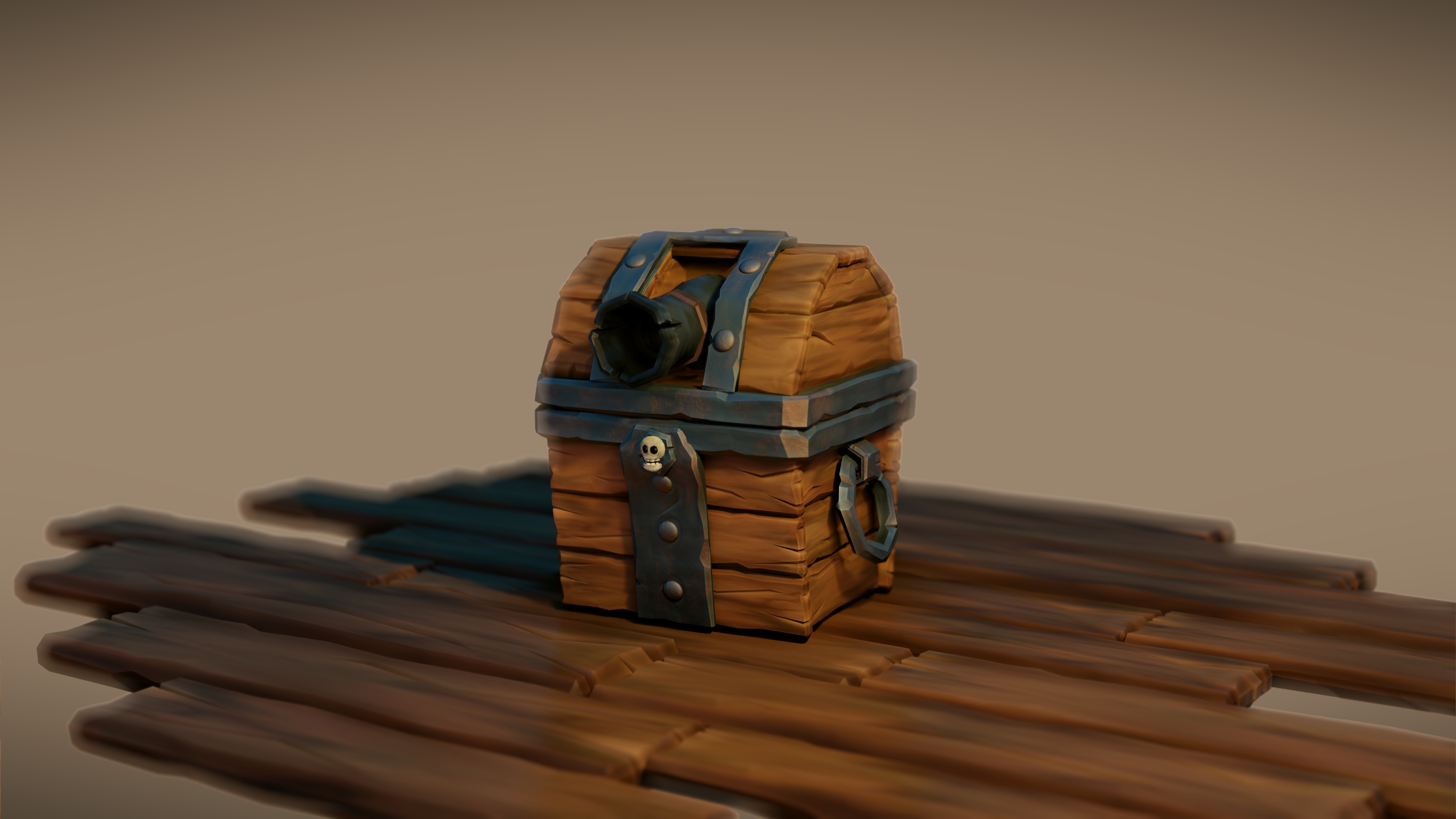 Thanks very much for the feedback on the design but I also would like to add my final render and animation which I created this weekend. When I have some extra I will make some changes to the design as you suggested and experiment some more with the reflections in the model.
The challenges I had with animating the trapped door, I solved by spinning the canon chest around so I didn't have to go into the details. It was my intention to use effects from anime to create the canon smoke effect which you can see at the end of the animation. Let me know what you think of this.
I had great time with this courses and learned that it pays off when completing an entire design and showing to other people.
![]() tijnkroon It looks very good, but the trick you use for the canon trap opening is a little of a let down. Plus it makes it weird for people that would not have seen the concept like us to suddenly have canon after the turn.
tijnkroon It looks very good, but the trick you use for the canon trap opening is a little of a let down. Plus it makes it weird for people that would not have seen the concept like us to suddenly have canon after the turn.
Fantastic job overall!
![]() tijnkroon Good effort! The final product looks nice. A couple of critiques:
tijnkroon Good effort! The final product looks nice. A couple of critiques:
Otherwise, good effort.
OMG! I have so much fun by looking the video :) I think I am grinning 3 minutes :)
Very great job!
![]() tijnkroon I gotta bump your grade up to the coveted A++. For accepting my challenge to rig and animate *within* the timeframe of the class - that's just awesome. Way to go Tijn 👏👏
tijnkroon I gotta bump your grade up to the coveted A++. For accepting my challenge to rig and animate *within* the timeframe of the class - that's just awesome. Way to go Tijn 👏👏
![]() tijnkroon I thought this was my favorite submission of the whole series. You totally broke 'the box' and made it your own and it is quite lovable. Great work.
tijnkroon I thought this was my favorite submission of the whole series. You totally broke 'the box' and made it your own and it is quite lovable. Great work.