This is my homework topic for BC4-1810, Shading and Lighting.
This is my first live class at CGC. I'm excited to be part of this class as shading and lighting is the next step in my blender learning plan.
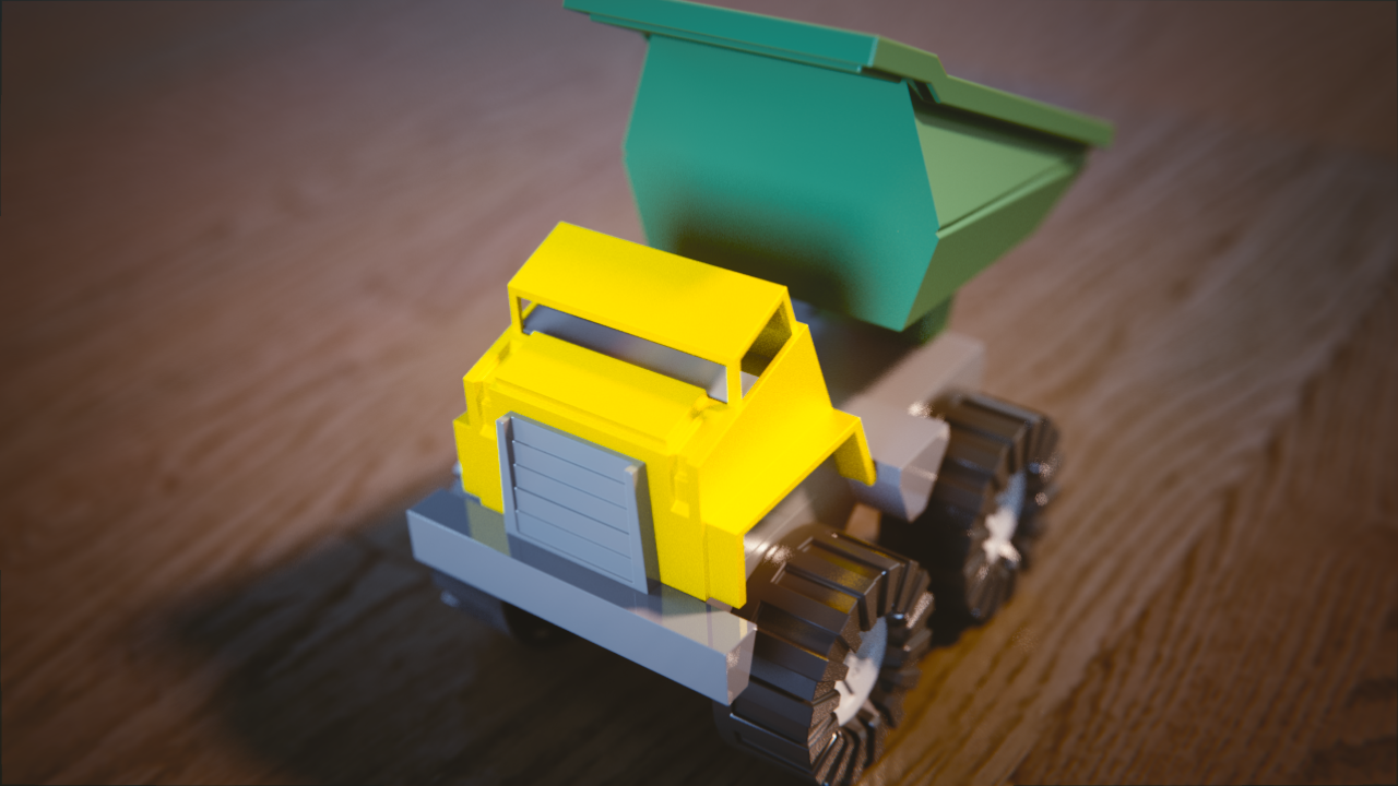
Here is my Truck Shading assignment submission.
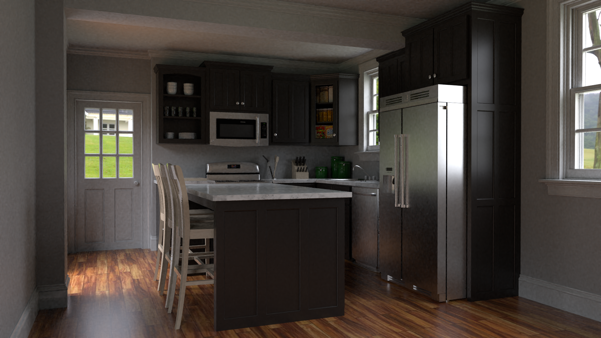
Bedroom Assignment (Night/Day)
For Day: I used a light blue area pointing into the window. I also added a low power light orange area light inside room aimed at the bed.
For Night: I used a low power mid-blue area light outside the window to simulate a moonlight effect. There is also a similar area light inside the room near where the camera is located. The two lamps are light orange point lights inside the lamps. I initially created the lights in the center of the lamp, which did not look right, then realized that the lights were inside the stem of the lamp. Once I moved them forward I was able to achieve the lamp like effect.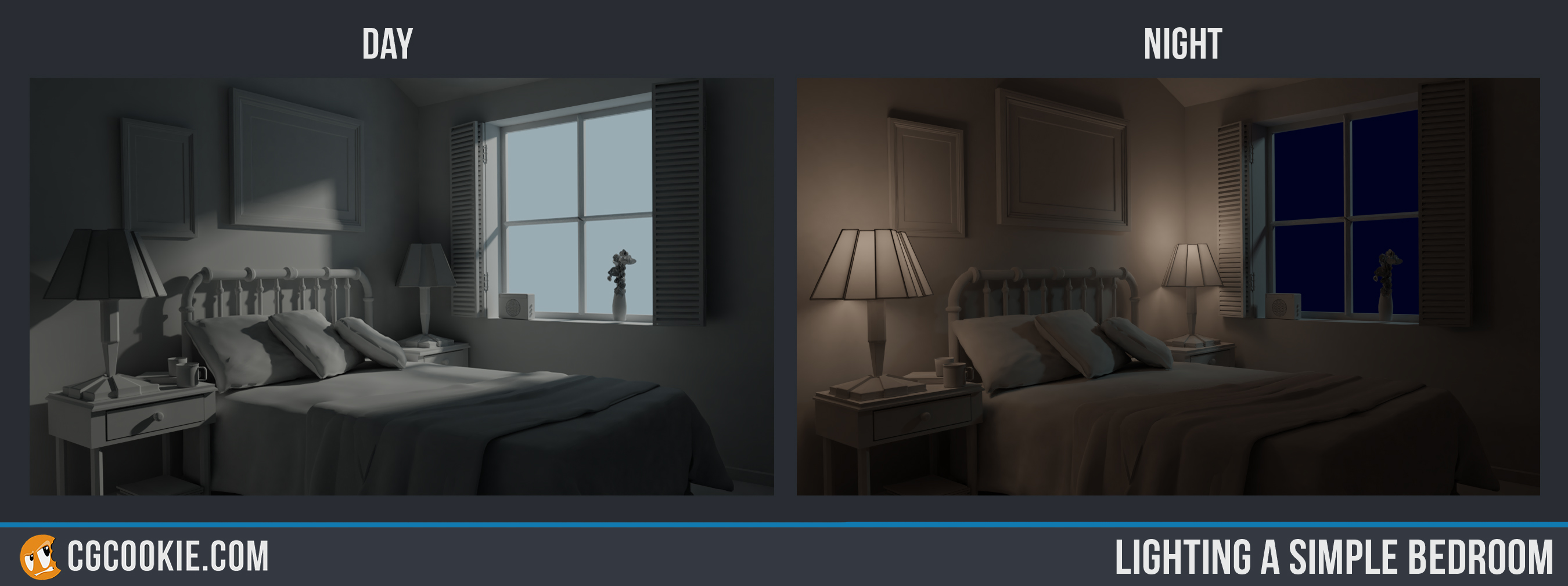
![]() notcastanza
notcastanza
nice work trough i think the day scene could been a bit brighther but that is my opinion of course . as for the night scene it looks good for me :) the truck also seems to be nice done .
![]() notcastanza Welcome to the class! What a fun camera position on the truck. The shader looks solid to me.
notcastanza Welcome to the class! What a fun camera position on the truck. The shader looks solid to me.
The day is nicely lit, but maybe a bit dark for my taste, as well. The night scene is nice; good play between the warm and cool colors. Good work.
Welcome indeed to the class ![]() notcastanza! First time I've ever seen someone tip the truck's bucket backward. That's worth a ⭐ if you ask me. In all seriousness, it looks good - reading very much like plastic.
notcastanza! First time I've ever seen someone tip the truck's bucket backward. That's worth a ⭐ if you ask me. In all seriousness, it looks good - reading very much like plastic.
It's very interesting to read your lighting breakdowns. You're approaching both scenes in unique ways; ways I've not thought of like an area light where the camera is located..
Overall it's working for you as the scenes look pretty good. My only note is that the contrast seems a little low to me. As in the sunlight isn't quite bright enough to be *sunlight* and the lamps feel fairly dim.
Maybe that's a filmic thing though. Regardless, you've earned an A this week. Good stuff 👍
![]() notcastanza I love the camera angle change you did in the toy truck! Shaders and lighting work fairly nice. Good job.
notcastanza I love the camera angle change you did in the toy truck! Shaders and lighting work fairly nice. Good job.
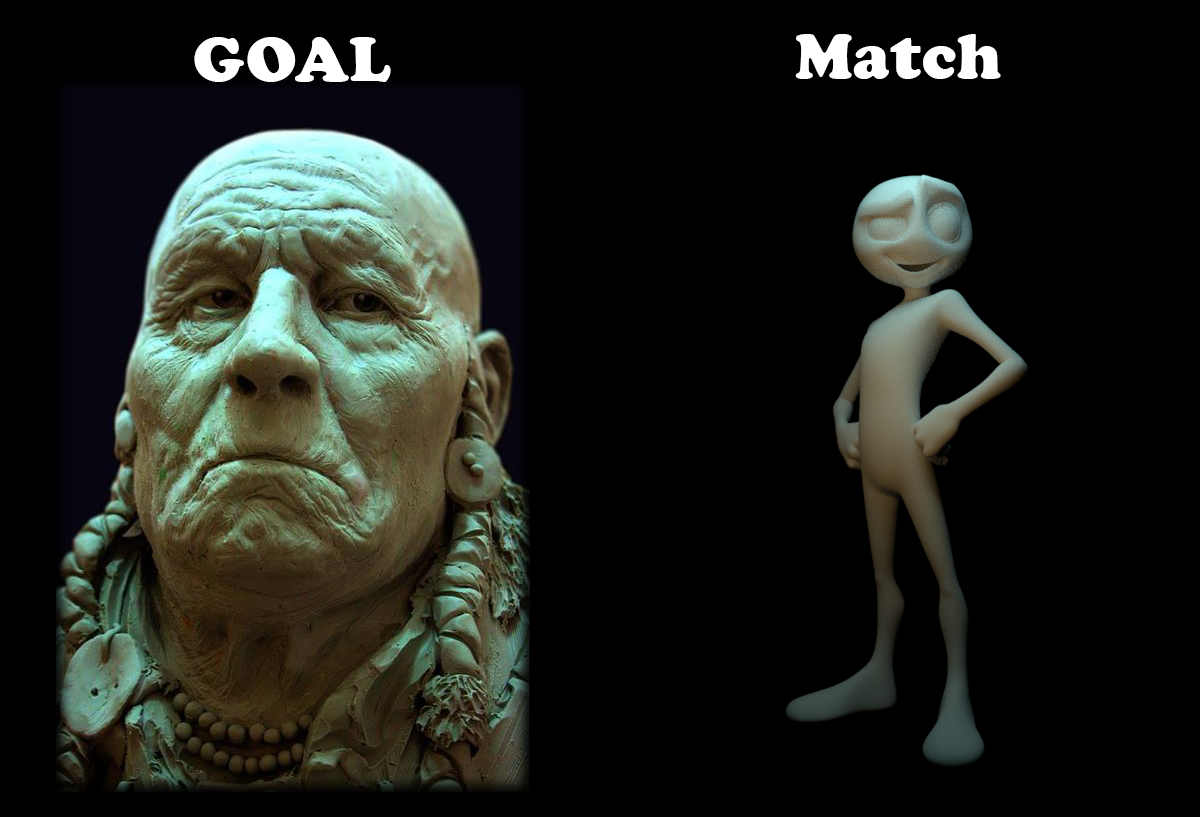
This was an interesting match because of the difference in models. I couldn't quite figure out if there was a warm light orange under light or not.
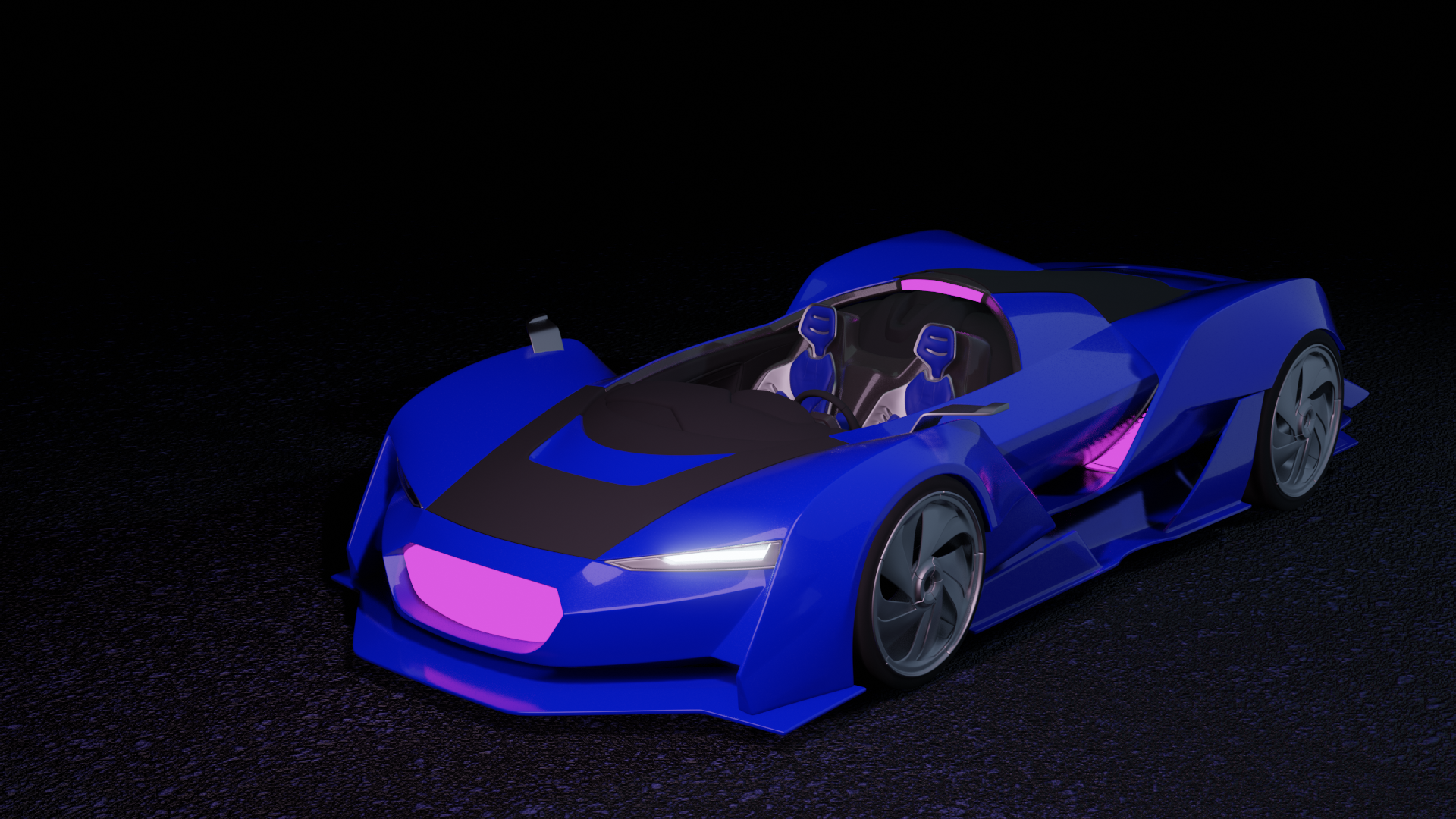
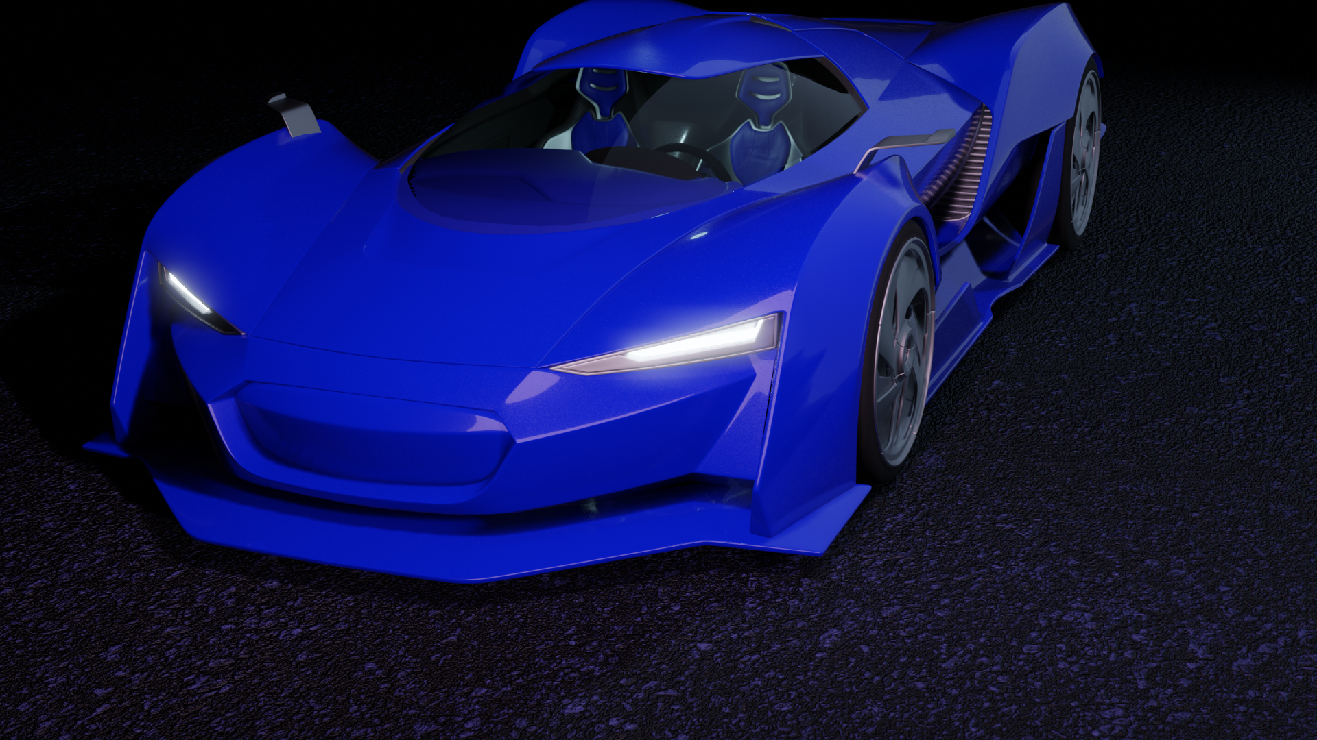
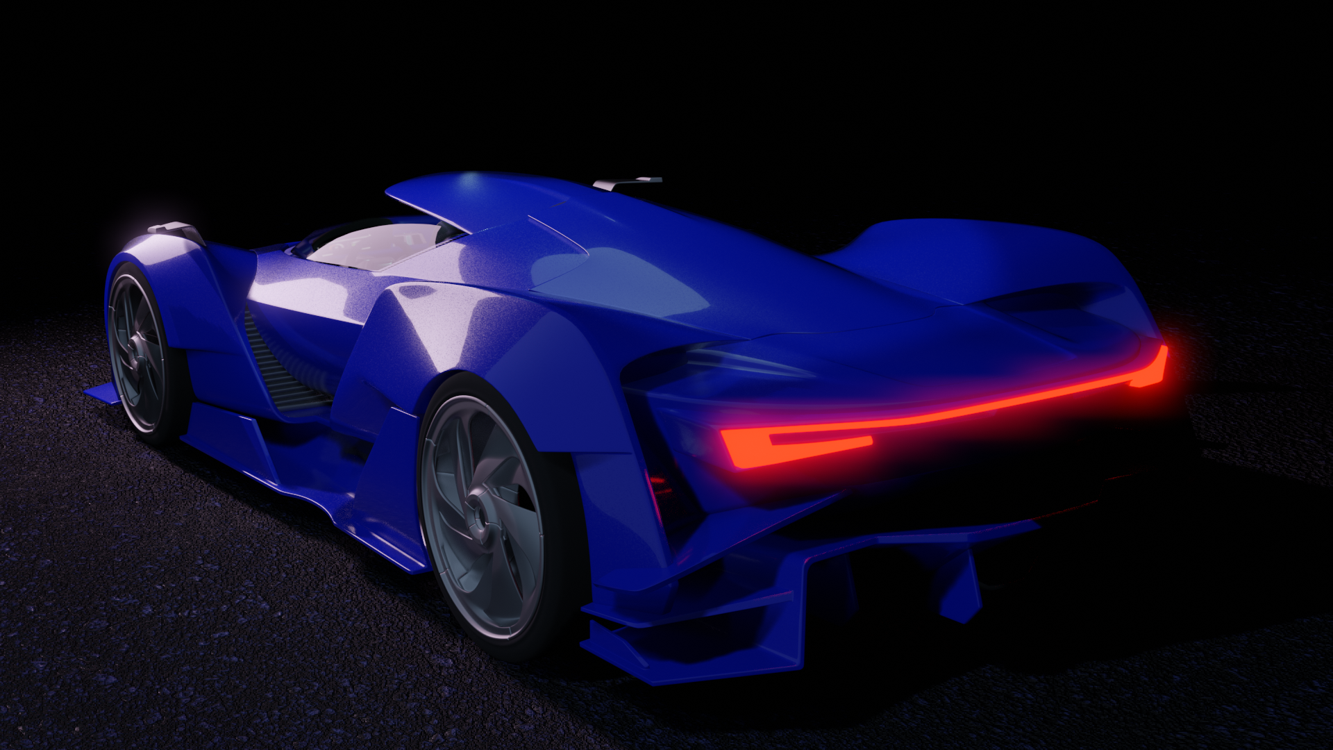
![]() notcastanza I really like blue paint on your car but black looks like it was 2D.
notcastanza I really like blue paint on your car but black looks like it was 2D.
![]() notcastanza Your lighting match looks pretty good despite the detail discrepancy. Good work.
notcastanza Your lighting match looks pretty good despite the detail discrepancy. Good work.
The car looks like a good start to what could be something great. The matte black looks a little strange, not quite sure what it is, the magenta lights at first thought looked like the texture you were sourcing is "lost" or broken in some way, but I think you just wanted magenta lights. I don't know if I like them with the blue personally. The background is maybe not the best color since you do have elements of black in the vehicle. It's a good attempt nonetheless.
Good Point, it does look like the no-image pink. I changed it to normal but added the roof and window.
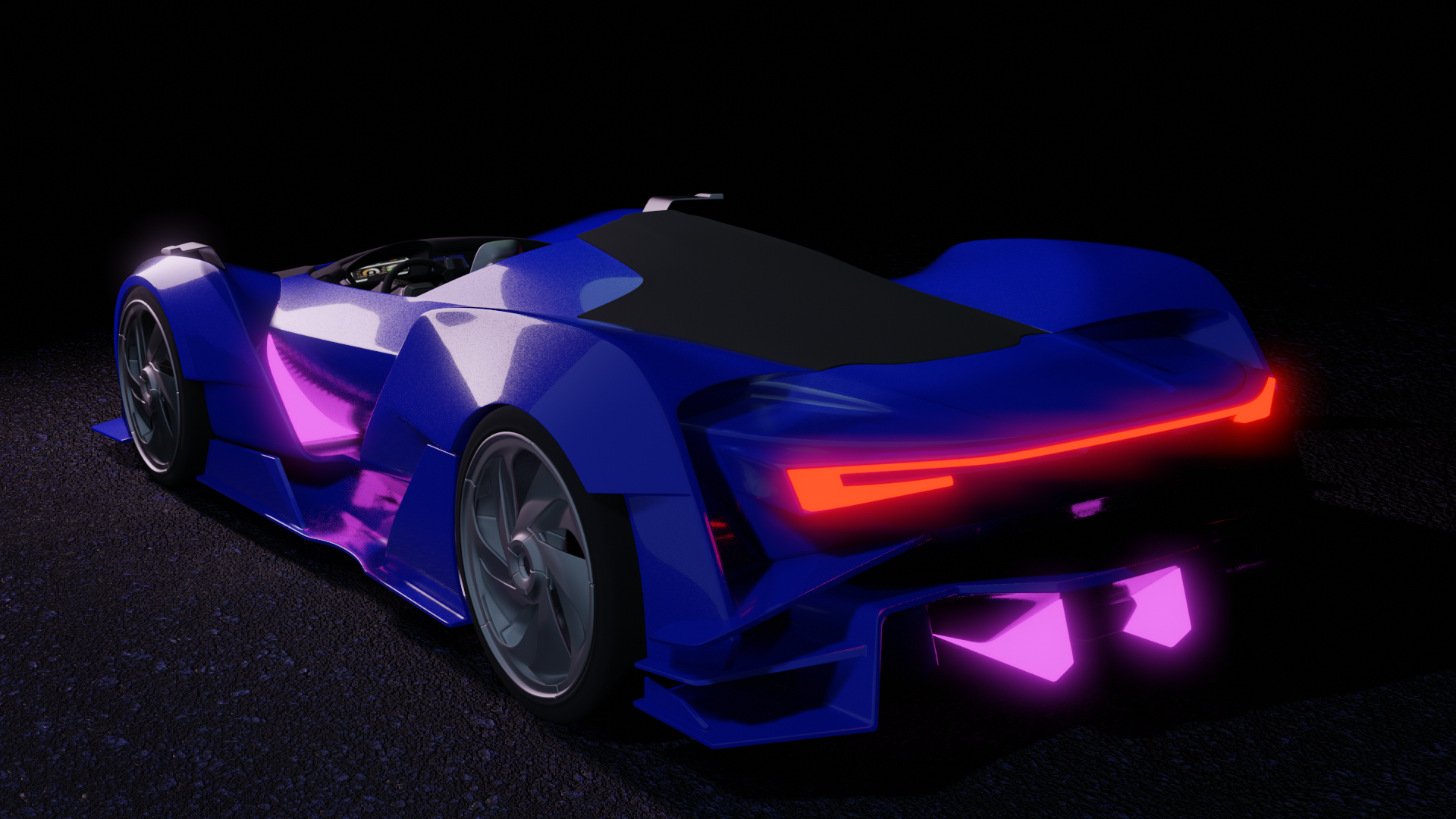
![]() notcastanza Thumbs up for your car render, lighting isnt too bad either.
notcastanza Thumbs up for your car render, lighting isnt too bad either.
This was an interesting match because of the difference in models
The stark difference in models was the first thing I noticed. Usually that means bad news for a decent light match. But yours has turned out quite well ![]() notcastanza! The more I study it the more I see similarities. That's excellent lighting detective work 👍 A in my book.
notcastanza! The more I study it the more I see similarities. That's excellent lighting detective work 👍 A in my book.
Your vehicle shaders look pretty good to me. I like that you replaced the black parts with the blue. My overarching question though is if you're using an HDRI environment. My guess is that you're not and instead lighting with lamps. That would explain the lack of reflections. Or rather the concentration of reflections on certain parts of the vehicle as opposed to varying degrees of reflection across the entire model. When you have such amazing reflection, why not get the most out of em -ya know? :)
It's a B from me. Good job this week!
![]() notcastanza Ben the car materials somehow suggest that the car is maybe a toy one, even the scale of the ground supports the impression. Not sure whether that is intended as concept, but it works for me as it is
notcastanza Ben the car materials somehow suggest that the car is maybe a toy one, even the scale of the ground supports the impression. Not sure whether that is intended as concept, but it works for me as it is
@theluthier I had an HDRI environment but I think it didn't show on the render. I was running out of time so I just went with it. I definitely need more practice with that.
I don't have a ton of time this week but I wanted to at least give the goblin a go. I wanted to give the image a little more sinister feel so I have him looking directly into the camera and tried to do more lighting from the bottom. I can't remember where I heard it but in film the purple background indicates that someone is going to die.
I am feeling more confident working with the shaders and basic texturing. Understanding how the light effects them is making it all click into place.
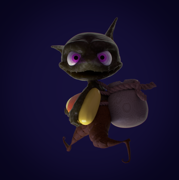
![]() notcastanza Good start. Maybe the camera angle could be a little higher, but I think there's a weird mesh issue with the pointing up ear, so doing the best you can. The materials look nice so far. Maybe there could be a ground plane; looks like he's floating.
notcastanza Good start. Maybe the camera angle could be a little higher, but I think there's a weird mesh issue with the pointing up ear, so doing the best you can. The materials look nice so far. Maybe there could be a ground plane; looks like he's floating.
![]() notcastanza Kudos for injecting color symbology into your render. That's an excellent tool for conveying undertones of meaning. I'm trying to remember back to college when we studied the various meanings of color..as I remember, purple represented "royalty" or 'nobility" which is why Jesus was often depicted with a purple sash or robe in renaissance paintings. That's not to say that purple doesn't mean also mean "sinister" in other contexts. Colors mean different things to different cultures. Still the effort is a big step in the right direction!
notcastanza Kudos for injecting color symbology into your render. That's an excellent tool for conveying undertones of meaning. I'm trying to remember back to college when we studied the various meanings of color..as I remember, purple represented "royalty" or 'nobility" which is why Jesus was often depicted with a purple sash or robe in renaissance paintings. That's not to say that purple doesn't mean also mean "sinister" in other contexts. Colors mean different things to different cultures. Still the effort is a big step in the right direction!
I have a few notes:
Overall it's a B from me 👍
![]() notcastanza great work this week!
notcastanza great work this week!
Also did you just enter the pumpkin contest with a here lies Kent gravestone? Love that! 😂 well done on your first complete scene 😊👍🏻