My homework thread for the October 2018 Class.
Week 1:
Week 2:
Week 3:
Week 4:
Week 4 - Act 1
I started working on this week's assignment over the weekend to hopefully be able to squeeze a pumpkin contest into my October schedule (looks unlikely at the moment, but I'll try anyway). That doesn't mean I'm not re-rendering these constantly, quite the opposite. I expect a lot more critiques this week, so I need to leave myself some room to be actually able to make the changes.
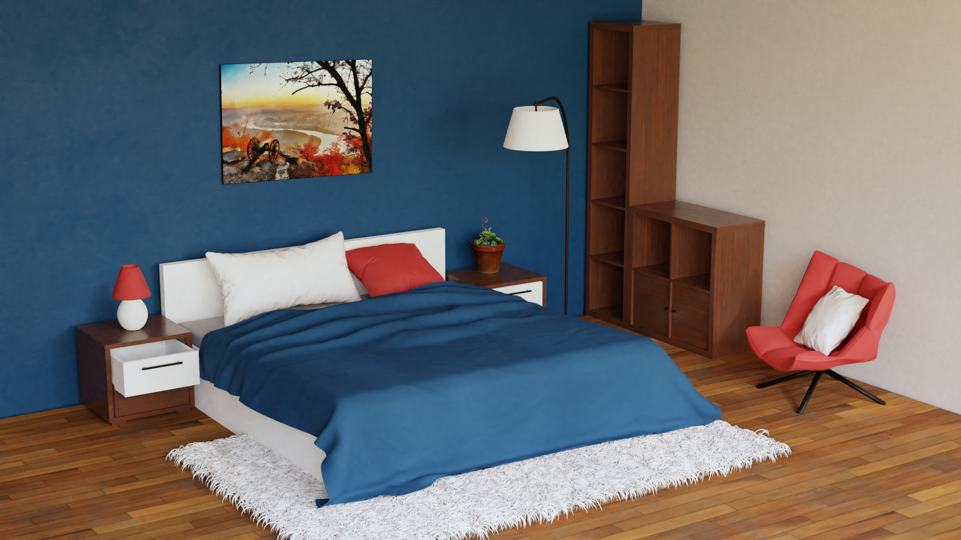
Not entirely happy with the scene right now, but I'm not sure what else I should try. I have to agree with Omar here - I find interiors more difficult to light than, say, characters. I think it's because there is less room for error in realistic renders. It either looks believable (hm...) or it doesn't. With other types of renders you are more likely to get away with "oh, that was always supposed to look like that..."
My rambling aside, this is the scene I downloaded from Sketchfab. I was going for a minimalist colour-blocking style that I keep seeing (read: I know zip about interior design). I had to edit the room somewhat (things were sinking into the floor, the window was awkwardly placed...) and I created the carpet hair because the original scene uses a texture. I also downloaded this plant to liven up things a bit. I removed all the original textures and replaced them with free ones I got from textures.com (floor, walls, furniture) and pixabay.com (painting). The bed-sheet uses a texture I downloaded when I was subscribed to Poliigon.com. Rendered in 2.79 Cycles (I have a camera issue in 2.8).
EDIT: Fixed the weird perspective
EDIT 2: Tried to improve flat lighting.

Week 4 - Act 2
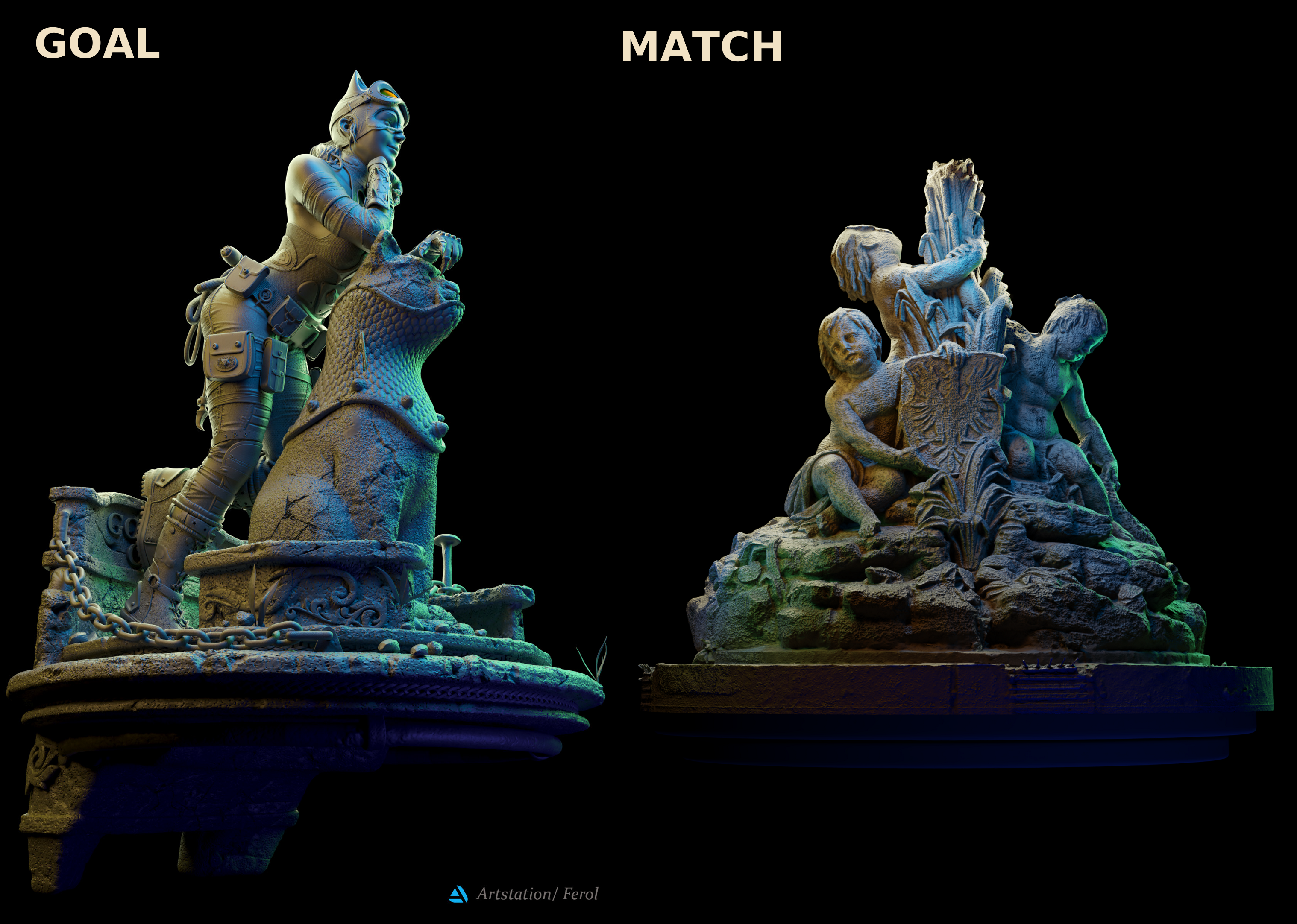
And while I'm at it I might as well post my final light matching. As I already mentioned in silentheart's thread, I was also intrigued by the catwoman statue. It's a really challenging lighting setup to imitate - I ended up with 13 area lamps... I'm not sure I can improve it, but if the community wishes, I'll have to try. :-)
The goal image is "Catwoman Statue" by Fernando Olivera, the sculpture is actually a 3D scan of a fountain right from the city I currently live in (when I found it on Sketchfab I just knew I had to use it).
![]() shiennar hey Kate. I like it trough is it me or is the wall not placed corectly. Somehow I have a feeling something isn't standing right and is tilted. When I look from the painting to the side wall of the book closet something looks tilted. But aside for that it really looks great
shiennar hey Kate. I like it trough is it me or is the wall not placed corectly. Somehow I have a feeling something isn't standing right and is tilted. When I look from the painting to the side wall of the book closet something looks tilted. But aside for that it really looks great
yyukinoh1989 I wouldn't be surprised if the wall was tilted (the painting definitely was), but it could also be focal length of the camera. I forgot to check the default one that came with the scene. I'll put it on my list of things to play with. :-)
yyukinoh1989 Ok, this is really weird. No matter what I did with the camera in 2.8, the vertical lines were always skewed. So I tried to append everything into 2.79. First, the camera was in a completely different place. But most importantly, I was able to get better perspective - without changing anything. Not sure if it's a bug or a feature, but I've re-rendered the image in 2.79. I had to do couple of other adjustments because 2.79 seems to be interpreting things differently. As the render finished I noticed that the rug now has thinner strands, but I'll fix that once I collect more issues (the main post has been updated, though).
Thank you very much for noticing that, Yukino. :-) I was focusing too much on other stuff to notice that.
![]() shiennar np it was something that somehow made it look a bit strange. Glad I could help. For the lightning and shading I really love it :). Also perfect lighting match
shiennar np it was something that somehow made it look a bit strange. Glad I could help. For the lightning and shading I really love it :). Also perfect lighting match
![]() shiennar Your light match is amazing!! The only thing I see is the greenish color in the bottom left feels out of place. In the source image there is some green on the tombstone, but it's coming from behind the model, and since yours doesn't have the same gap, it feels arbitrary, but the overall gradient is spot on. Good work. The bedroom seems like it is lacking gradients, the lighting feels flat to me. I would maybe try rotating your HDRI or even just choosing a different one to see if you can get a little more variation. There is some good texture and breakup on the floor, though I think it could use a touch more reflection, but the book cases and chair are maybe too smooth? I might try to adjust the position of the bookcases as well. Those perfect orthogonal angles look weird in a room where the bed isn't made. And look into the measurements and scale. Maybe it's just the camera angle, but everything looks like it's made for a tiny person. Just my thoughts. I also have no sense for interior design so I can't be of much help there.
shiennar Your light match is amazing!! The only thing I see is the greenish color in the bottom left feels out of place. In the source image there is some green on the tombstone, but it's coming from behind the model, and since yours doesn't have the same gap, it feels arbitrary, but the overall gradient is spot on. Good work. The bedroom seems like it is lacking gradients, the lighting feels flat to me. I would maybe try rotating your HDRI or even just choosing a different one to see if you can get a little more variation. There is some good texture and breakup on the floor, though I think it could use a touch more reflection, but the book cases and chair are maybe too smooth? I might try to adjust the position of the bookcases as well. Those perfect orthogonal angles look weird in a room where the bed isn't made. And look into the measurements and scale. Maybe it's just the camera angle, but everything looks like it's made for a tiny person. Just my thoughts. I also have no sense for interior design so I can't be of much help there.
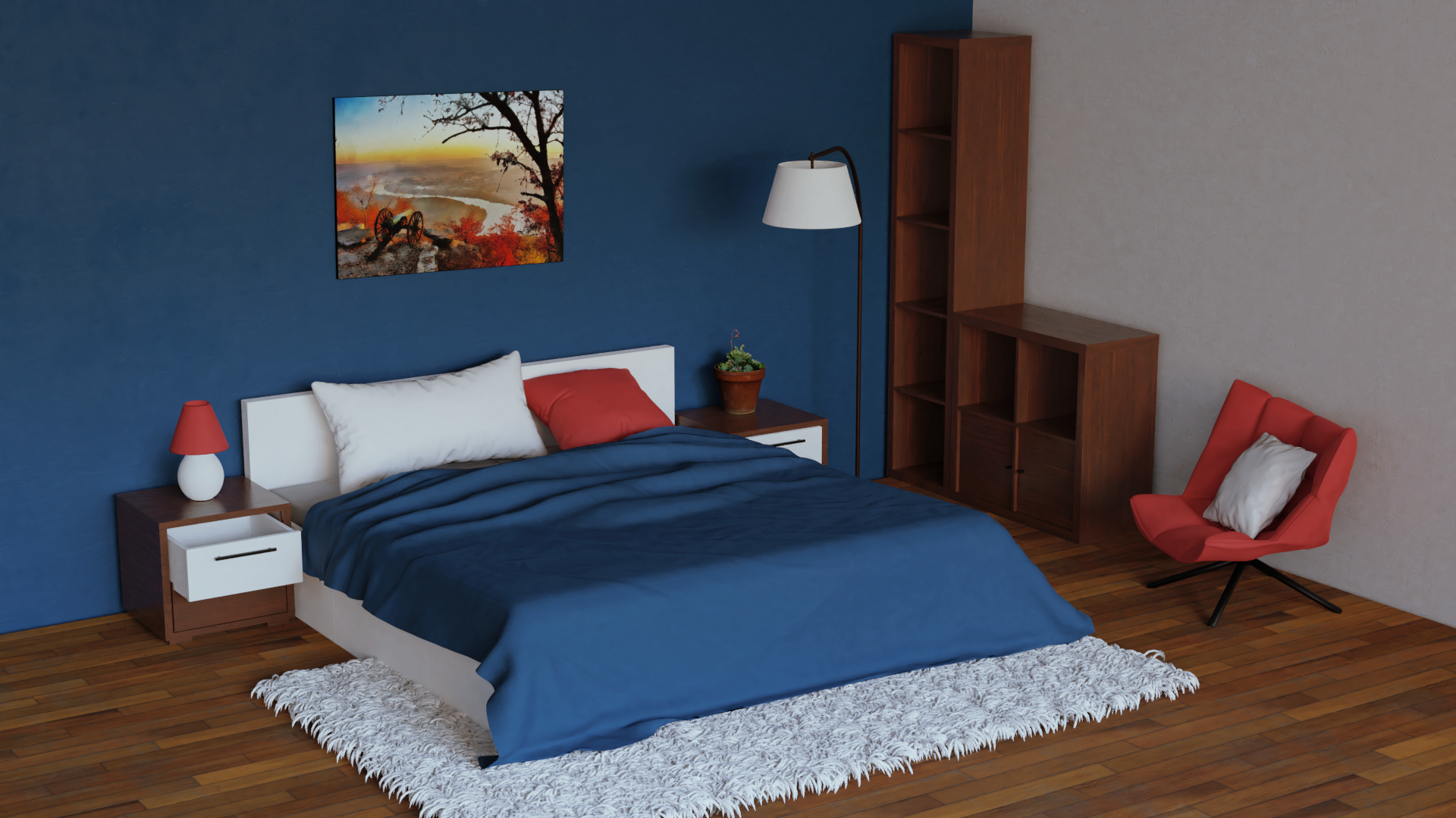
OK, I had another go at the interior lighting, but I'm not sure how successful that was. I created a new window wall and I used a plane with cell noise to simulate the curtains (the effect is not directly visible with this HDR because it doesn't have bright sun). I've improved the rug hairs and did a couple more tweaks. Generally, I tried to go for a darker look that matches the lighting in my room right now (overcast autumn day). Here is a comparison:
 |
 |
![]() shiennar Maybe it is a typical choice selecting the brighter image, but somehow the color world of the room looks better as it has some vibrant energy, while the dark one associates a really rainy day outside :-)
shiennar Maybe it is a typical choice selecting the brighter image, but somehow the color world of the room looks better as it has some vibrant energy, while the dark one associates a really rainy day outside :-)
Which the most of us does not wish too much as default, except in the Twilight films (which anyway I like very much, but so rather in the film :D )
![]() shiennar Your light match is as close as I've ever seen one. Fantastic investigative lighting work on a unique, uncommon light setup! One of my top favorites of the whole class A+
shiennar Your light match is as close as I've ever seen one. Fantastic investigative lighting work on a unique, uncommon light setup! One of my top favorites of the whole class A+
Your arch viz reads pretty believable. You've more than proven your ability to light and shade well, and it's true here as well. My critique comes from the camera angle mostly. It feels like an unnatural placement: Too high to be a eye-level, but not high enough to be a more extreme, artistic angle that we sometimes see in notable arch viz renders. The focal length also looks a bit high to be realistic. Either the room is massive or there are no foreground walls to limit the camera's location. So it ends up feeling like a set for a play more than an actual bedroom.
Does that makes sense? Am I guessing right that there are no foreground walls?
Its a B+ from me.
PS: I can't thank you enough about cutting reels together again this month. You've truly created a class staple! I fully intend to incorporate an automated slideshow system in the future that mimics what you've started.
@theluthier Thank you for the tips on the interior. I didn't really consider the camera angle, I was too focused on keeping things consistent with the original scene I downloaded. The focal length is 50. I've never dabbled in photography, but I found advice on Blender forum claiming that this was standard size and could be used for interiors (or anything between 35-50). Although I just searched again and the proper photography forums recommend 24-30. My bad. :-)
This is what the full room looks like.
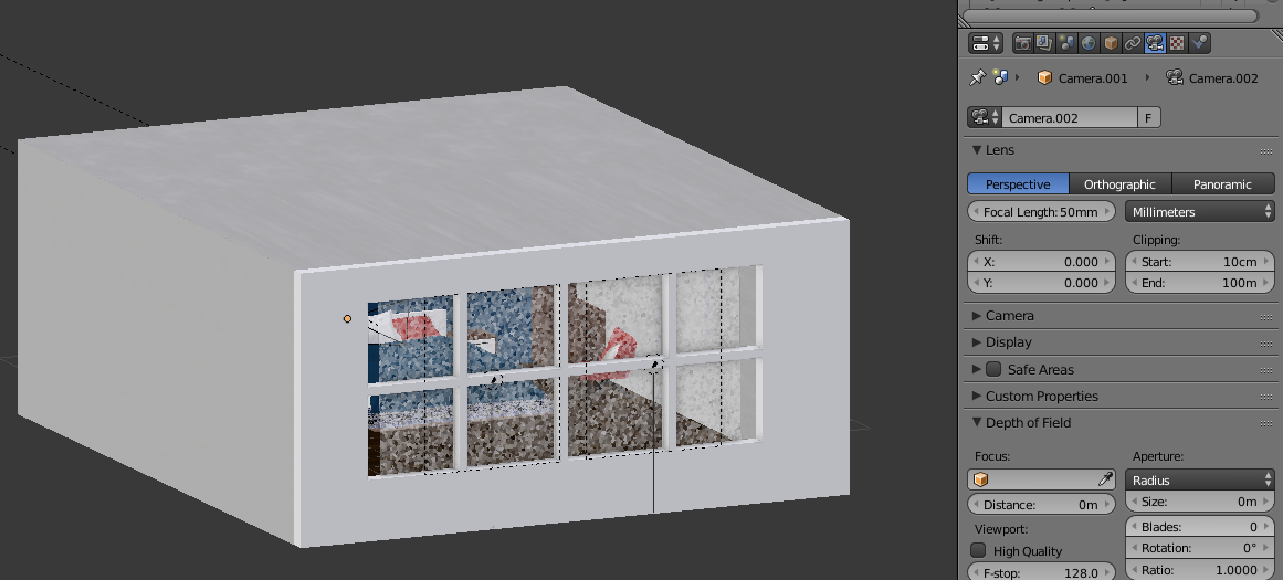
There was a small window originally, which I replaced with the window wall (and the "curtains"), but it is a completely enclosed space. The room size is 7x8 metres, so I guess that can qualify as massive for a bedroom?
![]() shiennar Hmmm that was my best diagnosis but 50mm isn't unusable in an interior space and your room is enclosed...I suppose my eye isn't quite sharp enough to make water-tight judgements about camera settings lol. Still I think the main issue lies in the camera. Just something to keep in mind.
shiennar Hmmm that was my best diagnosis but 50mm isn't unusable in an interior space and your room is enclosed...I suppose my eye isn't quite sharp enough to make water-tight judgements about camera settings lol. Still I think the main issue lies in the camera. Just something to keep in mind.
Oh also try a sun lamp instead of an area lamp. While I recommend areas for nearly all other types of lighting, I do recommend sun lamps for sunlight.
@theluthier I'm actually using HDR turned up to some ridiculous amount (8, if I remember correctly), the area lamp was there to make the curtain effect more visible, but I ended up not using it in the end.