If you're like me, as you scour the internet for inspirational 3D art, you run into some amazing CG lighting setups. You know, the ones that make you want to be better! Well why should we let them have all the fun? Why can't we give it a go?
Therefore, the challenge here is to select one of your favorite lighting examples and do your best to match it in Blender. If you don't keep a collection of your favorites, feel free to use mine. Analyze light colors, number of lights, position, etc and recreate. Use either lamps or HDRi's or both - whatever you need to get the result.
Once you select your favorite, open up one of your models (or download this posed Baker model), do your best to match the lighting and materials, and post it here. Here's my attempts:

Original by Julien Kaspar
Source render by Bruno Ortolland

Image Credit: "Lüfor"by Alexandre Aroul

Image Credit: "Super Mario" by Mark Henriksen

Image Credit: "Sci Fi Pilot" by binqi chen

Image Credit: "Female sculpting session 01" by Daniel Crossland

Image Credit: "Tribal Frog" by Paul Braddock

Image Credit: "Danbo in Autumn" by tomatoes
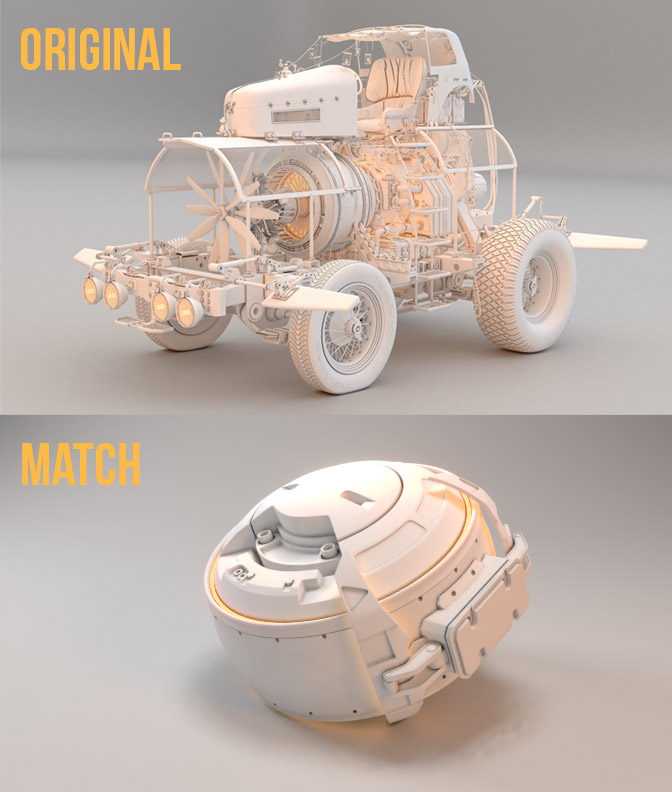
Image Credit: "The Mad Professor's Ride" by Ruairidh MacNeill
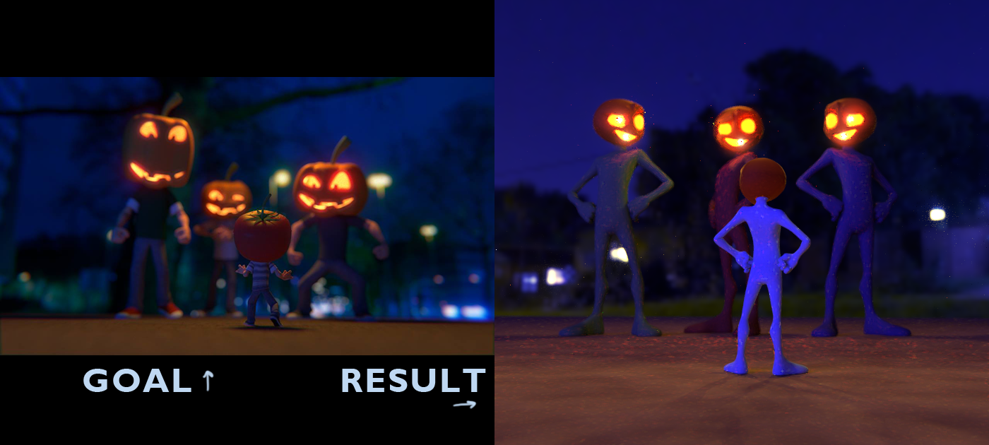
I should be in bed, and I will soon be. BUT I thought I'd try this lighting match for Halloween! The HDRI is from Greg Zaal. The image is from Fernando Telles: https://www.artstation.com/artwork/V8Kvn Also, I did a TINY bit of post-processing with the glowy face part, in Photoshop.
I'm miffed because I tried getting rid of the noise, the fireflies...I think I made the fireflies worse, but I can't retrace my steps now! Also, the lighting is a bit complicated here; I wasn't sure where a lot was coming from. Looks a touch more purple than I meant. The glowing orifices were tough because I still need to figure out how to make lighting work and not go through a mesh... So many issues...
But I came kind of close! That's great... What can I do to make it better? :D
Second submission, jjazze - Excellent! You mentioned something that I agree with: The goal you chose doesn't have the most discernible lighting in the first place. By my estimation, it's got a low-light HDRi and a top-down lamp. But I'm not 100% sure because the lighting doesn't feel particularly impressionable to me. Which would make it difficult to match. You did a pretty good job of it though.
Here's my second attempt using the goblin I finished sculpting this week. I believe the chat named him Arnie Goblinenager or something 😆
Goal image: "Female sculpting session 01" by Daniel Crossland
Great work with the sculpt Kent! , and the lighting suits him really well . I started to sculpt the head on mine at the weekend, hopefully ill have something worth showing this weekend when I get a few more hours at it :)
Looking good there Arnie. So awesome with that lighting and tone. There seems to be only one light at the front, according to the shadow... was the purple tones in the dark areas with RBG Curves in post?
So here's my third exercise, I got some insights while working this bad boy... that lighting is a lot like painting, it's light-painting. You turn off all the lights, then you just light up the scene with only one light to see what it is contributing, what reflections it is pinning, what bump maps it is highlighting... when you are satisfied to its contribution, then you turn that light off so there is no more influence and you turn on another light you have in the scene and see its influence and reflections is pinning, etc... and light by light you start to paint the reflections you want. In the end you turn on all your lights, see if they work in unison and you have your scene lit up. Some post production to crank up the contrast and try to set some realistic de-saturated tones and hopefully those are good choices and it looks good.
![]() dostovel There's one key light my scene: A bright orangy-yellow one from [screen] upper left. But also there's a very subtle blue fill/rim light coming from [screen] right. I see one suggested in the example particularly on the back of the thighs in the example.
dostovel There's one key light my scene: A bright orangy-yellow one from [screen] upper left. But also there's a very subtle blue fill/rim light coming from [screen] right. I see one suggested in the example particularly on the back of the thighs in the example.
And yes, I definitely boosted the purply-blue levels of the dark spectrum with the compositor.
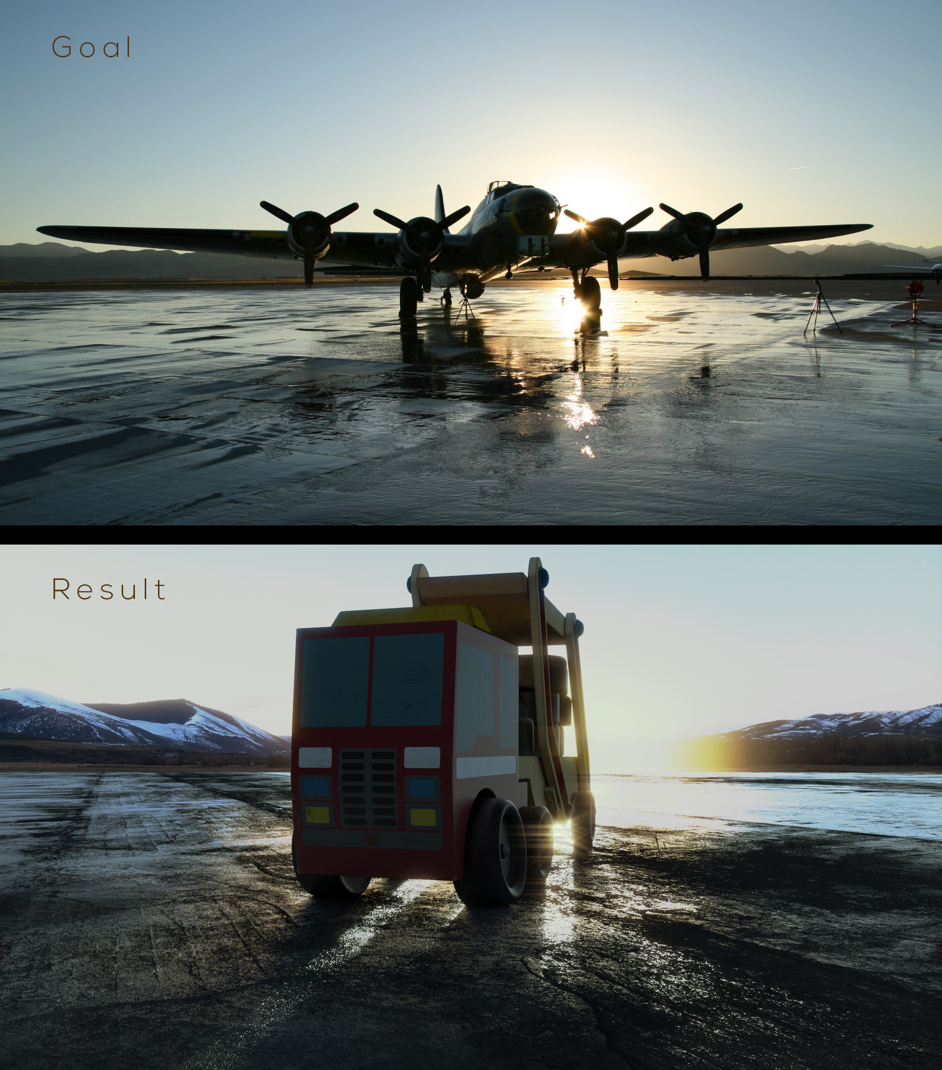
Oooo very pretty 3rd lighting match, Omar! That ground texture is pretty spot on. Love the wet glossy breakup. Also the mountains, sky, sun - it's all really close. Great job!
I've got 2 critiques. First is the vehicle model. It's kinda funny being so simplistic, which may be the intention. But I think it detracts from the effectiveness of the lighting. Something more complex and realistic, like the airplane, would do the most justice imo.
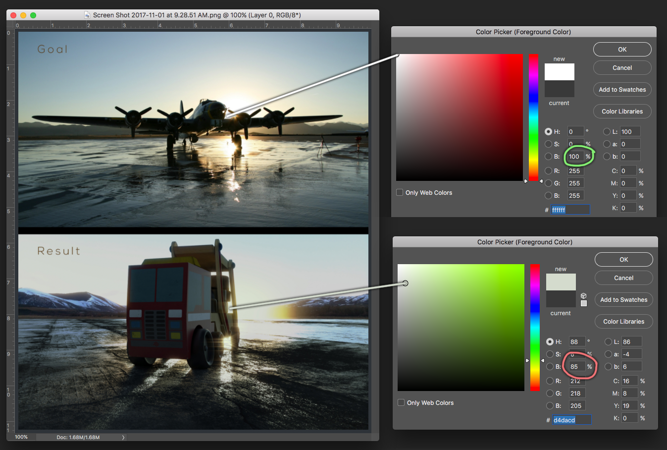
Secondly, the brightness of the sun is dimmed in your render. Feels kinda like the viewer is wearing sunglasses. Compare it to the 100% brightness in the example and the 85% in yours:
In my case, Jasmine, since I wanted to have the ground reach far into the horizon, I had to do a composite of many textures in photoshop, a massive HD texture map with enough of variations, so I could avoid the always noticeable tiling effect if I use just a single texture. The ground plain was too large and with a single texture pixelation is visible very quickly.
Kent, oooooh, that's right about the glossy roughness! ...I almost forgot that I'd done that! Thank you for reminding me!!
Omar, that sounds like a good amount of work, and I should try that as well sometime! It looks very convincing! :D
Man!! I wish I could watch one of those live streaming videos, because there will be a lighting match one. But I'm SO glad we can participate here!
You guys are doing really nice stuff!
I'm just warming up here...
Here's the original photo by Dean Kezan
Here's my result
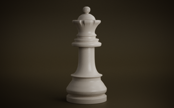
Welcome to the challenge ![]() michalzisman - Excellent first entry! You nailed it. Love the chess piece too. Jasmine seems right about the extra touch of red in the background. But that's nitpicky 😜
michalzisman - Excellent first entry! You nailed it. Love the chess piece too. Jasmine seems right about the extra touch of red in the background. But that's nitpicky 😜
I guess it's up to us individually if we want to fully emulate the exact image, but in my mind it's more of a "see if you can emulate the feel, character, atmosphere, overtone" kinda deal, instead of 100% xerox it.
Very cool challenge everyone's work so far is great.
Here is my reference a great piece by Julien Desroy https://www.artstation.com/artwork/Gmm4W
Mine doesn't have a large flat top surface to soak up the light as his does but it works. It was a lot of back and forth trying to balance the green and blue tone. Think mine is a tad bit on the green side