Nice work ggamparing !
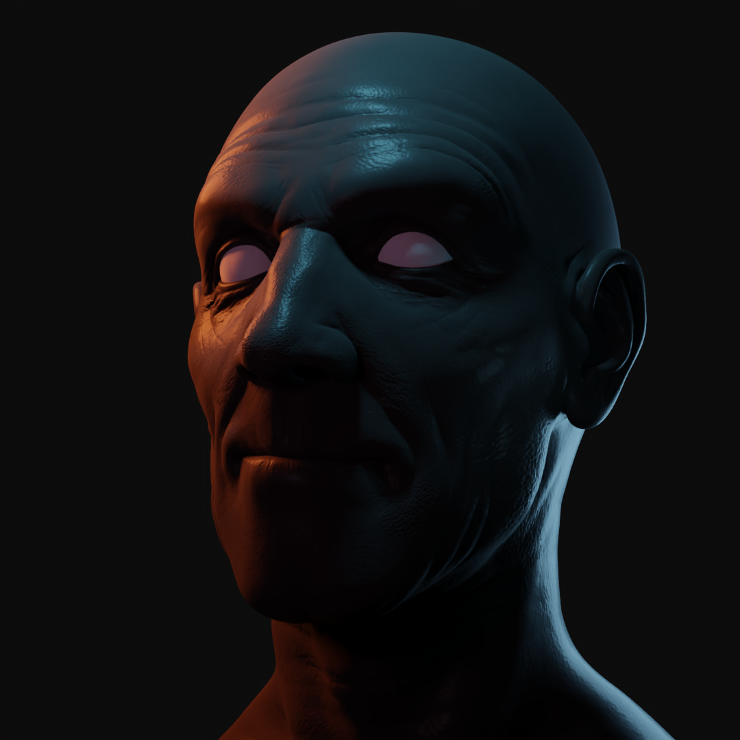
I think you nailed the colors of the lights and the directions they're from, and the resulting renders look good on their own, but they depart from the mood and vibe of the originals quite a bit. The way light hits a face conveys quite a bit about the story the photographer is going for and I think you've just barely missed it on these.
If you were to give this another shot at some point, try to mimic exactly which areas of the face are lit, even if the camera angle is different. You may find it helpful to move the camera into a similar position as the photo.
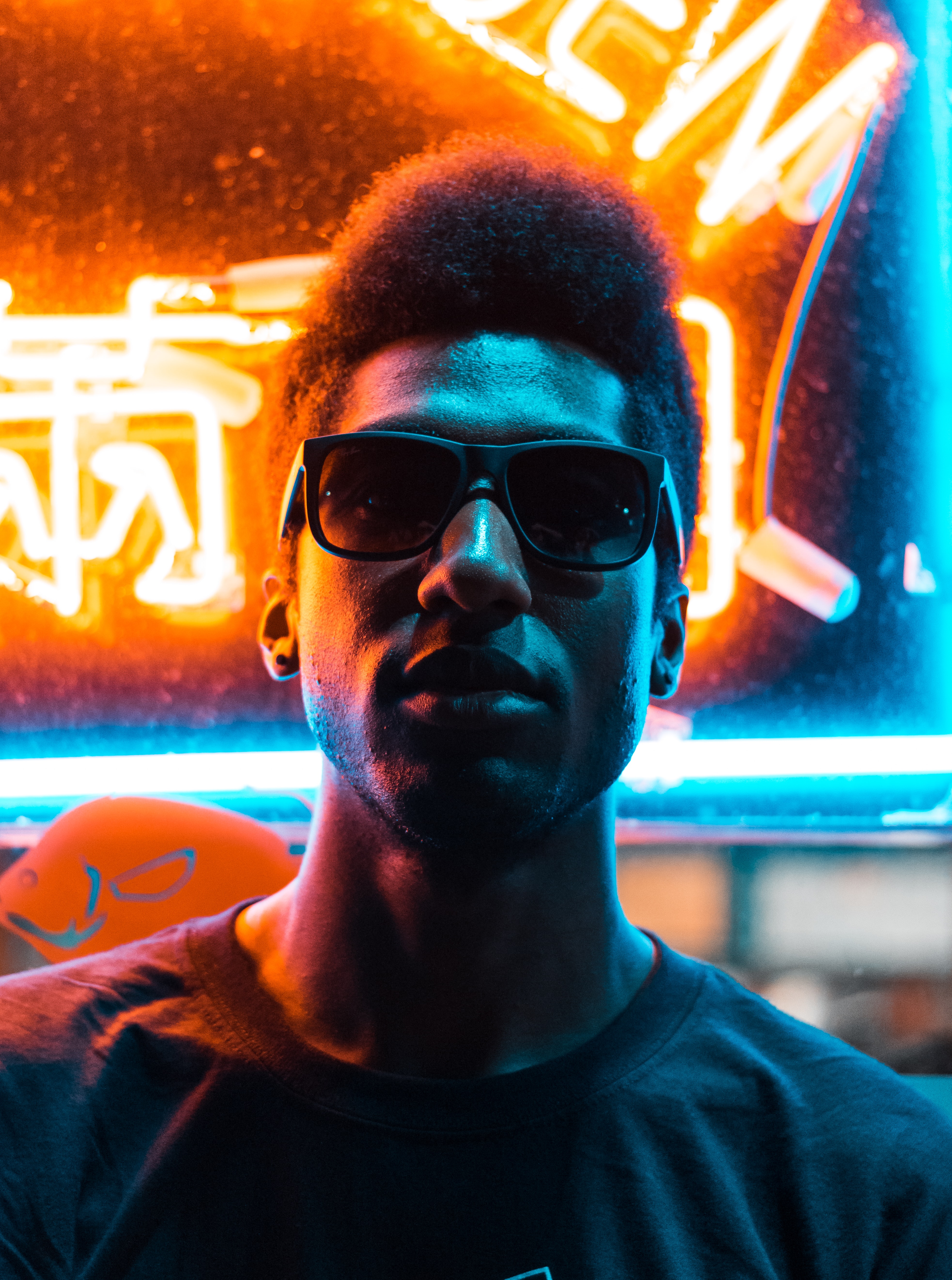
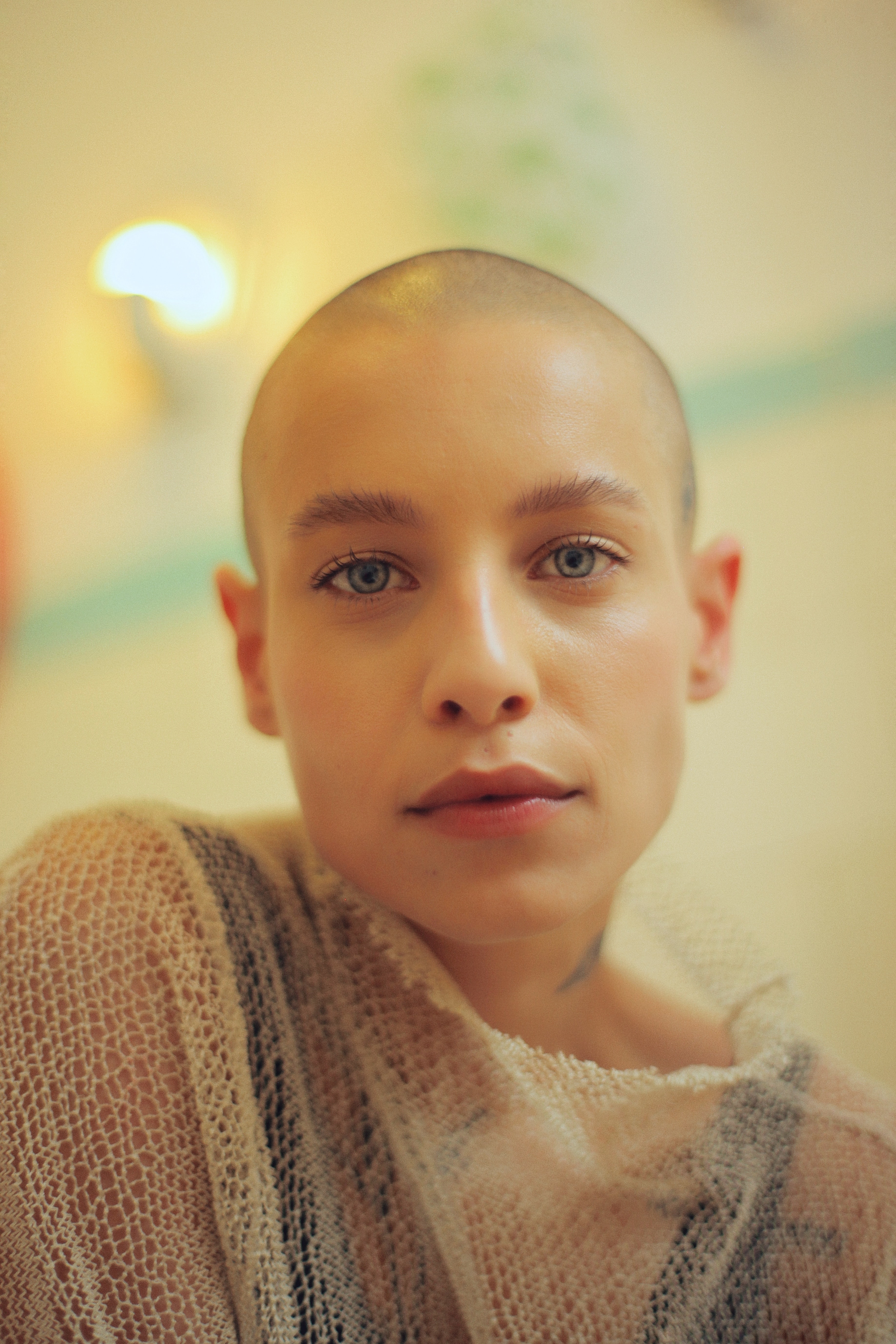
In the first, the colors should be bright and bold and bursting out of the photo. You can mess with the high contrast look, exposure, and gamma in the color management panel to help with this.
The second is spot on - maybe just a bit too bright.
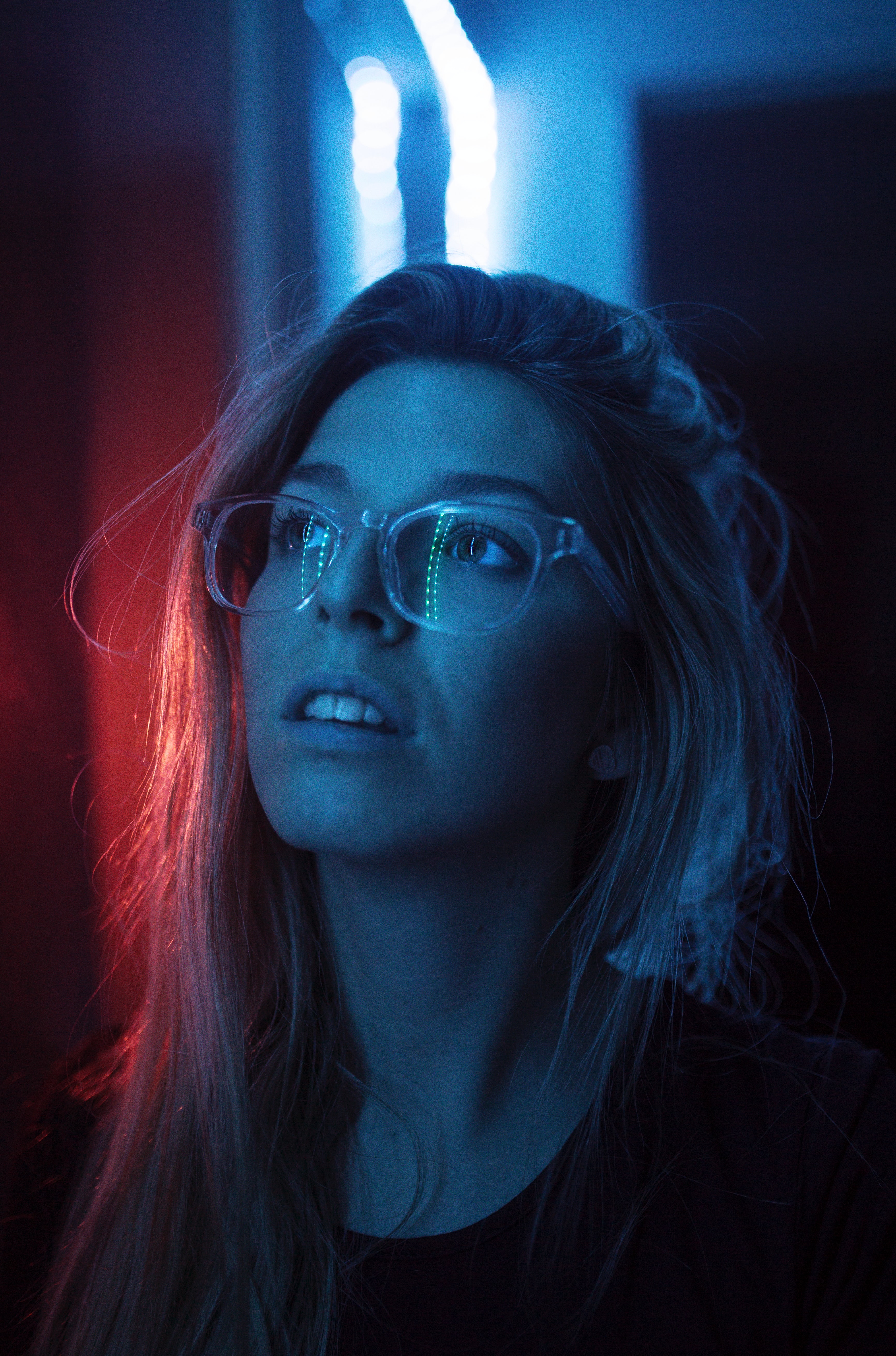
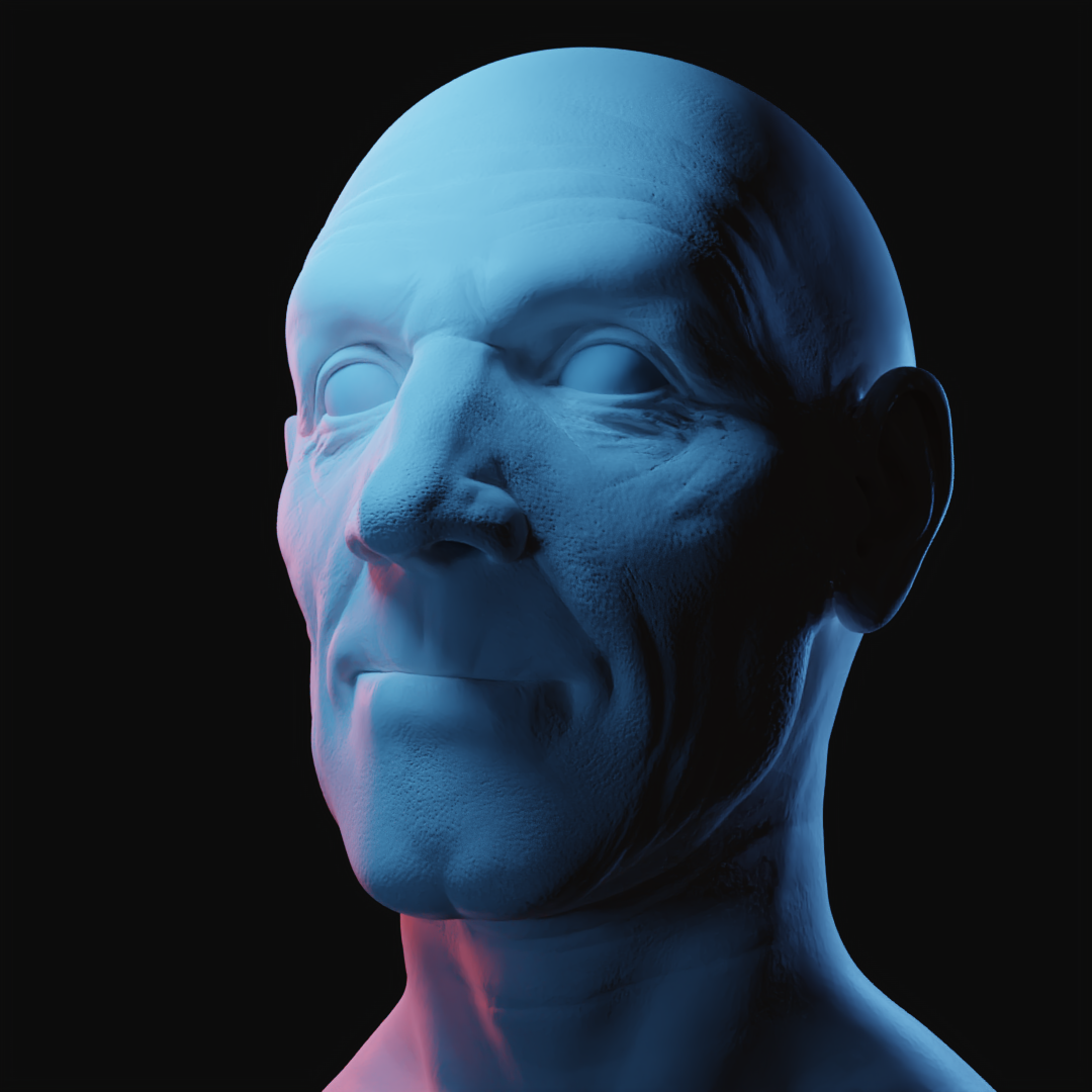
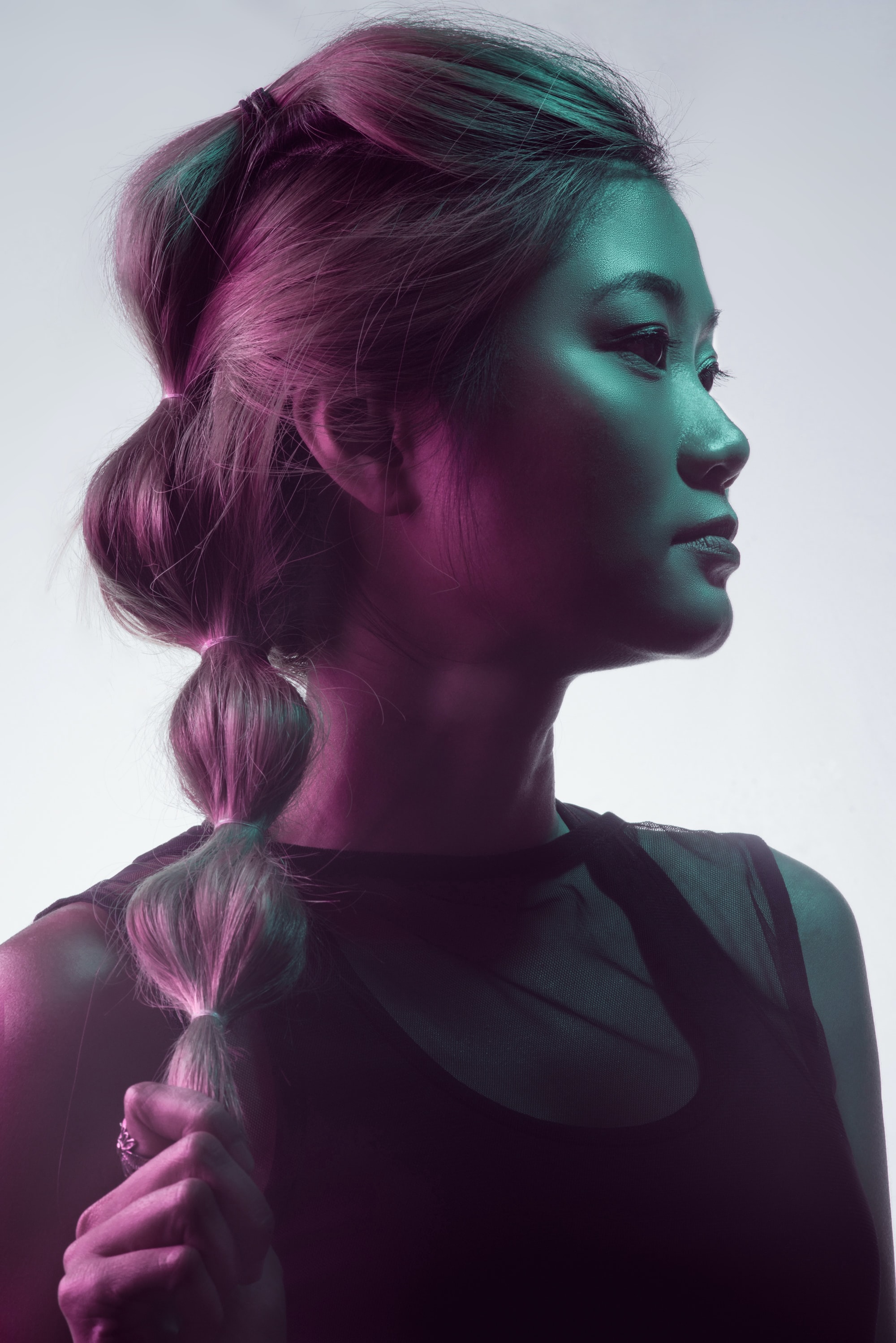
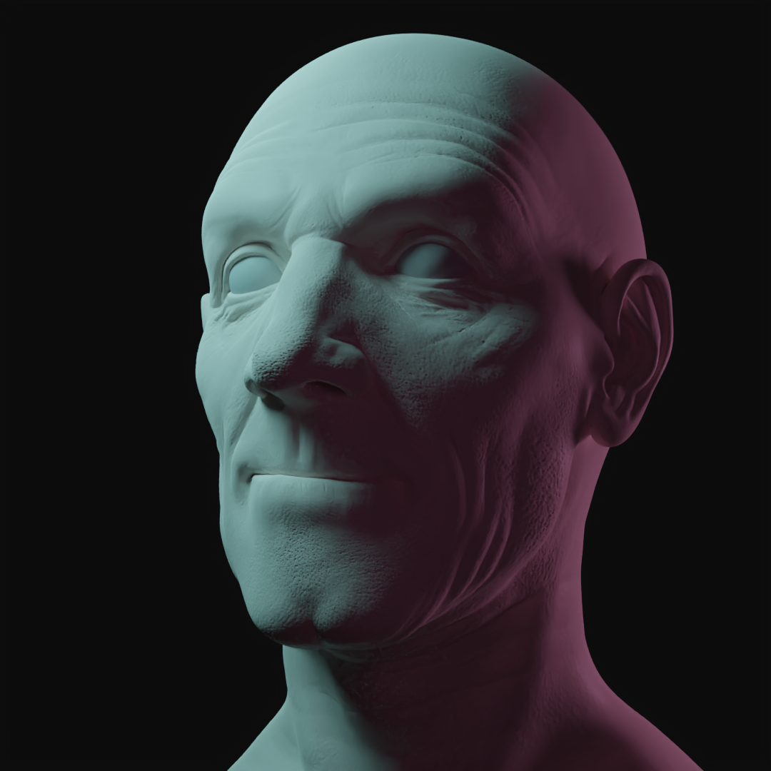
For the third, the harsh shadows change the mood completely. Try to see if you can still have the main source of light come from the top right, but make it very soft and chase away the shadows with the environment. The rim light that's in the background would help as well.
Number four is great! Nice work keeping it subtle.
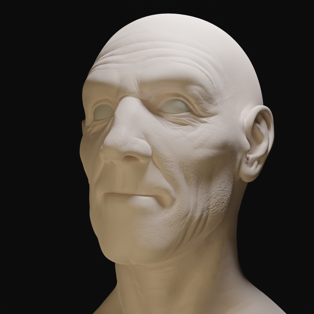
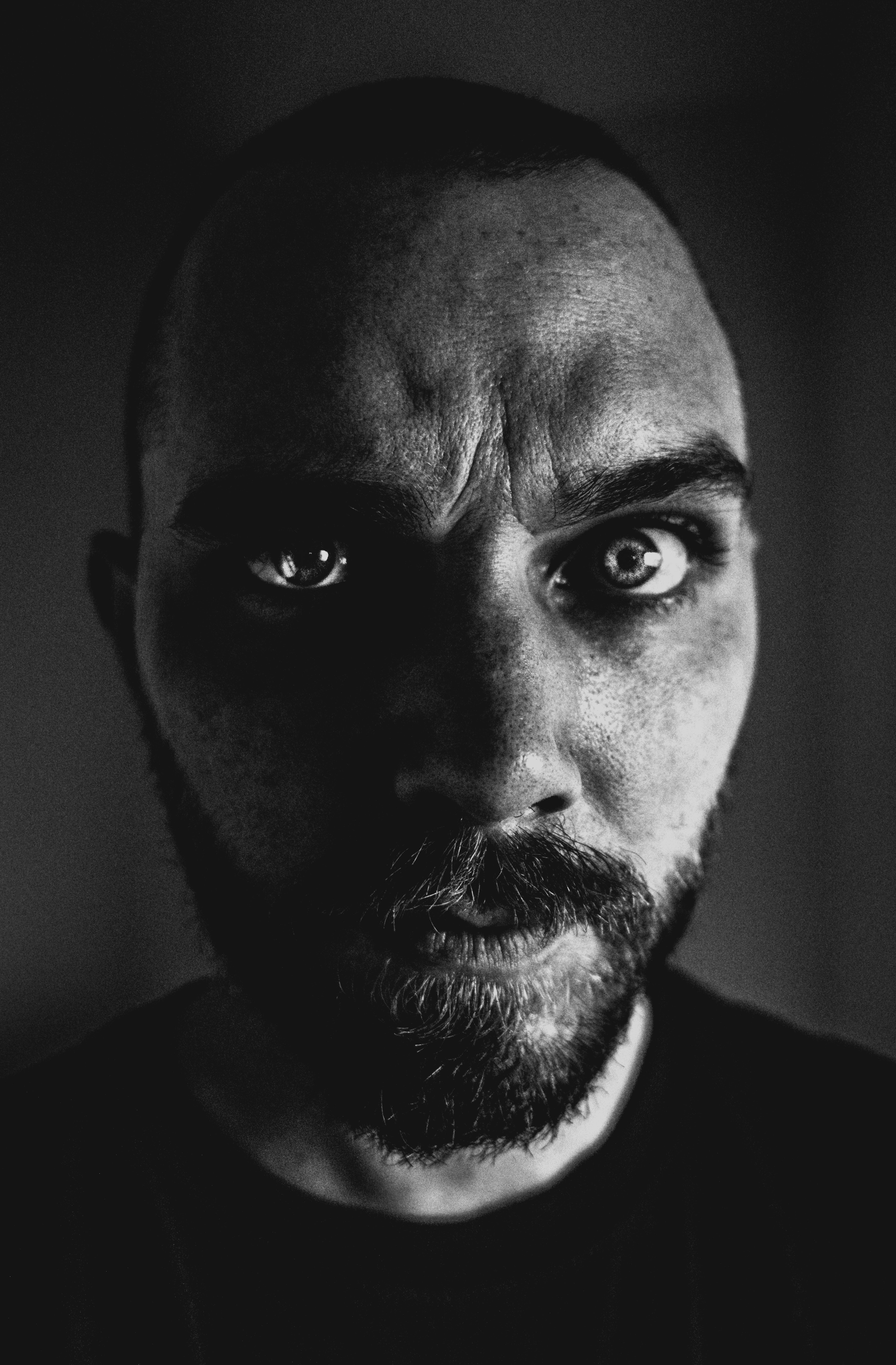
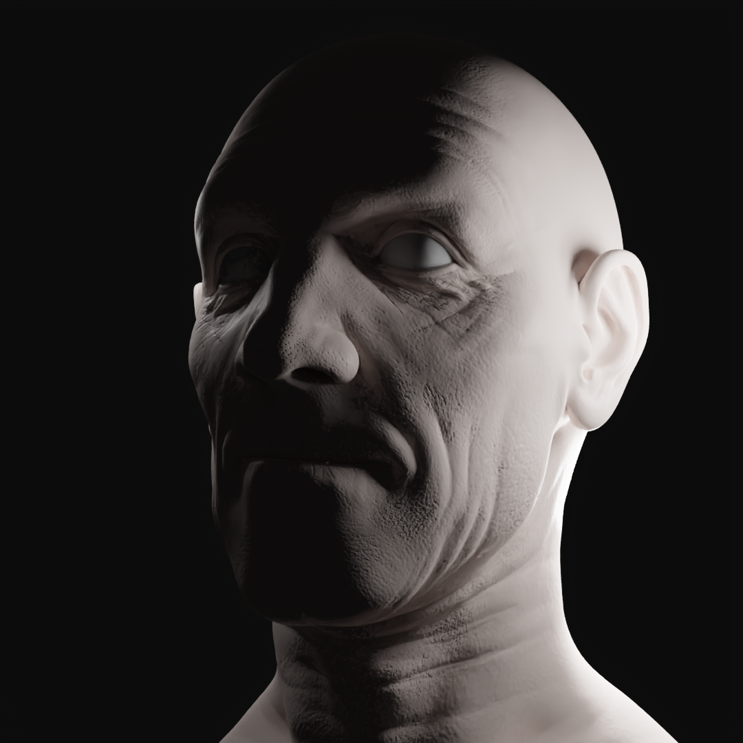
For five, the camera angle plays a big role, but also the fact that the light is hitting his forehead rather than the side of his head makes a really big difference. The photo seems to be conveying a sort of wounded anger, while the render looks like a stern and powerful figure - almost the opposite.
Hope that helps, you're definitely on the right track, and keep up the good work!