Nice work Sebastian! Those are awesome :) Here are a few notes on each:
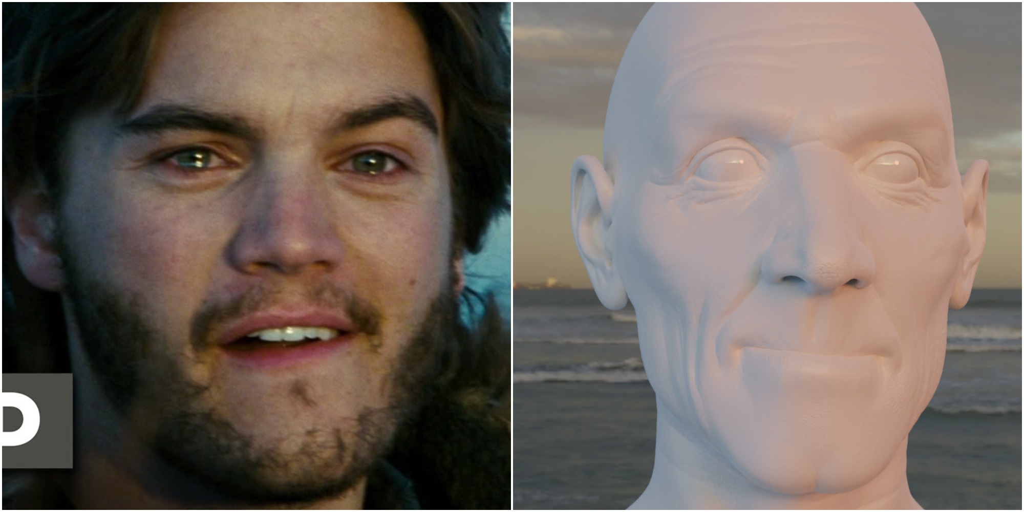
- I think this one is pretty spot on. the skin texture and material makes quite a lot of difference in terms of the color and feel of the image so it's hard to compare directly, but I think you nailed it. The only slight difference I see is that the warmer light is coming more from the front than from the side, since his cheekbone on the right side has the cooler light of the environment as well.
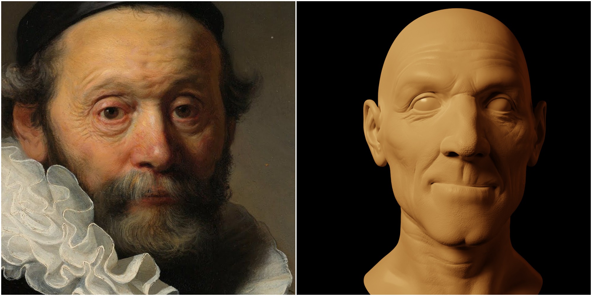
- Rembrandt - also excellent. I like how you captured the subtle rim on the right. It's interesting to note in the painting that his ear is fairly dark compared to what it would be if it was lit directly. I'm sure his hair and puffy collar contribute to blocking some light, but I'd bet he's using that to focus more attention on the main part of the face, almost like a subtle vignette.
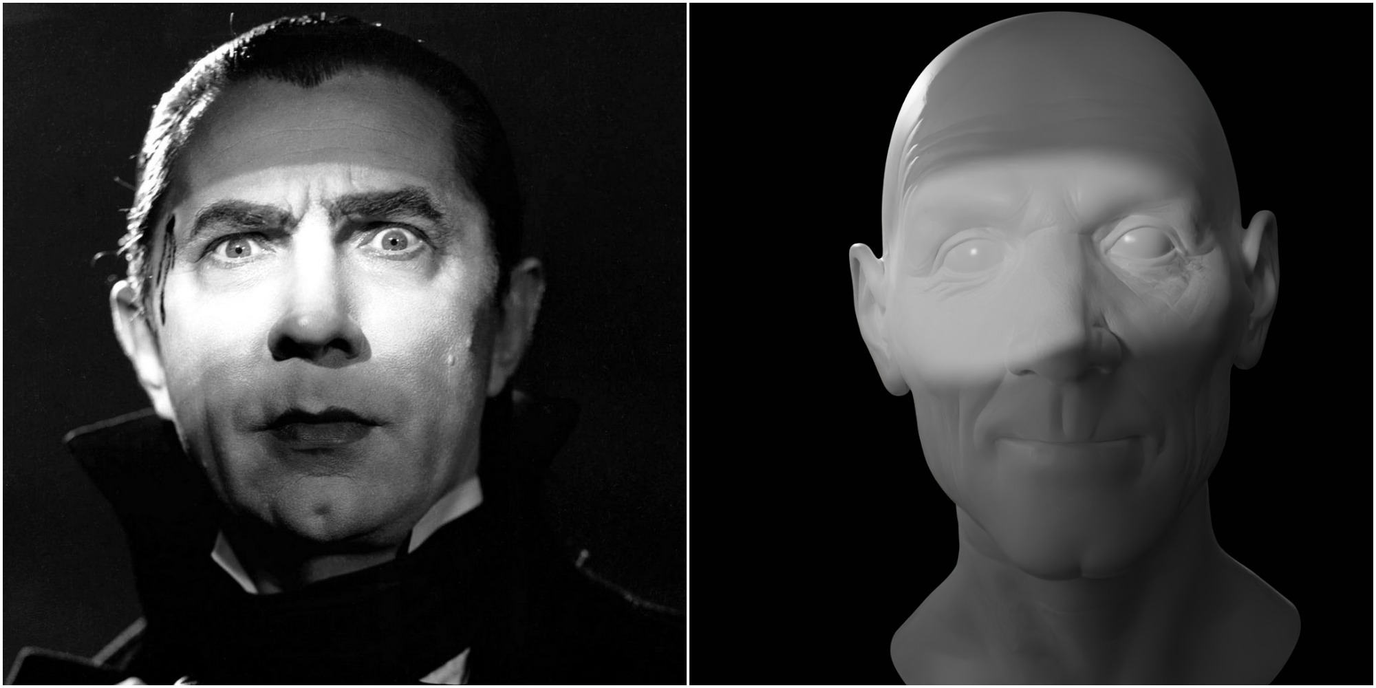
- Dracula - The original is pretty blown out, of course because it's older and the dynamic range was pretty low, but there's also some lines of texture being thrown across his face. Check out how sharp the line is at the top but how soft it is at the bottom. I think mimicking that type of exposure and using a texture (or objects) for the lines would really help.
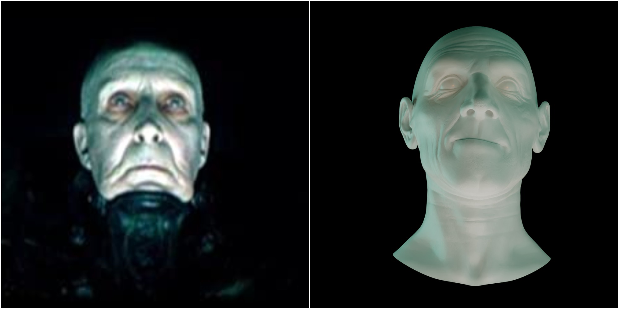
- Dark City - Great shot! Here I'd recommend brightening up the light coming from underneath. It looks like it's coming from the chin thing around his neck (I haven't seen the movie), so you could try using an area light and sticking it right there as well. Secondary, blue-ish colored lights that are a bit more dim could help fill out the rest. That color is doing a lot of work to make his skin look unnatural and sickly, which helps the creepy vibe.
Hope that helps! Keep up the good work.