I'd like some feedback on my sculpted head. It feels a little off whenever I look at it.
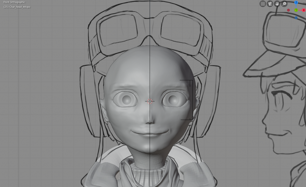
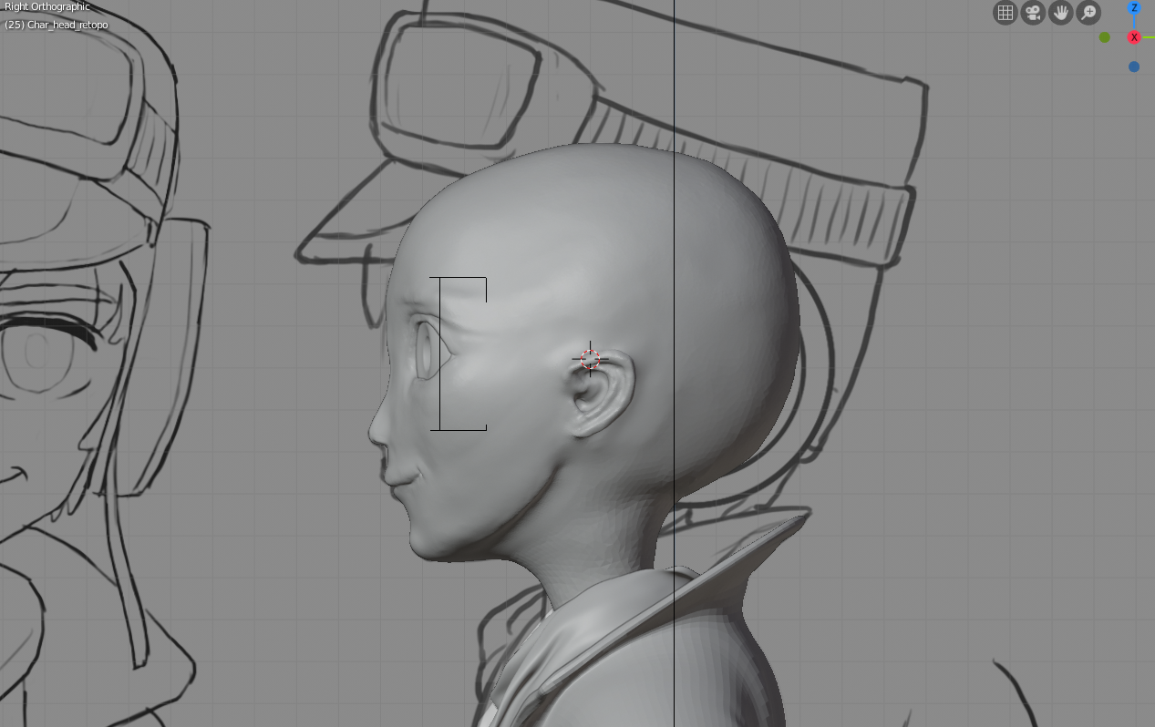
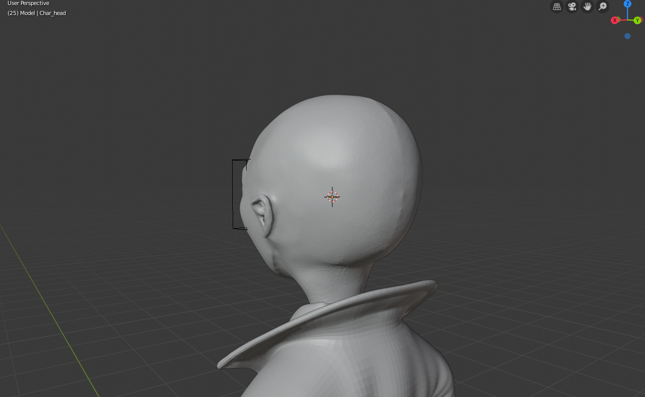
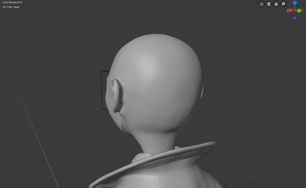
One thing is that the cranium is way too large in the back of the head. Generally, the distance from the chin to the brow and from the brow to back of the head should be similar.
I also think the ears are too small. On a realistic head, the top of the ear is usually as high as the brow. On a stylized character you can change it a bit of course but this seems like too much of a change to me. I also think you could make the earlobe go at a slightly larger angle away from the head.
You have the corner of the eye in the middle of the height of the head, which is correct, but since the eyes are so huge, it makes the forehead seem too small. I would probably move them down a bit.
The temporal region also seems a bit too slanted, I think it would look better if it was more vertical.
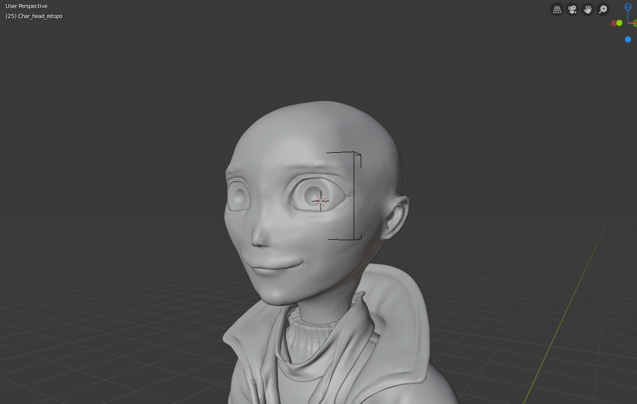
I think maybe you aren't departing from reality quite enough. The 2 main things that stand out to me are the flatness of the face (push it's dimensionality in the y-axis) and the flare of the neck as it comes up to the head. It's a stylized character so I would have the neck keep a more cylindrical shape and don't worry to much about it connecting to the head with anatomical accuracy. With the face it looks like maybe you spent a lot of time in orthographic view matching the artwork. Put it in perspective and play with the eyes, specifically the distance between them and the depth of the ocular cavity. I would also try pulling the mouth corners back in y, and making the lips more readable across the whole mouth. In general, make the face "rounder": put some good curves in the brows and cheeks. Here some examples of good stylized faces: Miss Seagull and Magus. Hope this helps.
The flatness of the face and the depth of eyes are a great point. The point about mouth as well. I would also add that the nose and the are between the eyes is lacking definition.
But I wouldnt say that the problem is not departing from reality enough, that depends only on the artistic decision of the person making it. And anatomical accuracy is important even with a stylized character. If you look at the two characters you linked here, I think the reason they work so well is because they are grounded in anatomy, even though they are stylized a lot. Look at the girl model for example. The proportion from eyebrow to chin and from eyebrow to back of the head is still there, its just partly covered by hair. The jaw ends in the middle of the head from lide view. The arch above the eye and below the eybrow is very clearly defined. So is the nose - the nostrils and the plane on the bridge of the nose. You can see the shape created by the muscles around the mouth. And even though the neck is super thin, it still connects with the head in the correct place.
Thanks for the model references and feedback! I've tweaked the sculpt a little more with said feedback and I think it looks a lot better now. I would like another set of eyes to take a look to see if I need to tweak it a little more.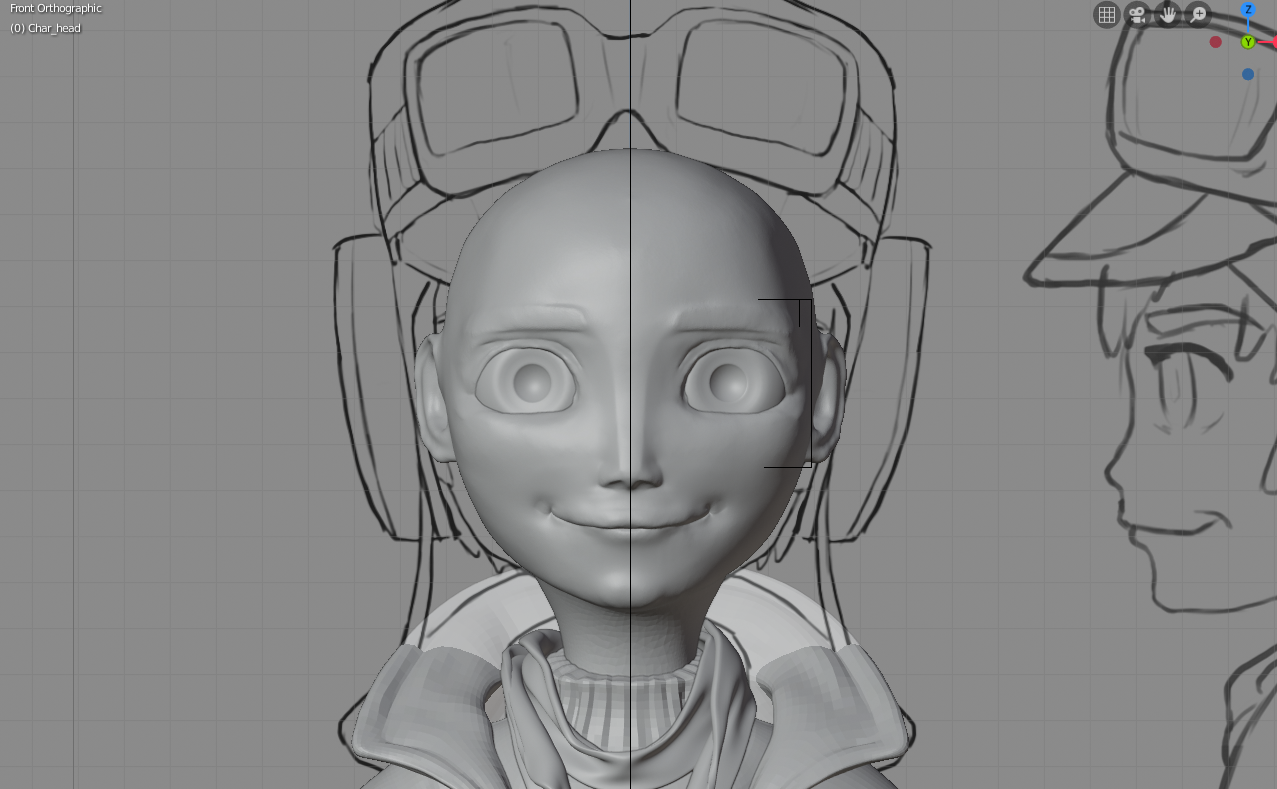
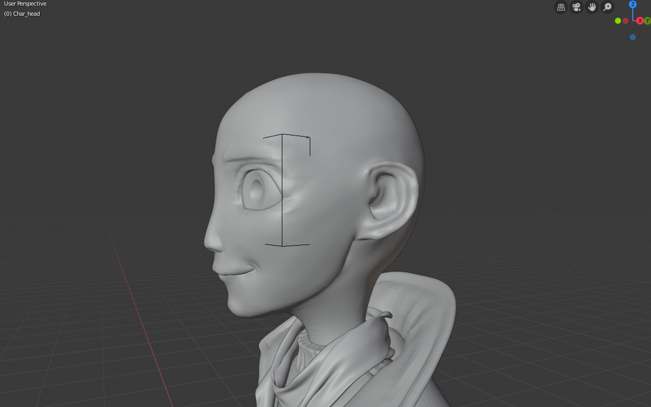
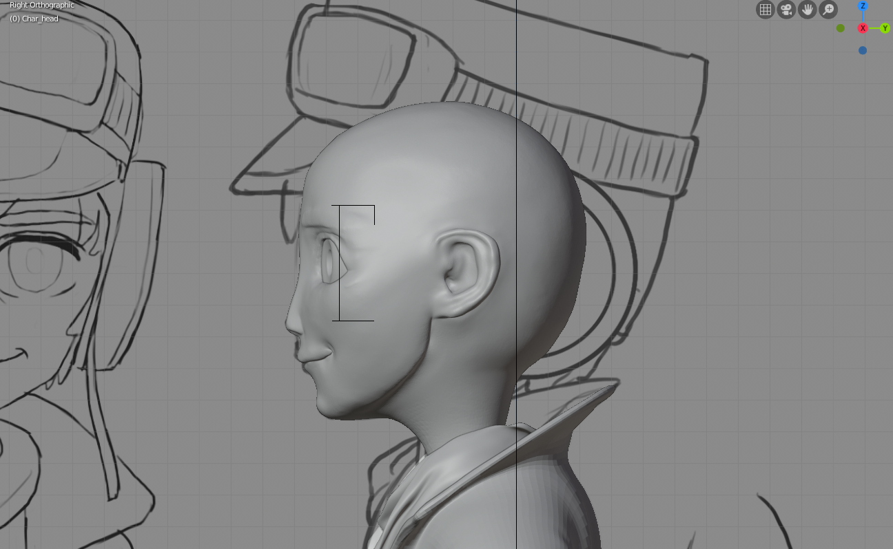
I would dig the cheek area right next to the nose in a bit more so the nose is more pronounced. I would also pull the area of the nose right above the bridge a bit in, the curve is too straight now in my opinion. Also I think the bridge of the nose from the front is too wide at the top. I think it looks better now that you made the front plane flatter like this, but the curve of the edge from front view looks a bit weird to me. I would probably make the bridge get narrow faster as it goes from the top and then make the edges run almost parallel. If that makes sense :D
The ears also need more work, but they are probably gonna be hidden under the helmet so it probably doestn matter that much. It would still be good practice to make them look really nice though. The head also looks weird from the back view, though I dont really know how I would fix that. :D
I would recommend that you collect a lot of reference images of both cartoony and realistic female heads, as well as some anatomy drawings with highlighted planes of the face. If you study those, you will probalby find a lot of similarities in structure. Try to figure out which anatomical features artists used in the cartoon artworks and which one they ignored. Id say they probably use most of the realistic anatomy and just make it stylized.
But I dont really know, thats just how I would go about it. I never made a cartoon character like this. I just know that having a lot of different reference images is always a good idea.