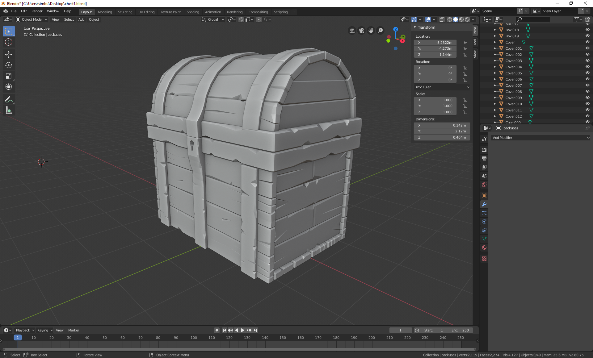
Jumping into homework train with my chest. Still missing some details but should finish on time.
It's good to see you in class again ![]() svetimas! Your chest looks great. Perfect execution of the course 👌
svetimas! Your chest looks great. Perfect execution of the course 👌
My only recommendation is to de-straighten everything and play with the proportions via lattice. I demonstrated this in the last video in the course, but it's kinda hidden (not in the lesson title). I think it helps push the model more into the fun-loving style.
Still that's just a small note. Overall you've earned an A this week 👍
@theluthier thanks for grading and the tip! I'm still on chapter 2 :D Definitely will use tip, the chest looks so much more stylized and interesting.
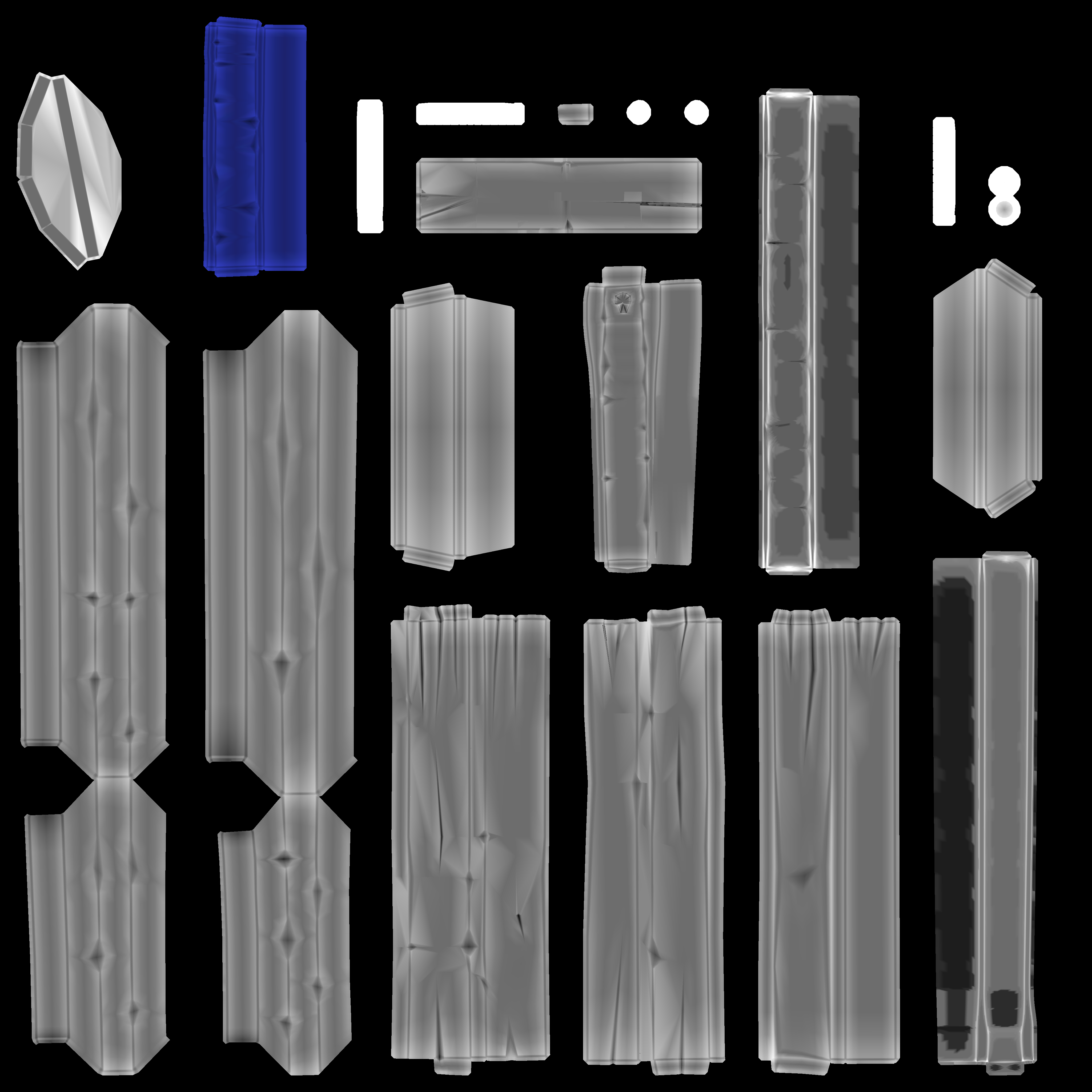
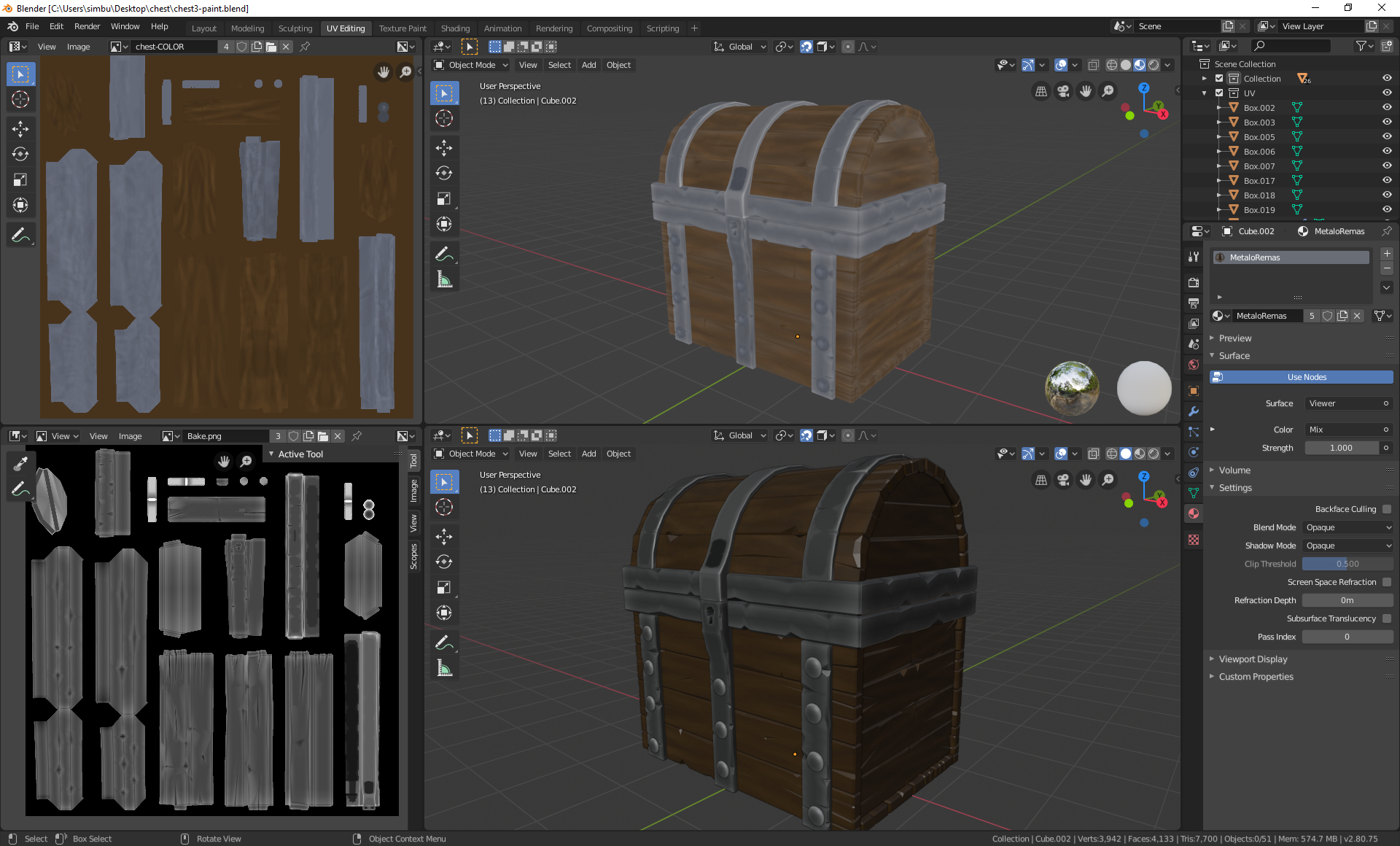
Catching up with texuring part. I had some issues in vertex paint mode that one of my chest part was blue and I havent any clue why do this happen. I have reloaded my first version of the chest with this part and it was blue in vertex paint mode already.
The only way I overcome this issue I put a color ramp separately in baking material for this part.
![]() svetimas I believe the dirty vertex color operation simply adds lightness and darkness over the existing color. By default the color is white so at some point you must have accidentally painted one of the pieces blue in vertex paint mode. If you run into this again you can set the paint color to white, select everything, and hit SHIFT + K to set all vertices to white. Then perform the dirty vertex color operation.
svetimas I believe the dirty vertex color operation simply adds lightness and darkness over the existing color. By default the color is white so at some point you must have accidentally painted one of the pieces blue in vertex paint mode. If you run into this again you can set the paint color to white, select everything, and hit SHIFT + K to set all vertices to white. Then perform the dirty vertex color operation.
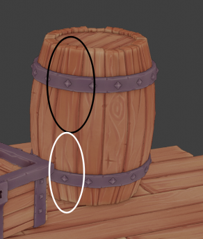
In the end, your texture looks pretty good! The metal bar is notably lighter in value which will give it more of a chrome-ish look rather than a darker medieval-ish look. But that's your choice and fine either way. The only other note I have is that your wood and metal could benefit from more broad gradients. Take this example from n647's chest where the gradients are broad from one end of the board to the other:
Still you've earned an A this week in my book 👍
@theluthier yes, the problem was with dirty vertex color and your tip helped me very much!
The gradient really helps to bring more life to image and I suppose I should have made it more. But nonetheless here is my submission.
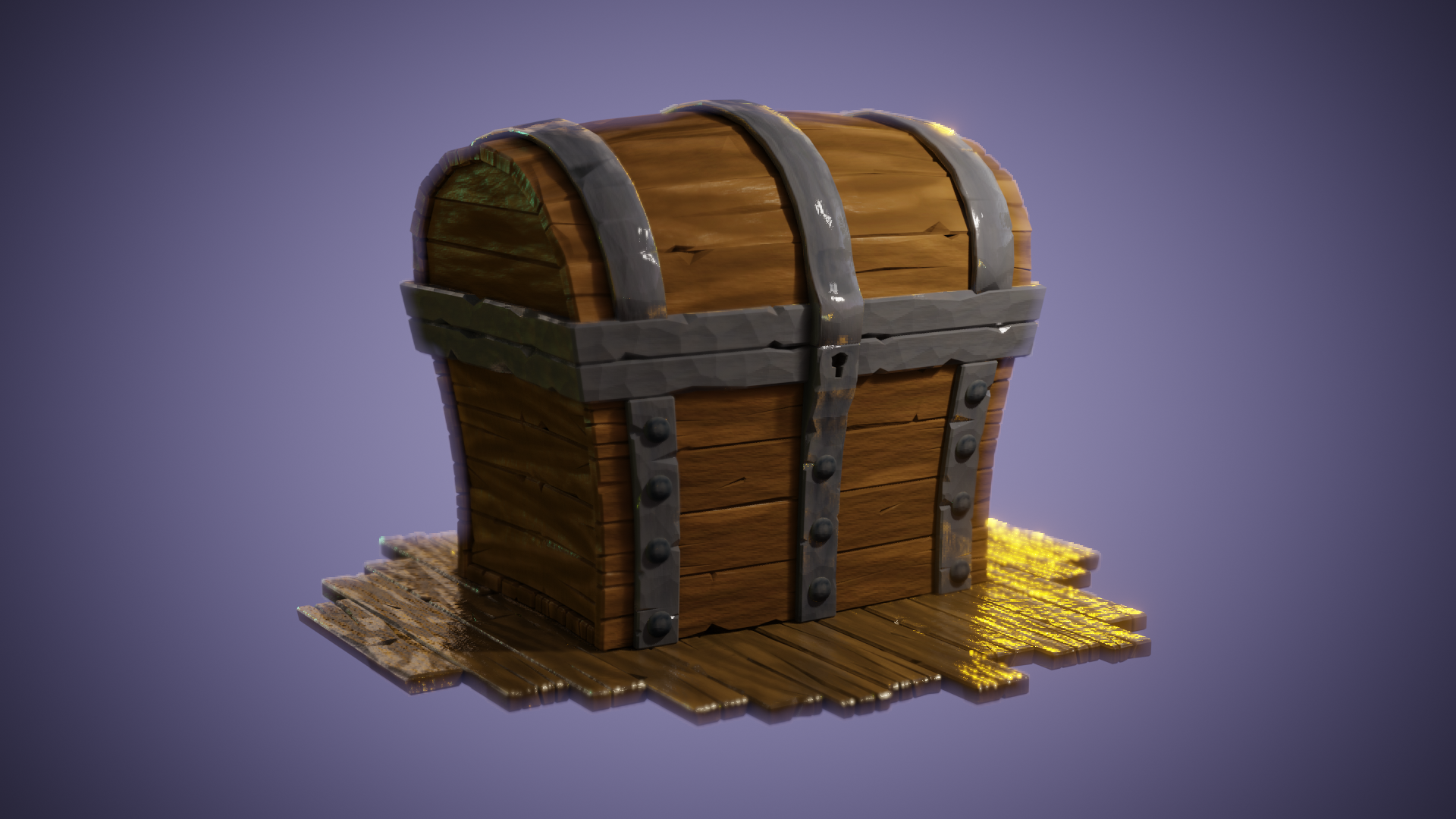
![]() svetimas Your treasure chest turned out good! Details are popping and overall it's presented in an appealing manner.
svetimas Your treasure chest turned out good! Details are popping and overall it's presented in an appealing manner.
My one note is that the metal pieces read less like metallic reflection and more like specular reflection. It could be as simple knocking the Principled BSDF sepc value down to 0 and increasing the metallic value up to 0.8 or so.
Still it could be your artistic preference to go with this particular look instead. Either way you've earned an A from me 👍