Week 1
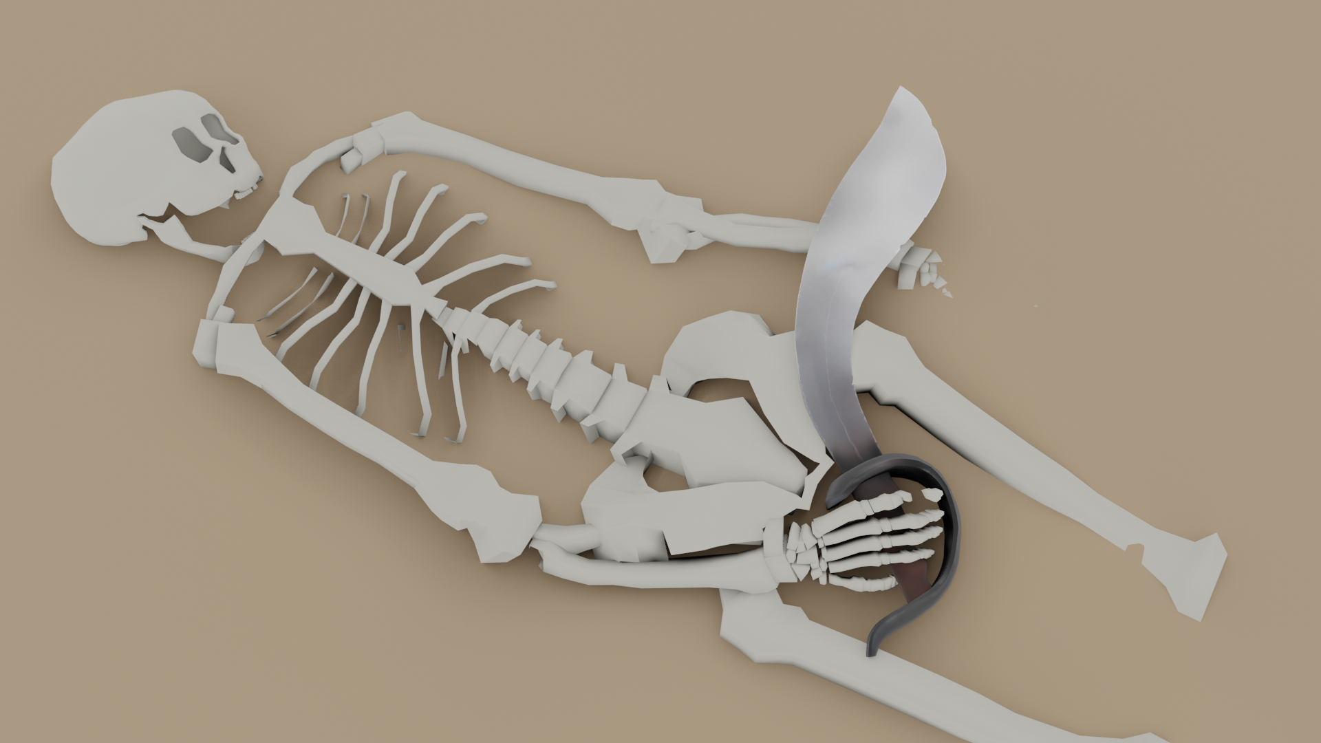
I'm in the pirate kinda mood with what I've worked on since being active here. I had a skull and 1/2 a skeleton I wanted to add into my scene, but I can't seem to link them into my scene.
yeppers I'm a newb.
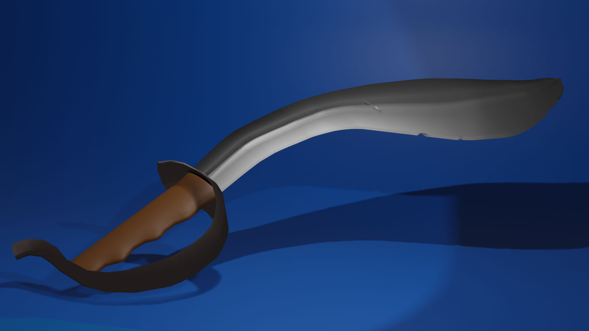
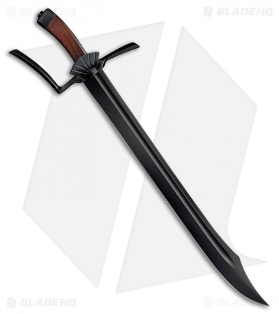
I looked at different swords and I always wanted to do a pirates sword. I started out following the tutorial but
went off on my own style and this is what I came up with.
After some really good suggestions I fixed what was suggested then decided to try my hand at a skeleton to post my sword with...ok I know this is one ugly skeleton and needs serious work....hahaha I just wanted to pose the sword with it.
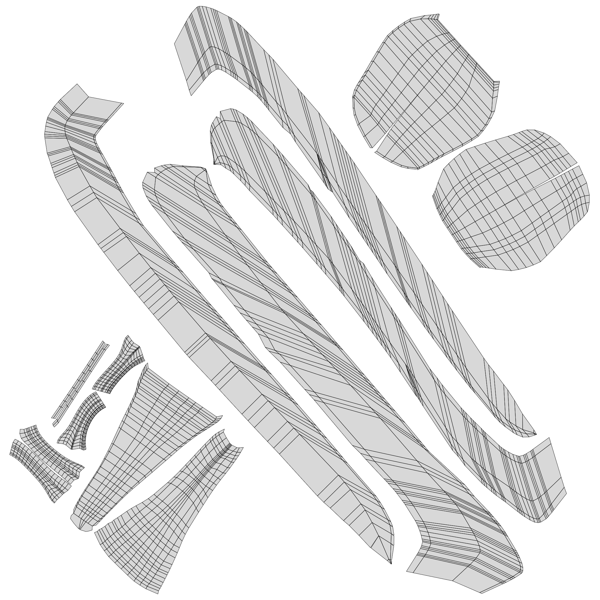
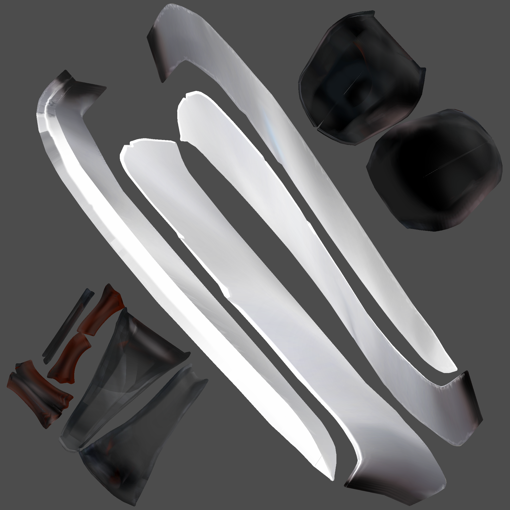
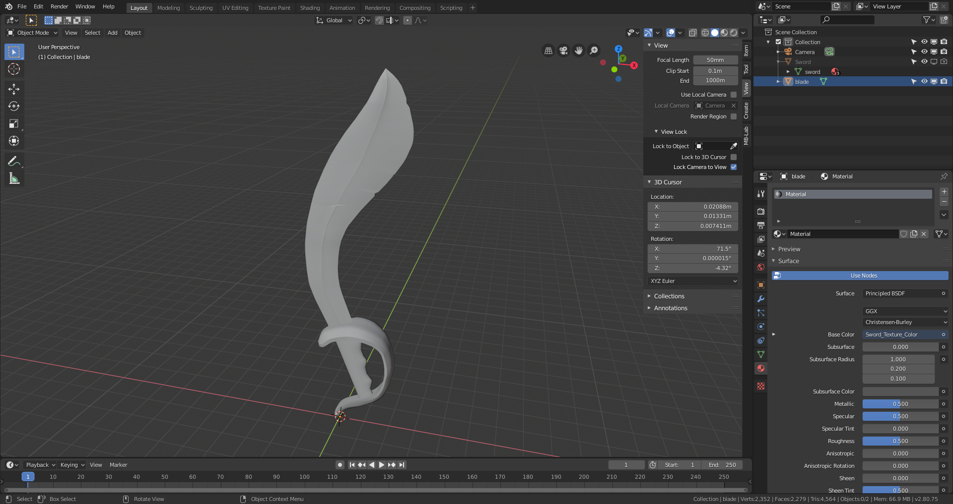
and here are the UV's and the painted textures.
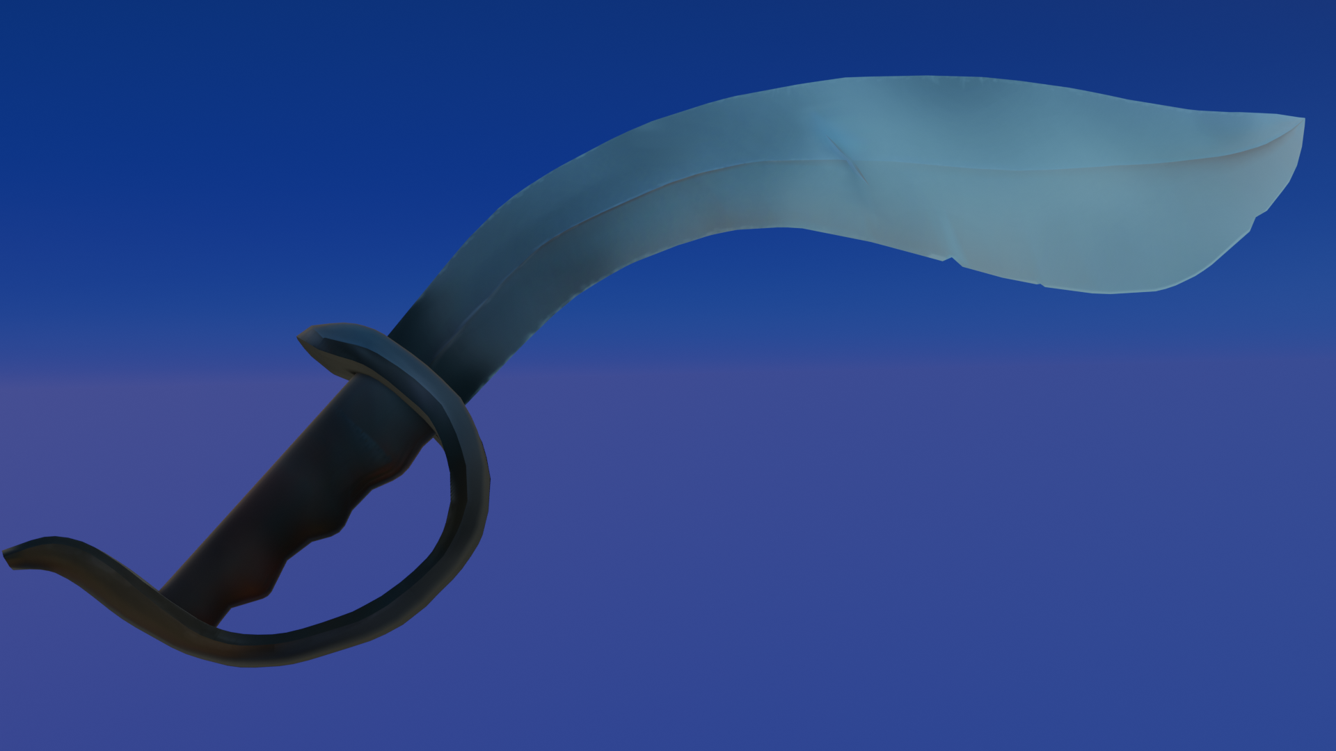
Other than the curvy thing around the handle being to thin, it looks great!
Hello, and welcome! Your sword looks pretty good, but it could benefit from marking some edges sharp to really define the form more. With just smooth shading on, it is overly smoothed and loses the form. Just keep chugging. You got this.
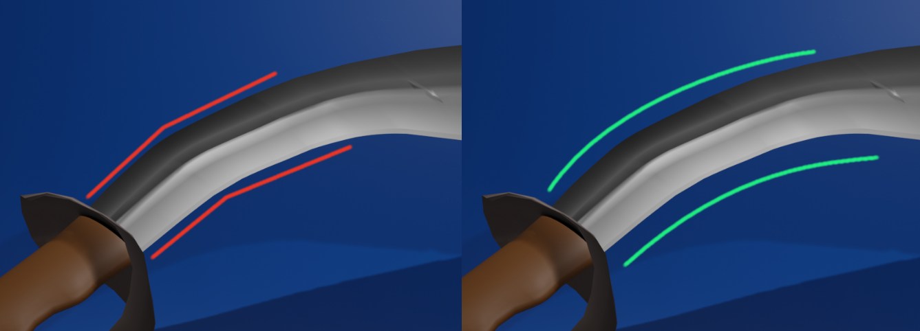
![]() ketre Welcome to the class, Karen! Going for the classic pirate sword - I like it. I agree with the notes already offered. I'd also like to add that the curve of the blade could be finessed a bit more. There's just a little bit of a straight kink that hinders the final shape.
ketre Welcome to the class, Karen! Going for the classic pirate sword - I like it. I agree with the notes already offered. I'd also like to add that the curve of the blade could be finessed a bit more. There's just a little bit of a straight kink that hinders the final shape.
For a "newb" you're doing solid work! It's an B+ in my book. I look forward to seeing this textured and shaded 👍
Week 1
I totally agree with what everyone said. I admit I struggled with getting the handle to look right! I think it and the blade look much better now. Thank you all for the critique! it helped to get me motivated to fix it.
@theluthier I didn't get a grade for week 2, and wasn't able to turn mine in for week 3.
Week 3 Final Render, I didn't make the dealine to turn this in but here it is. This has been a very fun enlightening class. Thank you @theluthier for taking this time to teach.
![]() ketre My apologies for missing your homework for week 2 and 3!
ketre My apologies for missing your homework for week 2 and 3!
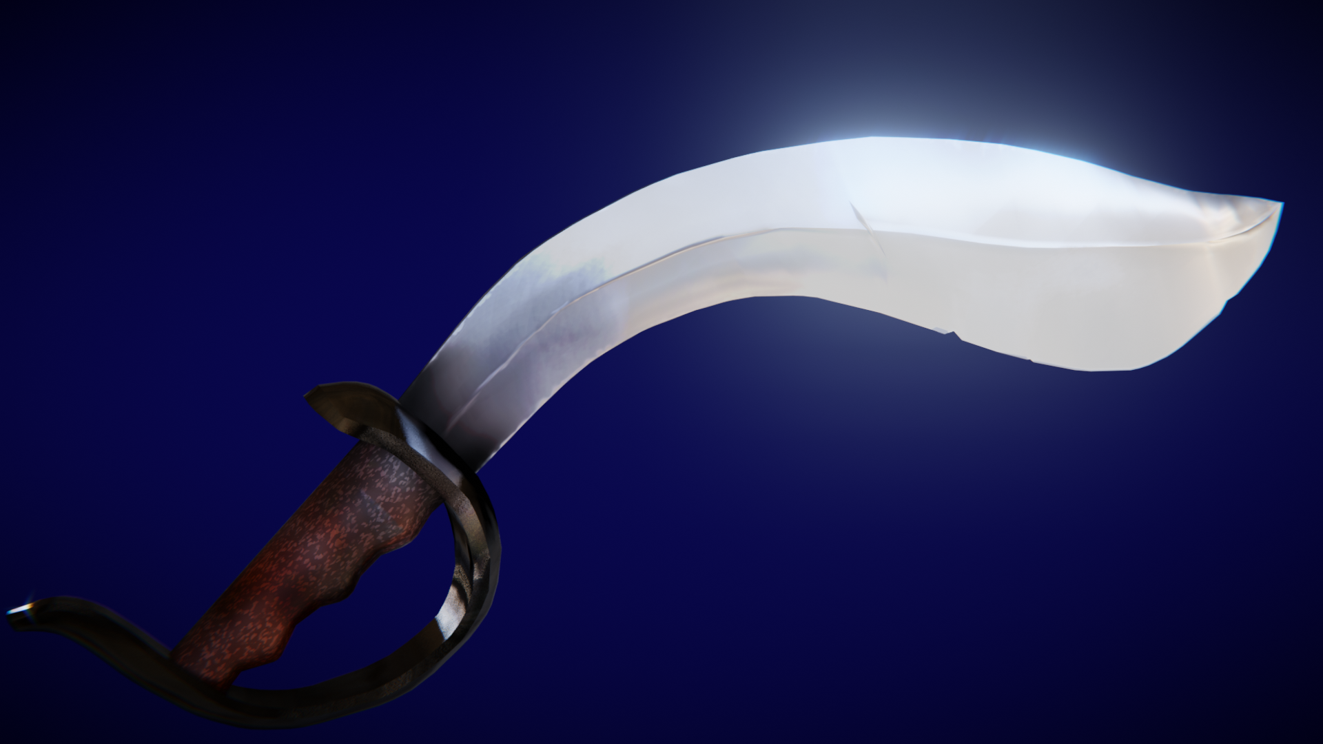
Week 2: Your texture looks good. I see the edge highlighting / scuffs, the broad gradient down the length of the blade looks great, various tones for each color. I don't really have anything to critique. It's an A from me 👍
Week 3: As for the material, the blade turned out wonderfully. It reads very well as a polished but used metal blade, reflecting brilliantly in the light. However the cross guard reads a little more like obsidian to me than metal. I should say that black metal does seem like a thing though:
It looks like a more modern look to me, not the time period of pirates. But if that's what you were going for, it's a valid artistic choice.
My only other note is that the handle's procedural texture looks more like sparkles than it does a leathery bump pattern. As such it's not entirely clear what the handle is supposed to be made of..
Overall the handle and crossguard result in a much darker value than the blade and they start to get lost in the dark background. I recommend brightening the grip + crossguard either in the material or the lighting or both.
Still it's good work and I give it a B+ 👍
This has been a very fun enlightening class. Thank you theluthier for taking this time to teach.
I'm really happy to hear that you found this class enlightening. Thanks for participating and committing to all 3 weeks of homework!
![]() ketre that blade is awesome. I agree with Kent on the texture. Didn't quite seel for me as a material of leather but I do particularly like the blade guard color choice.
ketre that blade is awesome. I agree with Kent on the texture. Didn't quite seel for me as a material of leather but I do particularly like the blade guard color choice.
![]() blanchsb honestly, I kinda got lost on the guard and the grip, everything I tried I couldn't get the bump effect like @theluthier was demonstrating in the class.
blanchsb honestly, I kinda got lost on the guard and the grip, everything I tried I couldn't get the bump effect like @theluthier was demonstrating in the class.
![]() ketre That's okay. Kent is a shader master. He has an entire shader-forge series. I didn't go beyond various forms of metal on my model so kuddos to you for taking a stab at it!
ketre That's okay. Kent is a shader master. He has an entire shader-forge series. I didn't go beyond various forms of metal on my model so kuddos to you for taking a stab at it!