Oh summer break lazyness... I just had to wait till the last day to finally get to work. But these classes surely are a motivation I needed.
My goal is to model this sword from Fate\Apocrypha:
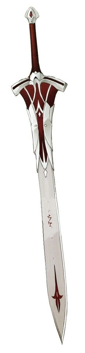
Homework submission Week 1
Uhh leaving it all for one day and being in a rush isn't good at all for creativity. Lesson learned.
It's really rough around the edges but I'll leave it as it is for now. Next time I will post WIP screenshots because now I know I need more feedback, I was a bit too confident in my skills with this one...
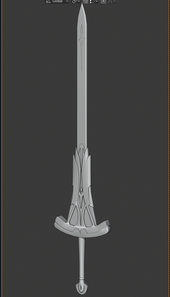
And just a side note: this model looks a bit different from the image I posted, because I found couple more refenrece images and there were some variations in the shape.
One of the problems I had was that I didn't know how much low-poly should it be and I think now that there are just too few vertices. I guess it looks okay from a distance, but not so much in a close-up. Im posting this on sketchfab so you can see this model better.
Great work Piotr, it looks like you were able to match the look and feel of your reference. :-)
![]() brzostek Welcome to the class! I can totally relate to being overconfident in my skills. I'm working on a [top secret 😉] project in my free time and it's taking forever. I thought I'd be able to knock it out much more quickly ha.
brzostek Welcome to the class! I can totally relate to being overconfident in my skills. I'm working on a [top secret 😉] project in my free time and it's taking forever. I thought I'd be able to knock it out much more quickly ha.
Still I think you've done a great job with this model. For being lo-poly, I agree with ![]() ullreym that you've matched the look and feel quite well. You know the model better than me though, so keep your standards high 👌
ullreym that you've matched the look and feel quite well. You know the model better than me though, so keep your standards high 👌
You've earned an A from me this week. I look forward to seeing this textured and shaded.
Hi, that's an awesome sword! I love the details, especially the part right above the guard.
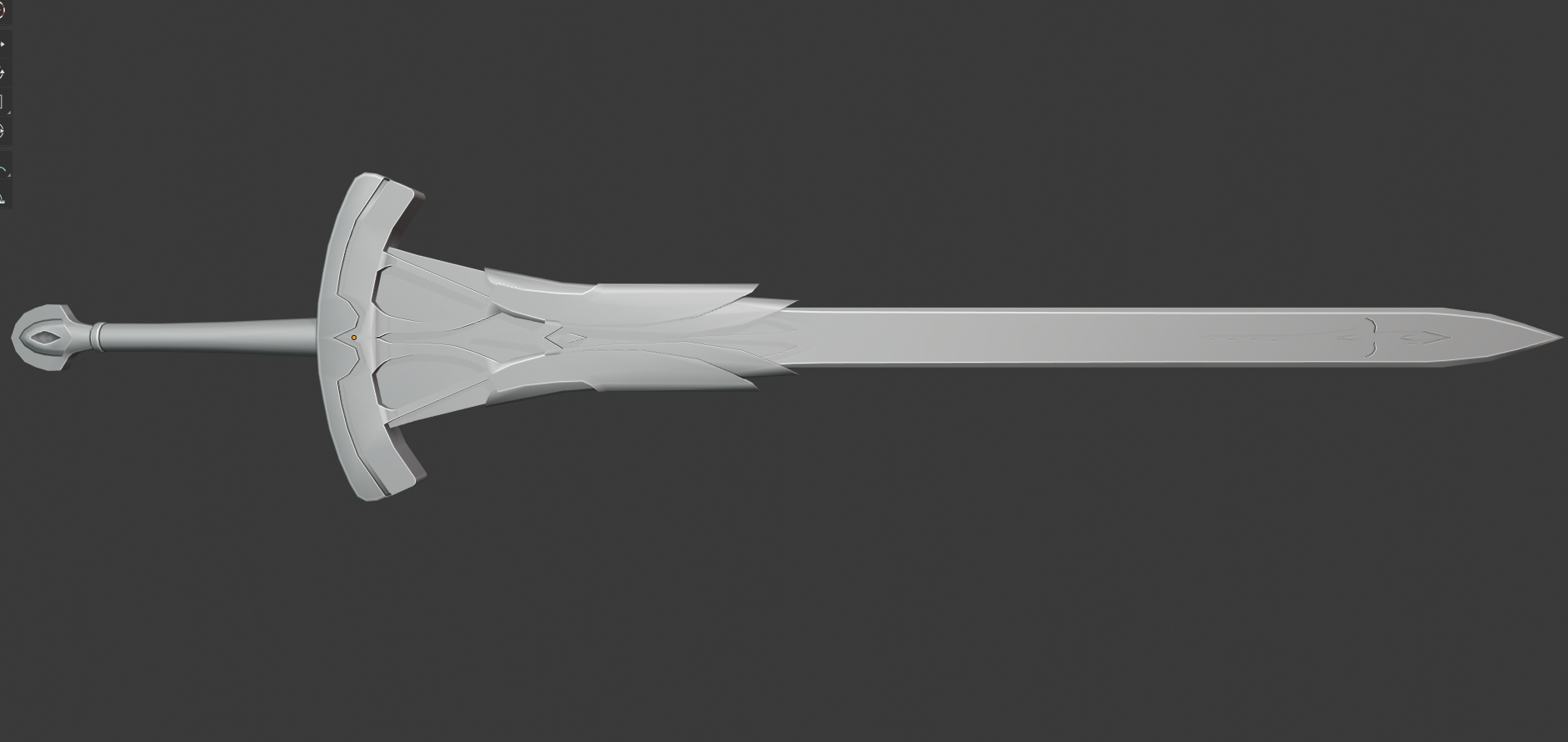
Homework submission Week 2
@theluthier
Uhh, I'm really, really late with this one, but here it is:
I tried making this sword look interesting and not flat while still making it look like the sword it's based on. But now when I think about my choice I think it kinda limits my creative freedom, that's why after the classes are over I'll just make a treasure chest or a barrel which I should've started with.
It took me so much time to unwrap this thing and I'm still not satisfied with how the UVs look like. Here are just the textures:
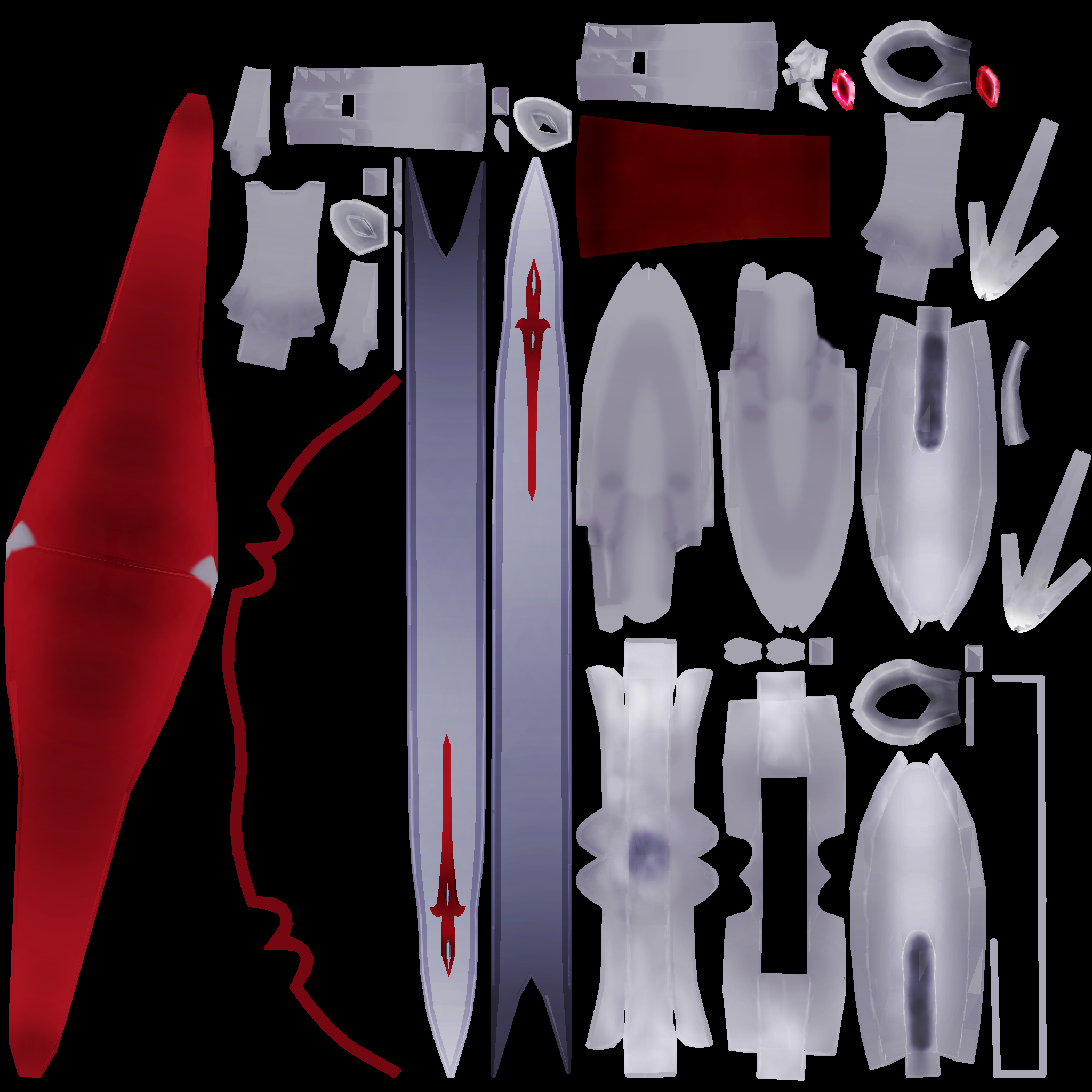
With week 3 I should have the homework done on time without any problems.
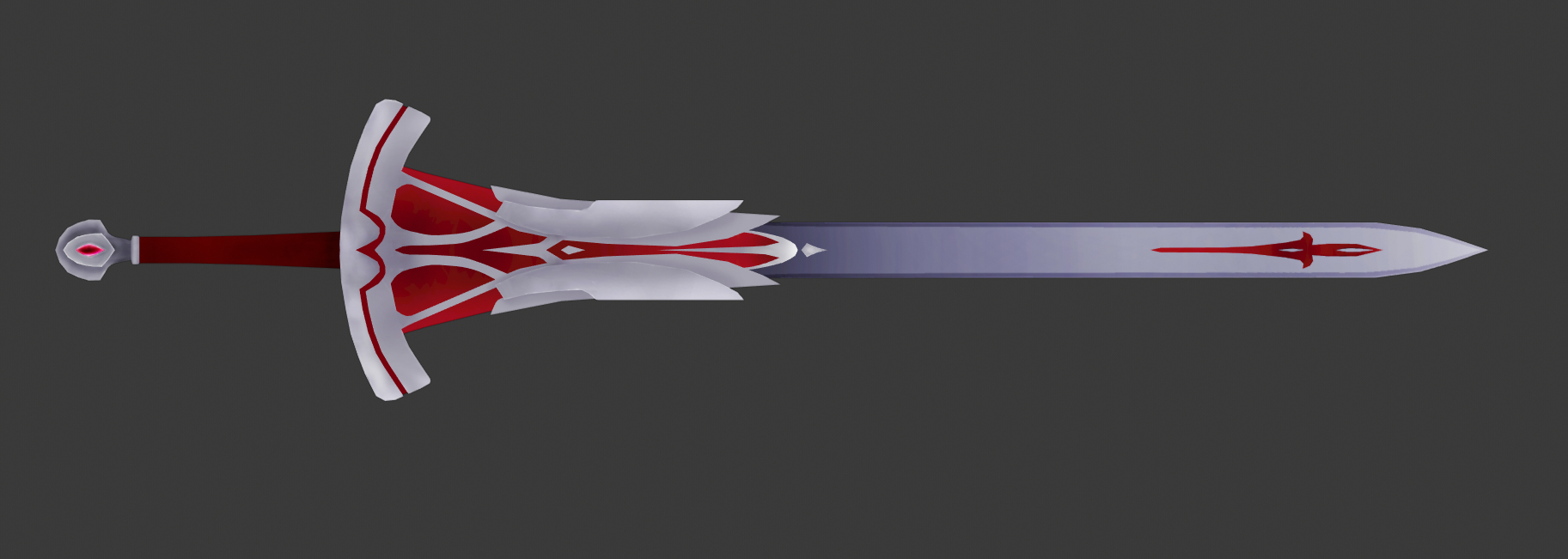
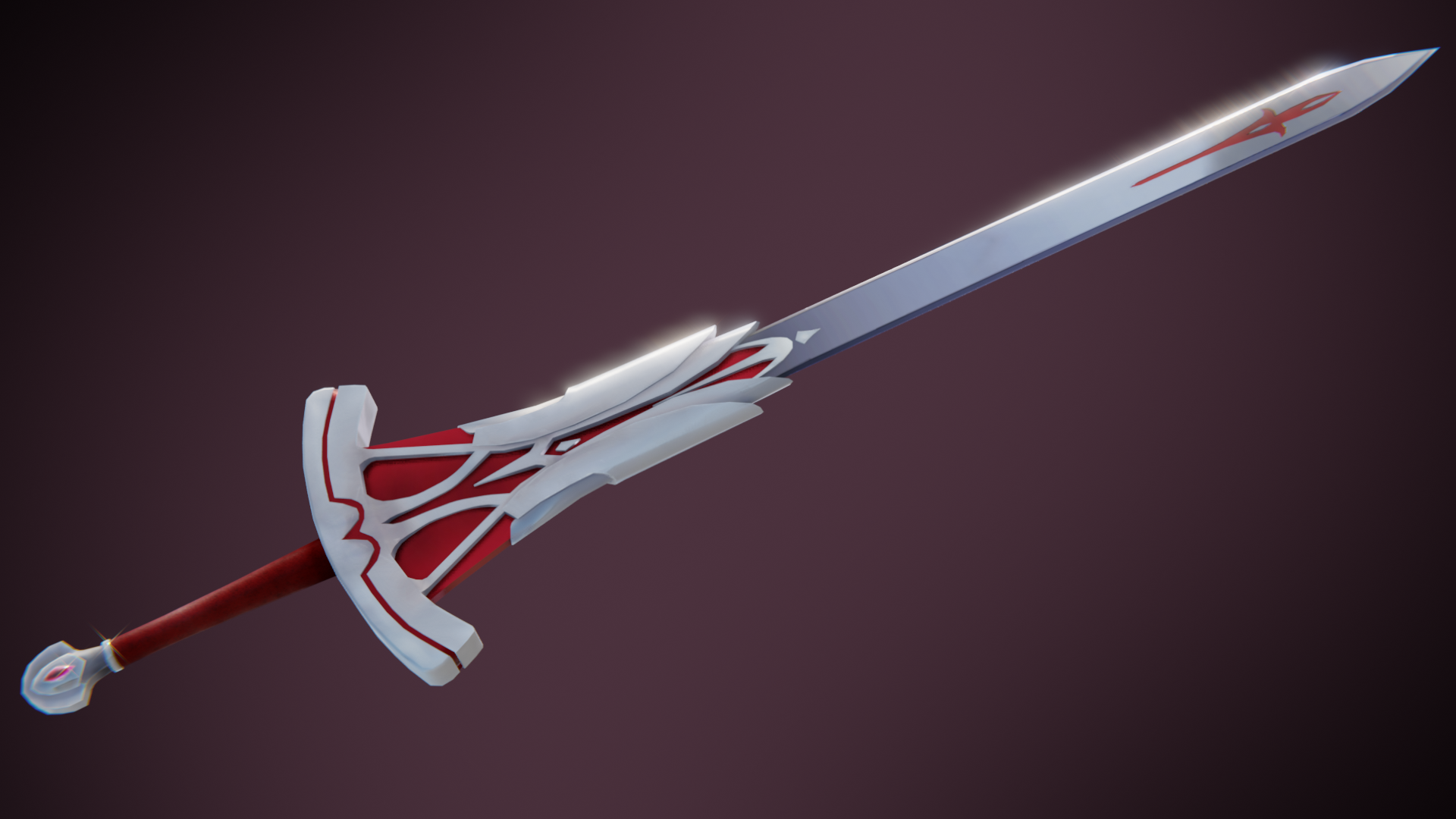
Homework submission Week 3
Thank you Kent for the class. I've learned a lot, but also I know what I should be working on now to improve my skills.
And personally, my favourite part of this sword is the pommel, lol
Thank you Kent for the class. I've learned a lot, but also I know what I should be working on now to improve my skills.
![]() brzostek I'm so glad to hear this! Thanks for sharing and participating in the class. Congrats also for completing all 3 weeks of homework. Your sword turned out good, Piotr! 👍
brzostek I'm so glad to hear this! Thanks for sharing and participating in the class. Congrats also for completing all 3 weeks of homework. Your sword turned out good, Piotr! 👍
My only note is that the whole sword appears to be diffuse (no reflectivity) aside from the blade which appears appropriately metallic. So I'm left wondering "What is the rest of the sword made of?" Is it metal with satin white and red paint?
To me, there would be more depth to the model if the leather reflected subtly like leather, all grey colored pieces were metal (even a dull metal) and the red either glowed or felt like painted metal. While pure-diffuse shading is definitely a type of style / aesthetic, it's odd to see something that reflects while the rest doesn't.
To summarize my opinion: Your model is full of interesting shapes that would be netter accentuated with reflections and relatable material types. Though I admit this could just be my subjective preference.
You've earned an A in my book still 👌
@theluthier Thanks for your feedback. I agree with what you said, the shading was a bit confusing for me with this sword. Especially the red parts, I had no idea what kind of material should it be. But I feel that I failed with lighting in the final render. I didn't really want to make it pure-diffuse although I know it could be a stylistic choice, especially for a sword from an anime.
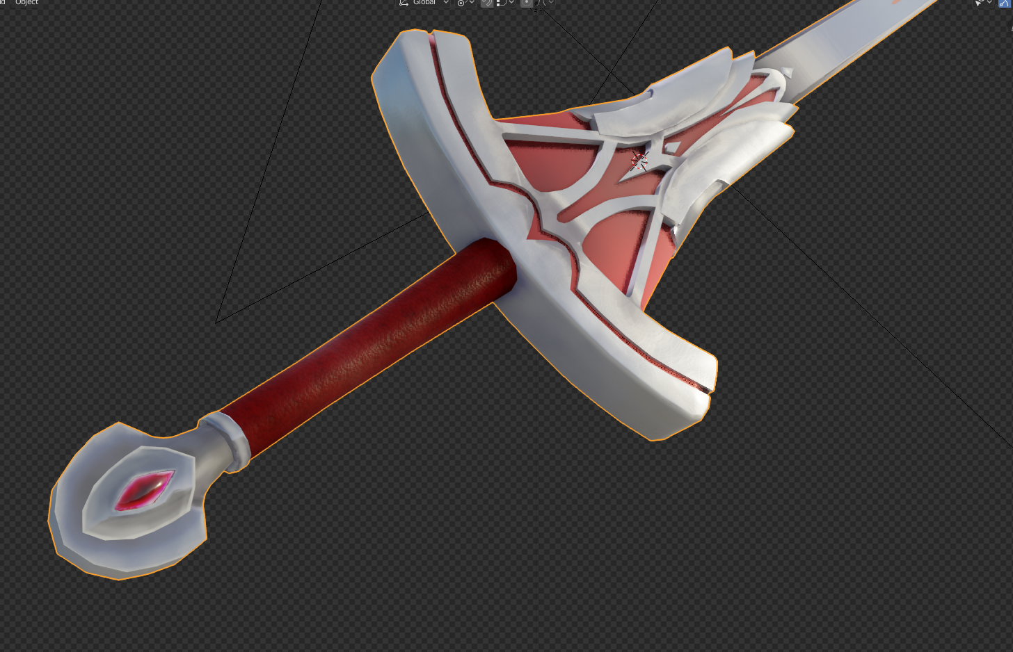
Here's a screenshot taken from a different camera angle:
Also, now I know I should put more effort in time management, this is a skill that's much more important than I thought. I need to get rid of a habit of creating things in long sessions, which are at the end mentally exhausting and lead to frustration and lack of motivation. I guess I had to experience it by myself to realize that.
![]() brzostek I like that leathery effect. I know what you are talking about with time management. It is rough but I think the fact that you go back and improve on it has definitely shown through. I had to really revamp my model from the texturing week. Yours is looking great though. I really like the pommel as well.
brzostek I like that leathery effect. I know what you are talking about with time management. It is rough but I think the fact that you go back and improve on it has definitely shown through. I had to really revamp my model from the texturing week. Yours is looking great though. I really like the pommel as well.