This is my thread where I will post my process & homework for the Beginner Course in Blender 2.8. I am almost done with the modeling of the treasure chest and then I will begin with my sword for the homework.
I would like to create the "Sting" that Bilbo found when going on his advanture. Maybe I can even use some Emission on the blade. I am not sure, how I can do the design elements on the sword but we will see how it will turn out. :-)
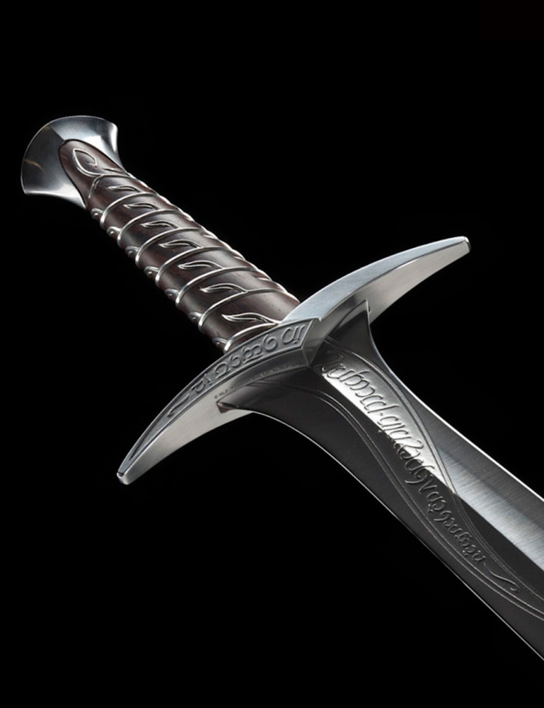
Here are some pictures of the sword: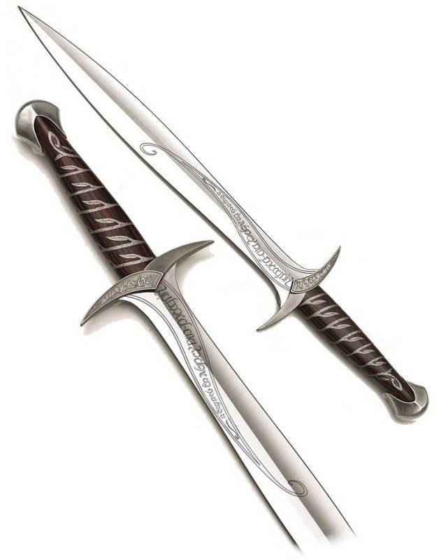
Damn I'm liking the look of that. And yeah, I imagine an emission shader in some aspect would definitely be responsible for this.
That's a beautiful sword!
As for the decoration on the sword, it's just curves and text, Both of which we have in Blender...
Thank you Kent and I am glad to be in this course. I enjoy your teaching very much. I am still new to Blender and the 3D-World but I am fascinated by it and hope to get better at it. :-)
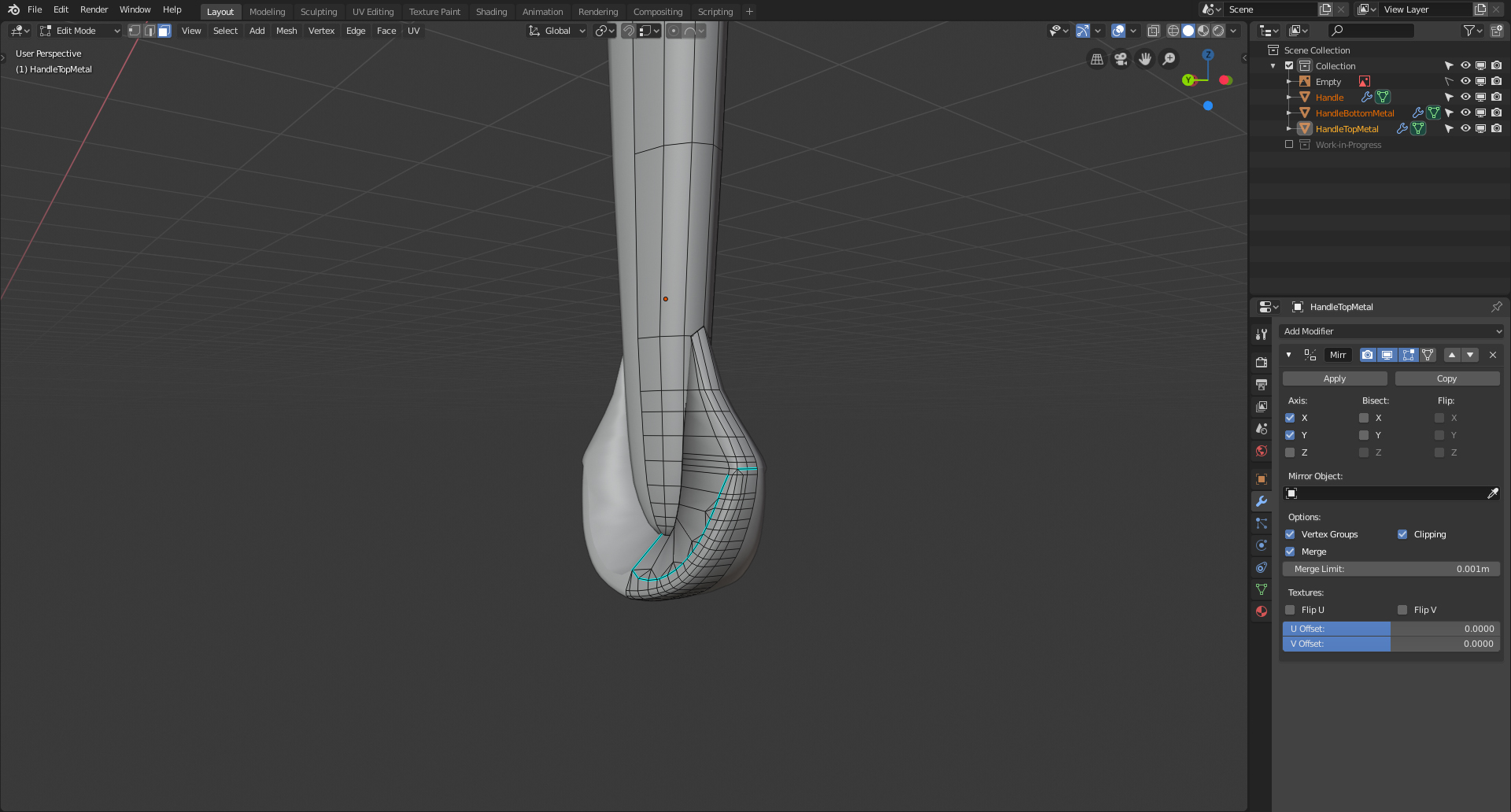
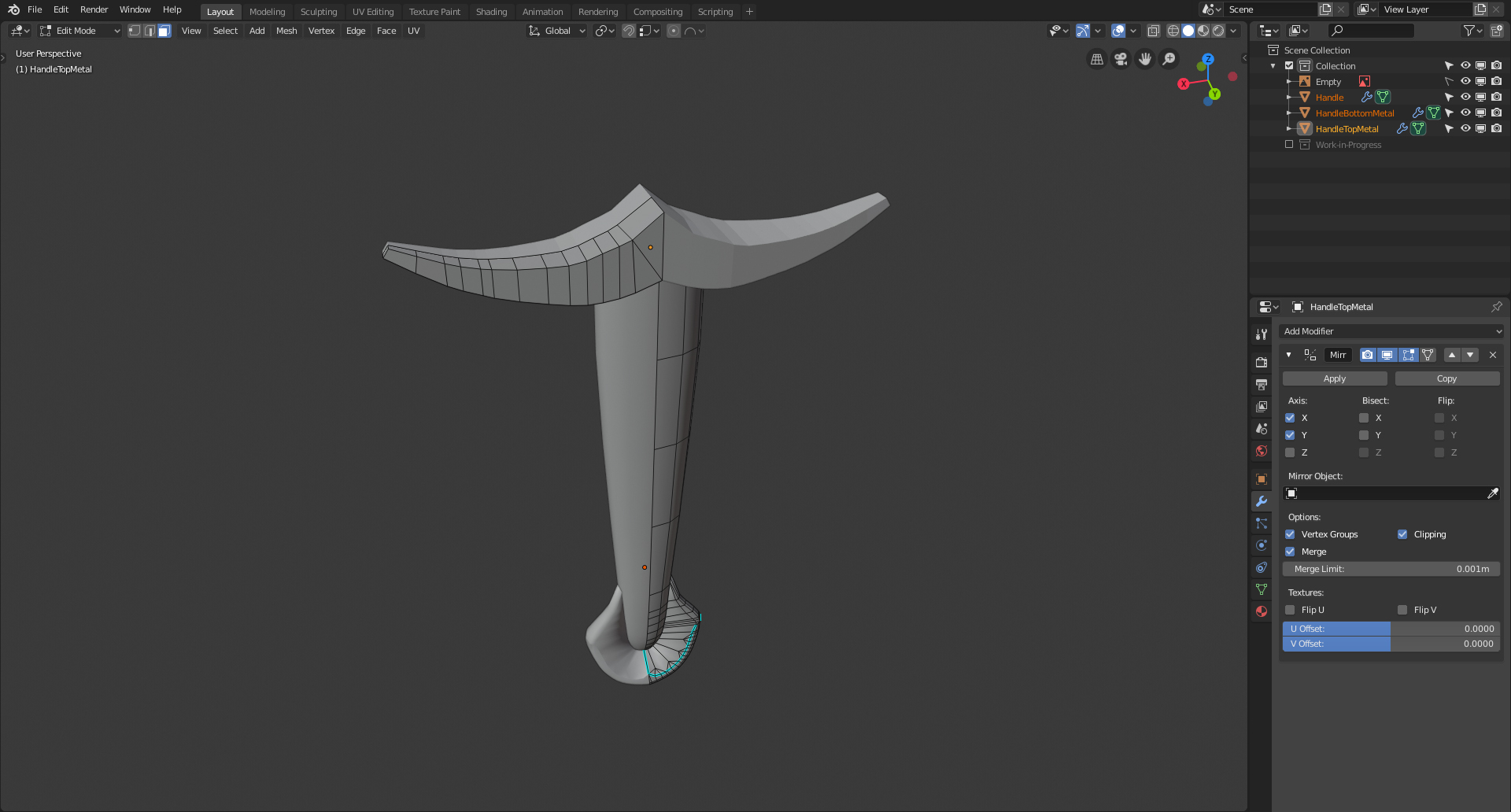
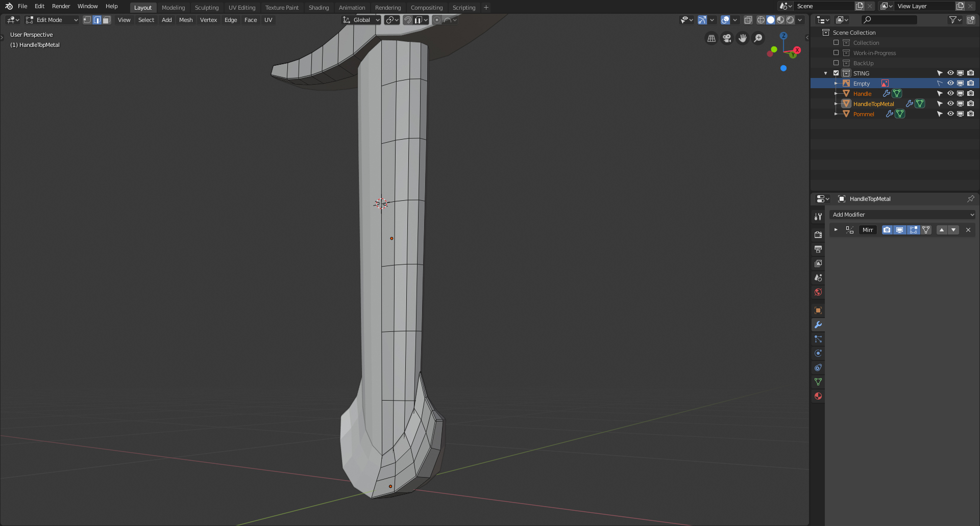
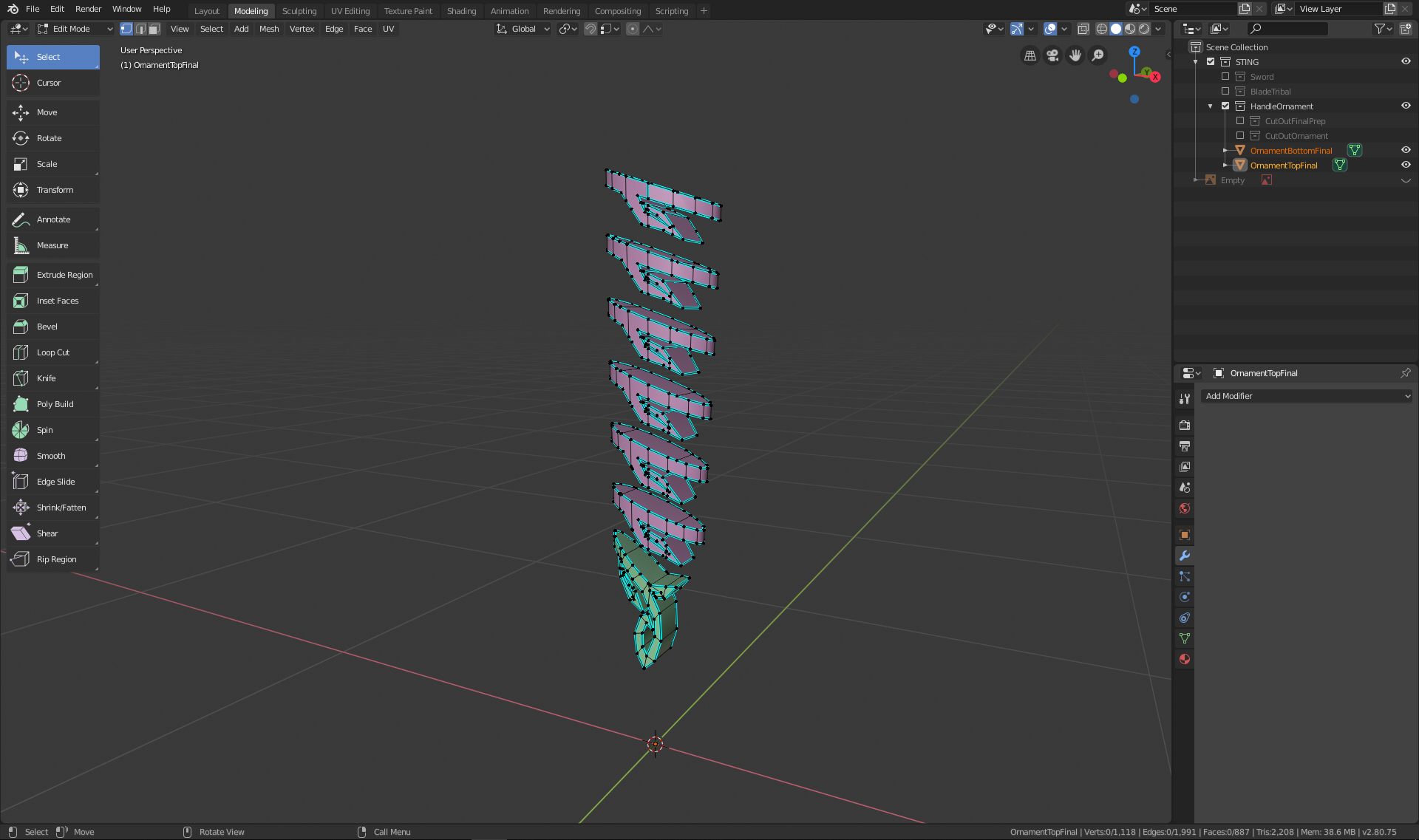
When I chose the sword I thought this would be a simple one to create. Unfortunalely this sword has a lot of curves and I am having a hard time getting the look right. Today I tried to create the handle of the sword. I tried many different ways to creat the metal part at the bottom but nothing looked right. I enden up using some faces on the side of the handle and duplicated them, then seperated these faces into an object and tried to extrude and bevel it out. I have not been able to get the top part right of the handle where the metal is somewhat overlapping but will continue to try.
I am grateful for any advise. :-)
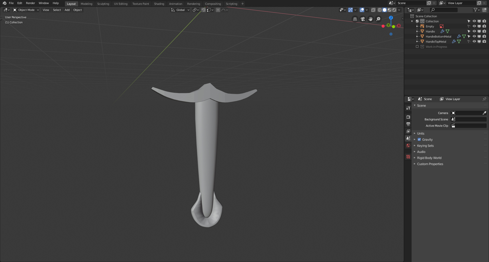
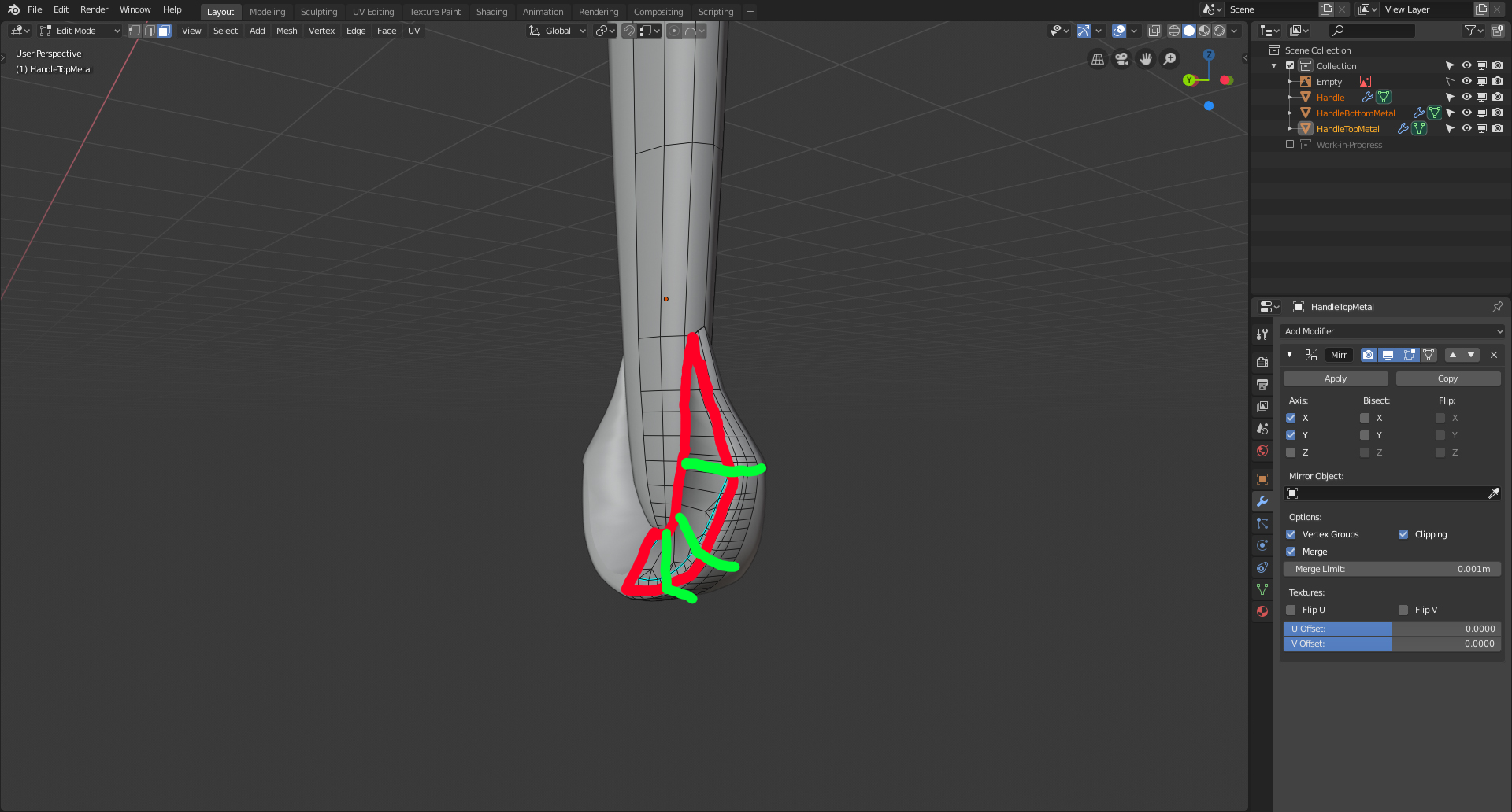
![]() philip79 I would start out by simplifying the pommel. Right now there are lots of unnecessary vertices. I would recommend making each major side it's own face, like so:
philip79 I would start out by simplifying the pommel. Right now there are lots of unnecessary vertices. I would recommend making each major side it's own face, like so:
![]() philip79 Definitely agree with
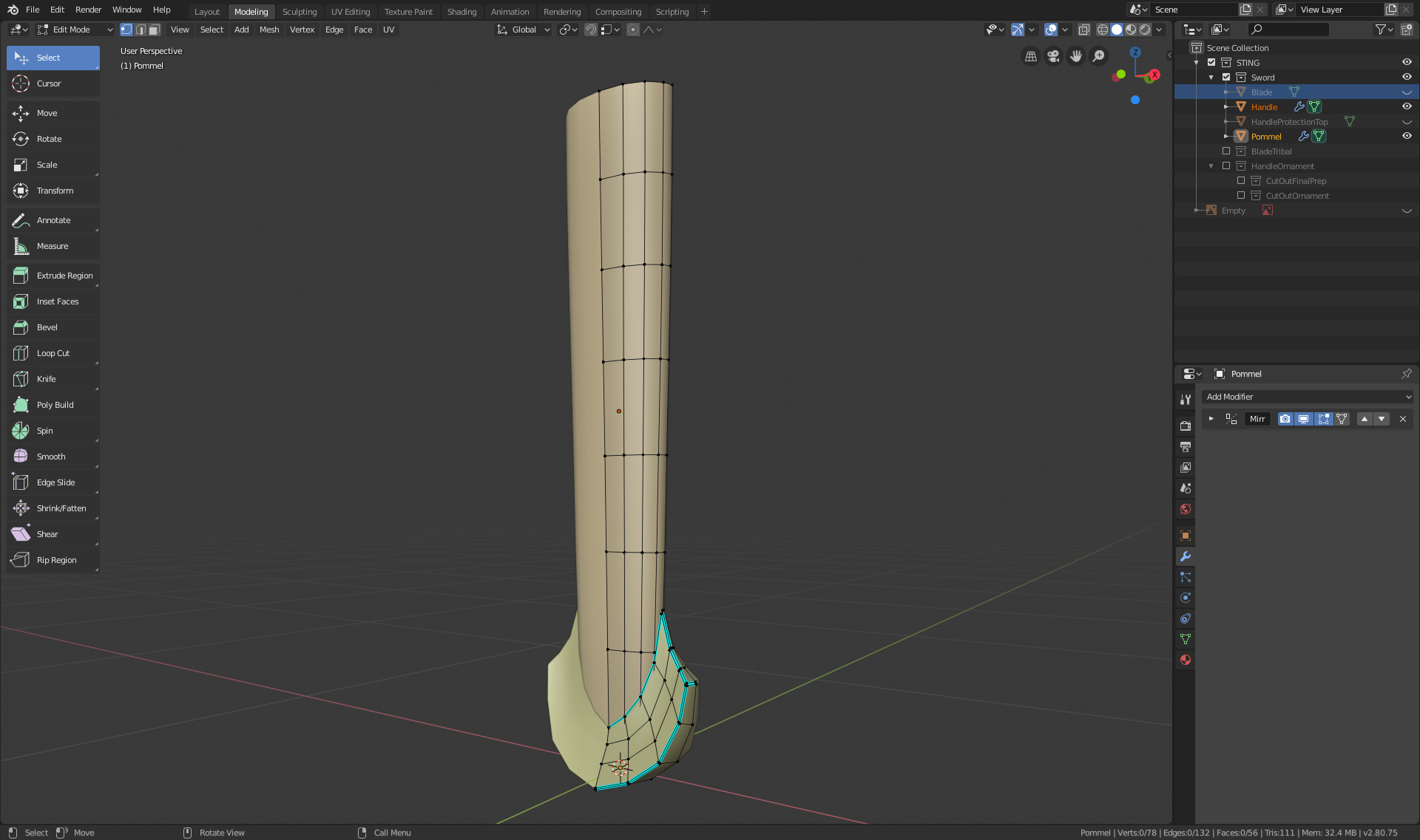
philip79 Definitely agree with ![]() williamatics, but as a sidenote I've noticed there seems to be some kind of pinching going on in the pommel? It could possibly just be the shading of the viewport, but it seems to be being caused by the diamond shaped quads you have. I'd also recommend marking sharp the red outline that William gave.
williamatics, but as a sidenote I've noticed there seems to be some kind of pinching going on in the pommel? It could possibly just be the shading of the viewport, but it seems to be being caused by the diamond shaped quads you have. I'd also recommend marking sharp the red outline that William gave.
It could be just me,but it looks like the handle is too thin/flat. Not by much, just a bit. That might also help with the pommel (that should definitely be simplified, like already mentioned). Also the curvature from the pommel to the hilt should be very slightly concave. That will also help with the transition to the handle.
So you would get something like this (especially look at the transition!):
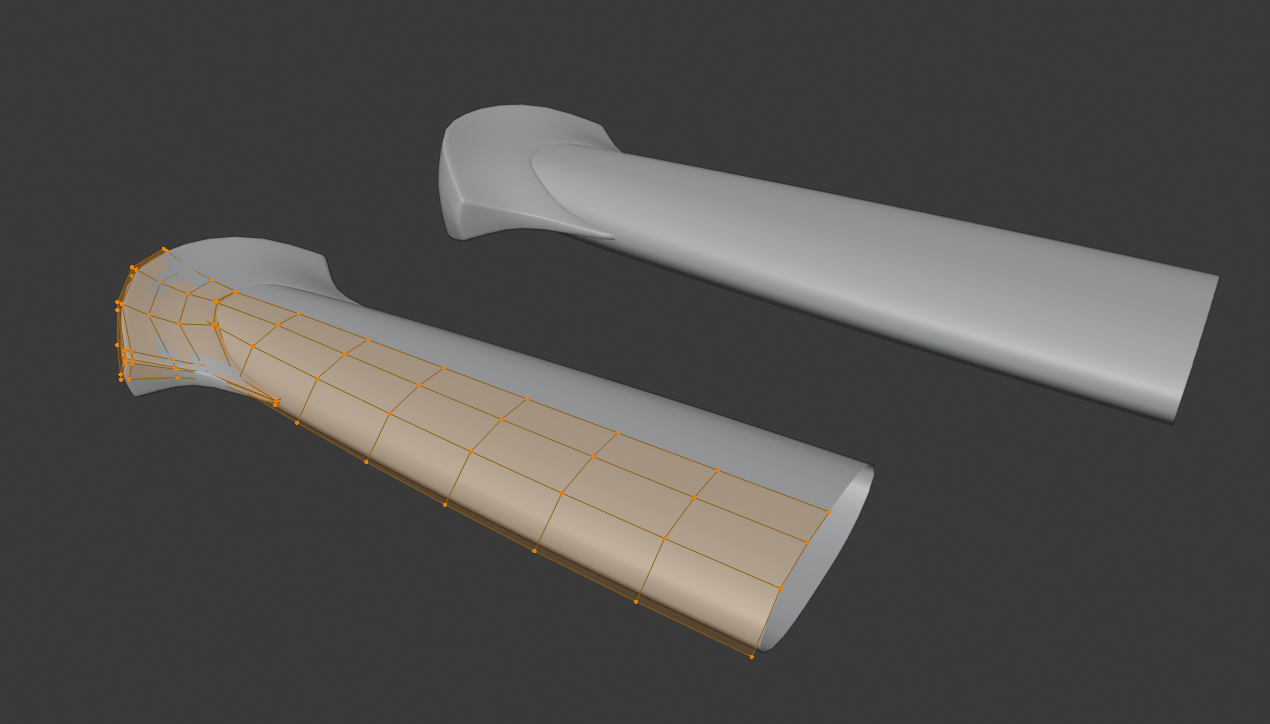
Thank you William Miller Aaron Rudderham & spikeyxxx for your feedback. I have given it another try and with your feedback and Images I think it looks good now. :-) I need to develope this skill to see a simplified version of a complex object. ^^
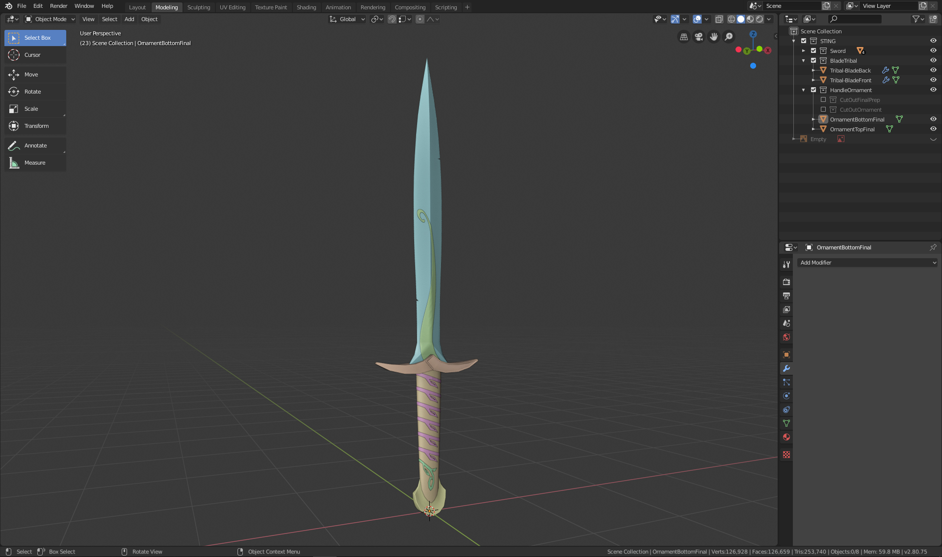
Homework submission - Week 1:
I am glad I had some days off because it took me forever to get anything done. I am not sure if I did it correctly but I tried my best. :-)
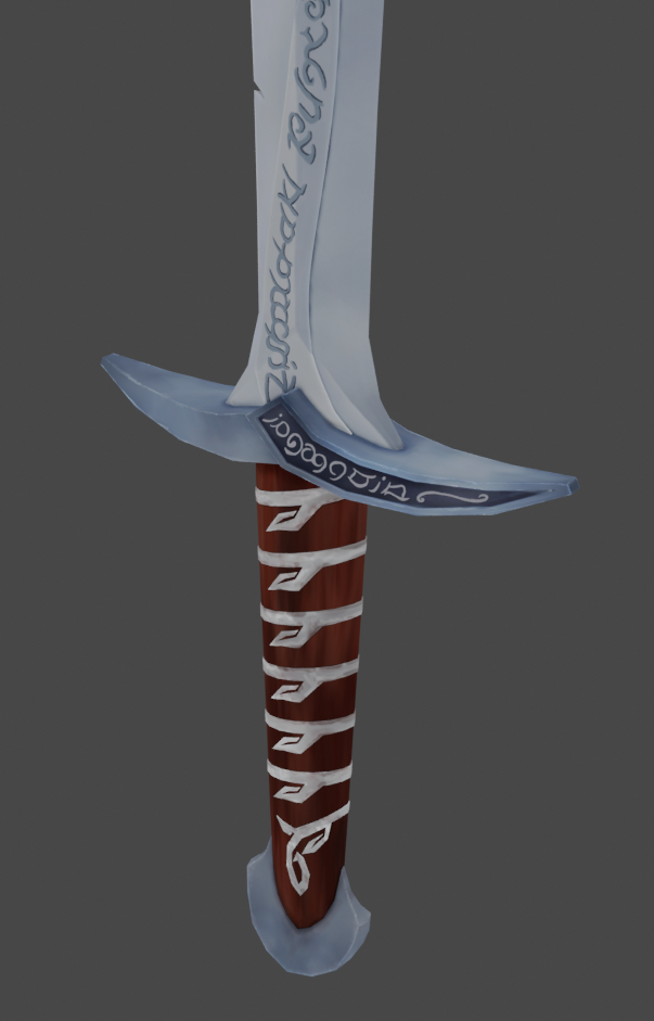
Step 1: Handle & Pommel
Thanks to some feedback here in the forum I was able to get it to look right.
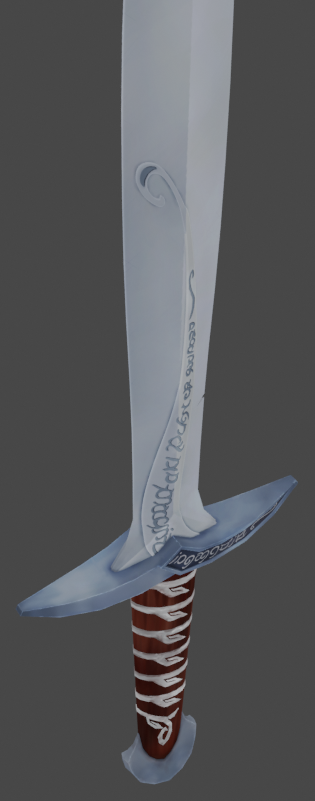
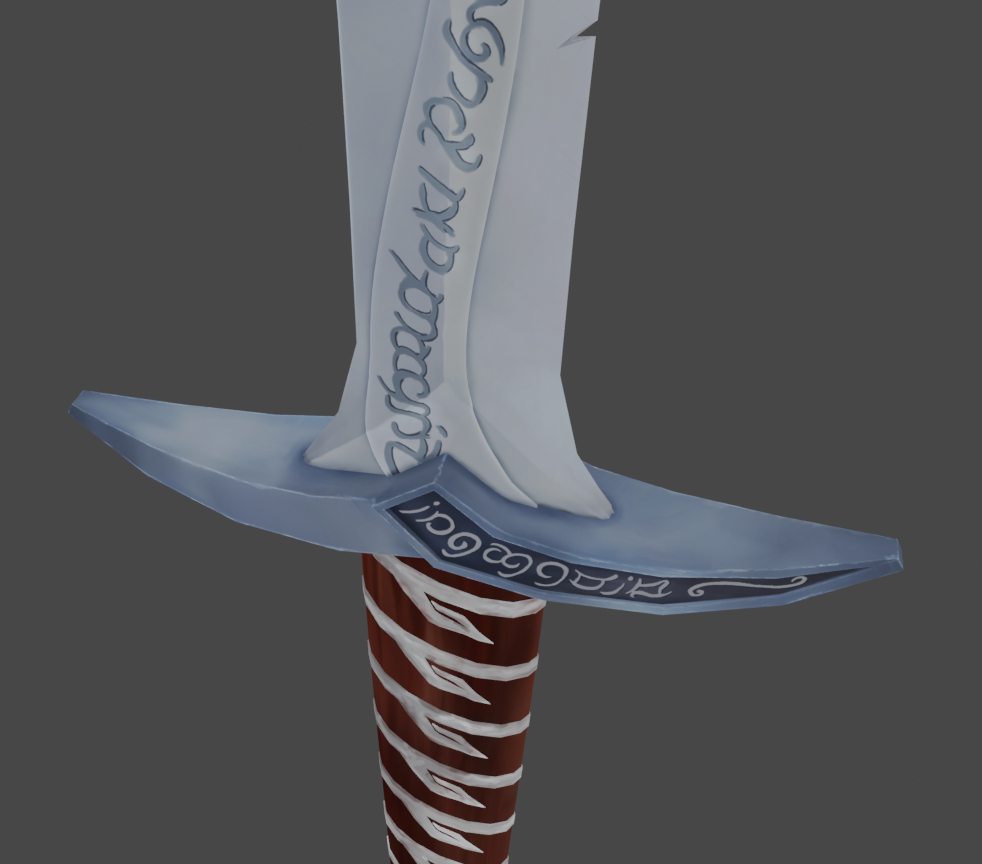
Step 2: Metal-protection above the handle
This was very difficult to create. I first used a mirror modiefier but I had to get rid of it because it is not simply mirrored but also in the opposite direction. I also had a hard time to get it to look right when using a Subsurface Modifier or Smooth shading. I didnt try to add the text because I have not reached that level to get it done.

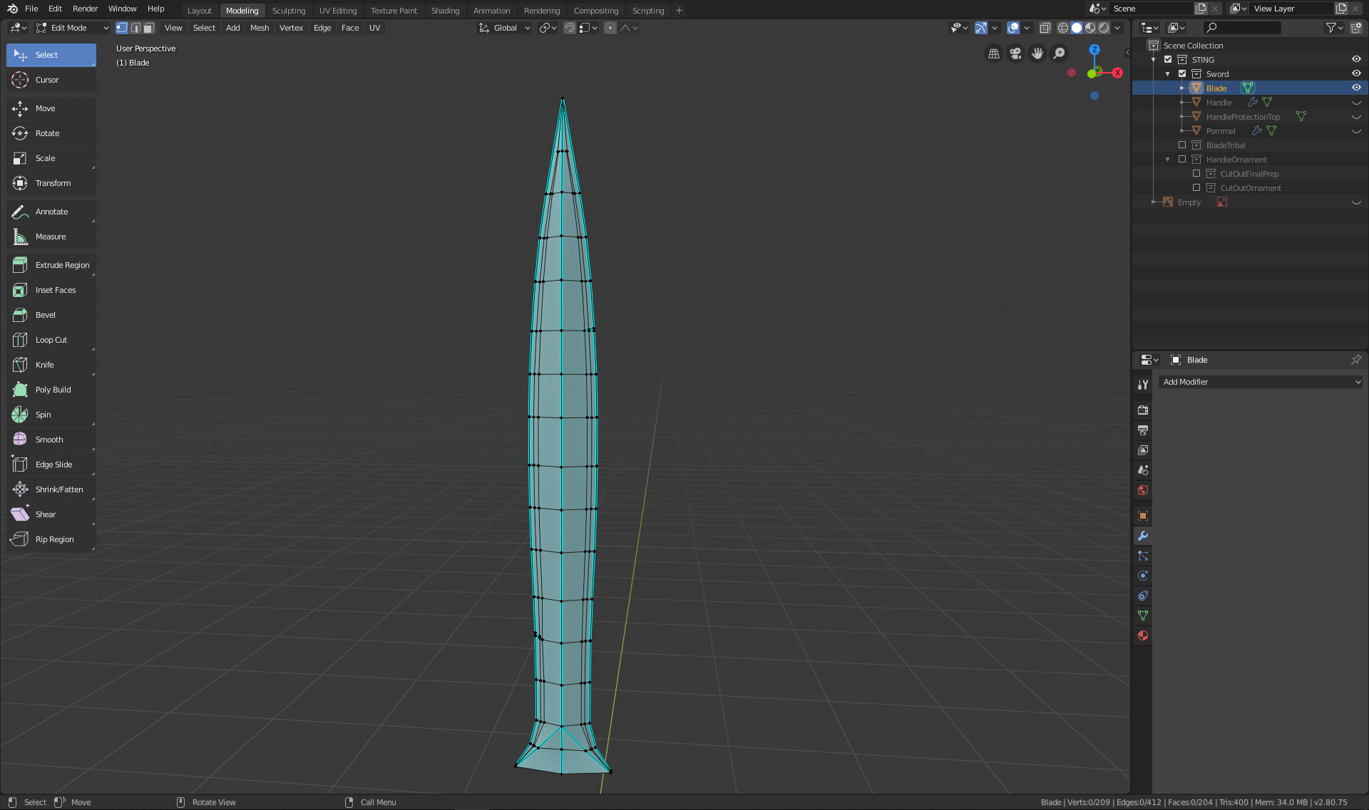
Step 3: The blade went well and I was able to use what I learned in the cousre and the modeling of the treasure chest.
Step 4: I created a singel vertex and create with extrude a flat version of the decorative part on the blade. Once I had it I used different Modifiers to get it on the surface of the blade. (I have not done the learning flow for modeling so I was trying many things. I hope to get there after this course).
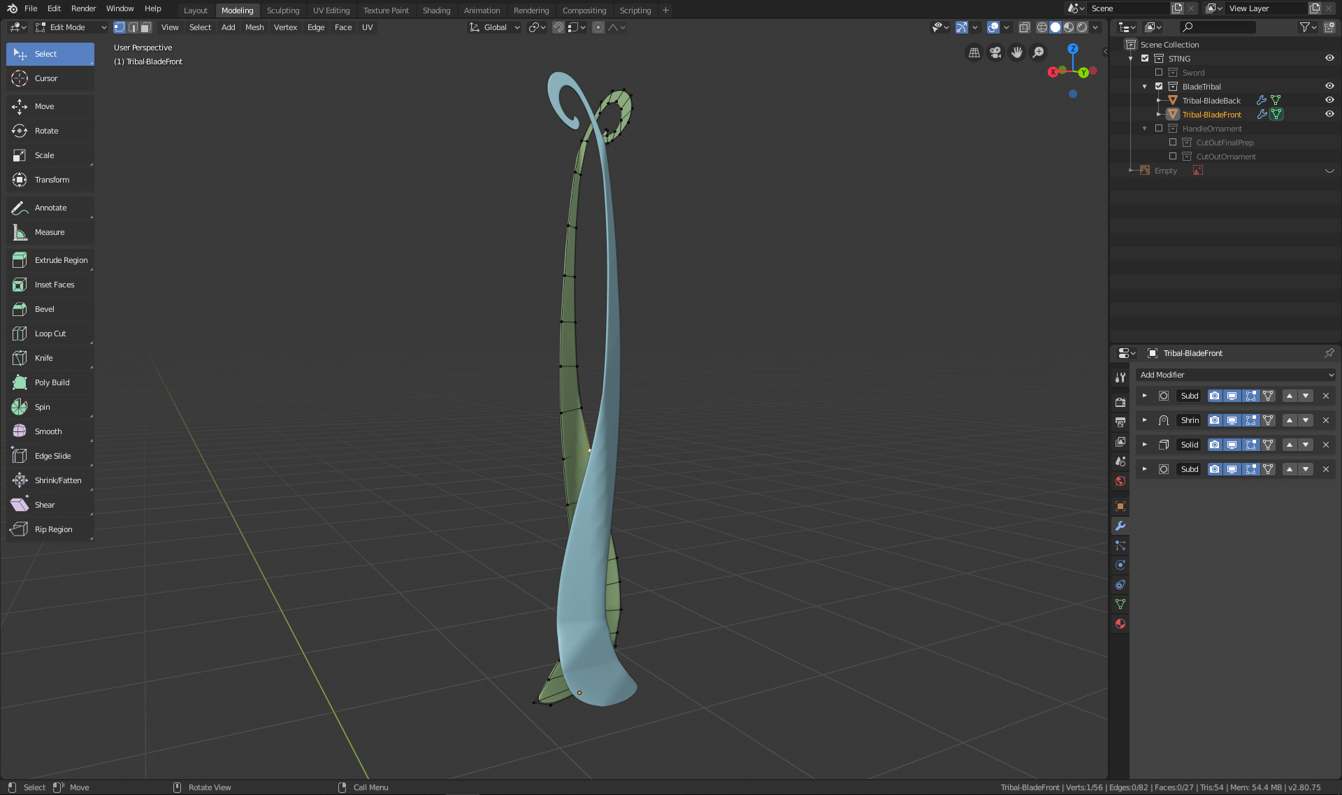
Step 5: I used the same method as on the blade to create the ornament on the handle. Once I had it 2D I was not able to get it right with the modifiers I have used previously. Instead I used an Array Modifier on the top ornament and then a Solidify Modifier to get it wider than the handle. Then I made a copy of the handle and cut out the elements with a Boolean Modifier. I applied all the modifiers and then extruded it out a bit over the handle and as a last step I marked all the hard edges.
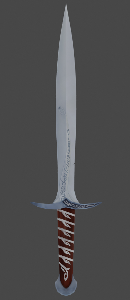
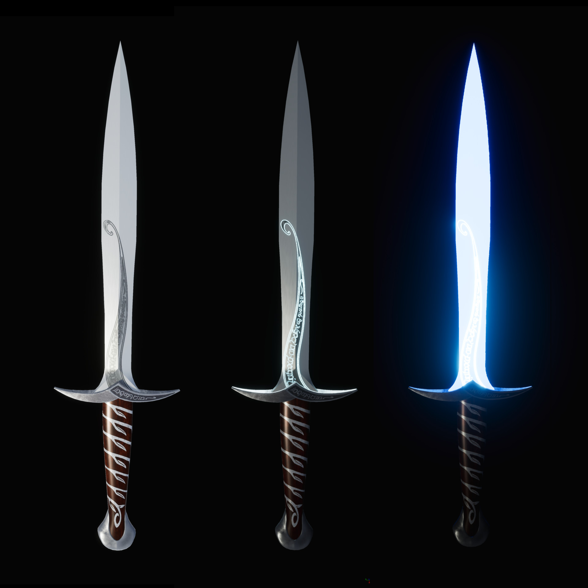
Here is my final Image for the Homework:
Thank you for your feedback. I am grateful for any tip and trick you guys can give me. If my approach for the ornaments on the blade/handle are not correct I would just leave them away for the rest of this course because I am not sure how much time I can invest next week and I still need to watch/create the Part 2/Texturing of the treasure chest. (I missed the part that we should watch the whole tutorial ahead of the course !!)
![]() philip79 Your Sting model has come full circle! The shape and structure is spot on. And you even included the delicate inlay designs in the handle and blade! That's very cool.
philip79 Your Sting model has come full circle! The shape and structure is spot on. And you even included the delicate inlay designs in the handle and blade! That's very cool.
No criticism from me. You've definitely earned an A from me this week. This model will look so good textured and shaded too 🤩
I missed the part that we should watch the whole tutorial ahead of the course
It wasn't a requirement to watch the course before the class. Though definitely OK if done that way, it's actually intended to be watched throughout the course with each week relating to a chapter. Week 1 correlates to chapter 1, week 2 to chapter 2, etc. Since you're doing the sword and not the chest, you can think of it as reference material with tips to glean that be applied to the sword. Hope that makes more sense.
@theluthier Thank you Kent. :-) Yes, I have been watching & creating the treasure chest alongside this course. It helps me a lot to first do it all on the chest and then on a completely different object. Thank you and the course is great. ^^
WIP-Update for Week 2
I have unwrapped my objects as good as I could but it was very difficult and I am sure there would have been some better solutions. Although bevel makes many things look better, It is so confusing to place seems when there are so many edges. I cut the blade into 4 pieces because I had a problem with it when it was only two elements but after spending a few hours on painting, I think that was a mistake and it would have worked just fine if the blade was in two elements.
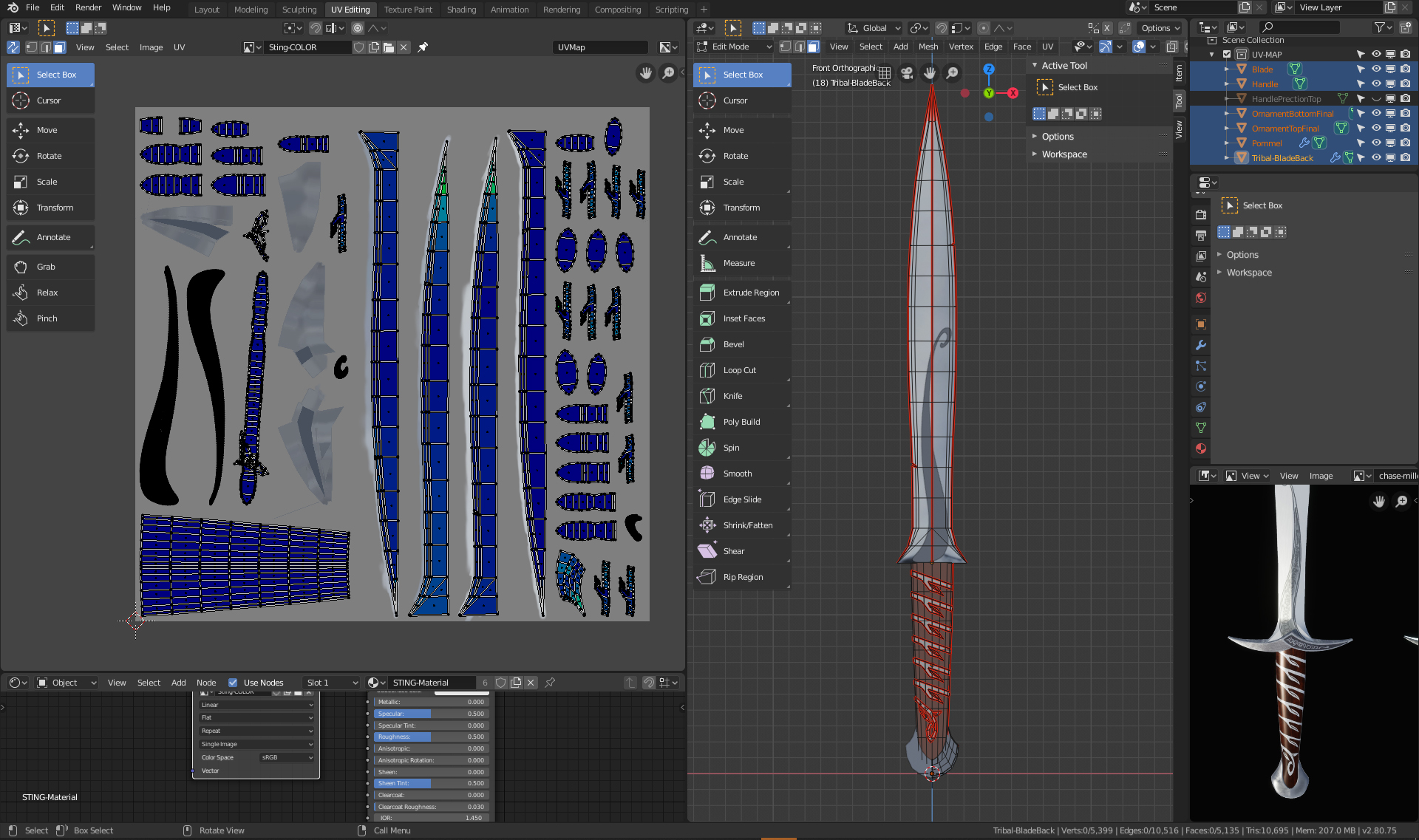
Once I got to the handle protection the problems got worse. I didn't lay out the UV Map very well and it ended up having some issues with verticies and faces, so that when I painted the metal above the handle, the color turned up on more than one place. :-(
I changed the seems but when I tried to unwrapp it again, the uv map were not laying on the correct places anymore and I would have lost all my previous painting work. After many tries I decided to unlink the material of my handle from the rest (Object > Relations > Make single user > Material) and created a second Material with a new texture only for my handle. This way I was able to keep the blade and work with a new uv map layout for the handle.
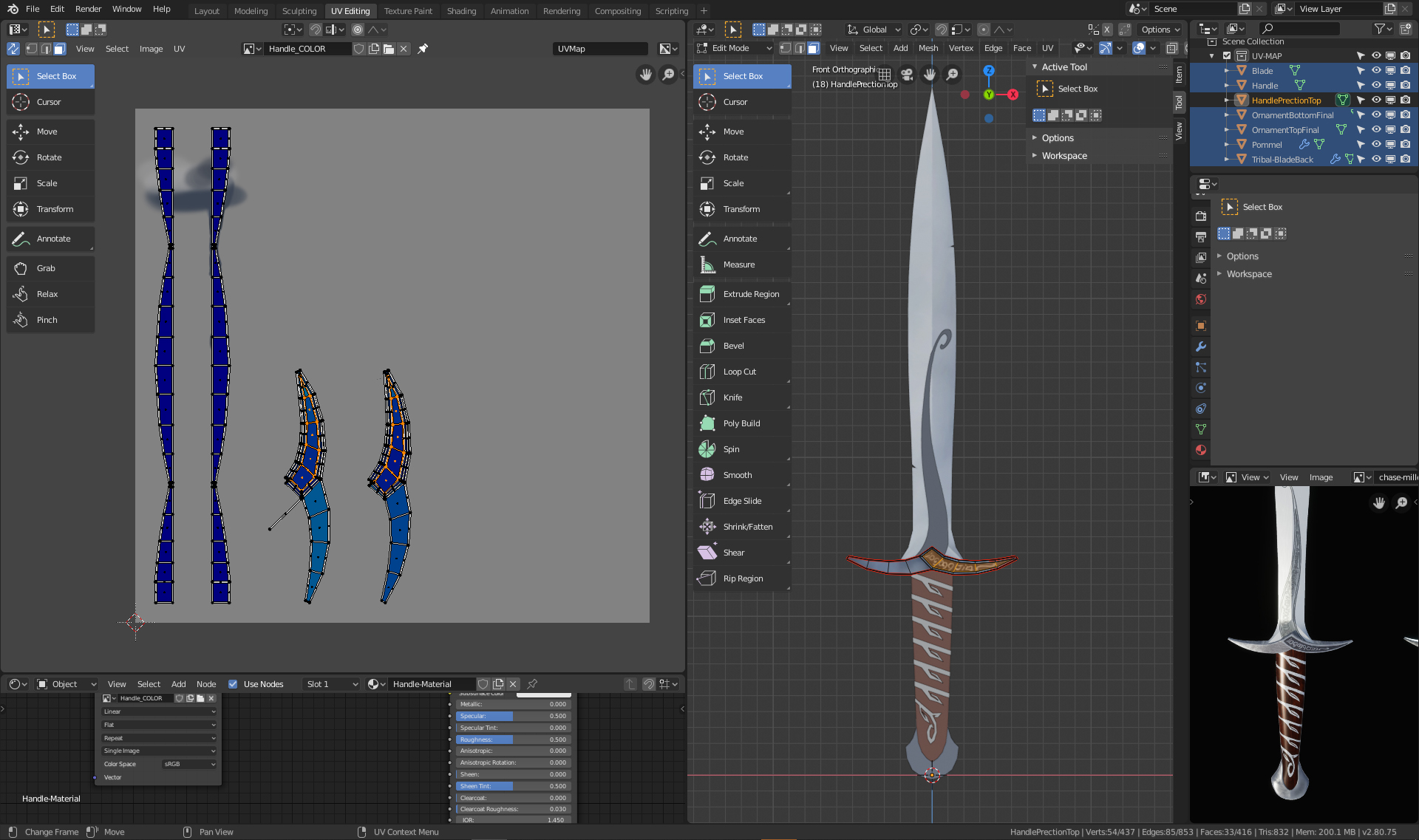
I don't know if there would have been a way to place the uv maps exactly at the same place again but I was so glad I was able to keep the blade bc painting is taking me forever. :-)
The UV unwrapping is very difficult and it seems almost impossible to get all blue on rounded elements ... but maybe with more practice this also gets easier.
![]() philip79 Trust me, UV unwrapping is practically an artform in it's complexity. There's no true right way and you'll always be learning about it. In a way it's a good thing! But if you want my advice, I would've personally made one seam in the middle of the blade mirroring the UVs, like you suggested. Just don't forget that you can resize the UVs in the editor so you're using up more space and can therefore get more details in!
philip79 Trust me, UV unwrapping is practically an artform in it's complexity. There's no true right way and you'll always be learning about it. In a way it's a good thing! But if you want my advice, I would've personally made one seam in the middle of the blade mirroring the UVs, like you suggested. Just don't forget that you can resize the UVs in the editor so you're using up more space and can therefore get more details in!
![]() thecabbagedetective Oh your are absolutly right, I totally forgot that I could have maximised the new texture! There are so many things to keep in mind ... ^^
thecabbagedetective Oh your are absolutly right, I totally forgot that I could have maximised the new texture! There are so many things to keep in mind ... ^^
Week 2 Homework Submission
This part of the project was sometimes a bit frustrating when I suddenly noticed that I had some minor mistakes in the uv map. In the future I will know better what I need to keep an eye on. :-) The painting in blender was fun but because I didnt use a mirror modifier it was difficult to make sure both sides of the sword look similar. I had to unwrapp the ornament on the blade again on one side b/c with the mirror modifier the form was not running correctly compared to the handle protection. But because I already painted one side I had to do it again on the other side because the lighting of the blade was on the opposite side of the blade. ^^