Day 01
I decided to join the class because I have problems to get used to Blender 2.8.
The change to 2.5 was already hard and now once again. A barrel can always be useful,
.."Fifteen men on a dead man's chest
Yo-ho-ho and a bottle of rum!.."
Bottle? hmm! I am from the north, we store good stuff in barrels ;)
Music for Blender-Modeling Fifteen Men
Now I am ready to go ;)
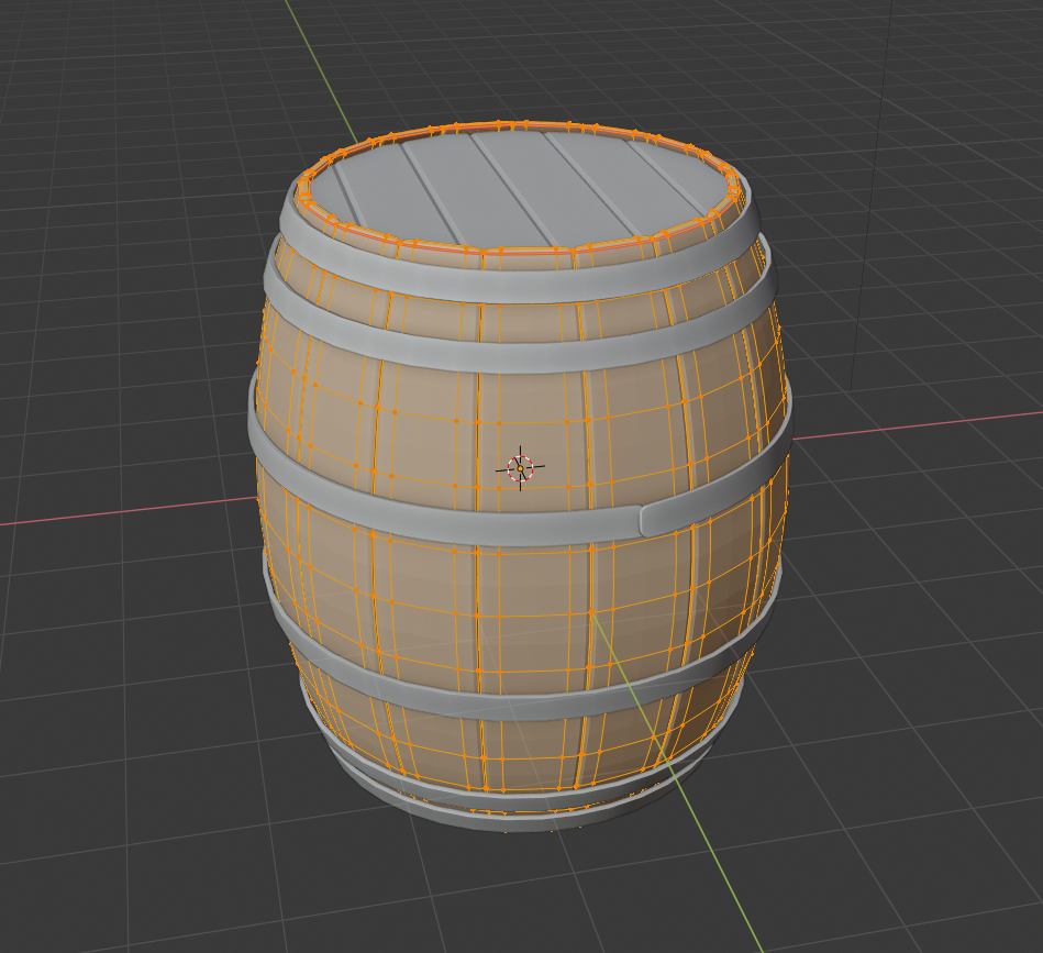
The challenge in the challenge.I decided to practice the modifier combination array and curve.
I also use the lattice modifier for the shape.
For the metal rings I used the shrinkwrap modifier.
This caused some trouble because I want some kind of junction with nails.
I also want to do this only one time for all with CTRL-L - linked Data.
That doesn´t work.
I had to apply the shrinkwrap and have to do this for each ring separatly.
So far I only have one of the rings.

I have less time this week but I surely make the fine tunig until Sunday
This is my second Blender 2.8 Model ( I made the palm-tree) and it is okay for me so far.
Just not as fast as I want.
mmonaloren Thank you for sharing your secret smart-repetition code! Seriously, that's golden insight into your workflow. I usually approach smart repetition in my head. Your method makes mine look super lazy 😅 Really nice work, Mona.
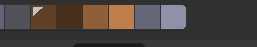
The updated model and workflow insight you shared has earned you an A++ for week 1. And your texture work is spot on. Another A on the report card from me. The only suggestion I have for you is that possibly the wood texture could use some broader gradient variety in the wood tones. Here's an example where the board is notably darker and more saturated on one end (circled in black) and the other end is brighter and less saturated (circled in white):
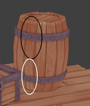
Your current texture looks fine, but this is just a small thing that could add a tiny bit more interest to the wood tones.
Keep up the great work! 👏
@theluthier hank you for your detailed comments and suggestions. That´s very helpful:)
Actually I had painted more variations in the texture. Gradient, first with big smooth brush then smaller brushes, and at least 2 different colours&different falloff (without culling) on every side for smaller strokes. For the colors (3 because it was convenient) I chose monochromatic -I like that.
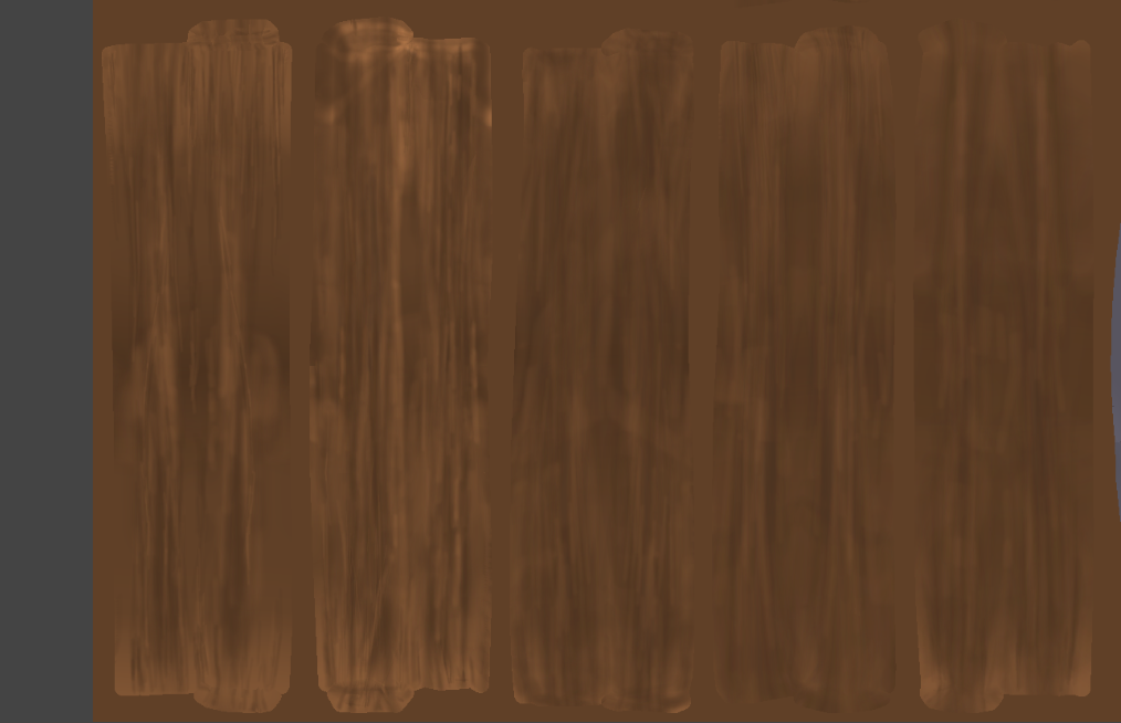
On the object the variations are hardly to be seen due to the resolution. I was too carefully and focused on the settings. Learning effect.
But..hmm..so much brighter on one end than the other at the same plank.I am not so happy with this idea even if it looks very good at the barrel of n647. I don't want that please-- laugh.
However: a compromise:
It really might be more interesting with broader grandient variety.
I would like to add Color Nr. 4 for some lighter areas so it is more visible also on the object.
But not on the same plank but distributed over all planks. So the planks do have more differences from each other.
All in all I would like to achieve a restful, quiet effekt/look (if this sentence make sense).
I hope I still have time this week.
There are some troubles with the shading&lightning part.
Week3-Day 1--Material Wood
Week3-Day 2 -Material Metal
There are not so much material settings but I am permanent tweaking the settings and couldn´t decide what will be the best;)
I guess I will make adjustments again and again until the end. I cannot decide.
Week 3-Day 3 Day of Instance Theory.
This is a tricky one but useful so I spent some hours to get familiar with this.
It easy to delete something that should not deleted ;) Could be a little more comfortable.
But obviously I dive deep into the subject of data in this class ;)
Week 3 Day 4-Day of Light and some problems
1. UV Map and noise/bump node
Some parts of the UV layout are in x and some in y direction.
So the bump effect on the object is not correct.
Solution: I have made a new material for this part and only change the x-y direction at the noise-node
2. Camera
every time I use Num0 for Camera Setting one plank of the barrel left his place and was flying around.
Couldn´t find the reason why and at the end I killed it. Built a new one according my repetition code.
3. Camera again
For some reason I had to go into "view-camera" and set the selected object (camera) as camera.I cannot explain it in a better way, was very strange
Didn´t work otherwise and I deleted and add a lot of cameras today.
4. world material setting & first test render
My first test render showed some white areas wihtout texture.Took me a while to figure out why.
I selected the collection and use "instance to scene" and "M" for the collection I wanted.
But there were some "backups" in this collection - selection also viewport and render disable.
But it was copied to the instance and were overlapping my original mesh.
First Render Test
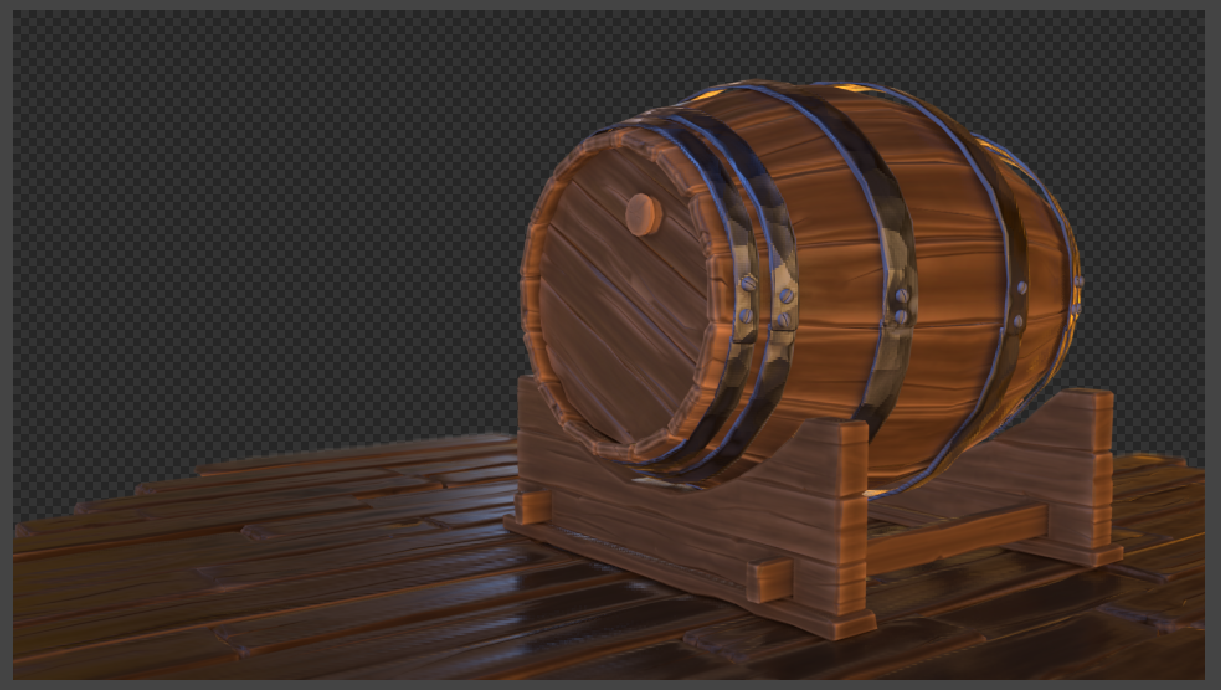
I surely will tweak all setting several times.
I am not sure If I like it. Perhaps I will make the planks bigger or in the other direction.
Change a little bit the overall color......
But at the moment I am hoping the compositing will not be so exiting as these settings so far ;)
mmonaloren You are learning all kinds of things this week. Good for you for sticking through the muck. The barrel scene is shaping up nicely, but the hammered metal is a touch too strong for my taste. But if it works for you, then that's okay, too. Maybe the wood could use a stronger bump to balance with the metal better.
mmonaloren | Some parts of the UV layout are in x and some in y direction.
If you use the Object Coordinates as input for the noise texture, it doesn't care about the UV layout...
For the rest, it is beginning to look really good (maybe change scale of the Voronoi on the metal? Something looks a bit off, like silent also mentioned...)
One thing: and maybe this is intentional, but it looks like it is standing on a round table, which makes me think the barrel is really small...
But like I said, that might be your intention, a small table barrel;)
Thank you very much for suggestion and advice.This is very helpful. Because after some hours tweaking and solving some problems I could not see anything.
Yes, these material settings are too strong.
And spikeyxx - thats it - thank you. I was thinking about these floor, there was something strange ;)
I have already thought about rotating. But also maybe the floor shouldn´t touch the edges.
I tried the Object Coordinate yesterday.I will do this again with more concentration today.
Some things to test out. Thank you.
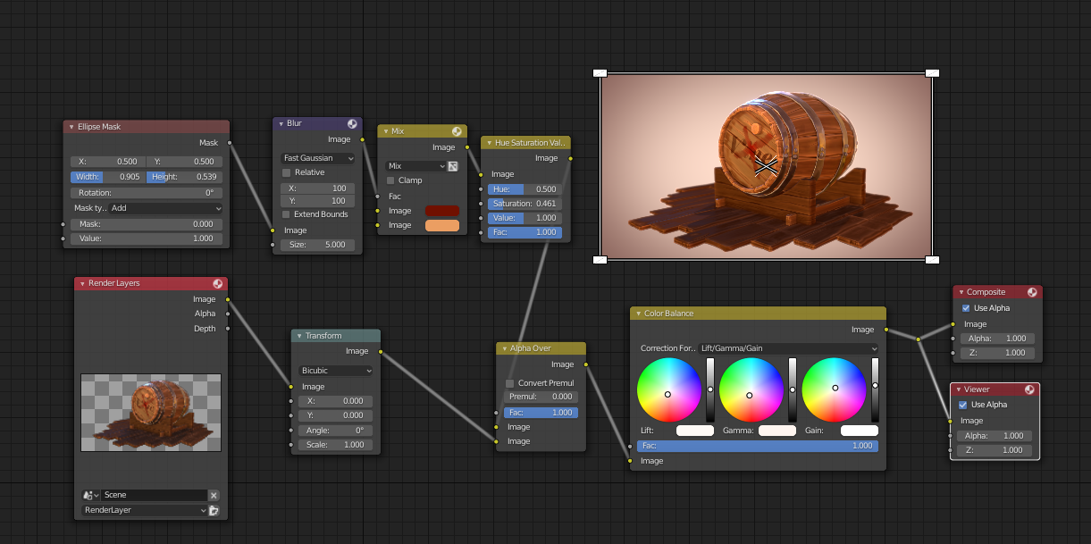
Week 3 Day 5 Compositing Part (following the treasure chest Course) and some Changes
Here are my changes. As far I can remember ;)
- new floor and new camera position
-Material Wood and Metal: Noise/Voronoi and some adjustments Reflection/Roughness
-Color changes: floor, wooden stack
and following the treasure chest course for compositing part.
I followed also the workflow with this workaround and render with 200% etc..
My render result showed a very dark vignette. Not so nice.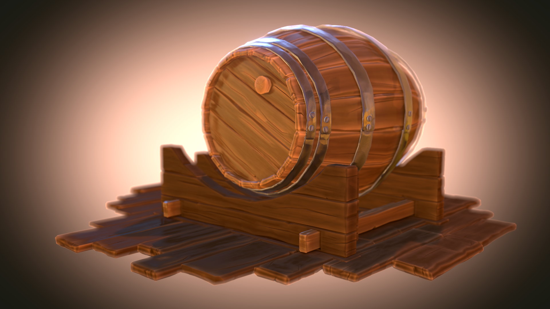
I changed the Mask but I am not totally happy with the result.
There are still some things to optimize.
But right now I need a break ;)
mmonaloren Maybe try a complementary color for the background?
You can do this easily by hand, but you can also color pick the main brown of the wood. Put that color into an Input > RGB node. Copy that node into the background and feed it through a Color > HSV node. Set the Hue to 0 and out comes the exact complementary color...
So, without any effects:
It's kinda relaxing to the eyes and makes the model stand out against the Background. Just an idea.
![]() spikeyxxx Thank you spickey.
spikeyxxx Thank you spickey.
Nice idea with the RGB Node and the complemantary.
I often use this color wheel for color check/idea. BTW. there is an complementary color on the edges ;)But very slighty.
I used one monochrome and the complementary of my barrel-brown for the Ellipse Mask/Mix Color.
Very subtle. So I will try a stronger version.
mmonaloren Doesn't Mixing the complementary color with the original sort of defeats the purpose of using a complementary color? Sorry if I misunderstood what you have been doing;)
![]() spikeyxxx sorry I did not write it very cleary.
spikeyxxx sorry I did not write it very cleary.
I used my color for the barrel as basecolor to find two other for good matching.
one of these (in die Edges) are the complementary.
The other is much brighter but in the monochrome range.
I want a over all design with warm colors, so I used the same color-monochrome range.
But this can also be very boring for the eyes, so I set the complementary too.
So I wanted to achieve a pleasant color atmosphere -quiet and restfull..if my helpless sentence makes any sense
But as you mentioned, perhaps it can be a good idea to make it more visible (the complementary).
And also there are some areas too brighten I guess.
mmonaloren O.k. I think I get it now. Good thinking!
Still, I would suggest to give it a try (non-destructively!) to make the background completely the complementary color and then add a vignette (maybe not that strong..). See how that looks. If you don't like it, just don't use it, but at least give it a try...
It's not Sunday yet, so still time to experiment;)
I'm sure you'll get a great result.
Keep up the good work!
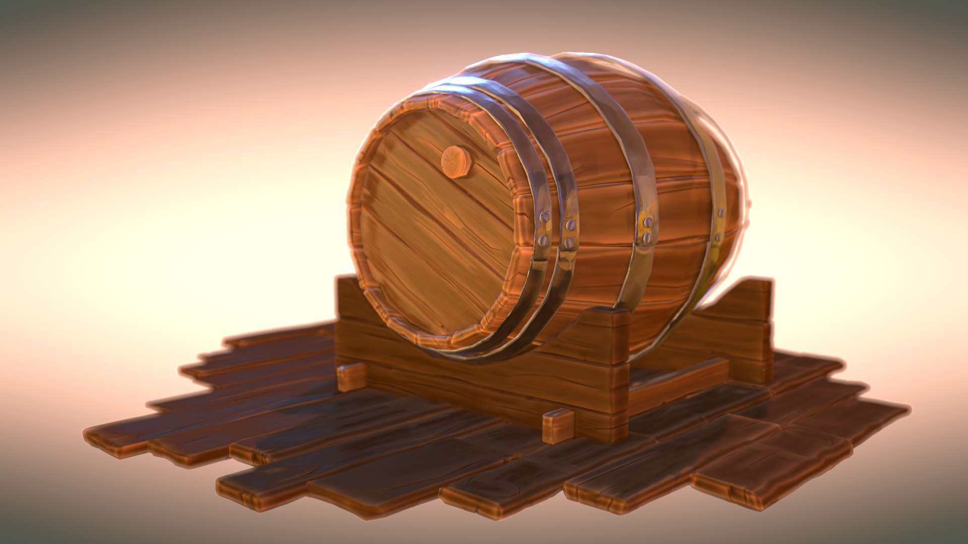
![]() spikeyxxx Some Render Test I made yesterday
spikeyxxx Some Render Test I made yesterday
based on your suggestion to use the complementar color. Played around a lot e.g. with Saturation, settings mask ellipse, and for the last one I used two colors
I want to achieve some harmony. For me the complementary ist more like a "bang" ;)
I also want to clean up and tweak some other things.
So up to this point I had not made any deciscion. It was defitely worth a try.
I was curious to see what it will be in the end.
BC1-1908 Homework Submission Week 3
the complementary color test looks good, but I wanted to try something else.
Basically I followed the treasure chest course because compositiong is new for me.
- Camera Settings:DoF / F-Stop I used an Empty
- Light: HDR Heaven "courtyard / often changed the Rotation to find a good lightning
an additional point lamp for the front part because I guess this should be the focus
and another point lamp at the rear backside of the barrel to support the metallic of the rings ( before it was a little bit too dark comparing to the front)
- Colors: monochromatic based on the warm colot of my textur paint base color
for a kind of harmony, restful, calm impression
Compositing Color Balance: Lift (dark), gamma (midtones) and Grain (highlights) only some very subtle changes to
bring out the more brownish Range oft the dark and midtones and for the highlights a tiny step to blue
HSV Node- reduced the Saturation to 0.4
I think this were my settings to played with.
At the end I thougt there is something missing and add the sign with red colors.
Painted in Gimp and import to Blender with " Images as Planes". Very easy to do with the Material settings
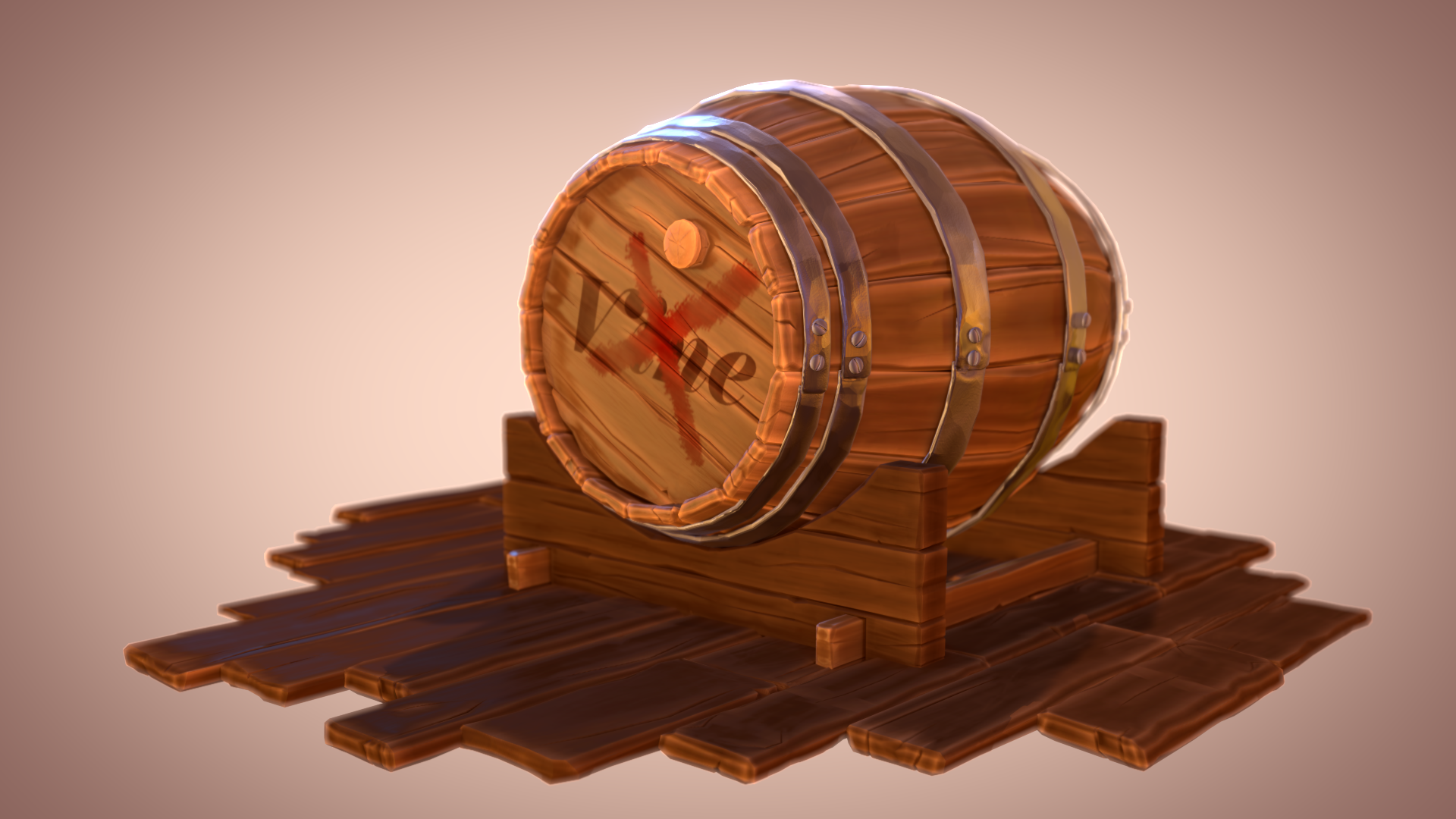
After 3 weeks working on this barrel I am more familar with 2.8 and start to like it;)
Besides I have learnded some more techniques, exspecially a lot about Blender data, very useful.
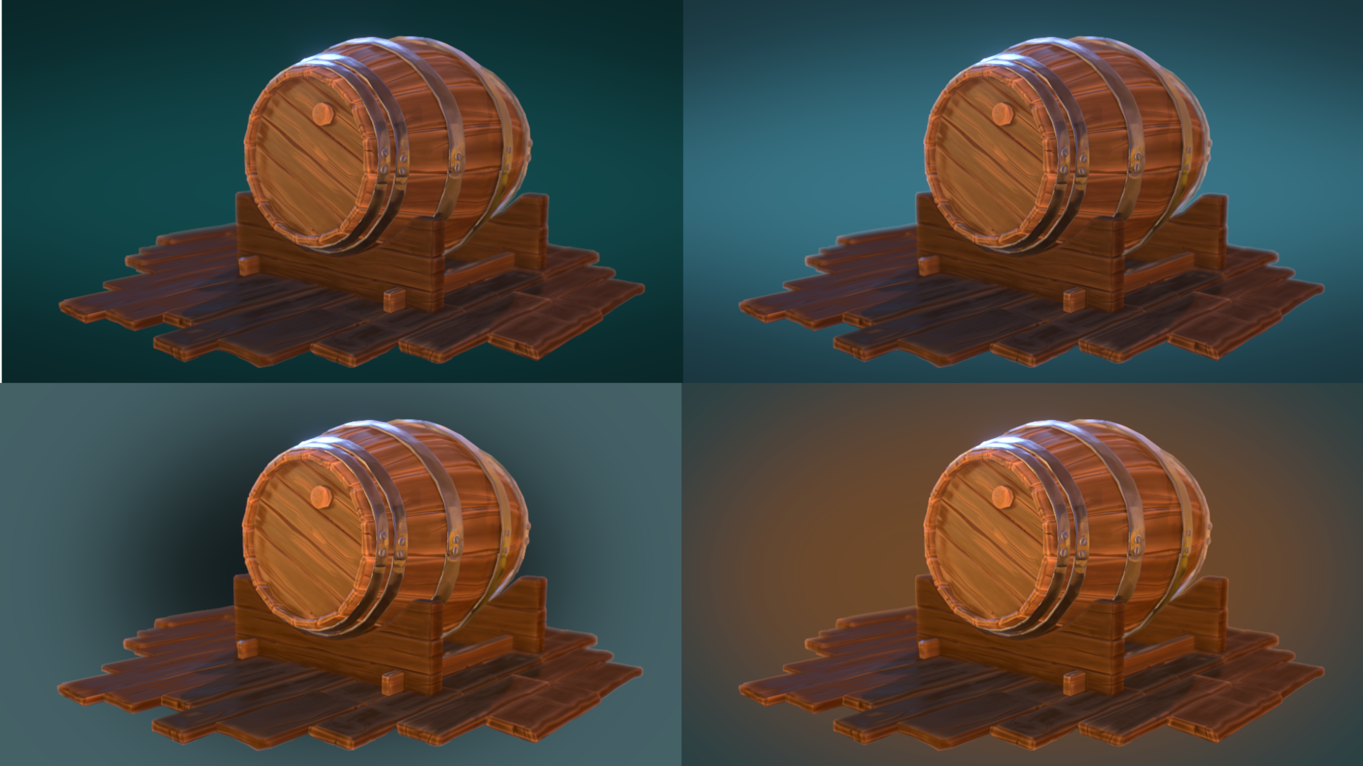
mmonaloren Hi Mona, The fourth image is definitely an improvement to what you had before, But I think that you should either go for completely monochromatic or use a complementary color for the background, With the complementary color just on the edges, it distracts from the center of the images. The less contrasty vignette is a good idea!
Maybe you could go for monochromatic and then use a blue-ish backlight to break that up?
Just try some things out...
mmonaloren Your barrel turned out so good. One of my favorite barrels. The wood details look incredible in the shader. Metal is very appealing. I love the warmth of the final composition too and that subtle vingnette 👌
All around a wonder finale. It's an A+ from me. Great job this month, Mona!