Hey,
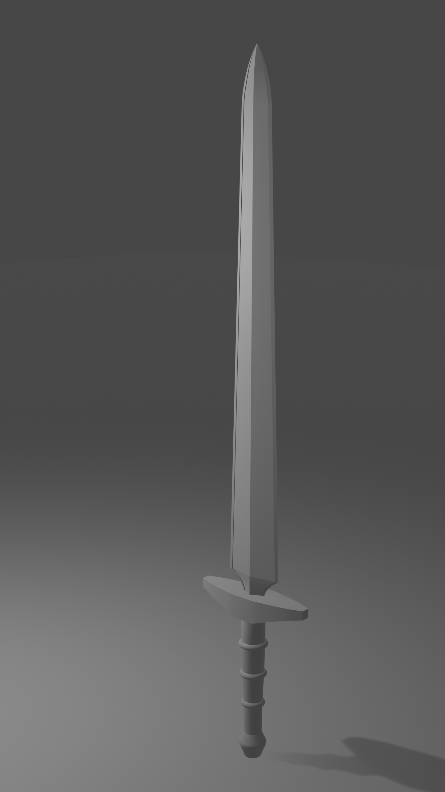
at day 1 I started making the same Sword, like the live stream, from my memories. I tried to remember the mechanics and I think it works well.
For day 2 I try to take a look on the "Treasure Chest" tutorial, also try to finish all parts fast because I see there is a second chest tutorial coming today :)
On day 3 I can do nothing....my son have 18. Birthday :)
On day 4 I try to make my own model.
On day 5 I have to submit something ;)
I hope to reach my goals.
![]() spikeyxxx thanks! I also will try this :) It looks much cleaner. Is it necessary to apply the Boolean modifier?
spikeyxxx thanks! I also will try this :) It looks much cleaner. Is it necessary to apply the Boolean modifier?
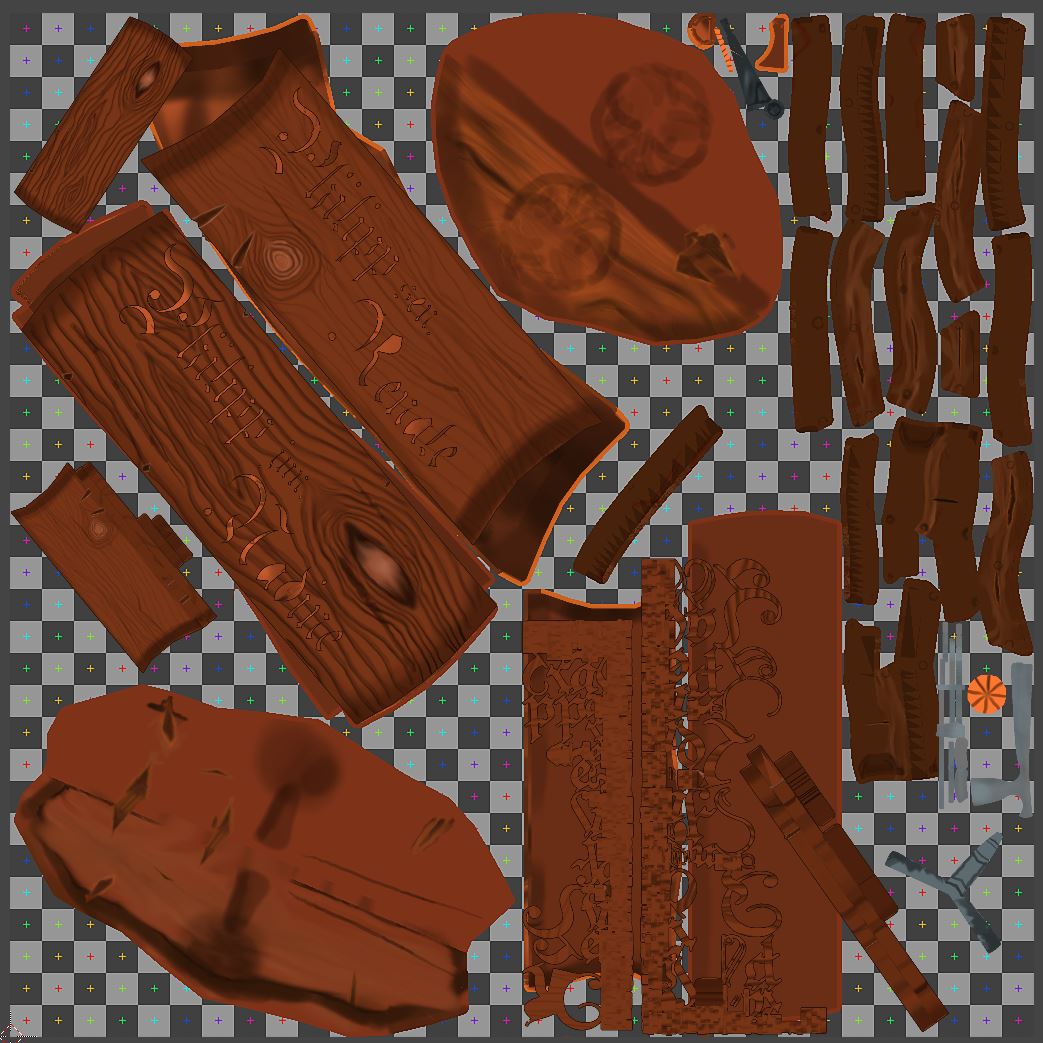
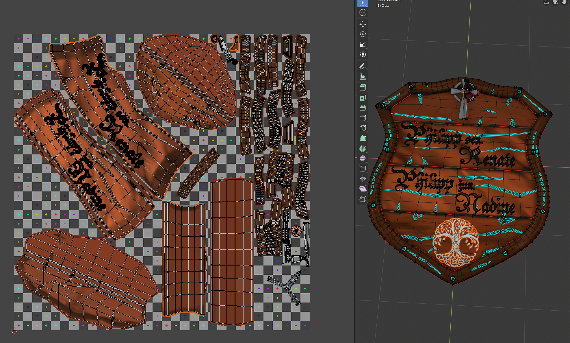
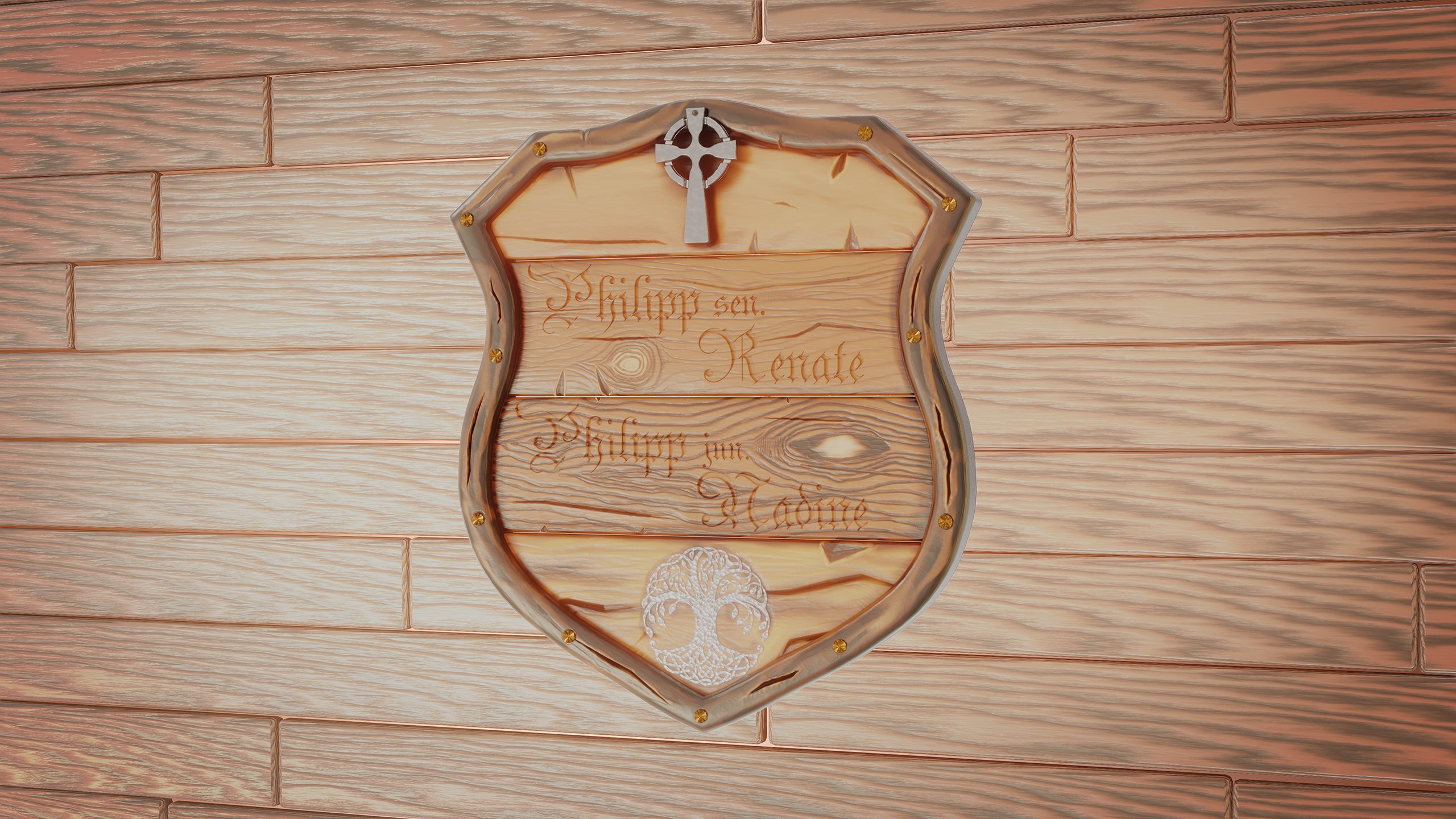
Homework Week 2 Submission
Sometimes I thought it would never be finished. To unwrap the boards with the text was horrible and isn't good but time is gone.
I really learned a lot....I need some more knowledge about different blend types and shortcuts to switch between the tools.
I am very bad at drawing and so the result makes me even happier :)
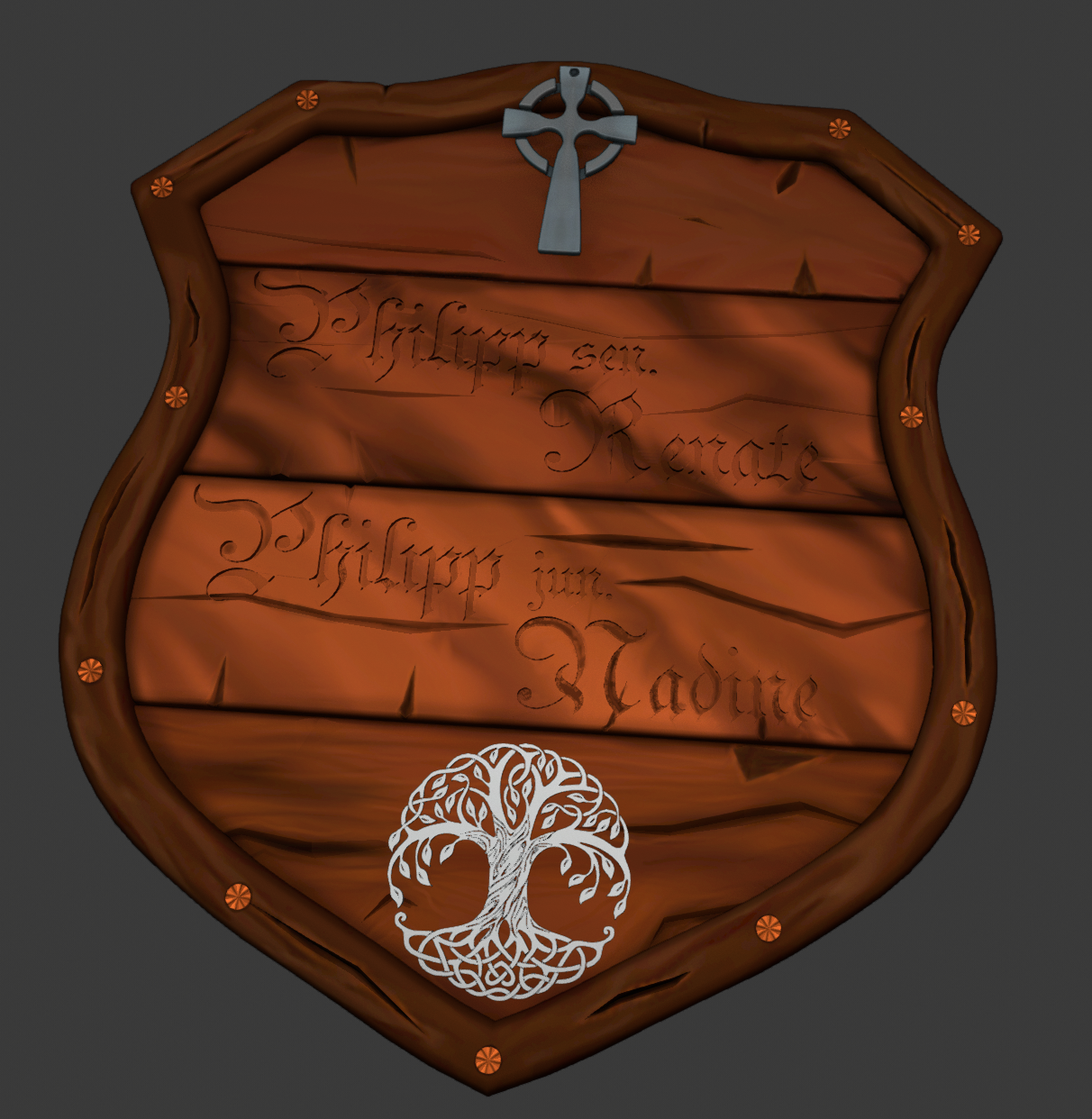
![]() cruento I really like that tree crest, is that from lord of the rings, Minas Tirith?
cruento I really like that tree crest, is that from lord of the rings, Minas Tirith?
![]() dostovel yes it could be :)
dostovel yes it could be :)
The meaning of the Celtic symbol:
The Tree of Life commonly represents the interconnections of everything in the universe.
It also represents the connection to one’s family and ancestors. The Tree of Life has an intricate network of branches that represents how a family grows and expands throughout many generations.
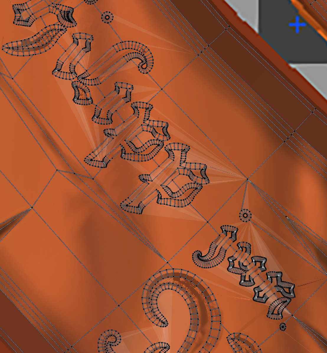
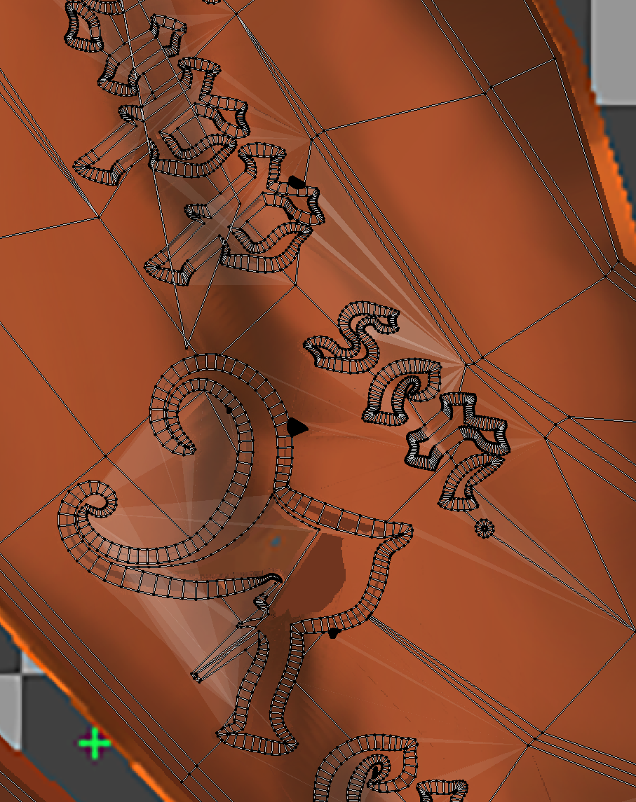
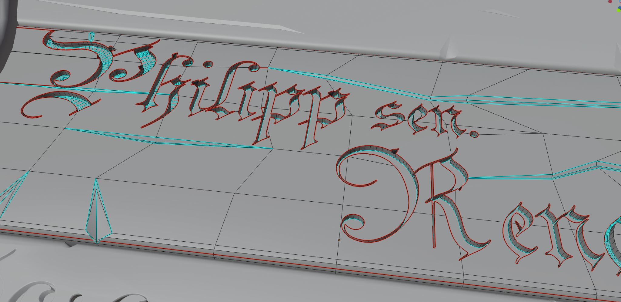
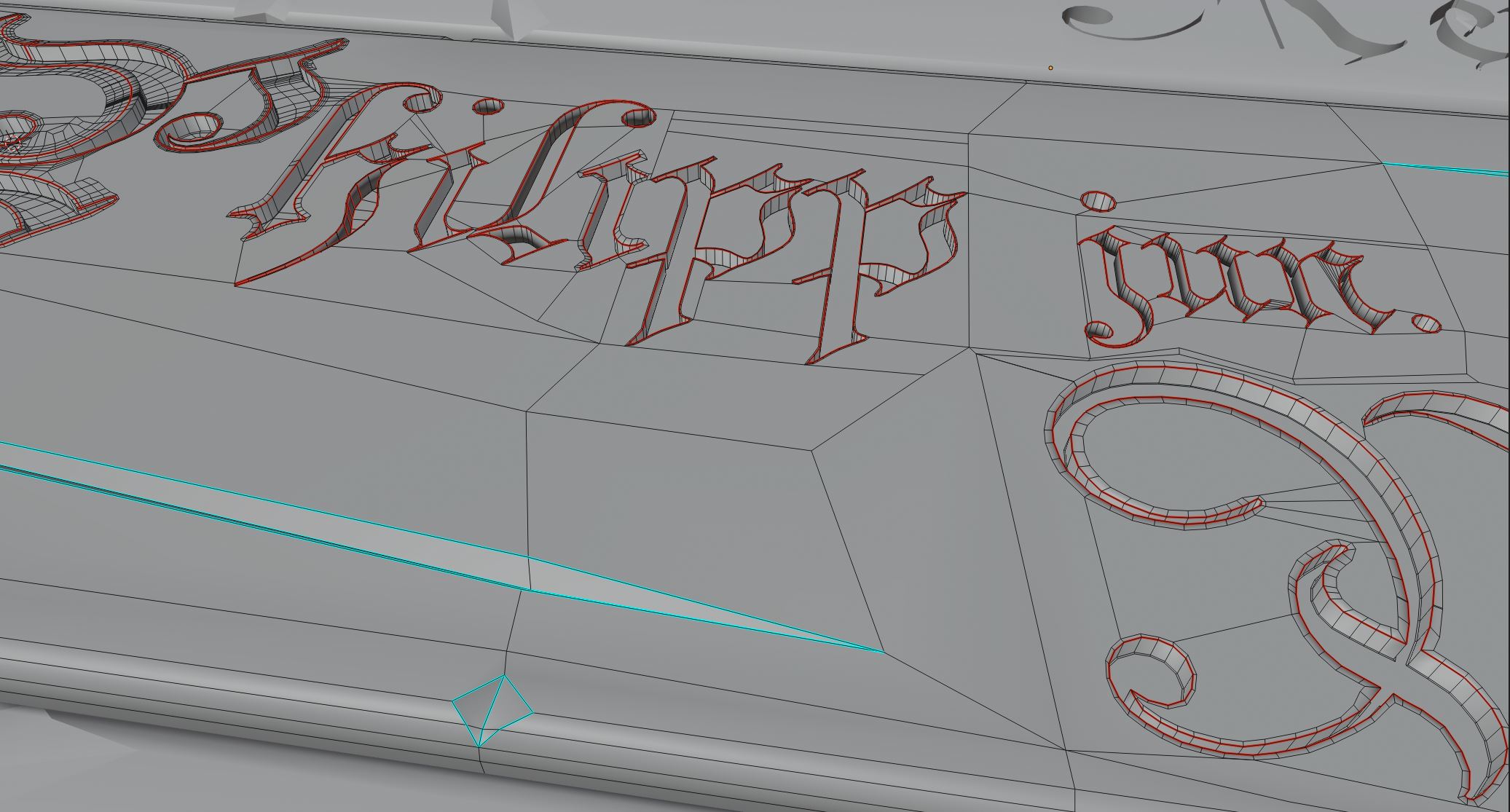
@ghujelk , ![]() spikeyxxx I am glad that you like it. The Font was not available in Blender, so I model it by my own. By applying the Boolean I had a lot of shading artifacts but it's ok now. I think it would work better if I make edges to the vert's of the text, but then it is a high poly mesh :)
spikeyxxx I am glad that you like it. The Font was not available in Blender, so I model it by my own. By applying the Boolean I had a lot of shading artifacts but it's ok now. I think it would work better if I make edges to the vert's of the text, but then it is a high poly mesh :)
![]() cruento I'm glad to hear you learned a lot along the way. I definitely see it showing in your results. Overall it's a good texture but I do have some notes to offer:
cruento I'm glad to hear you learned a lot along the way. I definitely see it showing in your results. Overall it's a good texture but I do have some notes to offer:
 The middle two boards have color stripes that flow diagonally instead of horizontally like the bottom board, which aligns correctly with how wood boards are cut in reality. It feels unnatural and doesn't align with the wood cracks either.
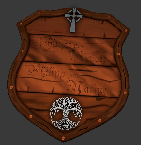
ssmurfmier1985 Whoops, it's a B: I recorded a grade on the report card but didn't put it in the feedback.
@theluthier thank you! OMG now if you say it I see it so clear :) I like the style of diagonal wood lines, but you are right wood never cracks diagonal to the wood grain....why I don't see it by my self. I think the middle boards need a new UV-unwrap, I have to cutout the text because there are a lot of stretching and the painting was very odd. Post some pictures in the afternoon.
![]() cruento Technically some rare wood does have a growth pattern called "figuring" that produces diagonal waviness that kinda looks like what you painted. But it's usually used in fine furniture and musical instruments, not in an outdoor sign usually made of common wood.
cruento Technically some rare wood does have a growth pattern called "figuring" that produces diagonal waviness that kinda looks like what you painted. But it's usually used in fine furniture and musical instruments, not in an outdoor sign usually made of common wood.
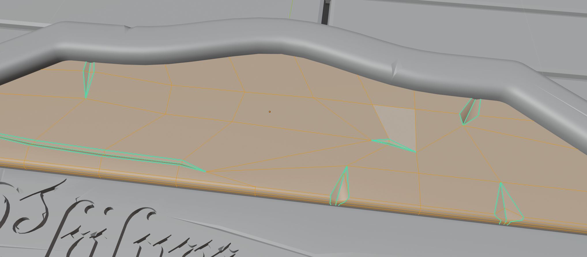
It looks like the extreme n-gons in you carved letters is messing up the dirty vertex colors. Hmm...that could be fixed I think but it'd be tricky. I suppose you can just ignore that for this project unless you wanted to hand paint edge highlighting and crevice darkening for each letter 😱
I won't count it against you to pass on the task. I got you into this mess after all by suggesting to boolean the letters for a carved look 😅
@theluthier hihi thanks yes that's right. But if I didn't try it I didn't know it ;) Thanks for the background info of wood pattern, i thought I saw something like this before but I didn't remember where this was. I will try something to fix this problem because I am sure I can need the knowledge (hope can forgot the pain ;).
Lots of cool work :) Neat to see the process as you work through engraving/carving text into the wood!
![]() cruento Late to the party. Phew! That's a lot of work you put in; plenty you learned. Good effort!
cruento Late to the party. Phew! That's a lot of work you put in; plenty you learned. Good effort!
Homework Week 3 Submission
Planks from the background are procedural texture. Haven't enough time to draw them. Try to show some making of and setup tomorrow.
![]() n647 thank you!
n647 thank you!
I think that I have 4 boards with different styles is a little bit odd :) I try many technics of drawing and adding the text to the boards. There are 4 names of individual persons and so all 4 boards are also individual and told the stories of my personal development.
First board and first painted:
Nothing special.
 Second board third painted:
I just tried to fix the problems by cutting out the text. It helps for the Texture-painting but not for the shading issues.
I need an edge split modifier to fix.
 Third board forth painted:
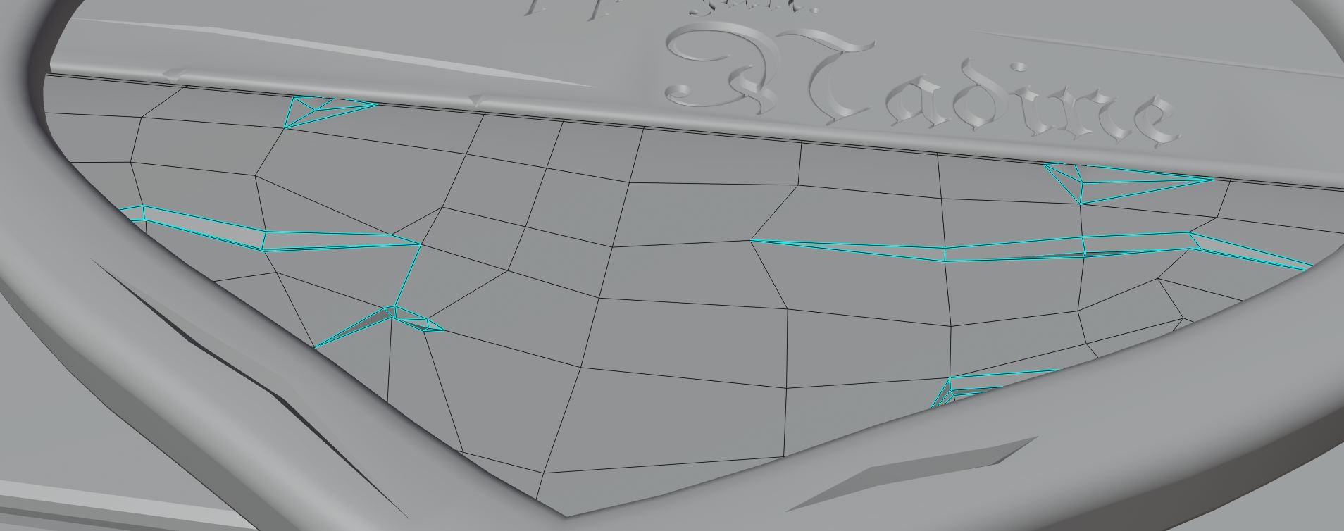
The Best result is with crating a face loop around each letter. Now i really know why it is important. Takes a long time :(
At the beginning it was very frustrating, but at the end I improve my speed a lot (could not believe :) and it was pure fun to push and pull all these vertices WooHoo :)
I think my topology is not sexy but it works for this project.
Fourth board and second painted:
UV-Map:
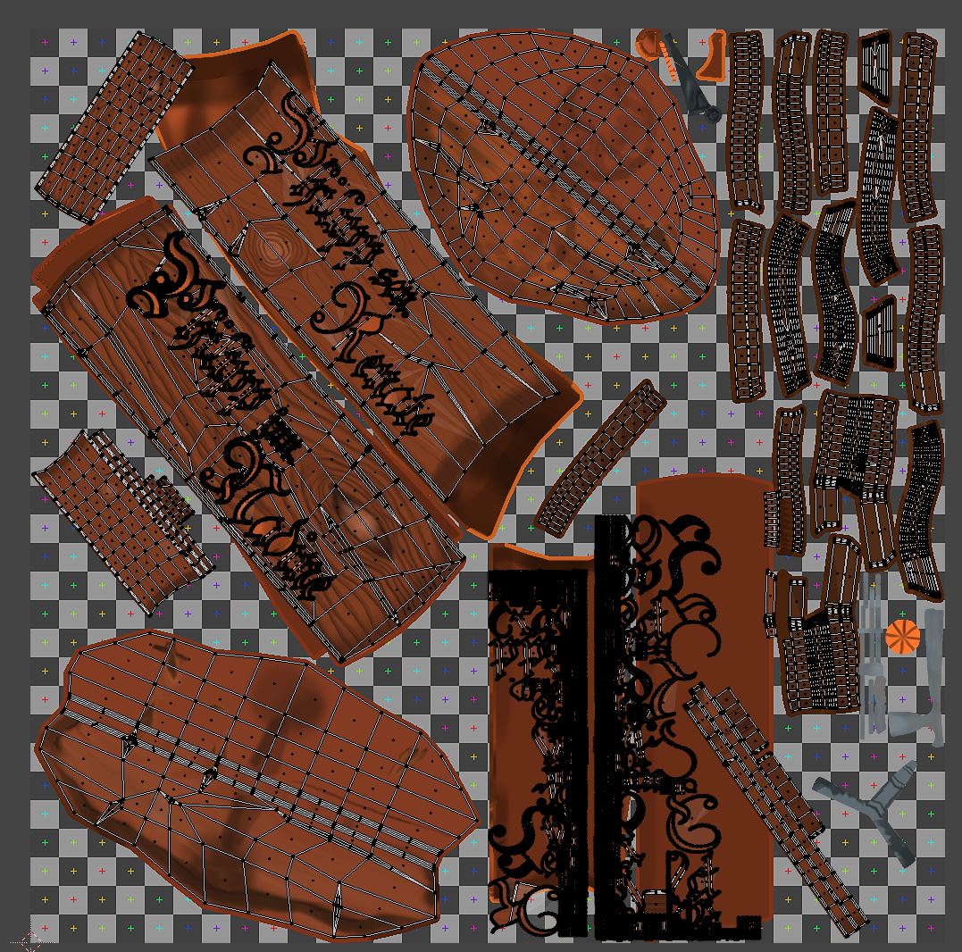
The map looks a bit odd. I forgot to over paint the old painted texture.