ttobles Yikes, there seems to have been an error uploading the image. I just updated the post with the correct image.
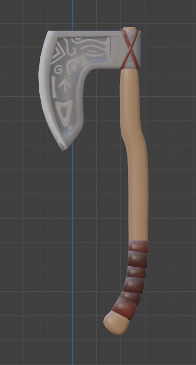
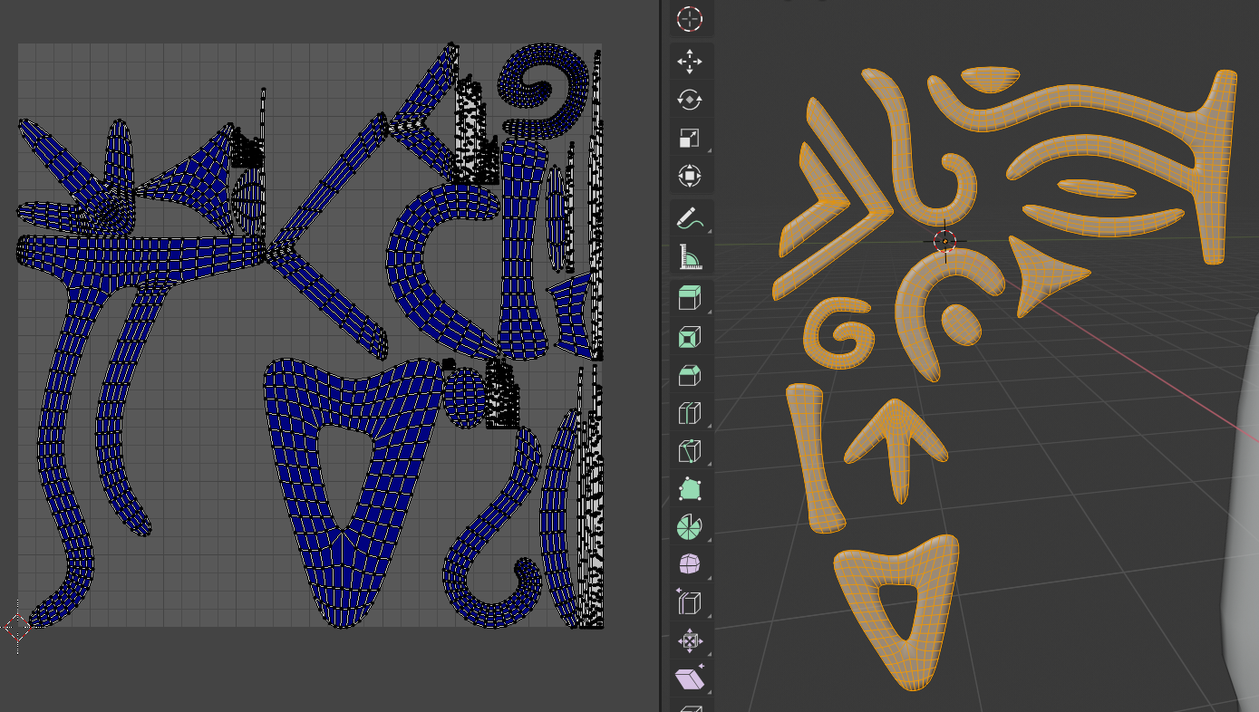
I've got some troubles with the UV-Layout that I can't solve on my own. I tried to cut some seems on the ornaments of the blade but there is like no way to lay them out without (red) streching. For testing I've cut out like every face for it's own since nothing else worked either. It's still all red. Somebody know what to do?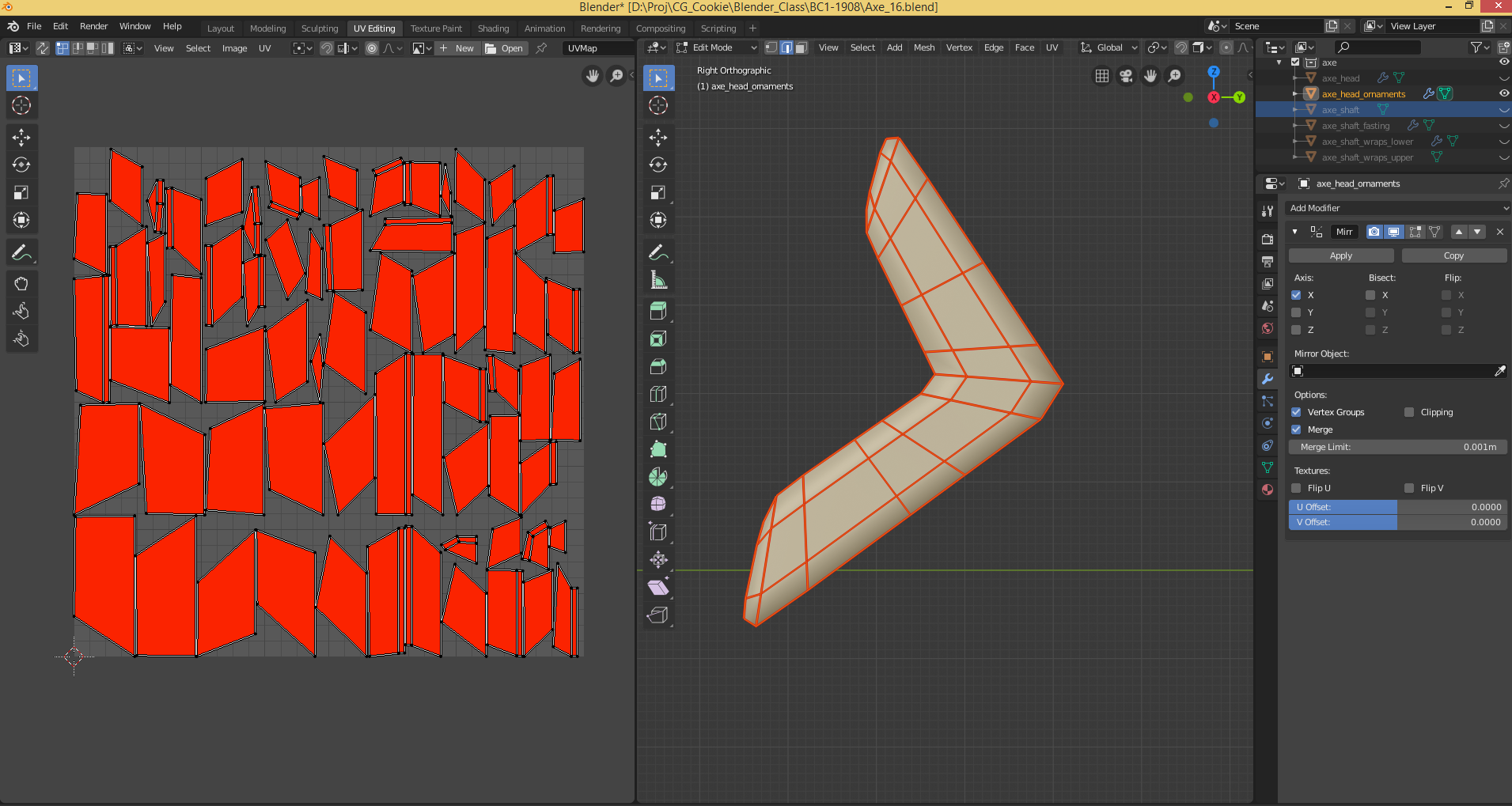
![]() spikeyxxx here is a link. If it's not working tell me pls.
spikeyxxx here is a link. If it's not working tell me pls.
EDIT
I uploaded the wrong file. This link is the actual one!
https://drive.google.com/file/d/1j787vYsOsugT5k60meQA_DBUyvjf19Lr/view?usp=sharing
ttobles Thanks tobles! I think you can call yourself the proud discoverer of a BUG.
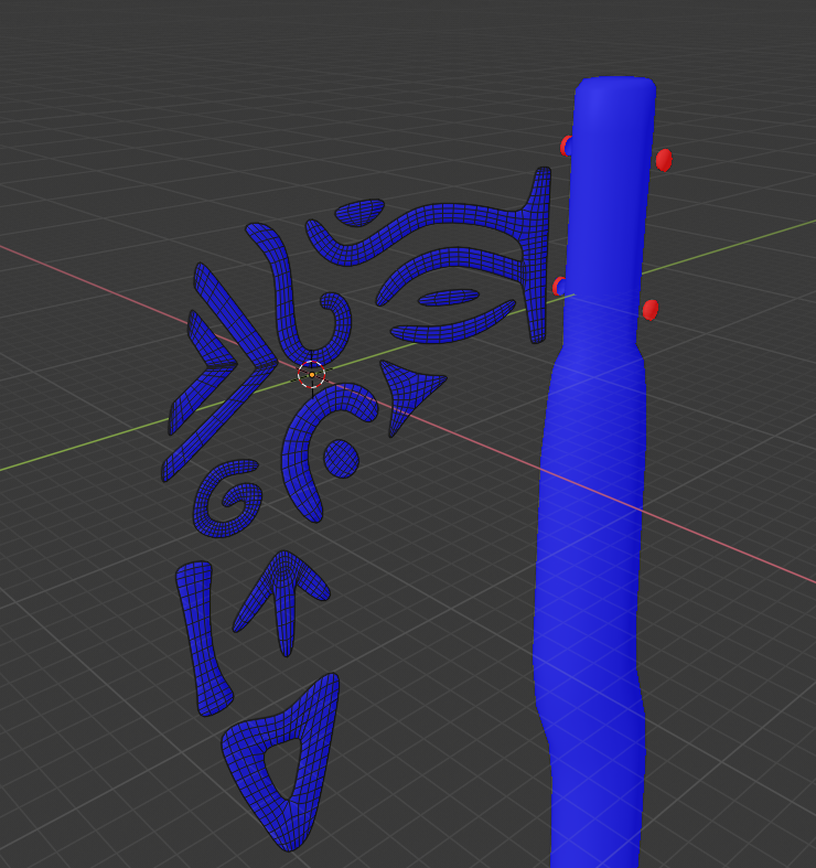
It appears, that if you select only one of your pieces of your ornaments and try to unwrap that, it reports heavy stretching, although there is none, or only very little.
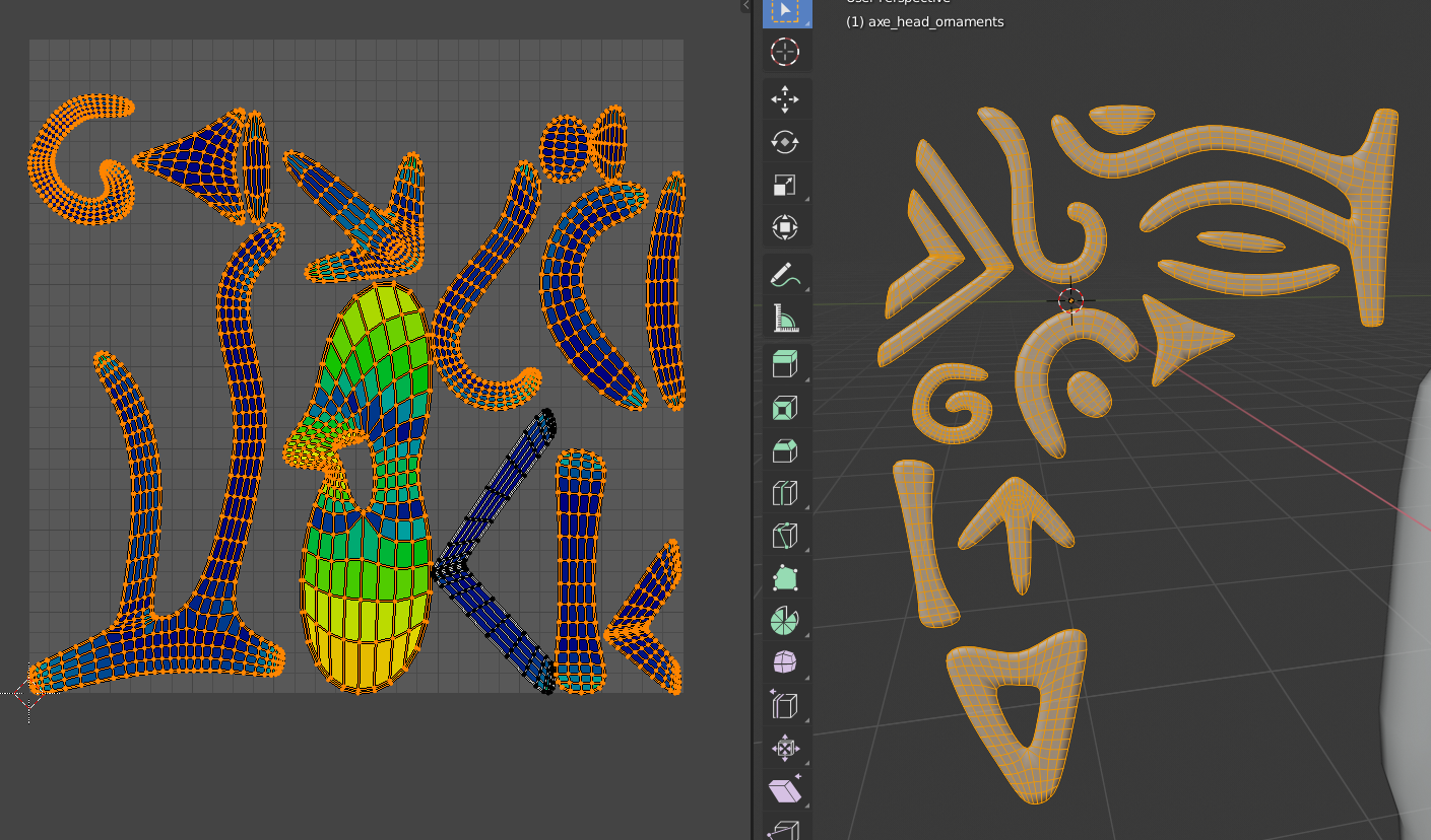
If you select all the ornament pieces and then unwrap, it will do as you would expect.
So, this is what you got:
When selecting All and then unwrap:
Still without seams!
With smart UV Project I got this:
I've tested the theory, by duplicating a Cube in edit mode, select one of the two and unwrap.
It said there was area stretching. When selecting both and then unwrapping everything was blue.
So, it's not you, it's 2.80!
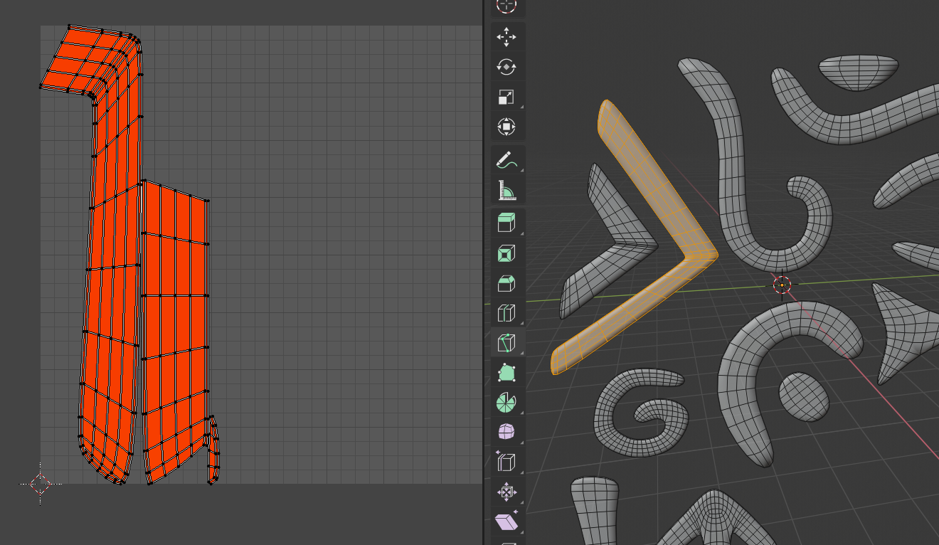
Btw, you do have a Normals problem on your axe_shaft_fasting. In case you run into problems there:
Hope this helps!
Dang it! I spend a whole week but didn't manager to get something out of it. This is what I got so far and I fear it will be the final result of this week...just dang it!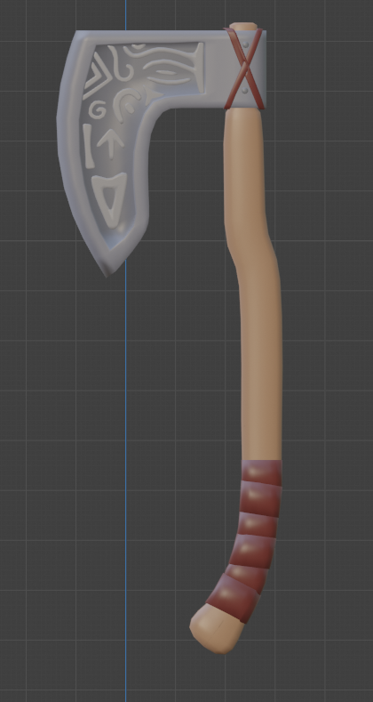
If somebody knows some tutorials which have been useful to you guys I would be happy if you point them out to me. I'd be grateful for tips and how-to's.
Greetings
tobles
ttobles I like what you've got so far on this axe! Overall the colors feel balanced and like a great place to start when you next get a chance to add some texturing.
I found a lot of good information and techniques here on CGCookie in the Texture Painting an Axe tutorial: https://cgcookie.com/exercise/texture-painting-an-ax
There are also various youtube texture painting tutorials, one I found to be very helpful was a series by a user XRG81.
ttobles I'm sorry to see this week has been hard on you. Thanks ![]() spikeyxxx for helping with the problematic scene.
spikeyxxx for helping with the problematic scene.
I could be wrong, but the issue you're having with the unwrapped portion of your ornaments seems to be a sign of relative scale being out of whack. It looks like that little piece you unwrapped separately from the rest of the ornaments (even though they're part of the same object). So when you unwrap it, the UVs are scaled way differently that the rest of your pieces and will always show red until the scales of all UV islands are relative to one another.
This is also why selecting all mesh islands and unwrapping results in mostly blue UV islands, since they're scale is relative. Therefore my recommendation is to cut seams for all mesh ornaments and the unwrap them together.
I hate to be a strict grader, but due to this week's assignment being incomplete I give it a C but bump it up to a B for the struggle you experienced 😔
ttobles Hey, you did the best you could with the cards you were handed this week. Now, really get at it this week and bring it home! You got this.
Homework Submission Week 3
Hello everybody,
this is my submission for Week 3 of this class. It looks a little dark, but that is on purpose, I like it that way (but other opinions are welcome). For this week, I took a step back and went back on the model itself and removed the ornaments. I just couldn't look at them anymore. After that was fixed I took a nose-dive into shading and I really learned something about shading in a short time, I'm very happy about that! I spent some time looking at my render and I have to admit that the outcome of this class wasn't what I was aiming for so it feels kind of like a fail, but on the other hand it's my first time walking through the whole pipeline and doing stuff like texturing, UV's etc. for the first time, what makes me feel very satisfied with the fact that I made it. So the last three weeks were a roller coaster of emotions.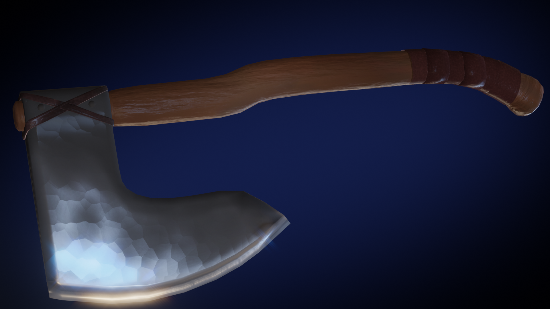
EDIT: I inversed the bump map. Thanks ![]() spikeyxxx
spikeyxxx
Cheers,
tobles
it's my first time walking through the whole pipeline and doing stuff like texturing, UV's etc. for the first time, what makes me feel very satisfied with the fact that I made it
ttobles This is a very impressive result for your fist time. You absolutely should be proud of what you've accomplished. You're already making good choices as an artist too:
I took a step back and went back on the model itself and removed the ornaments. I just couldn't look at them anymore.
It can be very hard to remove elements that you've built with your own two hands mouse and keyboard but sometimes that's the right choice. I think it was in this case: Simplifying the axe design allows you to focus on the shading and I think that paid off. The wood texture looks great and the axe head looks pretty good too. A hammered metal is fitting.
It looks a little dark, but that is on purpose, I like it that way (but other opinions are welcome).
Darkness is certainly a valid artistic choice and when done well it's super effective. Omar's lighting experiments from week 3 are fantastic examples.
In the end I'm going to give you an A because I can see that you adapted this week, backtracked, then persevered to the final result. Good stuff tobles!