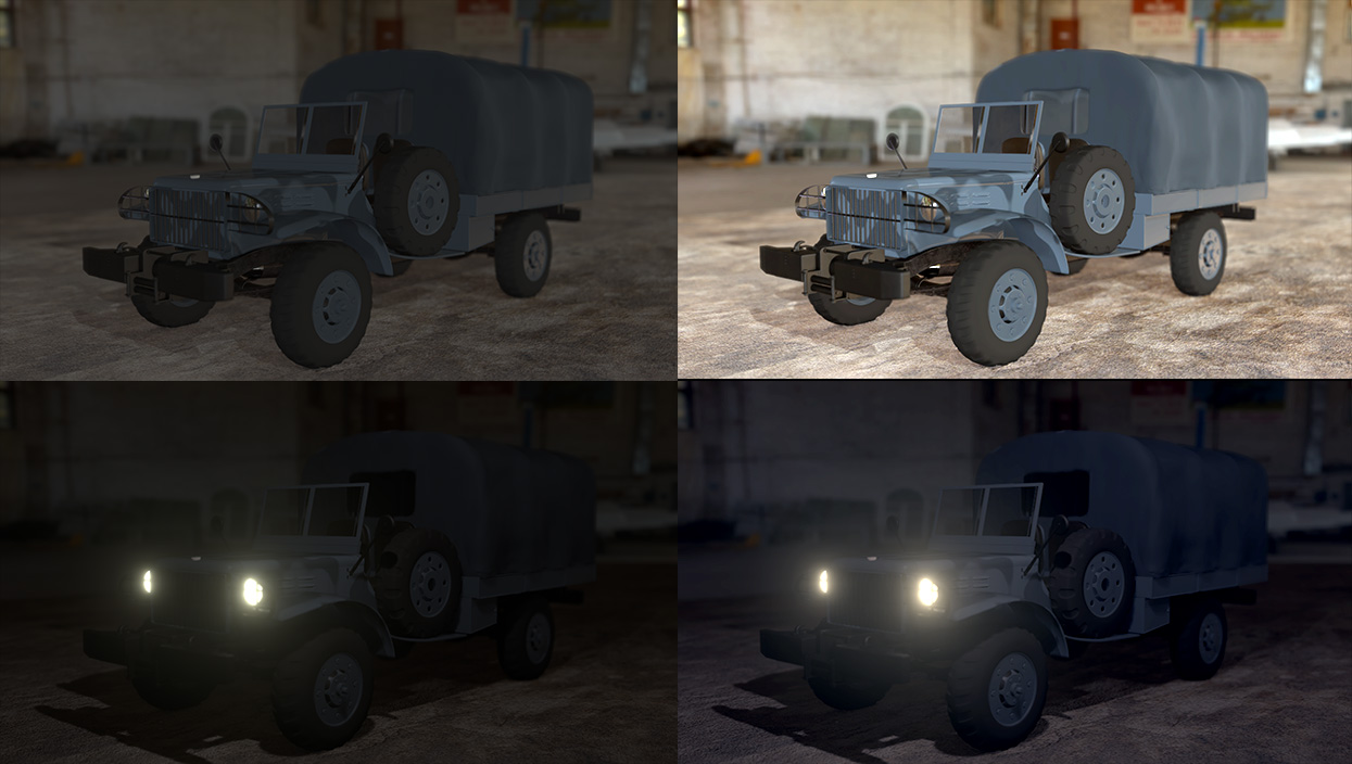
Hi this is my lighting exercise, i tried to add some volumetric light, but i cant get it perfectly it cause a lot of noise, and the denoiser create strange black spots., so i increase the samples to 4000 but it didn't fix the problem, :( 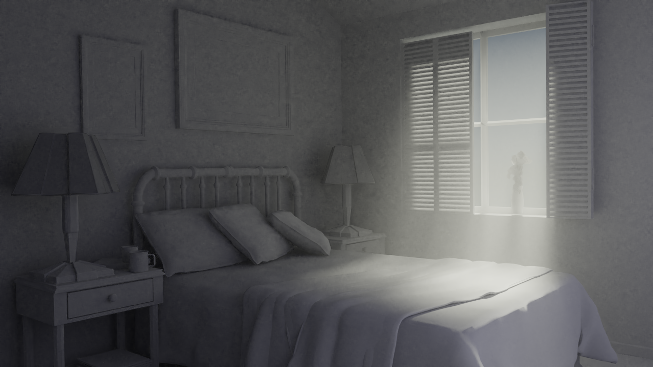 And this is my toy car exercise, with this i didnt have any problem.
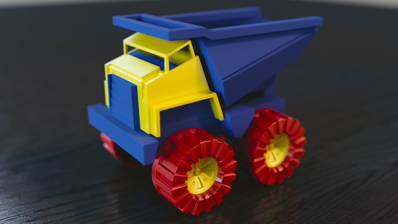
llejimenezro Your day scene looks like it's lit well. Bummer about the volumetric light.
Your truck shader is almost there; looks like some glossiness is missing and something else.
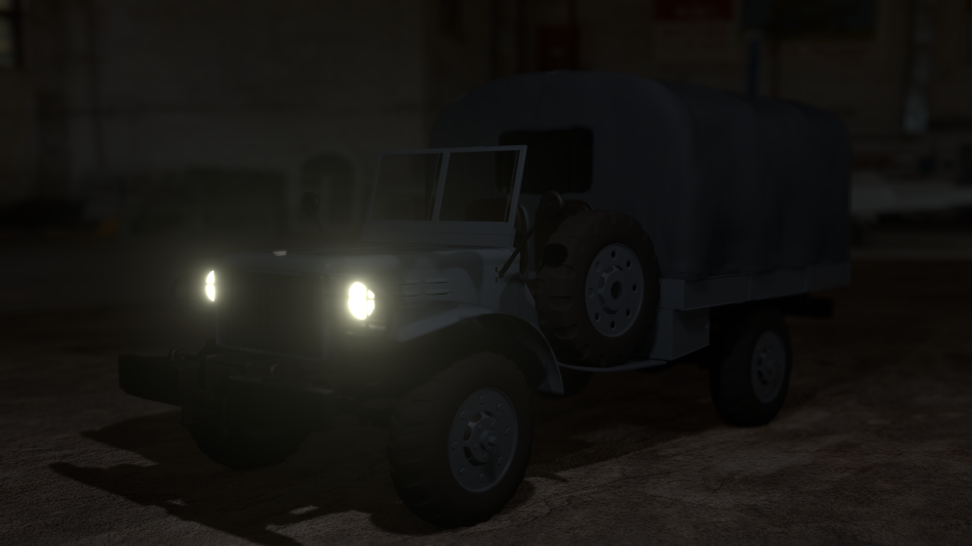
Are you still working on the night scene?
Wow, 4000 samples wasn't enough to clean the noise? That's surprising to me..I've never needed that many samples before. Then again I've not explored volumetrics too much. Typically the splotchy spots come from the denoising algorithm not having enough samples to work with. But 4000 should be plenty. Hmmm...
Your toy truck looks pretty good but the environment and floor appears to be completely desaturated (white and black). Kinda looks like that photo filter that keeps the focus in color while desaturating everything else. Is that the goal?
Did you do the night time scene?
@theluthier, in the truck exercise i want to give it a cold sensation, but probably i give it so much.
llejimenezro Ok maybe saturate the HDRI toward a blue hue to achieve more of a cold feel. You're on the right track for that mood!
@theluthier Is this a situation where upping the values in the light paths could help? Since cranking up samples didn't.
![]() gradyp Hmm possible light paths could help the situation. Though typically more light paths takes longer to computer and thus longer to clean the image in my experience. But perhaps lowering the light paths is the way to go. That's dangerous for interior renders, since they need every bounce to realistically emulate light. May be worth a shot though.
gradyp Hmm possible light paths could help the situation. Though typically more light paths takes longer to computer and thus longer to clean the image in my experience. But perhaps lowering the light paths is the way to go. That's dangerous for interior renders, since they need every bounce to realistically emulate light. May be worth a shot though.
If you want to provide a download link to your .blend file llejimenezro we'll take a closer look at your settings.
@theluthier , ![]() gradyp off course, sorry for answer so late, i was to busy https://drive.google.com/open?id=1bVHFKUS7nyRrkEoDWEREP9cTiupEke7c
gradyp off course, sorry for answer so late, i was to busy https://drive.google.com/open?id=1bVHFKUS7nyRrkEoDWEREP9cTiupEke7c
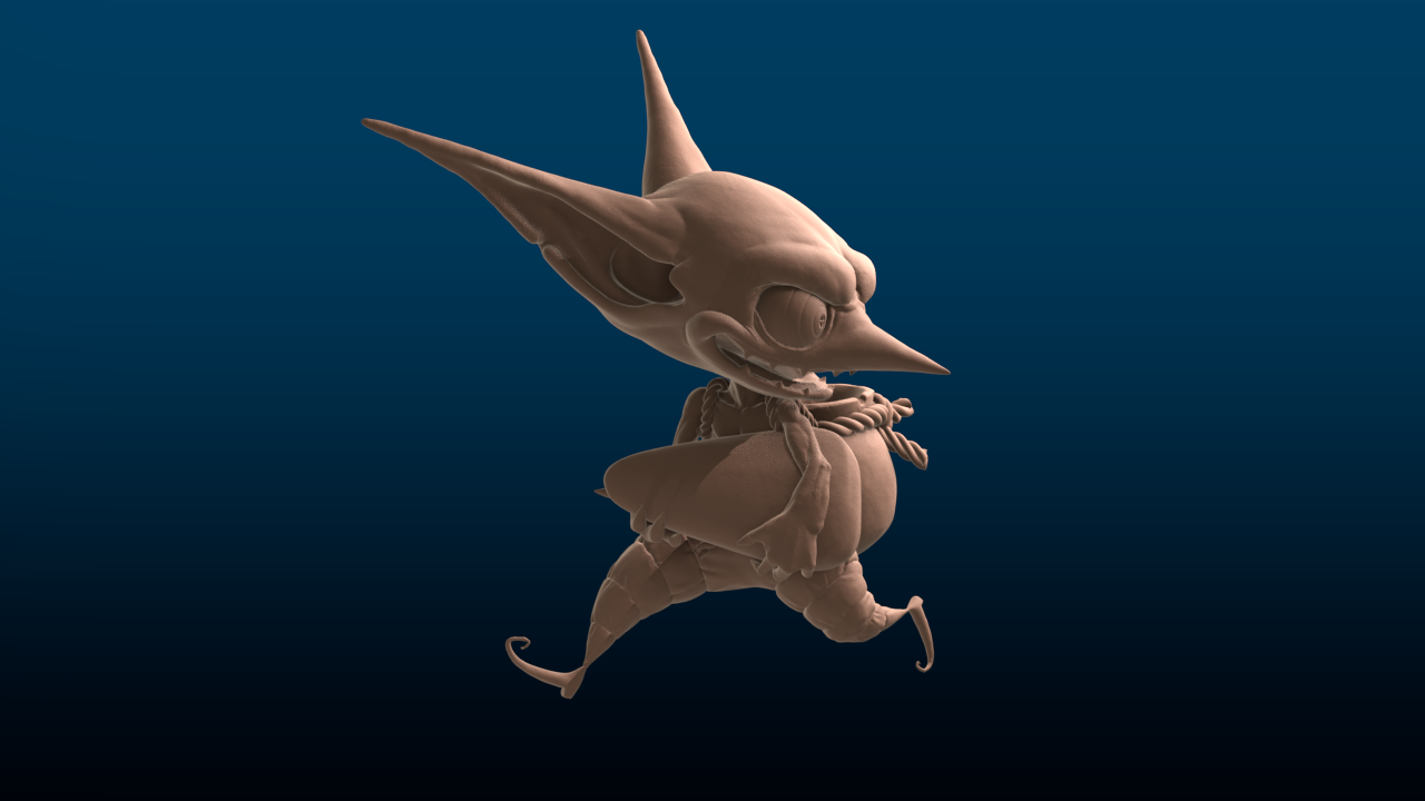
an this is my homework jobs, i tried day and night lighting in the car exersice, all do in evee 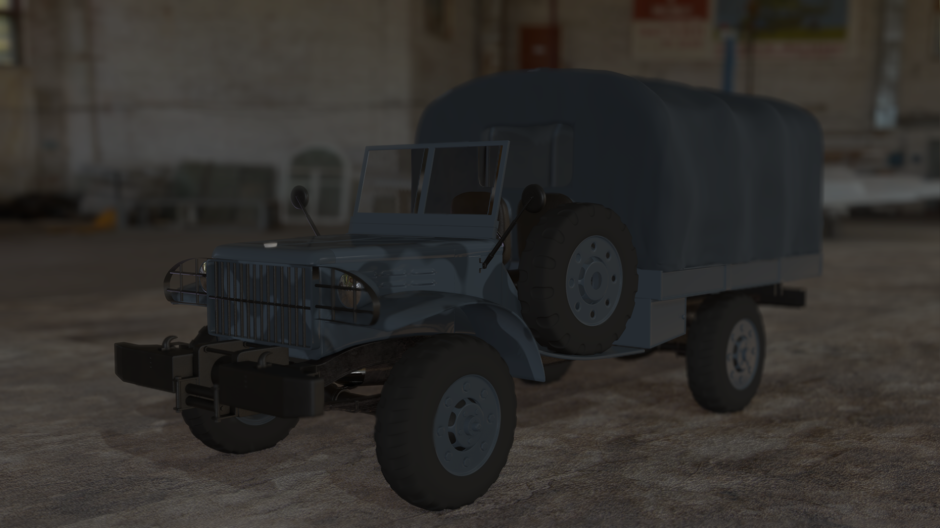
this is my inspiration cg render 
and this is my attempt
llejimenezro Good work this week. I applaud your initiative to do a day and night version of your vehicle. Here's my notes:
Still I like the effort in these renders: It's a B for this first half of the homework.
I think you're really close with the light match. Lamp values, hues, saturations, and positioning look pretty spot on. The only note I have is again about contact shadows. In the image below, notice the darkening that's taking place on the left where two objects touch / intersect:

It's a B+ on the light match for me. Good work overall, Leonardo!
llejimenezro nice progress is there, much less noise than at Week1, keep it up till Week5 when we will just get all the well deserved XPs :-)
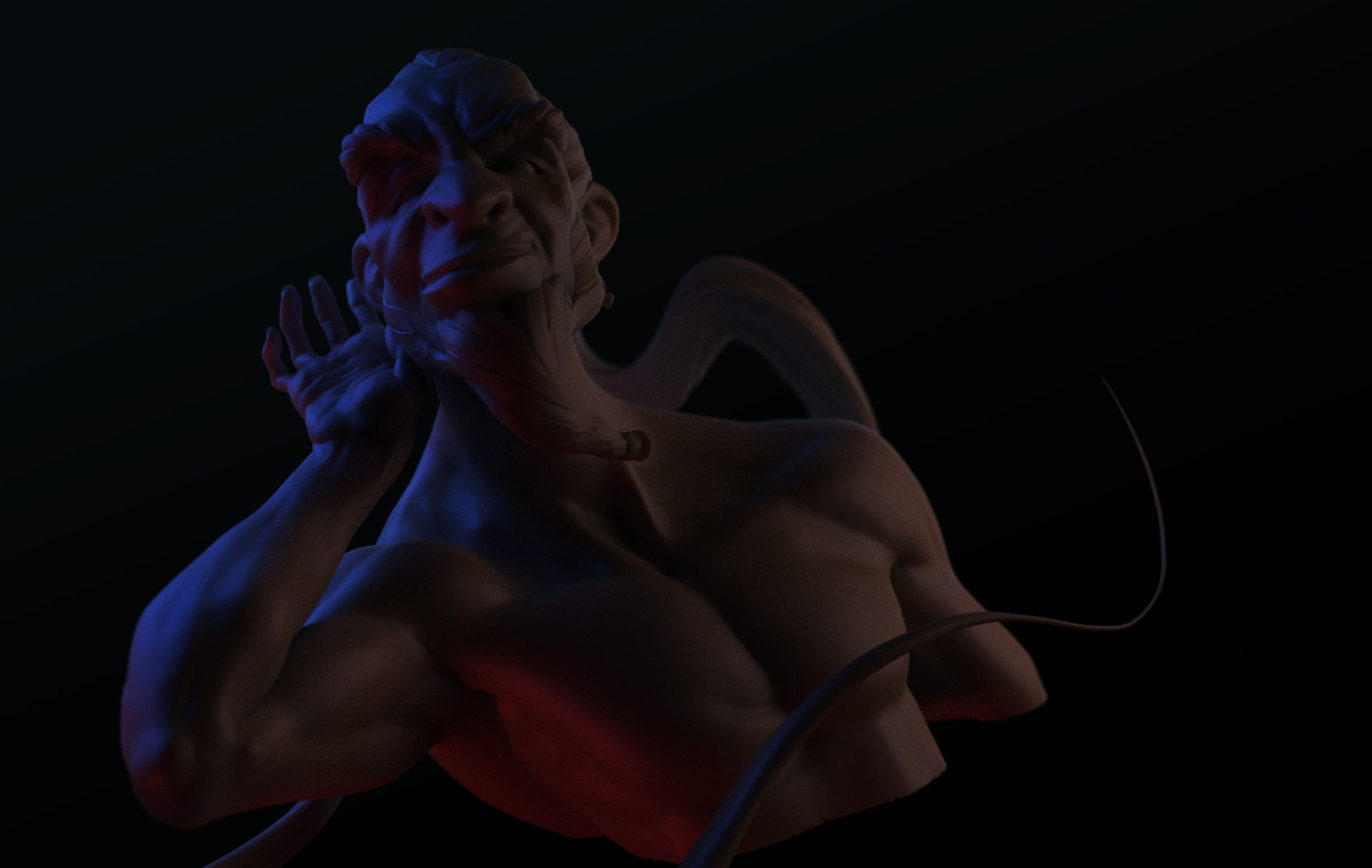
llejimenezro Solid work this week, Leonardo! First thing I notice about your goblin render is the rim light is strong. Might just be me, but I always like a strong rim light. I've got a couple notes:
It's a B+ from me 👍
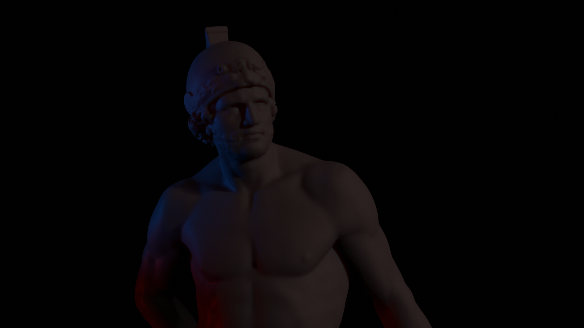
Your light match looks very close but in both, everything is very dim. Both images are using such a small portion of the value spectrum. In this level graph, all the date is on the far left (low) value spectrum and it's using none of the upper 2/3rds:

Look how much more appealing and discernible they are when using the entire spectrum:
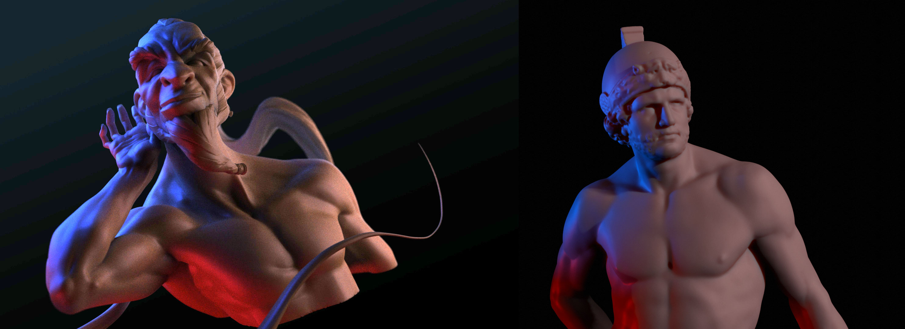
As for comparing them, the red and blue light seem to mix and mingle better in the source than in your render. In yours the red seems isolated to the bottom half of the model only and the blue isolated to the top. Whereas in the source there's clearly red light spilling on to the characters face as well.
A fairly small note, all things considered. Another B+ from me.