Working on the homework, and at the same time re-reading the shading and lightning tricks they did for The Lego Movie: https://www.expandedcinematography.com/the-cinematography-of-the-lego-movie.html
I will finish the homework today! I promise! :>
 Using Principled BSDF, there is a weird red streak in the grill of the truck for which I can't fathom where it comes from.
 Somehow I couldn't get the window frame to make shadows. I'm using an area light and sun light, both with shadows, in that direction.
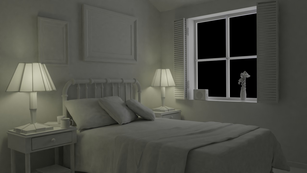 By night...
Well, if these exercises taught me one thing: I suck. The good thing is, I have plenty of room to improve...
Lets hope being better prepared will make me go further than an F for next week.
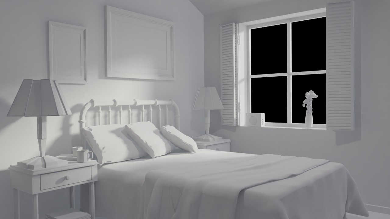
hoxolotl: Not bad, but the day time render of the bedroom is extremly whitish.
What a mystery. For the bedroom exercise, did you go to your world properties and change the background color?
The truck looks like a good start,but something is missing. Not quite sure what it is. The yellow is really saturated, which is getting blown out. Otherwise, good start.
The day scene is nicely lit, but white makes things feel clinical and boring. Try something more yellow-orange and see how that changes the mood of the scene. Similar idea with the night scene.
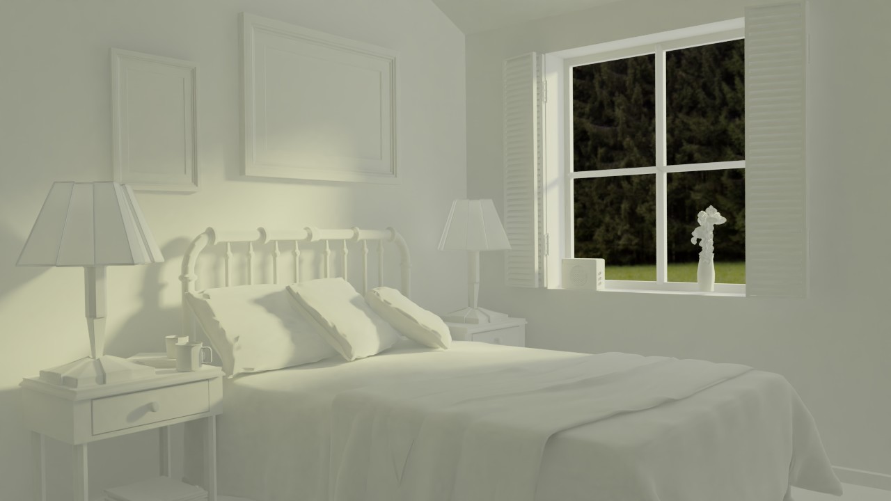
I also suggest changing the background color to something other than black to better fit the whole idea of this image. It could be a blue sky through that window. Overall, good work, but there's plenty to learn.
First of all, I'm so glad you bring up the Lego Movie in a shading and lighting class - that movie has some of the most GLORIOUS shading and lighting! I almost had a hard time paying attention to the narrative in light of the S&L 😅
I like that you changed up the HDRI for the toy truck scene. Totally shifts the mood. The yellow is blowing out a bit much; kinda feels like it's glowing. But the yellow, grey, and black read very much like plastic.
To echo the other feedback, my biggest note on the arch viz renders is the lack of color. White-only / highly desaturated lighting is generally uninteresting, especially when there's no real materials in the scene (clay render) like this one. I strongly recommend implementing stronger colors: Yellow orange for sunlight, blue shadows during day time (from the sky), warm orangy-yellow for lamp lights and purply-blue for moonlight.
Besides the color, it's pretty good in terms of values. The black window is probably from Blender rendering an alpha channel by default but it's fairly distracting in the daytime render. A landscape texture is best but even a blown-out white will do.
Thanks for all the feedback!
![]() jack07 I added an environment texture ( Glade01.exr from the blender cloud). The Background strength was set to 0.1 though.
jack07 I added an environment texture ( Glade01.exr from the blender cloud). The Background strength was set to 0.1 though.
I played with the light colors, set the background strength to 1, and this is the result:
Sadly I' m strapped for time, and off to work ( modelling a drone in Blender, yay!). So I need the time I have left to prepare for next lesson VS fixing this one, I' d rather skip a little fixing than be a week late on everything.