Hey Guys,
Had a go at the homework. The lighting was very interesting. In the end I wasn't happy with some of the light colours. I added a second light in the room in the daylight scene. I thought it necessary so the sun didn't crush some of the detail. A low strength Hemi in white. Using the HDRI images is super fun. There are some gorgeous images around. I went to HDRI Haven. Heaps of cool stuff there. The author has the right idea
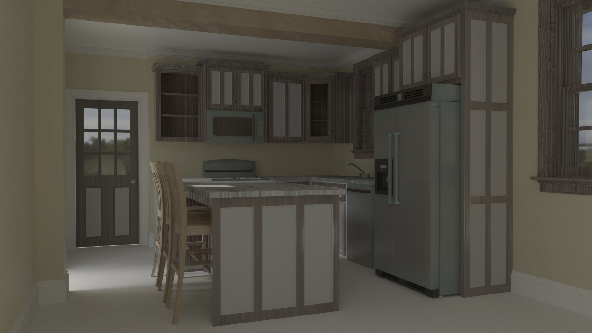
Arch Viz attempt. Not all bad, buts it harder than I thought it would be. annnd it late
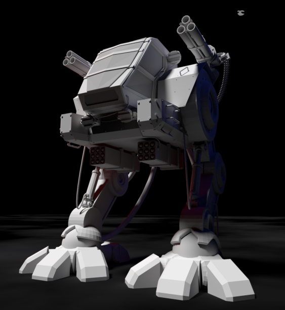
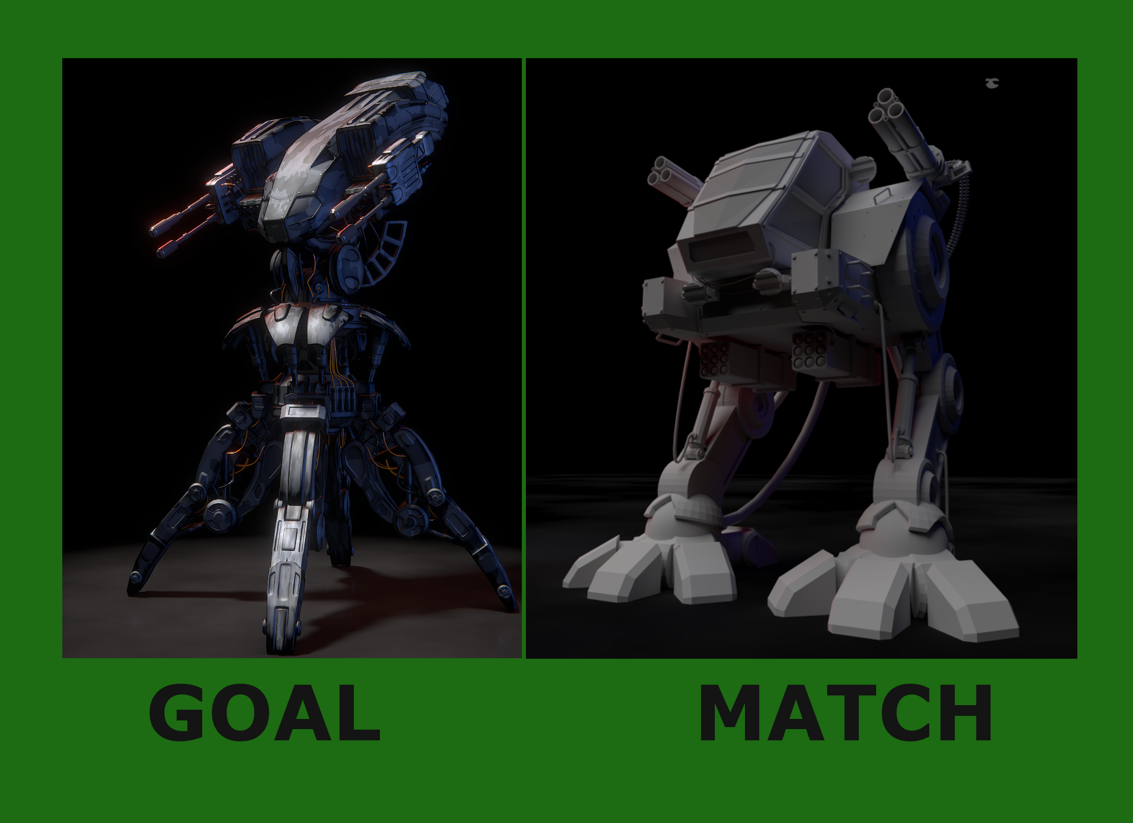
Ha. Looking at this in the thread, I'm sure it looked closer on my PC. This was actually pretty hard for me. The goal was really nicely lit. I couldn't piece together how to get a strong key light in without washing out the blue and red fills.
ssparkes983 I have the feeling what Kent mentioned this week in the live stream that your monitor maybe use brighter colors for you, becase on my one the colors are rather dark on almost all of your images.
Or eventually it can be also your style absolutely, just wanted to mention this impression
ssparkes983 Congrats on completing homework for all 4 weeks! I know that's a big effort; one worth commending.
I'll echo Zsolt the lighting in your arch viz is on the dim side. Perhaps it's intended to be post suns set or pre-sunrise. Either way my overwhelming reaction is "I wish it were brighter". Additionally I don't get much indication about sunlight itself. It's brightest in the doorway on the left side of the image whereas I would like to see the sun streaming in through a window and playing on the floor and/or cabinets in an interesting way.
Overall it's a B from me.
I like the updated light match to brighten the image. It looks pretty close to the source in terms of lighting. Though the source has a metallic material with textures and yours is grey, which causes a disconnect in terms of *matching*. Still it's a good effort. Another B in my book.