Hey guys, first time messing with blender and first time participating in a live class, these are my two exercises, I had a hard time with the white plastic shader on the truck, on my first attempt it ended up being too bright, so I tried improving it with a ColorRamp + Pointiness node. Still not happy with it but I improved a bit.
First Version: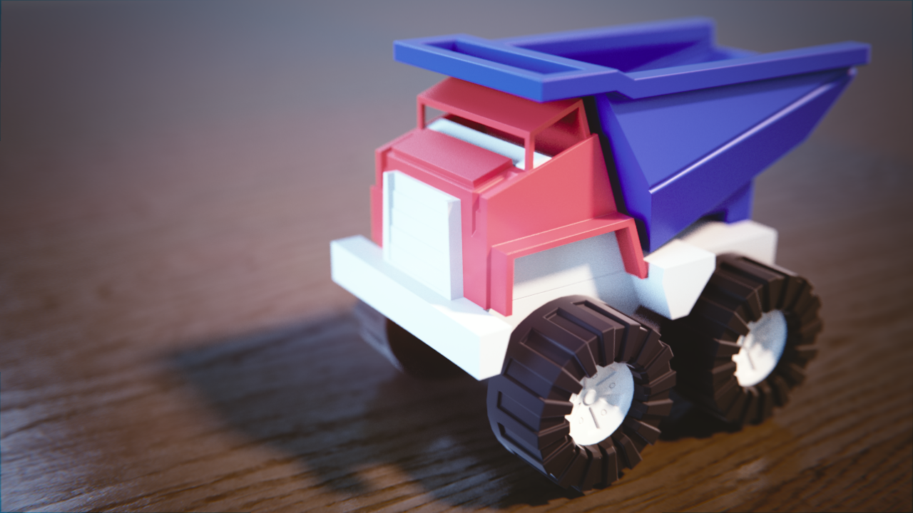
Improved Version:
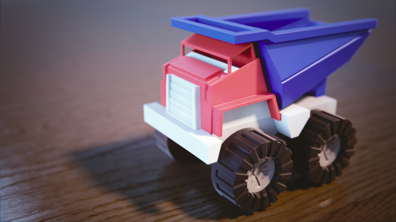
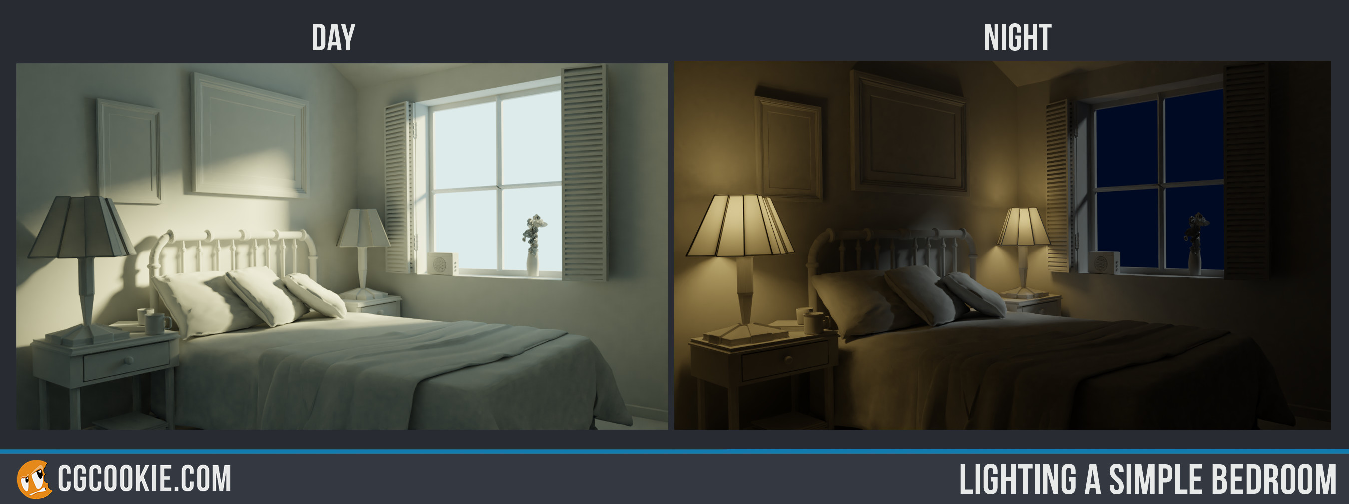
As for my room + light assignment I don't have much to add besides my lamps not being "warm" enough at night.
Here's the link to both my assignments:
https://cgcookie.com/exercise_submissions/16485
https://cgcookie.com/exercise_submissions/16512
Welcome to the class!
Nice improvement for the white portion of the truck. There's some really intense bounce light on the wheels I'm guessing from the white bouncing onto the wood. Kind of fascinating, actually.
Nice day scene. Nice touch of orange in the lighting. Maybe a touch more blue in the background, but that's a nitpicky thing. The night scene is nice, but a bit black on the right side of the image. Maybe an adjustment to the lights is needed. The lamps look good; nice warm orange. Good work.
Very well done, especially considering this is your first time touching Blender. The improvement on the white of the truck is greatt by the way, good job! 😊
First time in a class and first time with Blender? I'm impressed.
Welcome to the class vverygrinderchuck! White can be tricky to light. I remember discovering that pure *pure* white (as in a color value of 1) is actually very rare in reality. I think it's why most physically based shaders (including Blender + Cycles) defualt to 0.8 in value. It's been helpful for me to redefine white as 0.8 instead of 1.
Still it's a solid result for the toy truck. Same with the day and night scene. I agree with silent's feedback. Overall an easy A in my book.
Are you coming from another 3D package?
verygrinderchuck: Good job on lighting the bedroom. When it comes to the truck that is ok too, but i think i would have toned down the white just slightly.
@theluthier Hey Kent, thanks a lot for the feedback, I am still learning all the ins and outs of the shaders, I knew that I needed to bring the whites down but the hard part was figuring out how.
I studied Maya 7 or 8 years ago for one of my classes in game-dev school, I ended dropping out and forgetting almost all I learned, which is sad, but I kept my love for 3d art and any artistic digital medium.
So I'd say I have an intermediate grasp of concepts but when it comes down to Creating, making and sticking with practices I fall short.
So far I'm in love with Cgcookie, I feel like I'm part of a big family of amazing people, and it also serves me to kick my butt whenever I don't "feel like studying or practicing".
This month I will also join the Pumpkin Challenge to push me harder, my long term goal is to be able to create anything I set my mind to, and this month will be my first step towards that dream.
![]() silentheart00 ssmurfmier1985 aarev Thanks for the input guys, I'll take it all in consideration on my next creation :)
silentheart00 ssmurfmier1985 aarev Thanks for the input guys, I'll take it all in consideration on my next creation :)
So far I'm in love with Cgcookie, I feel like I'm part of a big family of amazing people, and it also serves me to kick my butt whenever I don't "feel like studying or practicing".
We love to hear that! Our community family is a seriously good group of people. We're happy to have you. I look forward to seeing what you create this month.
Tried working with EVEE but my computer runs even slower than the livestream one, haha.
So I felt like I was figting blender 2.8 instead of just enjoying it.
Here's my result of that fight: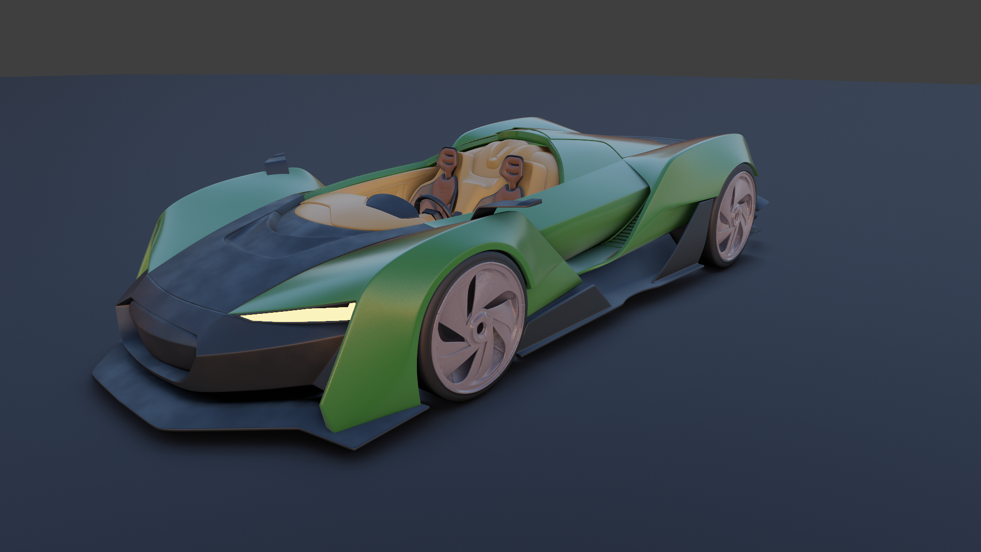 I've got a couple of artifacts on my shadows when I tried turning on "Screen Space Reflections".
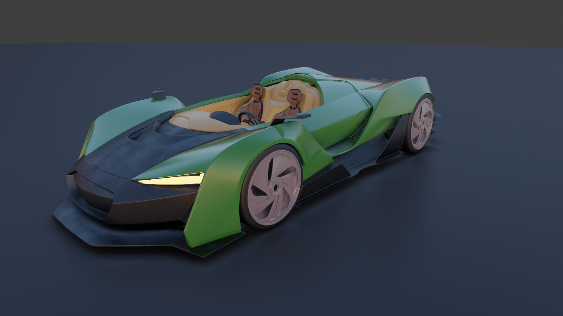
vverygrinderchuck Nice car! Materials read as they should (though I feel the wheels could be a bit shinier) and nice colour coordination all around. Are you using an HDRI? I honestly can't tell, but if not you definitely should. Also texturing the ground would be a neat addition too. Though seeing as you're having technical issues these may not be possible in which case fair enough. The texturing is coming through on the matte well too, so keep it up!
vverygrinderchuck Good start. I would go with a slightly darker green, but that's my taste. I also agree maybe the rims could be a bit shinier, but those are small critiques.
![]() thecabbagedetective ssmurfmier1985
thecabbagedetective ssmurfmier1985 ![]() silentheart00
silentheart00
I took into consideration your tips and improved it a bit.
Added texture to the floor, changed the green to a darker tone and made the rubber and rims on the wheels shinier.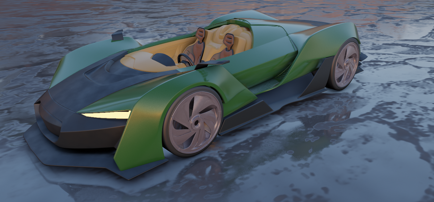
vverygrinderchuck Great progress! the shiny makes it much more appealing and the texture on the floor gives is more interest. I would suggest to make the rubber a bit darker, tires are usaly very dark grey / black. Other than that great work on aplying the feedback 😊👍🏻
Light Match Exercise, this one was tricky, even more so after I realized I was working on 2 monitors and each with a different colorization. So I had to start again, haha.

vverygrinderchuck Lol, I made the same mistake with the 2 screens 😂
It looks very close, great job!
vverygrinderchuck Nuts, Eevee was that slow huh? I wonder if the car is too high resolution..it's up there in polycount with the subsurf modifiers..You still did pretty good despite the fighting. Man am I familiar with that fight lol. I gotta give you an A for effort on the sportscar.
Your light match is really close to the source render! Fantastic choice of model. I've only got a few notes:
It's a B in my book for the light match. Good stuff! 👌
vverygrinderchuck That looks like a nice car. I agree with Kent's critique. It also looks like the shadows could be way softer, too, so increasing the size should help with that.