Hi all, I need feedback about the following images, taken into Unity, about a modular asset environment I'm making. The modular assets are composed to make a scene (not a gameplay suited one, just a generic scene)
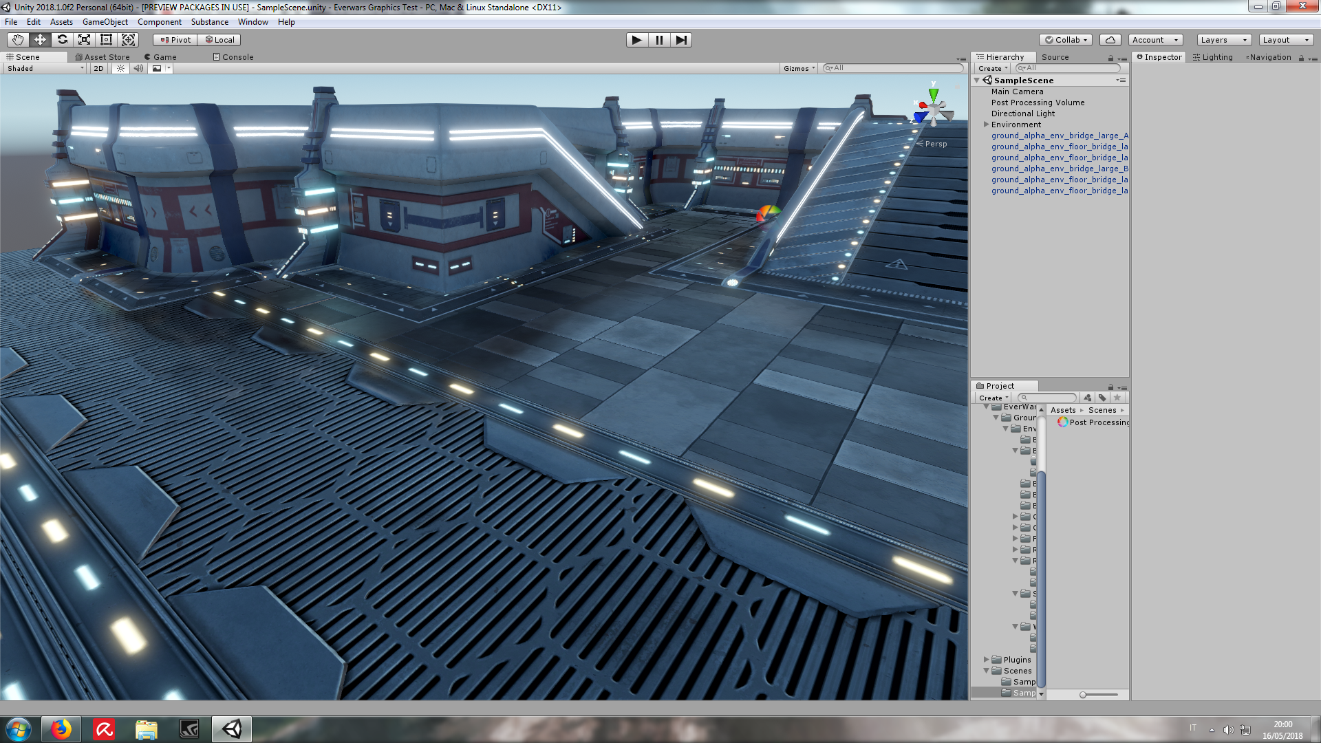
There are no props or complex decorations (like pipes, tubes, separators, additional structures, generators, etc...), I just want to get shapes, color and basic structures right before adding geometry details. I want it to be enough good looking in its simplest form.
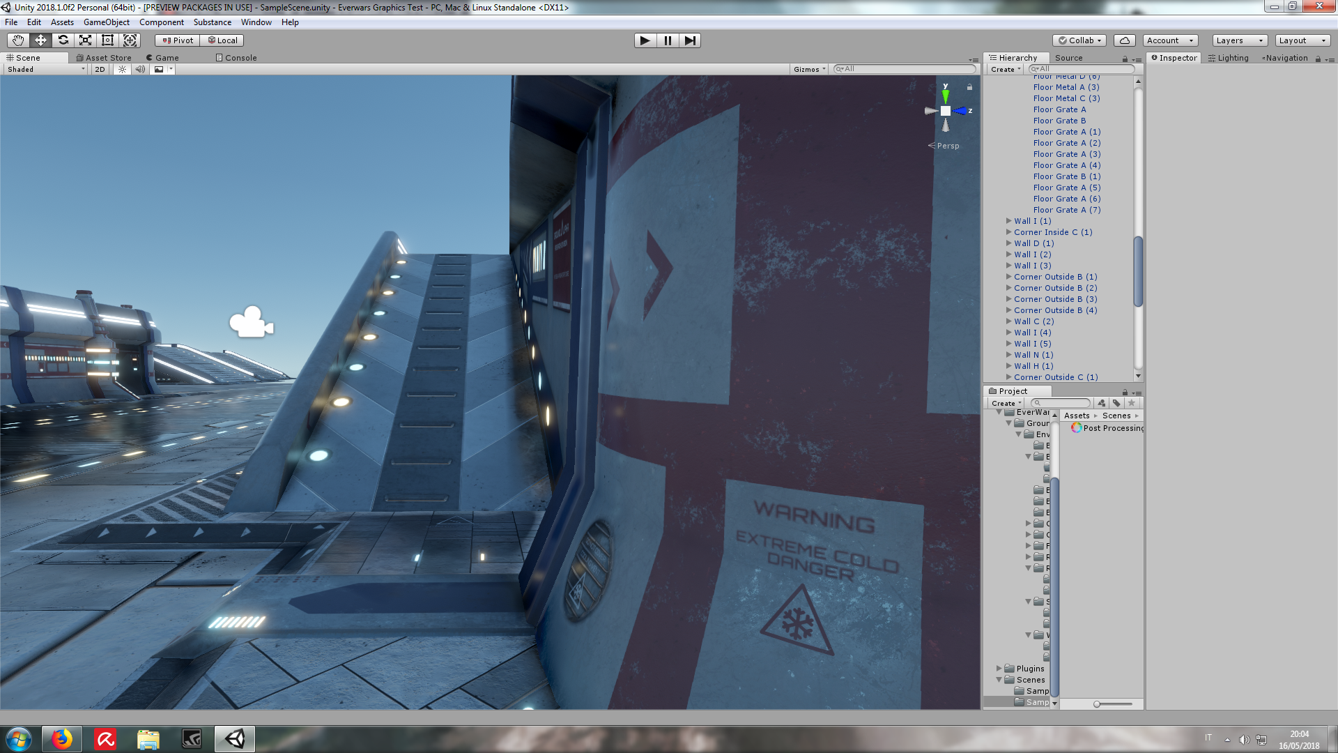
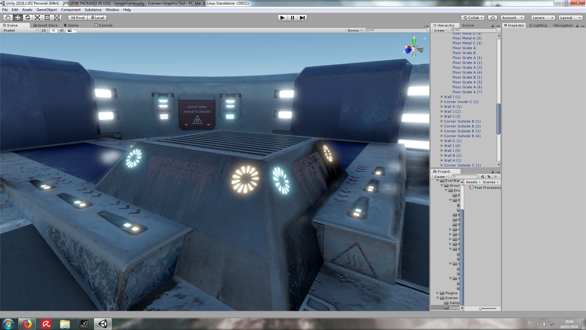
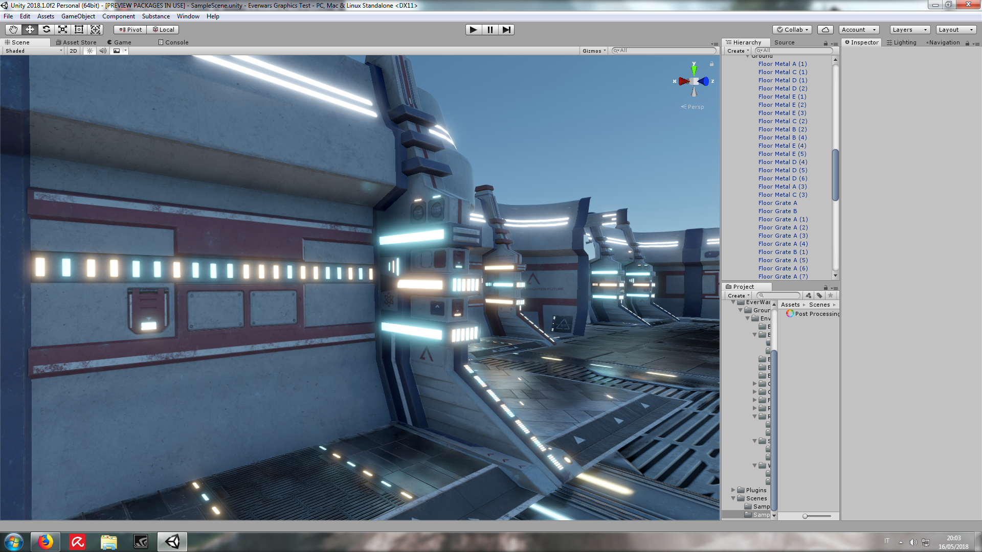
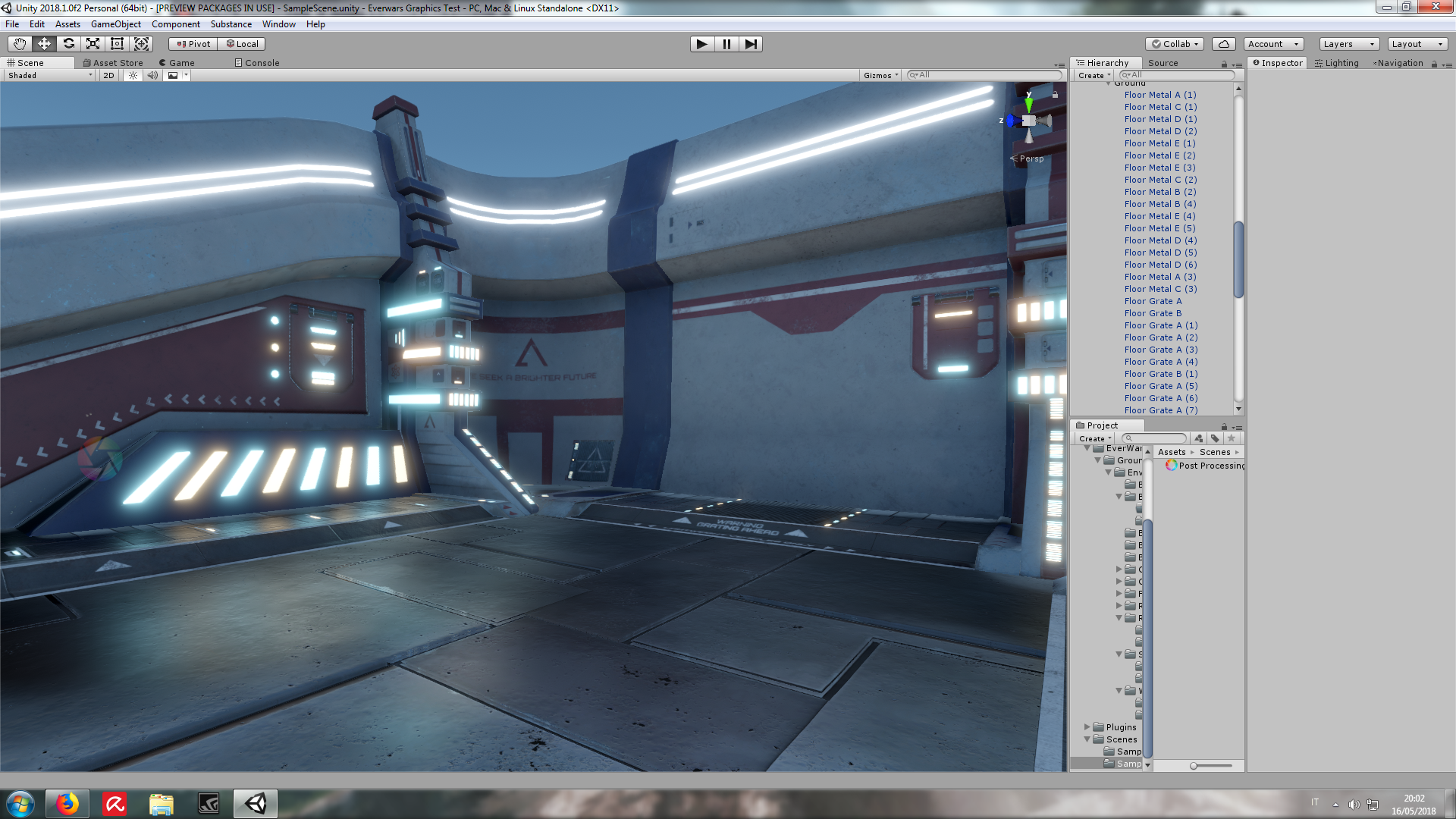
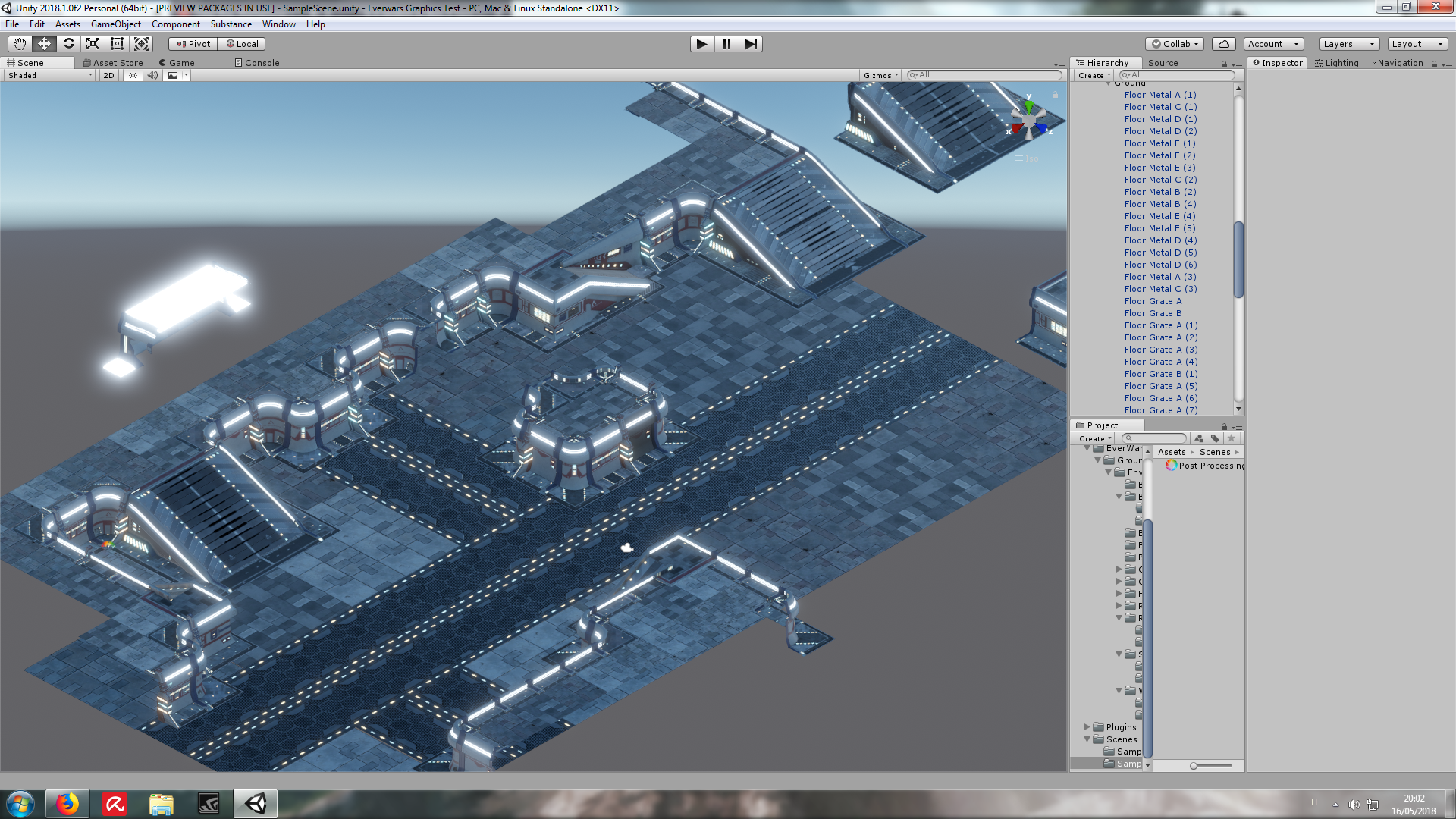
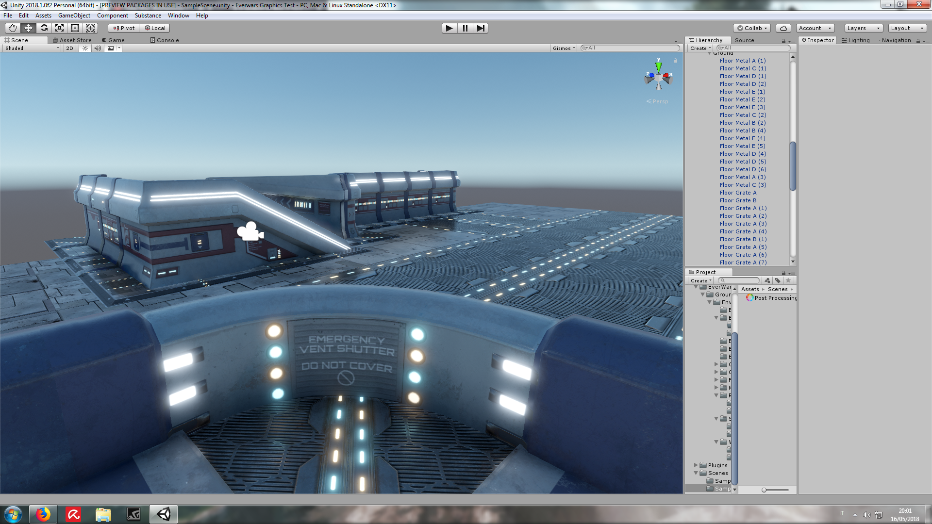
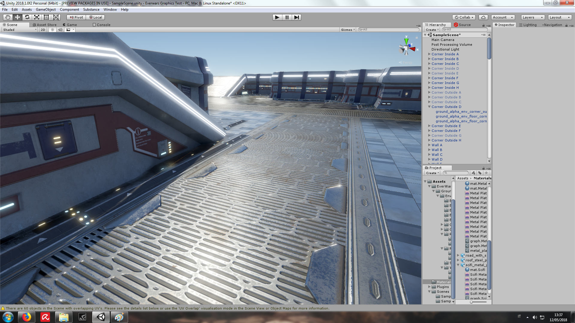
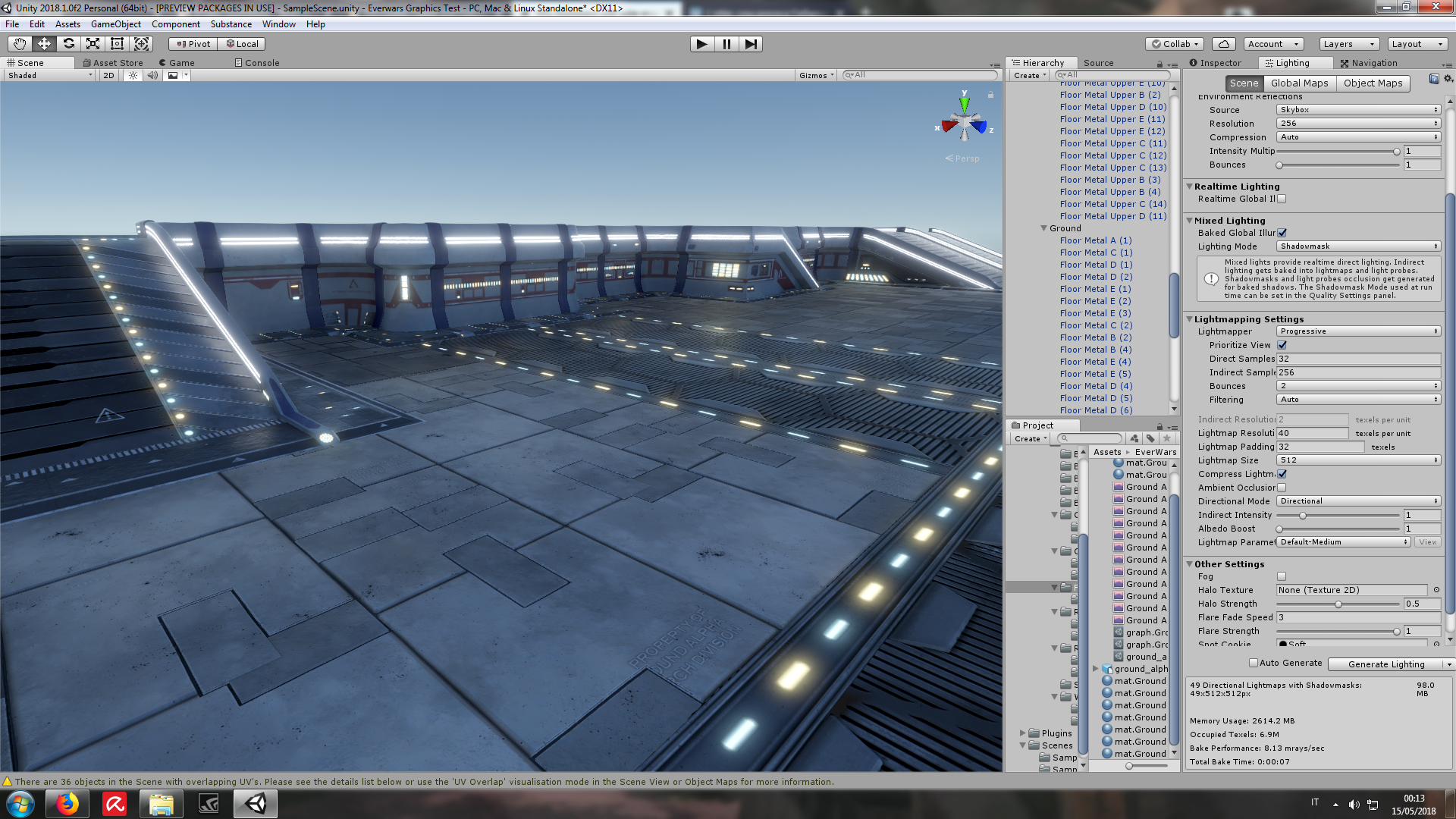
The scene represents a sci-fi scientific complex exterior. The game is a 3rd person shooter/RTS with mechs, tanks, helicopters and turrets, so things are not going to be seen from a 1st person perspective.
Any feedback is very welcome, since I'm at the point when I alternate days in which I think everything looks great to days when I feel everything is just plain bad, and I could really use someone else's eyes. I asked here because I don't feel comfortable enough with this assets yet to make a project... And yes, forgive the brightness but the light is set for a very shiny day (1 directional light default setup)
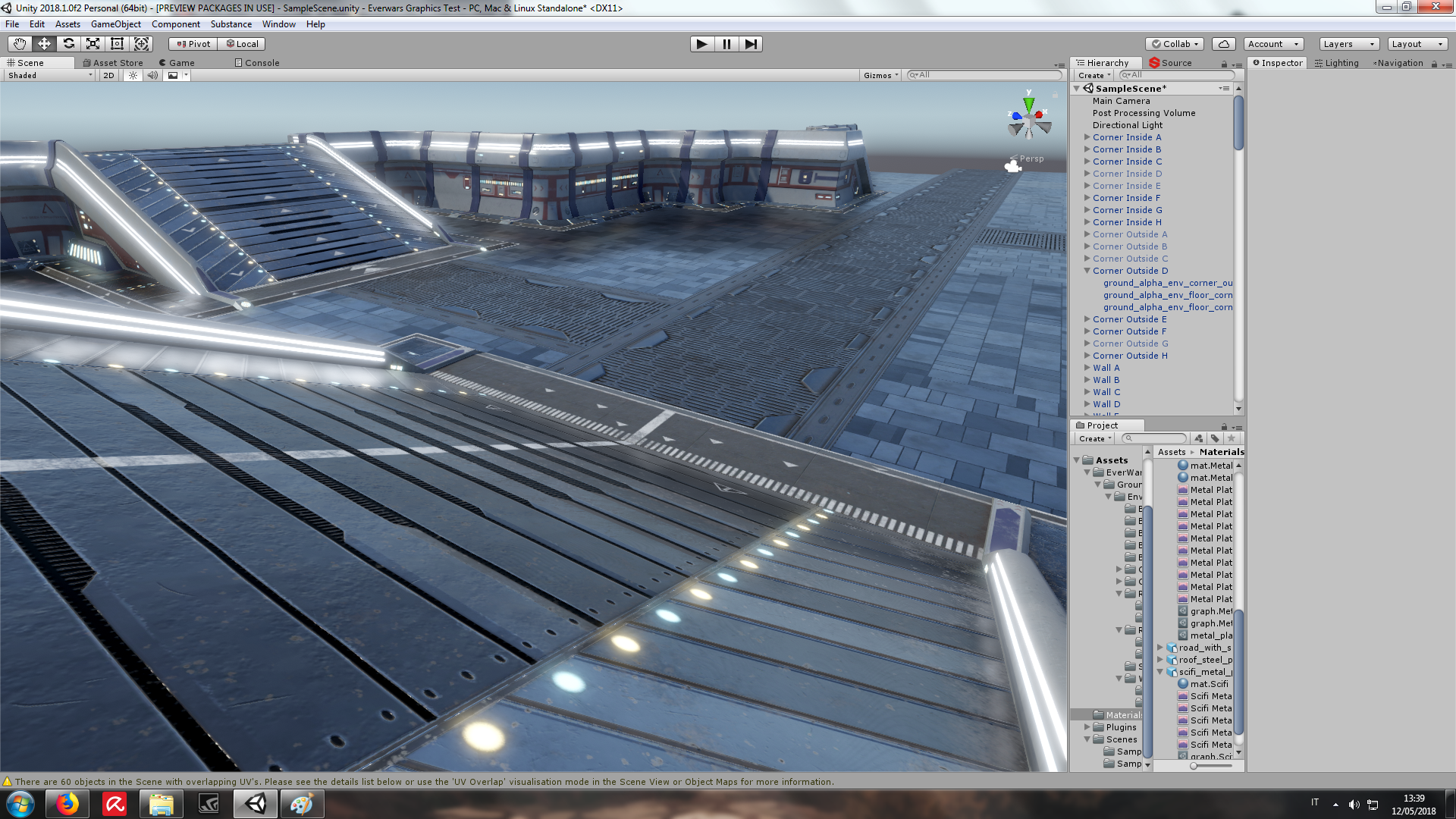

I think it looks great for the most part, although the blue tiles look a bit weird with the scifi-esque design of the rest of the level. Feels like a "luxury scifi" scene. It kind of looks like a marble floor I might find in a high end hotel combined with a rough and "utilitarian" feel of the grates and metal.
Everything has a shine to it which looks fine, but I think it would add depth by making specific parts a lot less shiny and more rough like while other areas would have a shine. For example the ramps I would think should be rough in surface to help with vehicles to climb them. Areas that wouldn't come in contact with vehicles or objects could be more shiny.
I love the glow and overall design of the models. My only critiques are on the textures used. I'd also like to see what this would look like from the actual perspective you plan on using in the game. While it may look amazing up close, if the game is meant to be seen from a higher up angle it can greatly impact how it will be seen.
![]() jgonzalez In the game would be possible to zoom in - out of the character, so the perspective can vary. I may use some dummy asset from the Asset store to test the real game perspective and character size.
jgonzalez In the game would be possible to zoom in - out of the character, so the perspective can vary. I may use some dummy asset from the Asset store to test the real game perspective and character size.
Anyway, amazing feedback, I'll try to make the floor overall less shiny. I'll also try to change somewhat the style of the "blue tiles" in something with a more neutral color. Have you any suggestion about color/pattern in this regard?
![]() insanemonster I think the colors look fine, it just looks like fancy marble tiles.I think the tiling of that texture is what makes it look that way. It actually does look really nice, but I wouldn't expect outdoor environments to contain shiny tiled floors. I think if you added some prop "doors" and "hatches" to make it seem like it was more industrial it would blend in more. I suppose adding more details to it being more rugged and easy to withstand heavy use by vehicles/characters would help. Right now it feels almost immaculate. Anyways that's just my thoughts on it, I don't know much about your game or how it will play so my critique may be completely invalid.
insanemonster I think the colors look fine, it just looks like fancy marble tiles.I think the tiling of that texture is what makes it look that way. It actually does look really nice, but I wouldn't expect outdoor environments to contain shiny tiled floors. I think if you added some prop "doors" and "hatches" to make it seem like it was more industrial it would blend in more. I suppose adding more details to it being more rugged and easy to withstand heavy use by vehicles/characters would help. Right now it feels almost immaculate. Anyways that's just my thoughts on it, I don't know much about your game or how it will play so my critique may be completely invalid.
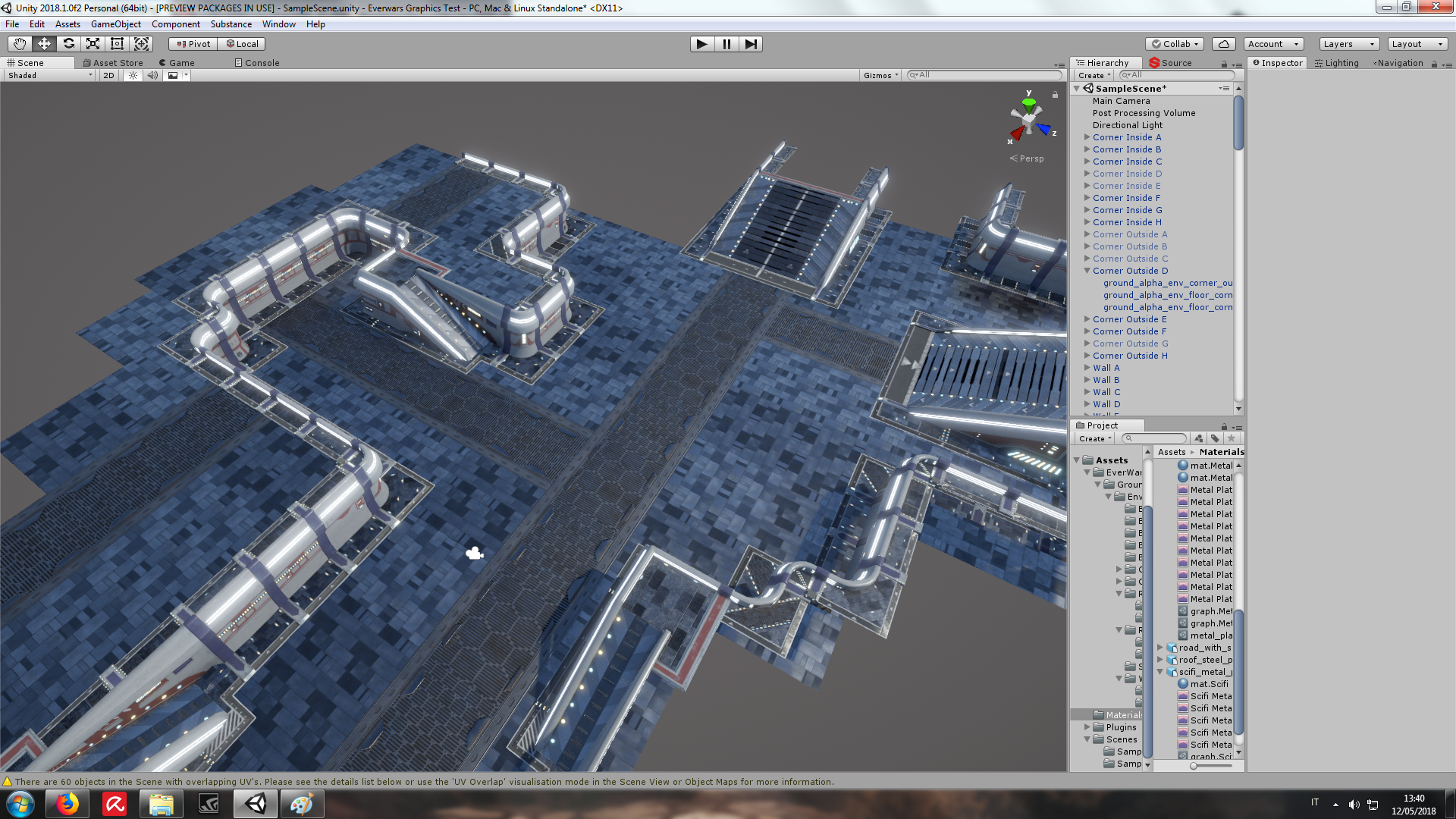
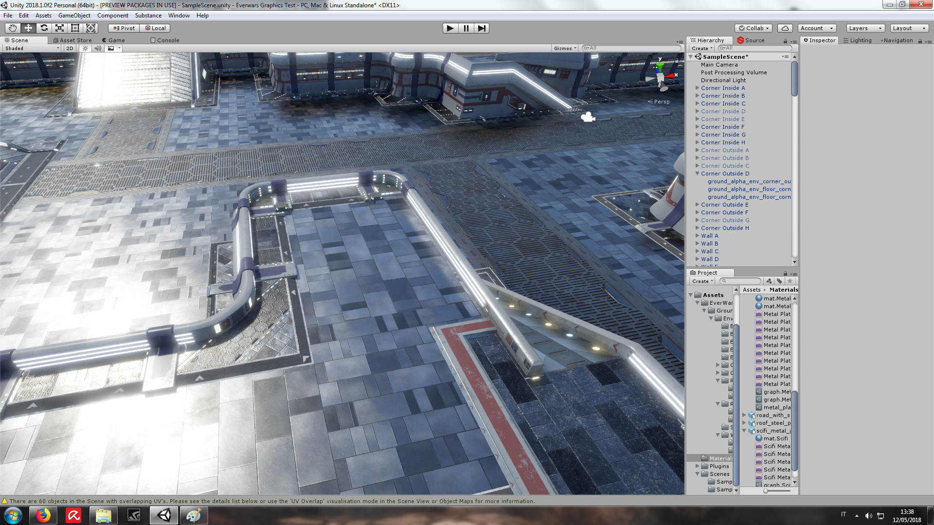
So, Jonathans ( ;-) ), I tried to apply some of your tips to the floors. I've changed only them (and rearranged the scene accordingly).
I've added rust, some patterns and text (randomly displaced) and a roughness multiplier. I think overall it's improved. I've yet to change the walls and walls floor assets though. The scene is a bit darker, to better test the different roughness.

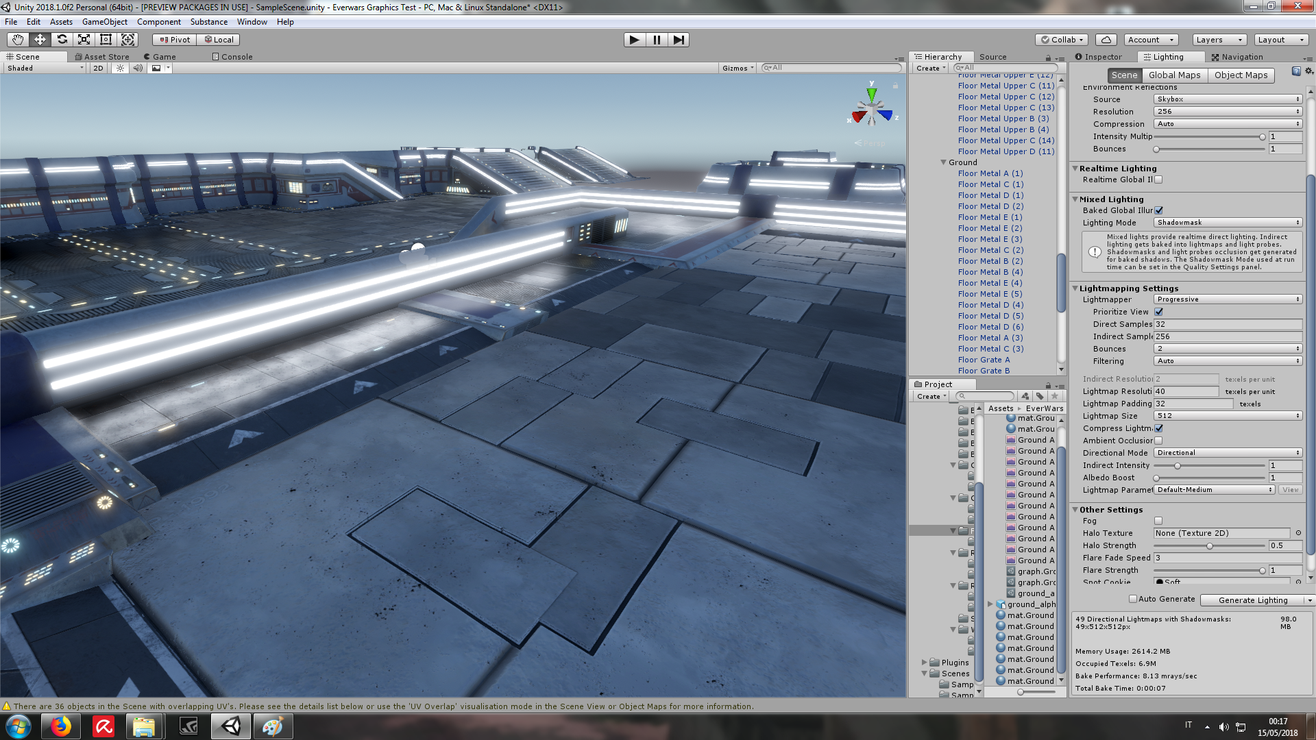
![]() insanemonster I think it looks much better now. Looks more like concrete or something I'd expect to find outside. Don't really have anything else to add beyond that. The variation in the shine definitely adds some nice depth to it now. I'd like to see what you add in next.
insanemonster I think it looks much better now. Looks more like concrete or something I'd expect to find outside. Don't really have anything else to add beyond that. The variation in the shine definitely adds some nice depth to it now. I'd like to see what you add in next.
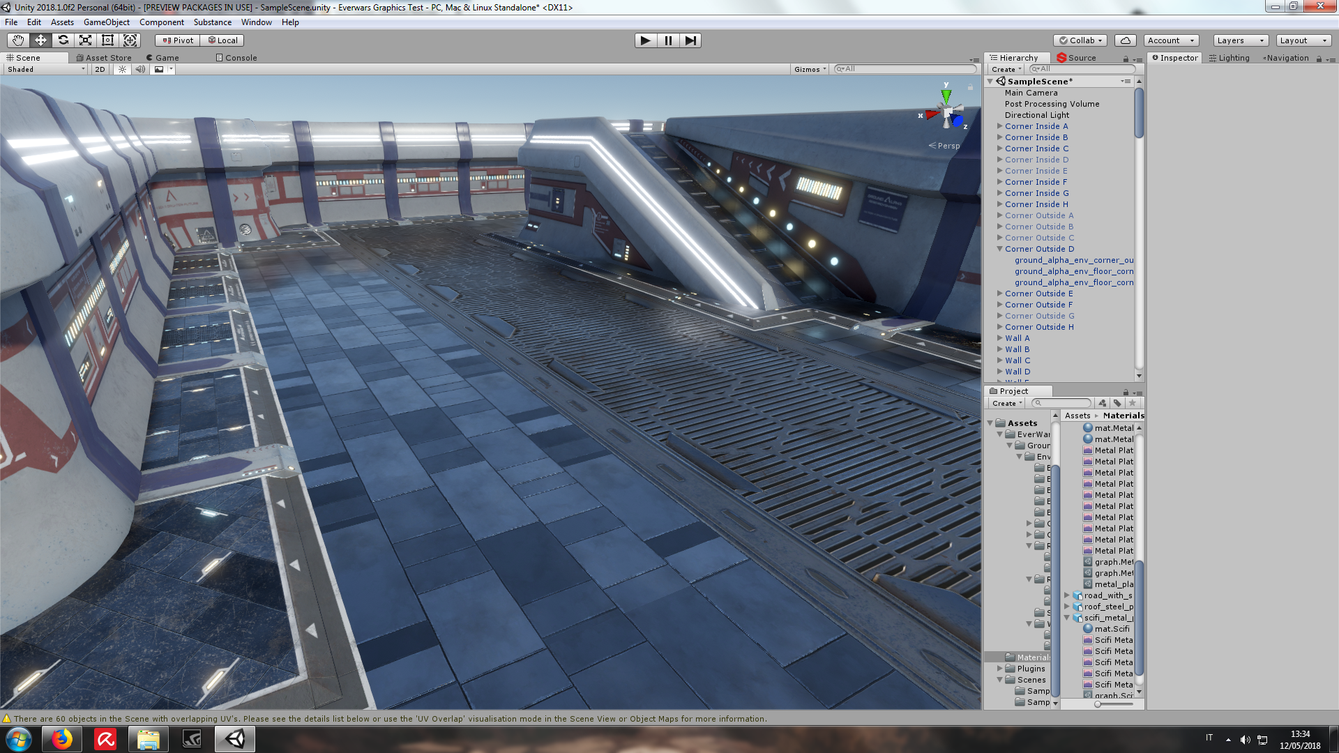
Ok, some finetuning to nearly all aspect of the assets (textures, materials and of course post processing). I use SSR as one of my post processing image effects. Jonathan do you maybe know some way to avoid the black artifacts on the screen edges? If not, do you think reflection probes are a viable alternative?
Here are the images: