Dear Diary, today I died.
Kidding. Sup!
I work on a personal project that is a fancreation of League of Legends aimed at realism.
The project incorporates a large scene and in that scene are several structures and objects, some of them having crystals.
With the help of a friendly user I found the Shader Forge course and went through the videos.
Looked complicated, was complicated.
Now for my project, I could not copy the node-setup. Had to look something like a gem or crystal as in the course, but not entirely. I also didn't use the Absorption Resource Node that is used in the course, since I don't completely understand what is going on inside that node and I want to understand the entire process of creating complex materials.
BUT, the course helped me understand how I need to approach a material like that.
And so the adventure started. First off, the reference material: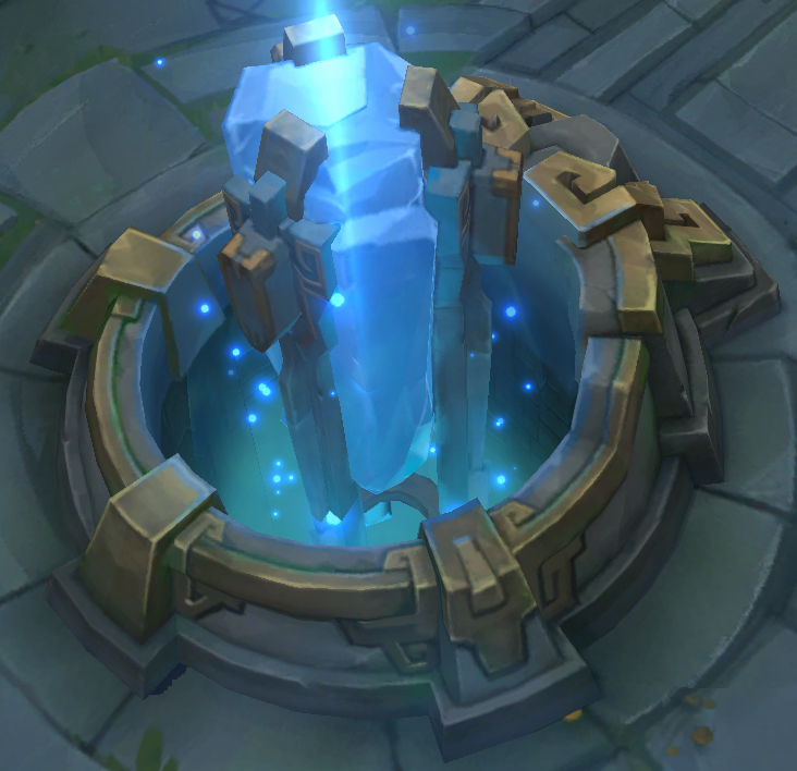
Ingame, the crystal is completely solid, has no refractions, no translucency or anything fancy at all. That is due to the artstyle of League of Legends, everything looks painted. Which is nice, but not what I want.
So I need to improvise here and create an interesting crystal material that still incorporates the main features of the reference image.
First off, I want the crystal to feel like it is charged with energy or magic. I want it to emit light from the inside.
Since I didn't want the entire crystal to emit light, but make it seem like the emission is coming from the inside, from its' core, I took the generated coordinates of the crystal, and channeled the Z axis into a gradient texture followed by a colour ramp so I have precise control over the gradient.
The result is piped into the strength of the emission, setting a smooth transition from "lights on" to "lights off". So far so good.
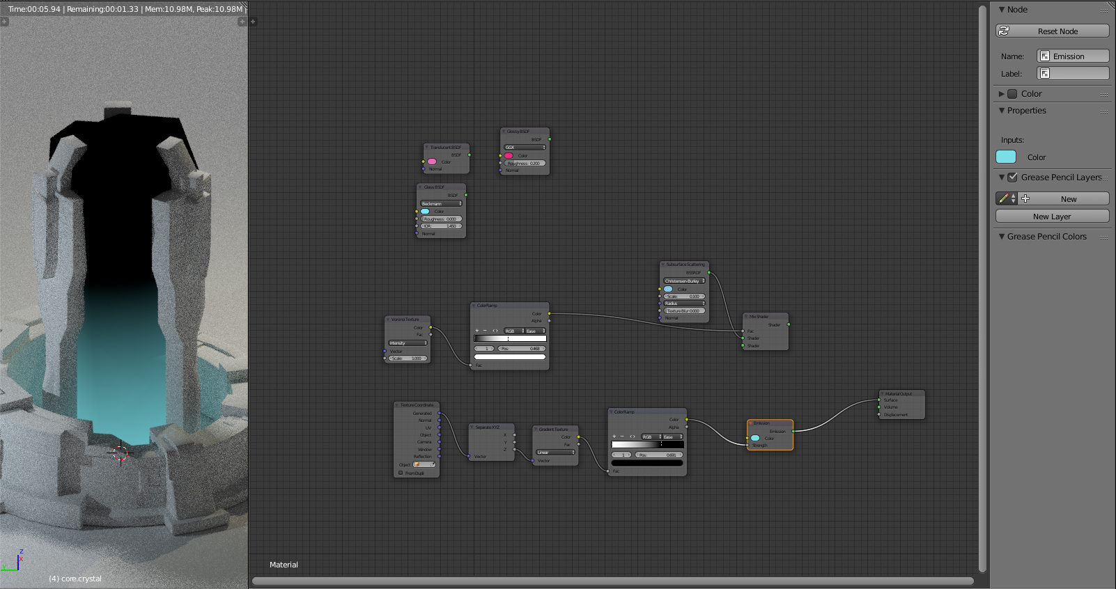
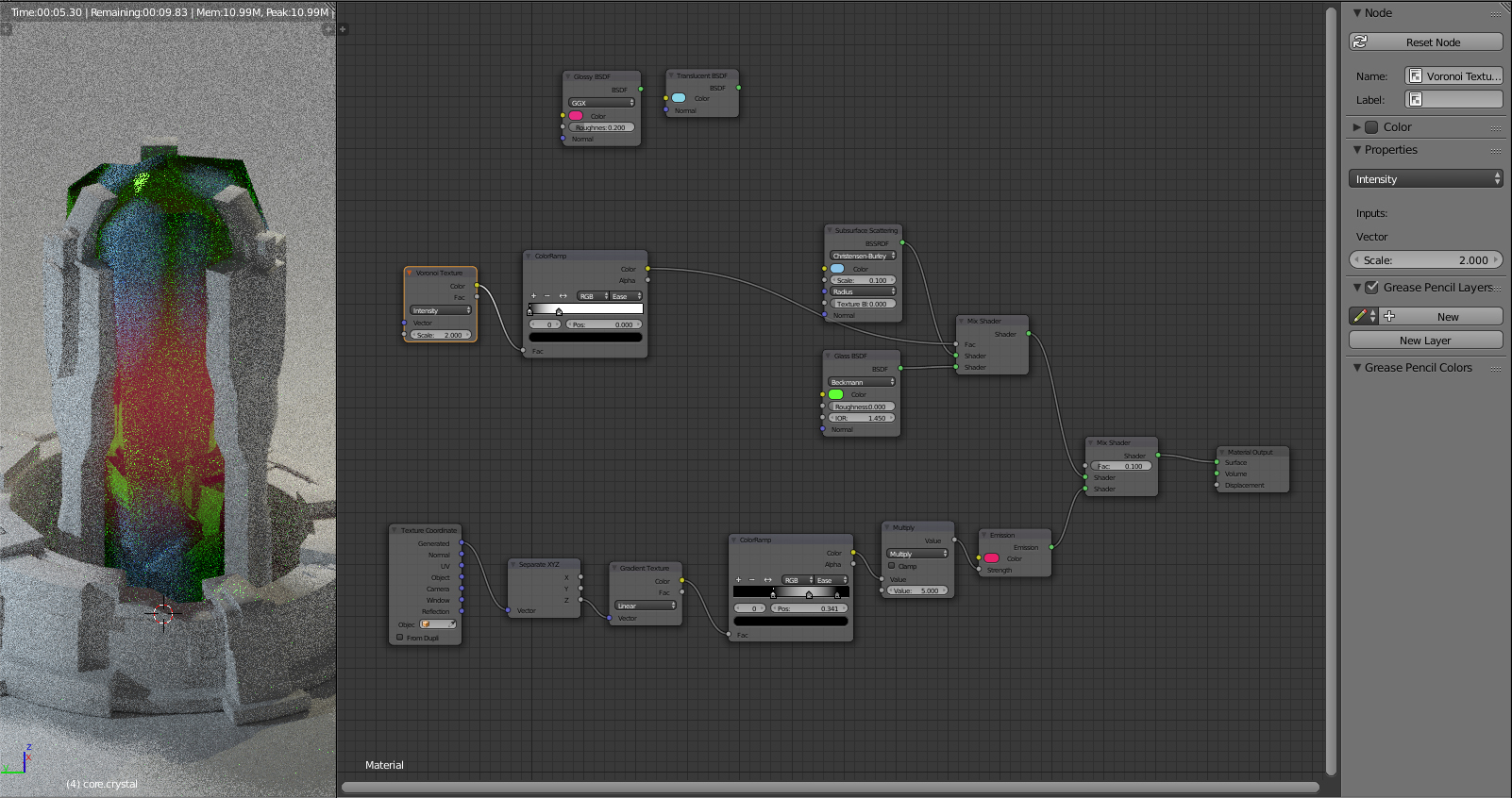
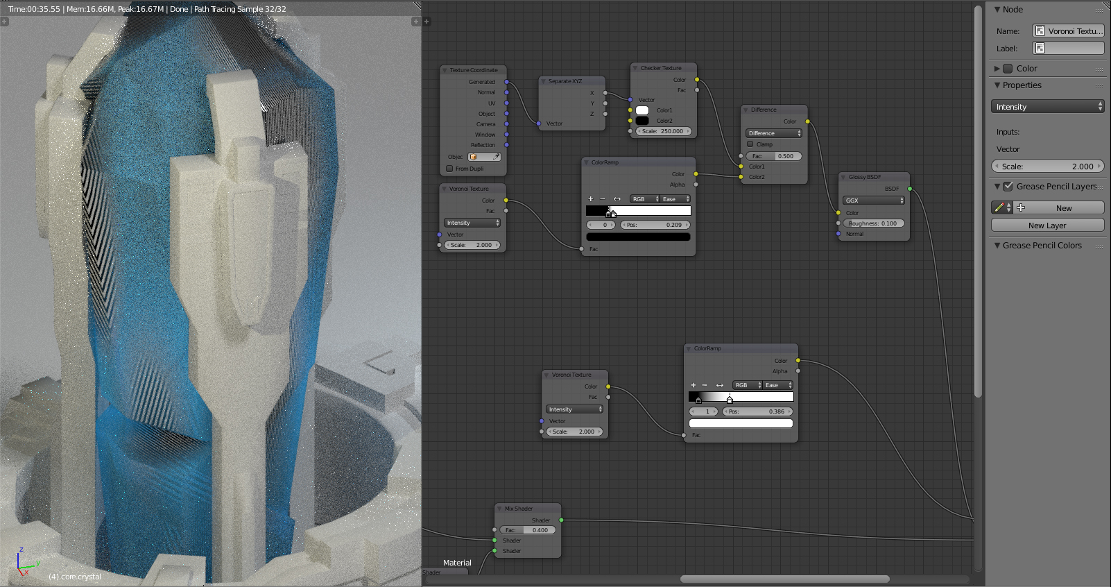
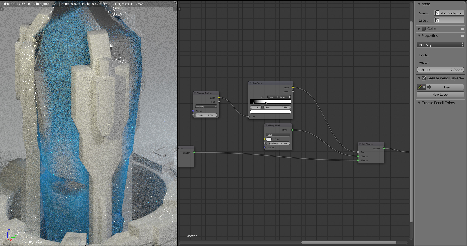
After that I set up a simple surface with an SSS and a glossy connected into a mix shader, while the Voronoi texture controls the shaders. The colour ramp again helps me to control the spread and smoothness of the voronoi texture.
To make it easier for me to see how the shaders actually play into each other, I have chosen a bright pink for the glossy and a smooth blue for the SSS and you can see that the glossy is dominating by far. Looks interesting too but I don't want a metal core.
So the glossy look made it to metallic, was not what I wanted. Replacing glossy with translucency did the trick. I now switched the emission light to pink to determine how strong it was and as you can see here, the emission is getting dulled out by the SSS shader.
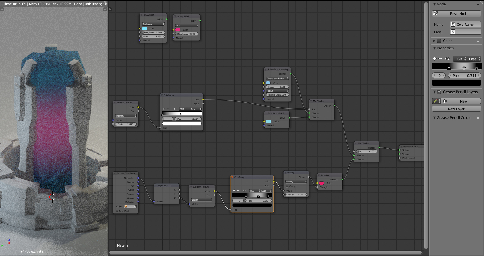
So, a couple of quality of life adjustments to the emission. I added a Math Converter set it to multiplay and the value to 5 to increase the strength of the emission without messing up the smoothness of the colour ramp.
Then I added another handle into the colour ramp to move the emission to the actual core of the crystal. Much better.
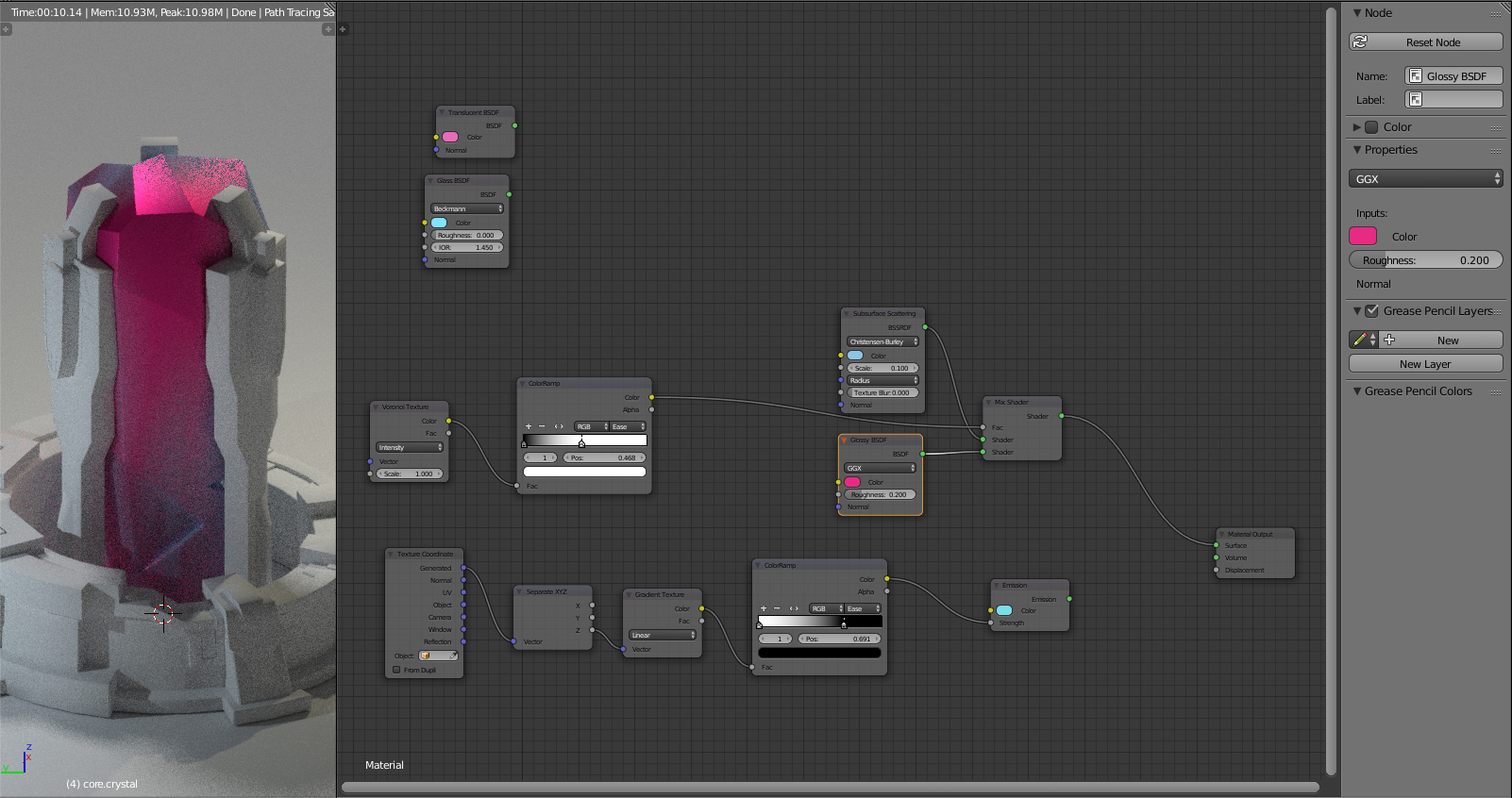
The translucency made it look interesting but now it reminds me of expensive designer hard soap.
So I replaced translucency with glass, gave it a nice green colour so I can determine how strong the shader is.
![]()
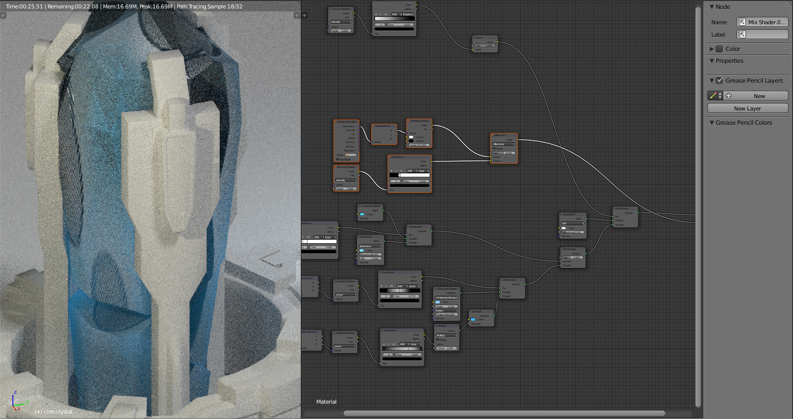
Here I replaced the SSS with Translucency, which gave it a really nice looking effect but it reminded me more of a decorative type of gem or crystal, and I want one that is visibly used for accessing some sort of power/energy.

So after a lot of experimenting I copied the vector and colour ramp information from the emission shader, adjusted the colour ramp to be slightly above the emission one, channeled the emission and SSS together into a mix shader and the colour ramp output into the factor giving me a very nice solid looking crystal type of look.
The transparency and glass shaders give it a nice touch around the top edges. That was very close to what I had in mind.

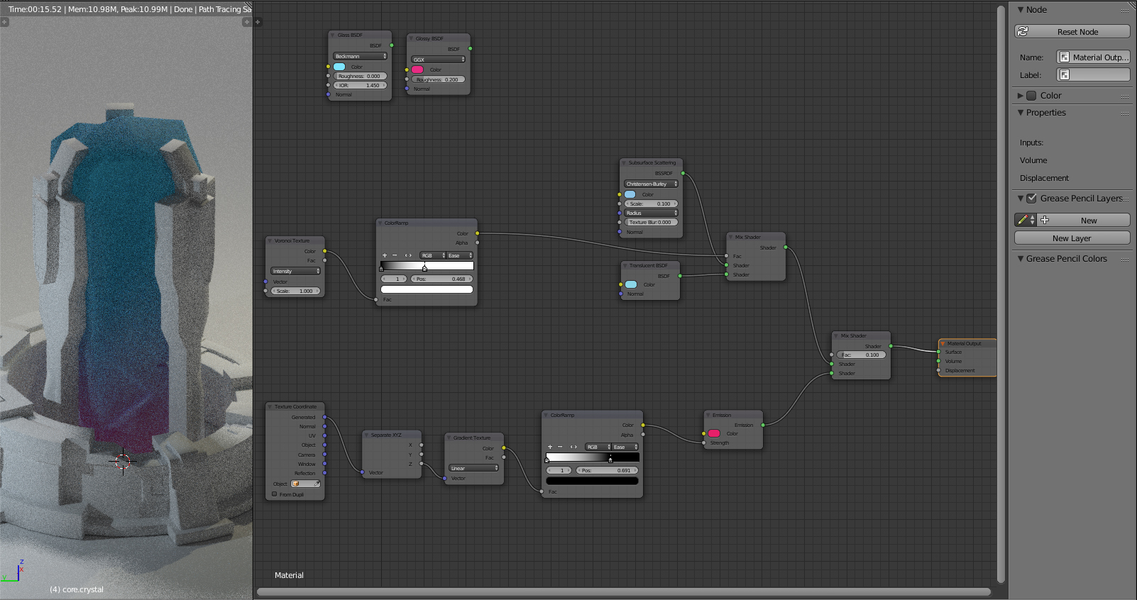
After a short break I looked back at it and the emission was way off. It was too strong and looked unnatural. So I went ahead, toned the multiplier down, adjusted a couple of other things and this was starting to look very good! :D
Now for the last part, I wanted something very subtle and interesting happening right beneath the surface of the crystal and this was the most difficult part to figure out.

I wanted to add subtle changes of consistency within the crystal. I wanted to make it look like tool marks but right underneath the surface, where the material of the crystal would also have different attributes in terms of specularity and transparency.
So first off I went with a linear texture and a colour ramp and started adding a bunch of handles trying to get a striped look.
Lemme tell you that setting up these 11 handles took me a solid 4 minutes and it needed to be much much more subtle and detailed.
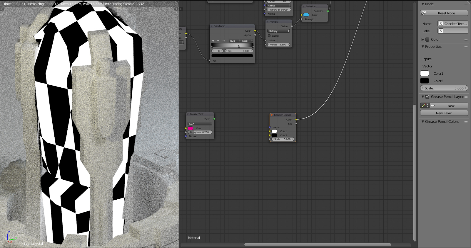
So, hello Checker Texture!
Now to achieve the striped look with squares, I need to restrict the texture to one vector.

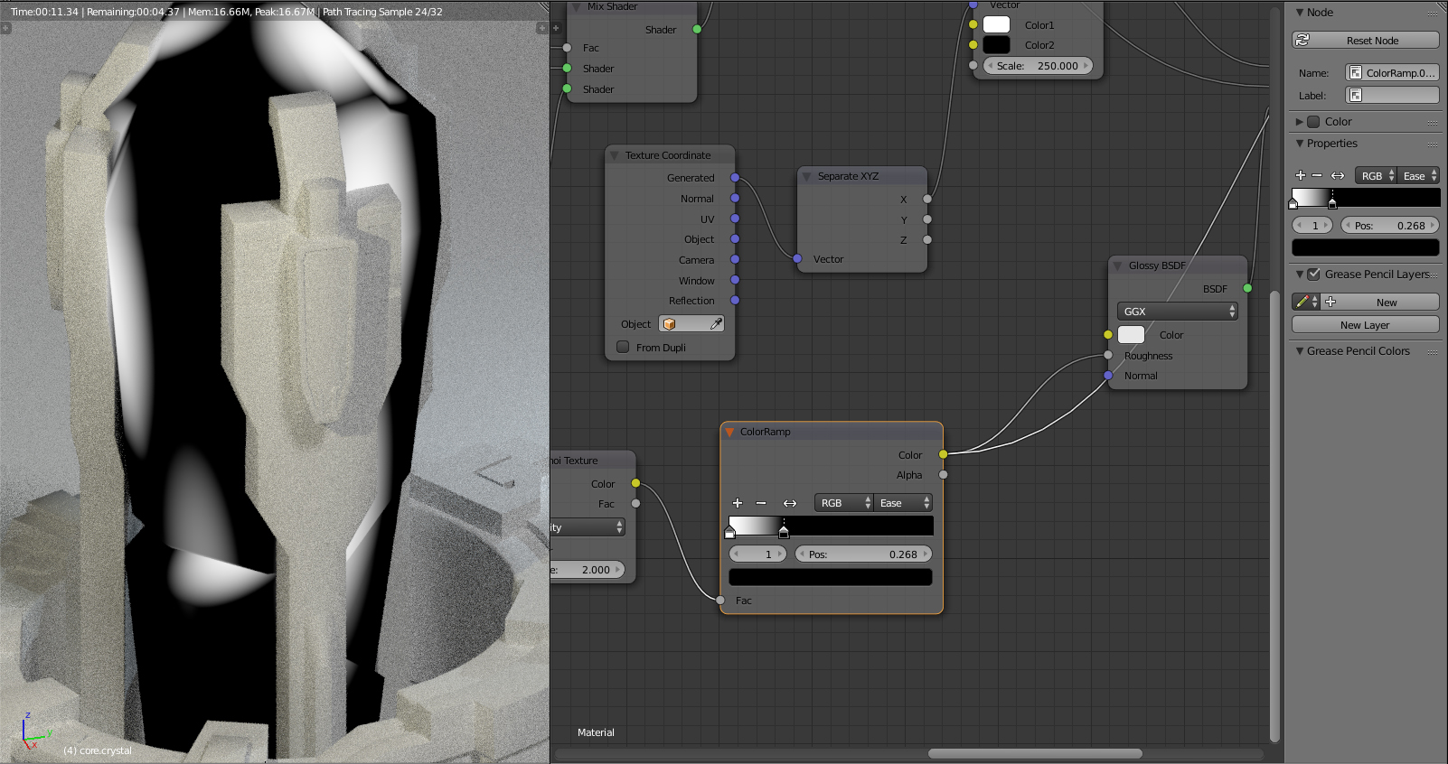
So I took the vector coordinates and seperated them, which game this nice radiator look. The stripes on the side are still too thick and I also don't want the entire crystal to have these subtle highlights, so there is still some adjustment to be done.
For now the stripes are fine, I know they work and I first want to get the result I'm looking for and then I can still adjust the stripes themselves.
Once again, I summoned Voronoi texture, adjusted it with a colour ramp and tried to channel it into the shaders and factors so that only the white parts would be glossy. Many issues came with this, it still turned the entire crystal into a glossy monster.
Hello, why is it black and silver? No?
Nope.
No displacement. No-No. I want my smooth surfaces.
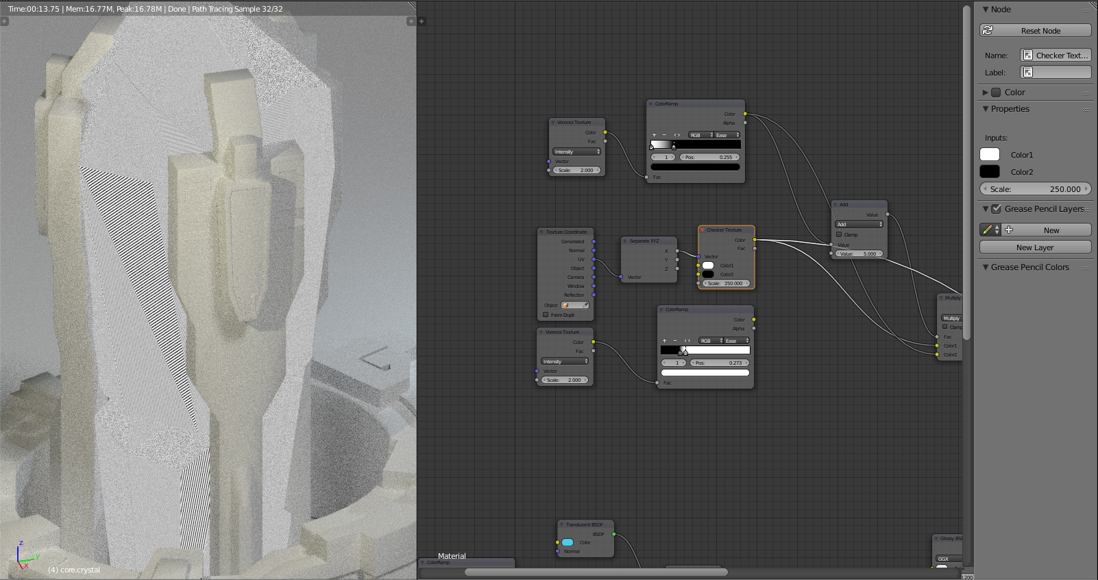
And FINALLY I figured it out after 3 hours of intense node stuff, get some adjustments on the stripes. Changing the vector coordinates from Generated to UV made the stripes more even and finer, now I had to tone down the scaling otherwise you wouldn't be able to distinguish the stripes anymore.

And here is the final result!
It looks very accurately the way I wanted it to, while maintaining the idea of a solid crystal that can be harnessed for energy/magic whatever.
Now of course you have to keep in mind that as my scene grows, my lighting will also change and many other things will factor into the materials, like other nearby materials, objects, other reflections and so on.
So I'm confident that despite these extremely subtle changes, the effort was worth it and will surely give me some interesting images I can put out in the final steps of the project. And if not, I can still readjust that stuff. ;)
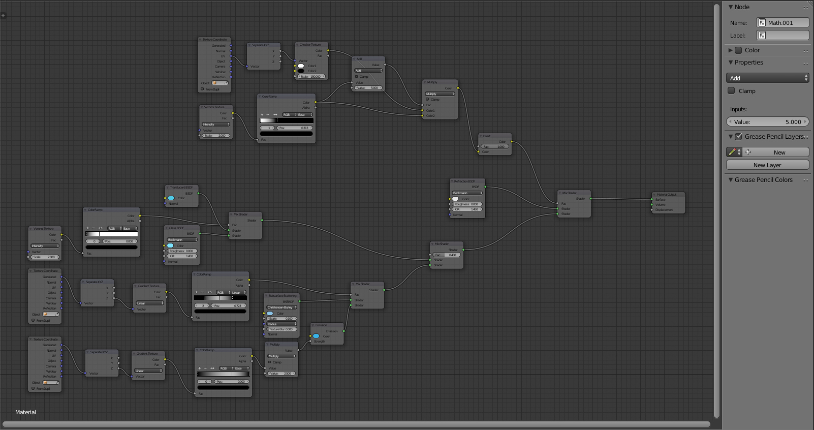
I skipped some steps, because I didn't want to make this post too large, despite the warning in the title, but here is a complete and final screenshot of my node setup.
Thank you to everyone who followed me through my difficult adventure and last but not least, here is a rendered version of the crystal material.
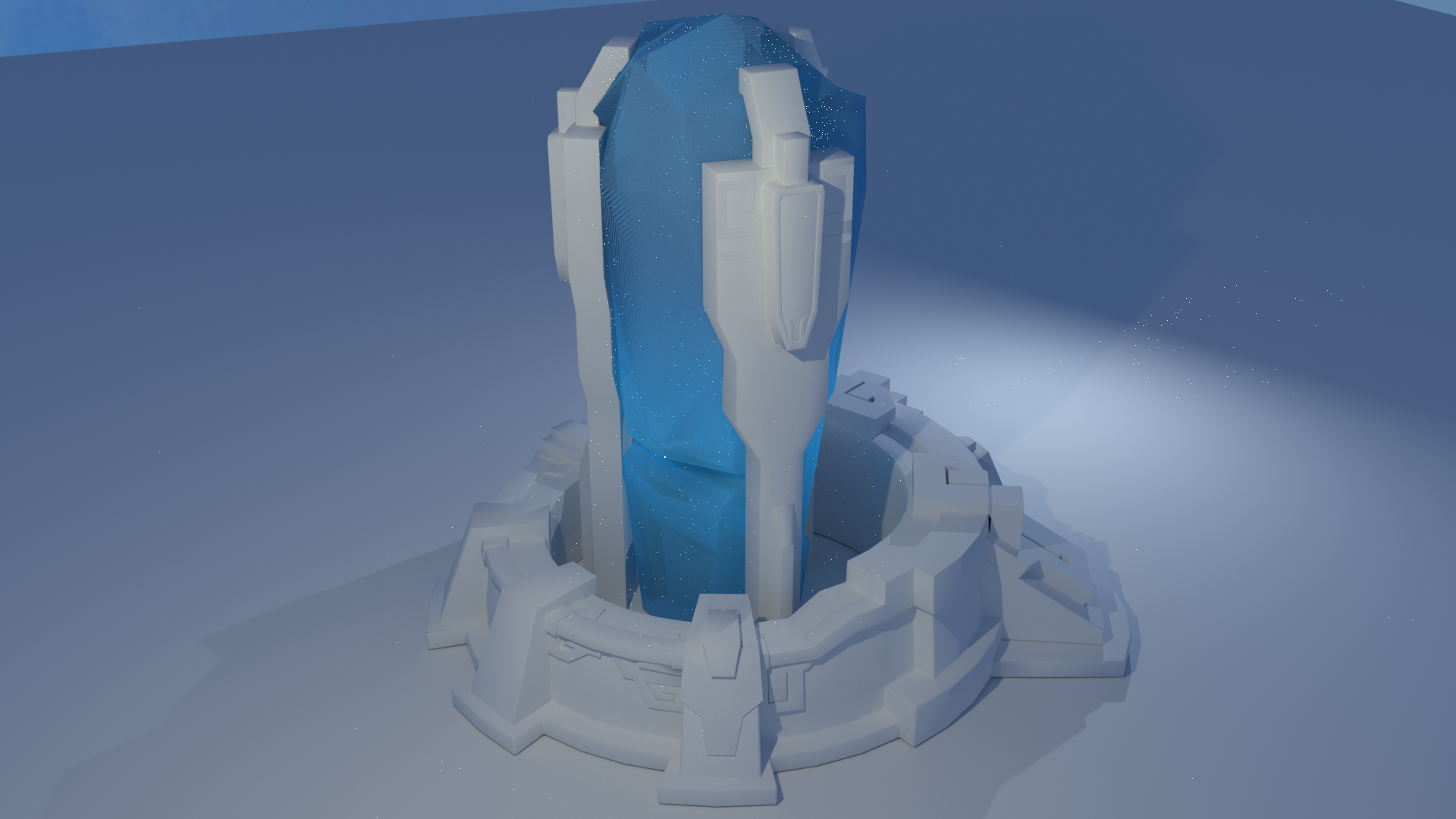
So much work for such a simple looking material q.q
Cheers!
I read it all, it was a journey on its own. Don’t know what to say, mouse no node expert. Just have to leave a comment, know what it is after so much work and finally nobody cares.
So, here’s my ‘hip hip hip hoera !’
Btw, are you aware of the ‘Denoising’ checkbox in the ‘render layer tab’ to get rid of the fireflies ? Try to render it again with the denoising checked.
Oh hey, thanks a lot!
I actually didn't know about that, I won't re-render it again as of now, since it's just a quick inbetween image in a WIP project.
Next time I'll do that though, thanks!
Thanks for sharing your magic crystal journey Elen, very informative Cycles learning material
Now forward! Add the mystical laser-beam to it Bzzzz
Thanks!
Nah the laser beam won't be added, my project is not going to be a 1:1 copy of the game. Not easy to explain what I wanna do, but be patient and I shall post more images soon :)
I'm looking forward to Book 2 of this short story! It was a great following your creative journey and I managed to learn quite a few tricks from your node adventure and final setup.
Hi @elensanima, I like how you "summoned Voronoi texture" as if the process of creating a shader is like building a complex spell in a fantasy game. Sorceress of Cycles Shaders is hard to say three times fast.
Keep up the good work. I'd like to see how things turn out.
Hey, yeah I had to spice it up a bit :D
Sorcerer*, sorry about the misleading name. It's an old one in reference of a character.
Sup! Hope it's okay if I keep this thread up instead of creating a new one.
I updated my project with new images and just wanted to throw a quick update in here.
Basically, I worked on the stone and gold materials. I tried to generate them in a similar way that I did with the crystal but that did not work out quite the way I wanted it to.
It looked okay-ish, but still too cartoony. It lacked detail and incosistent variety in patterns and scratches and whatnot. So this was what I had yesterday on 11th April:

Note the colours and saturation are way off because I played around a bit with Photoshop curves, trying to make it look more interesting, but then it still looked like a cartoon image just more saturated. Whatevs.
Went to work, came back and started those materials from scratch, this time with most of the material being controlled by texture maps.

And voilà! The gold looks much better now, maybe still a bit too reflective but nothing that a little bit of tweaking at the end cannot fix.
I also made some adjustments to the crystal material, included some air pockets with a noise texture that is channeled into the IOR of the refraction BSDF. And this is starting to look a lot better overall.
Now the details of the textures, especially in the gold ornaments, may not be all too apparent in this resolution and sample count, but trust me, it's going to look sweet. :D
This is my first personal 3DCG project where I'm actually making progress and improving as I go, so yeah - thanks to CGCookie and the helpful members in here! :)
Cheers!
//Oh, quick edit:
Here are my node setups for the gold material. First screen is from the top image and second from the lower image. As you can see in the better-looking-image the material is much simpler built as most of it is controlled in the texture maps.
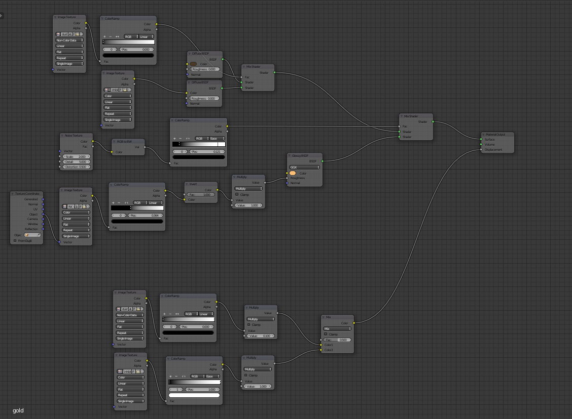
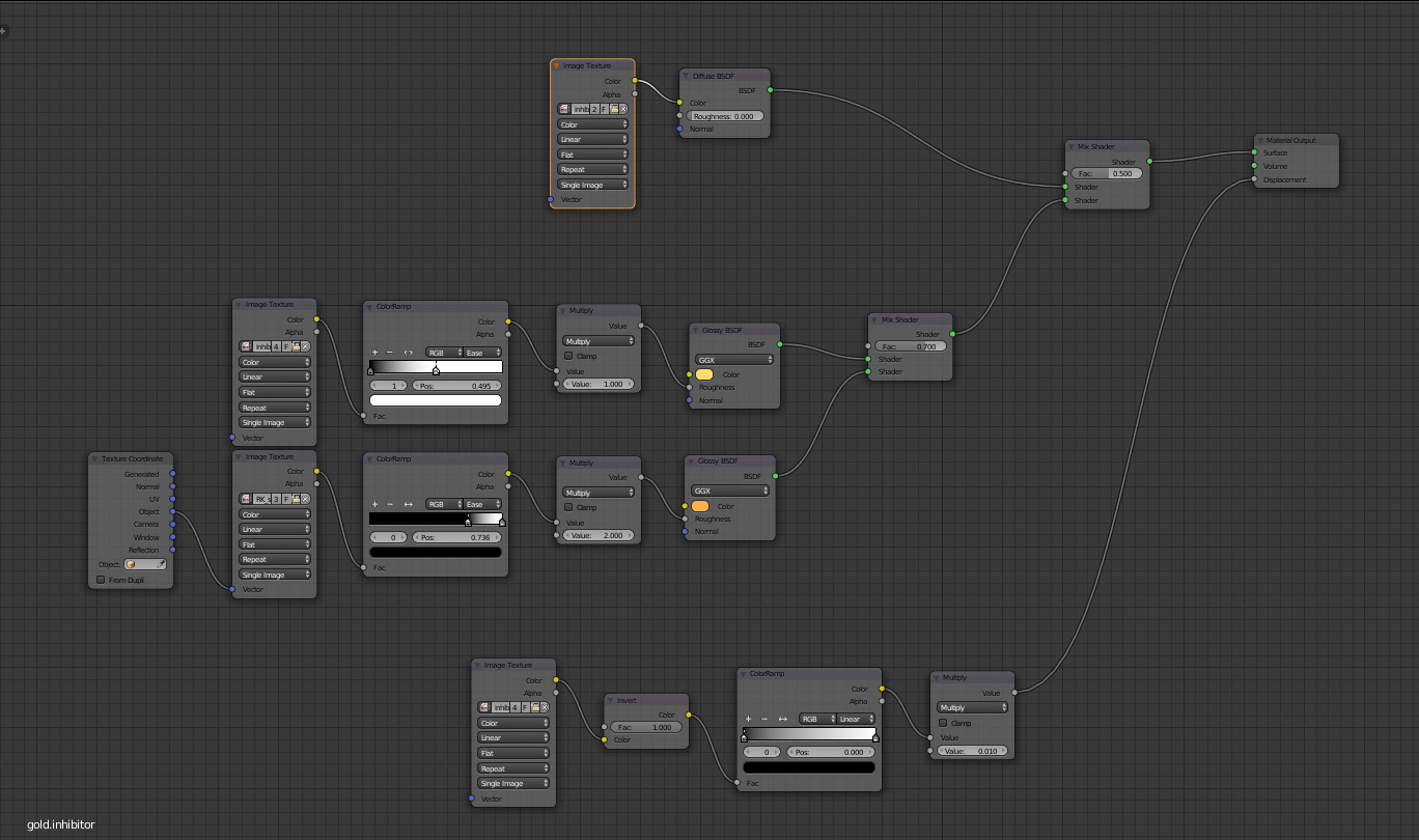
That looks great, Thanks for sharing the Cycle-node map images!