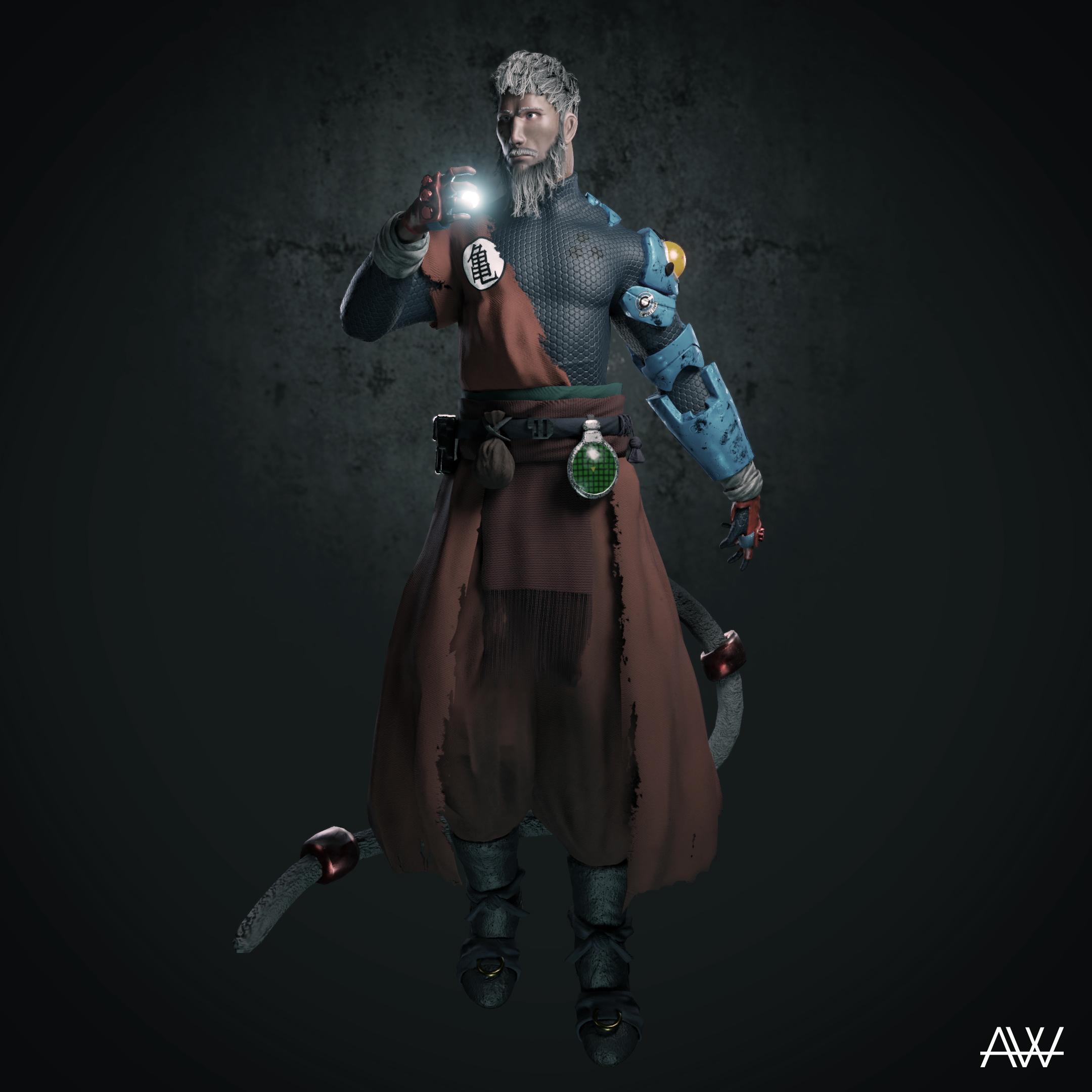
Hello CGCookie!
This is my first post here in the community section. As the title says, i want to ask the community to critizise my recent artwork. I found it really difficult to get good critics through out the internet. I also posted this project on artstation but as you may know it's not that easy to get any advices there. So, i'm hoping you guys could help me on what needed to be improved and so on, before i jump in to my next project.
Thanks a lot and cheers!
Interesting character. I'll try to give some feedback on what i see.
I like how the head and eyes work like he is looking something specific outside the pic.
few things though where for me it starts to go bland if you will. the pose, he looks stiff, i don't know if the bright thing on his right arm is something he is going to throw it or not, or is it spell he is summoning? though looking his garments, he looks more like alchemist, so the bright thing makes less sense.
the pants and cloak material looks like there is shadin problem, though i think you were trying to go towards worn look? the metal arm bits looks too much diffuse color and not painted metal with wear and tear.
overral lighting is bit flat, what i mean by this is that you have reflections in certain part but on other parts there is none like the pants and arm.
also for character its good to have pedestal for them, unless you make the midair pose.
hope its not too harsh. with few tweaks that could look dope.
If your familiar with dragonball, this character is actually goku. Well, the old version of him anyway. So this is actually a mid air pose. Hes flying and making an energy ball.
Thanks for the reply man, really appreciated!
Thats Goku? oh man, the things i've forgotten in my life. :D
I'd rework the pose to convey the flying notion more, it could be the framing of the character that takes away the movement.
Hello Arfri.
My critique would be the lighting and composition. You can have a few more renders positioning the camera in more appealing ways. For the lighting, maybe you can find inspiration on this thread:
https://cgcookie.com/t/538-match-your-favorite-lighting-example
I think all my critiques would revolve around better texturing, the modeling looks great. The skin looks almost plastic like, it's probably the shine and that it looks too perfectly clear. The beard looks great and realistic, but the hair on the head looks like "hair planes". So whatever you did for the beard I would do the same for the head.
this is the refrence image.
after that i just improvised and tried to figure out whats best for the character.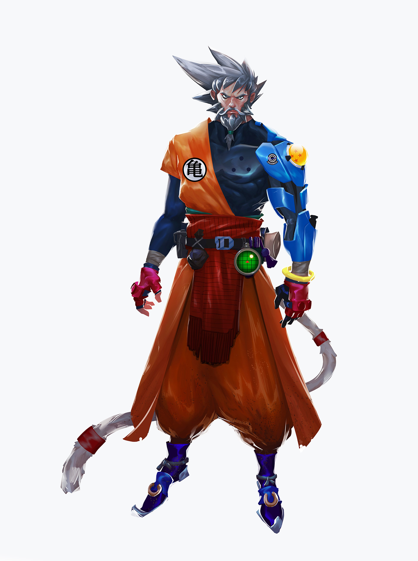
for the texture i used 1 4k map, since i wanted it to be a game ready model. Though i dont really know if that matters or is important... But i did made a mistake on making the UV island to small for the head making it loose a lot of the detail on the normal.
For the hair it's funny because i actually think the other way around :D, i'm still struggling with controling the hair cards and making the strips and so on. note taken, thanks man!
Ah ok. Yeah the face just looks like one solid color and it's a bit too shiny. Seems to look fine in the texture. Creating realistic skin is no easy feat by any means. For the hair it might actually look great, it's just tough to see at it's current size in the image. The beard just doesn't actually show any semblance of being made from "cards" so it looks more natural.
Not much experience to say anything, but an aspect that stands out is that upon closer viewing the ear canal seems very shallow. As in it seems like the ear's various valley geometries do not go very deep and there seems to be deep depression for an ear canal.
Its something like this work you've done from concept to creation that makes me I'd like to get to that level of proficiency someday.