I tried uploading the renders before and got a glitch. Can't go back in the post to fix it, so apologies for the duplicate (maybe the crew can delete it on their end?).
I'm starting to study product viz more in depth. Particularly fascinated with how labels are printed in real life and trying to make that knowledge result in a more realistic rendering of textures on products.
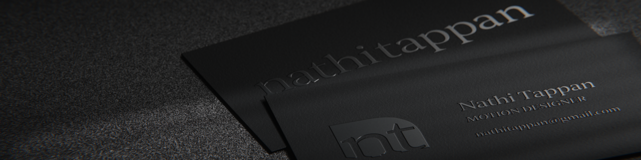
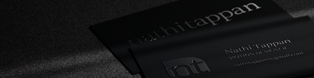
This is a simple business card... just something to test waters with masking and making different displacement maps, tweaking the edges with curves and such.
A quick "session" let's say. One of those, let's sit down, put a 2 hour timer on and play.
That certainly reminded me of how much my renders end up so dark. I don't know if that's just the mood I tend to go for, or if I just don't feel confident in making anything "well lit". Most my brighter renders feel flat and lacking in shadows. I'm hoping that following the new Session-Interiors course will strengthen a bit my lighting muscles.
That said, if anyone has any words of wisdom on product viz, recommendations of content (making masks and maps for texturing, more than even applying them in Blender), and more importantly feedback on the two renders below, I'm all ears. Really nit picking! Please tell me what's wrong with it so I can try and figure out a fix. Or what you would have done differently.

I'd say the bottom one in particular is too dark. That accentuates the shadows of the 3D effect of the letters, creating that dark outline Omar is talking about.
The materials look really good, I think, but it's hard to see. What is your lighting setup like?
For renders like that I'd take full advantage of something we can't do in real life: Light and shadow linking. You can use accent lights to highlight areas of importance without affecting other areas, same for creating shadows.
If you like the darker tones, don't worry. That will be achieved by the colors of the materials. Even a well lit dark color can give you that darker feel to it. If you look up "dark business cards" you'll find tons of examples of what I mean.

I like the first one better and think it's great. I can see the flatness that you are talking about. I think if you did some color adjustment on the second one you can get the lighter look with the depth of the second one. You can do it in the compositor, but I'd recommend trying with color management in the properties editor on the render tab first. You can adjust this after you render and see the results in the render results (Image Editor). If memory serves me right, I'm thinking a slight gamma adjustment and switch to high or very high contrast. Also, this might be one of those times where filmic would work better than AGX.
Thanks guys! Yeah, the font stroke is mostly because of the lighting (I tightened the mask as far as possible and it still shows). I'll try light linking to brighten just that area, good idea Sascha!
Yep Dwayne, they are mostly different in brightness of lights, then a couple tweaks on Render Raw. I too think I like the first one better, but the letters somewhat feel more matte gray instead of a glossy surface being lit.
Crazy how the simplest model and materials can still be so tricky to get where I want with lighting.
Then going through spot gloss, raised UVs and foil pressing for labels... it's going to be one of those rabbit holes.