

Hi I am working on a new animation series for my channel, my first that I can grow with and start now. This is my first time fully compositing though I have learned here and there about it. I wanted a eerie vibe for the hotel below and also a modern handheld camera feel (getting the animation approved now as well). Is the vibe good (not too dark? Light bloom ok?) and does the screen feel like a modern phone? Heres the videos of the 2 areas and my composite node tree for blender 5.2. Anything else I am missing?
https://youtube.com/shorts/NO5QFhwduek
https://youtube.com/shorts/4Yh3vIdPdaY
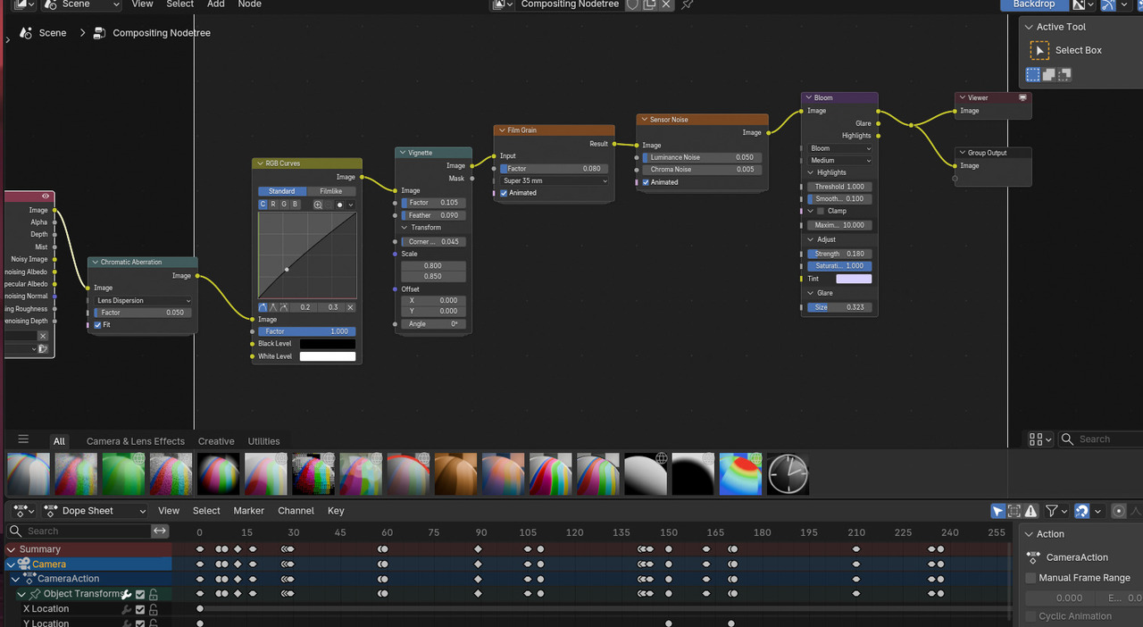

The second link doesn't work. About the handheld camera. The going up and down is a bit too much imo. Makes me feel seasick and doesn't seem natural. The hotel is eerie, so well done
just curious by what percentage would you say its too much by? i did have it more then that starting out haha, i know it needs a little bounce for realism but i can experiment a little less height as legs do hold the walking pretty straight, this part is supposed to feel like a normal walk before crazy stuff starts to happen, this is my first handheld feel
It's not just percentage. It feels like he strapped the camera on his head and he's nodding while walking, looking up and down. I'm not an expert, just giving my first impression.
Ps now watched the second video that looks ok (a lot lighter though, was that what you want)?

"I wanted a eerie vibe for the hotel..."
That's not what I get. The camera is pointing down too much, as if the person lets their head hang, looking at the floor. This makes it feel more depressed than scary/eerie to me. You can also lower the Focal Length, add some Depth of Field and get a completely different vibe:
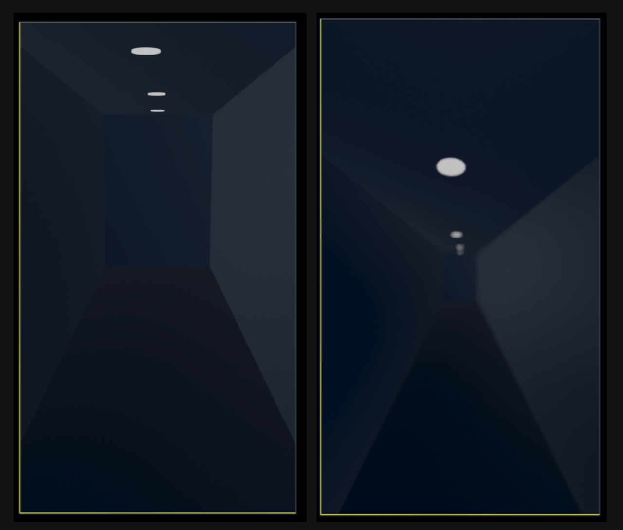
I didn’t get the feeling of pointing down, I think that’s just from too much bouncing or something not right in the bounce timing I’m not sure yet either. And as I say I haven’t had the animation fully approved yet though I was done at the time so i was experimenting with compositing as the next step. Maybe my curves are too curvy for the up and down walking is all, not sure in what direction to change that too yet if so. The series was inspired by the backrooms least for the hand held camera, start at a normal hotel and things get stranger walking down until you fall through the floor at the end. More to the series but that’s the camera vibe.
I do want the walking to feel normal so I can reuse the asset for the series so it is important to get that feeling right and get advice from you guys too. Least I got a little bit to start

Yea I did reduce it more the first time cause I noticed people holding cameras don’t bounce up and down too much, thanks Dwayne, my line of thinking too is the hotel is a straight view down I only looked right to look at a door and then continue straight walking. I start walking a couple steps, look to the door right then you see the current aniamtion, then walk to the bowl. Not sure what that means for my timing not matching the camera momentum if that is true, too many and too high bounces? Maybe more subtle left to right for movement and less up and down? I did notice the non bounce from watching a lot of fail army clips and related channels on YouTube along with backrooms.
This is only a piece of the animation but it does include the walk I’d like to save to reuse later so I’ll look into it, thanks for the ideas