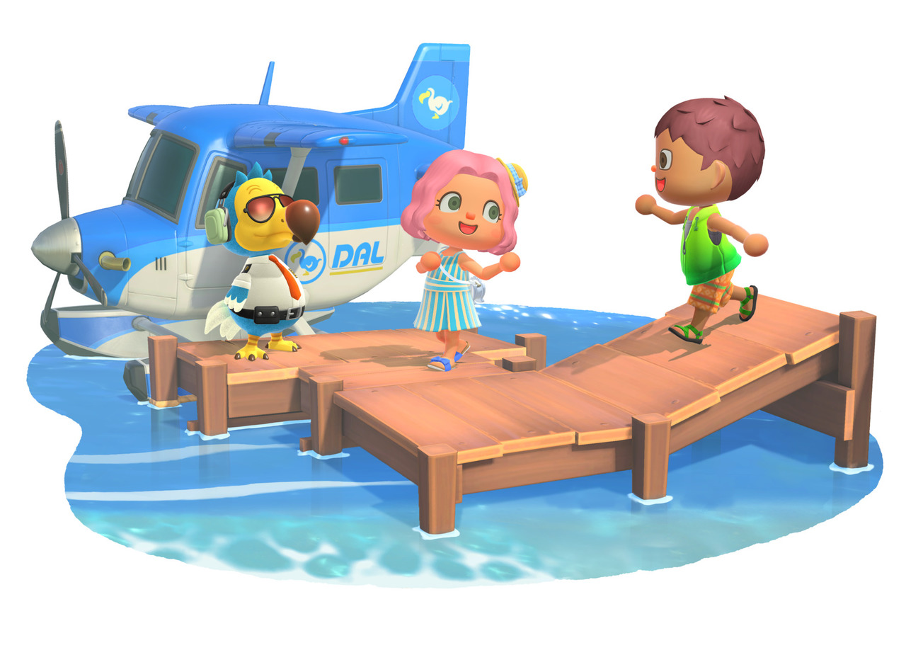
I am trying to achieve a look similar to the animal crossing image below, but finding it more difficult than I would have thought. I can't seem to nail down the lighting, as I struggle to find a balance between brightening the image up enough and blowing the colors out.
The character looks more like an action figure than a breathing creature. Is this because of bad texturing, bad lighting, something else?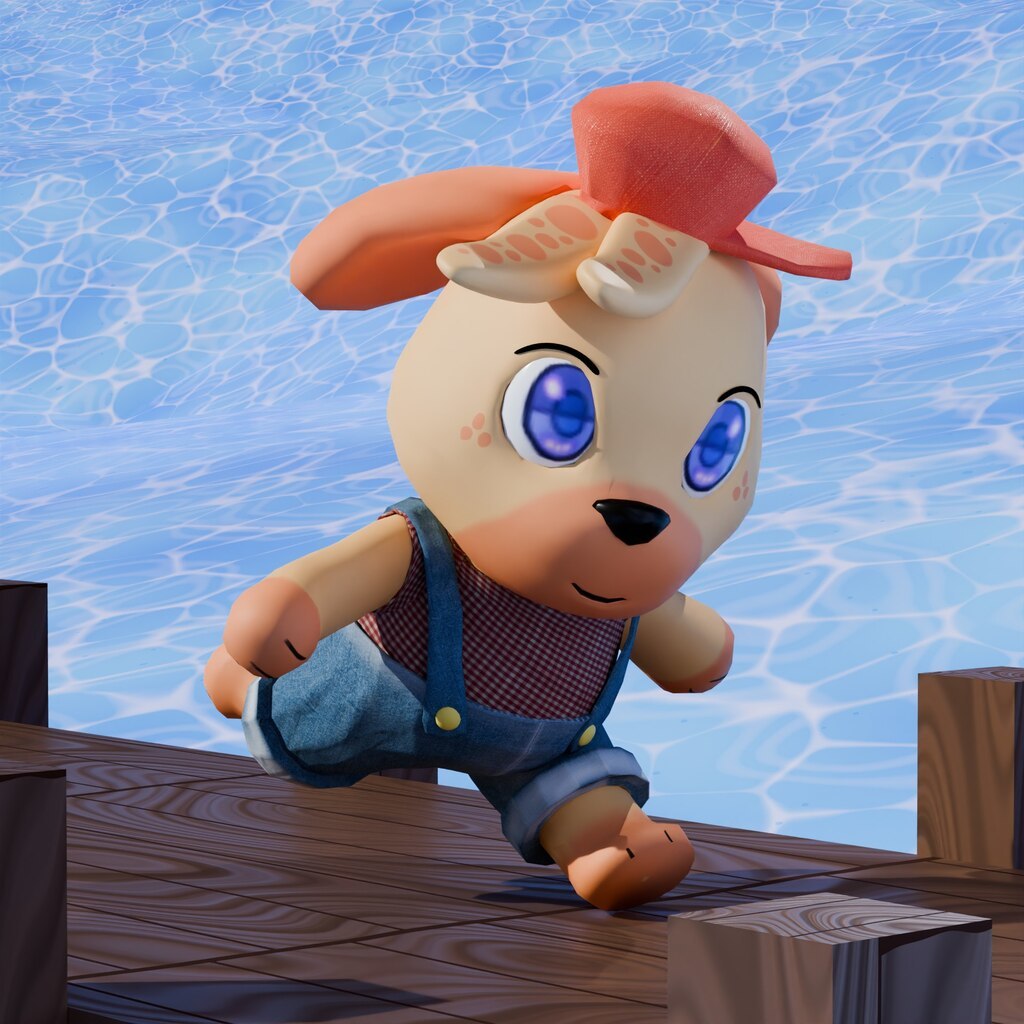
Well that is not an easy thing to put into words, it is that you say (lighting, materials, composition, etc) and a couple other dozen things. Composition and presentation is very art driven, is not too technical so it's not easy to give an answer, it's death by a thousand cuts, it's all the little tiny decision you make, having the eye for it and the experience.
It's like when there's two people, one knows how to draw and the other doesn't. If you give them both pencil and paper and tell them to draw an elephant, they will produce very different results. If the one that doesn't know how to draw tells to the other "dude how did you do that? Tell me how to move my hand so I can get the same result", that would be near to impossible, a million things had to go on inside the head of the person that knows how to draw and it culminated in his wrist moving in a way with his eye coordination and on and on and on.
But there's some technical aspects to point in this one at least. Color saturation for instance, the lighting is much more bright, the shading is more cartoonish, the bevel corners have lighter colors, so in your version the light is kinda dark, shaders approach more at realism. It all comes down to hues and lighting it seems, it's all about the colors. For the expression of the characters that is where you have to breath life into them, the eyes are a big part, but again, it's not that easy to point exactly how to achieve it, moving the eyes, getting the correct shape and position, it's experience, failing over and over and trying and trying. Don't be afraid to start over, keep trying until you nail the look, try different things, keep going with no loss of enthusiasm to succeed.
For starters, excellent job!! I really like it. I'm assuming, as I don't see an "animal crossing", you want the single character to match more closely with the three characters in the bottom picture. I am not by any means a "character specialist", but there were a couple of things I noticed. You did a particularly good job on the clothing!! The only critique on the clothing I can make would be on the "pleats" on the cuffs. They look a little too sharp for me. You may want to smooth those more or make them much skinnier. Maybe add some fine wrinkles coming off them to make them look less perfect.
The character in the top image, reminds me of a Mylar Balloon almost. Which is not necessarily a bad thing. I think the biggest difference in the images is the amount of fine gradation every color in the bottom has. Literally every color of every thing has a gradient. Whether that is a linear gradient or a spherical gradient on the faces. I think I would add some "Fresnel" to your materials which would help with the gradation through the colors. I would bring the overall roughness up. The characters in the bottom have a very Matte finish. I would also soften your shadows quite a bit. If you want your character to appear more "lifelike", you need to not have the "catch-lights" be the same in both eyes. Your shadows are coming from behind and the left-side of the screen. While her right eye would definitely have some highlights and "catch-lights", her left wouldn't have near as much. The eye itself should be much more shiny overall if you want it to be more realistic. Think gradation for lights and shadows, as well as, materials. I made a small material to try to show the layer weight node with both Fresnel and Facing, in case you weren't familiar with them. In the examples, I left my Voronoi scale and detail very low so you could see the colors in the sphere. In reality, I'd turn my detail up to around 9.75 or higher and my scale up to around 500 or so depending on what look I'm going for.
As far as lighting, on the bottom image, I think the artist was trying to make it appear as if the sun were coming from the viewer's screen right, bottom corner. It appears to me as to be using 3 lights for shadows, or is using light linking, because there are some definite differences in the shadows. The boy's shadow is more to the front then the side. The girl's is more to the side than the front. The bird's is more to the side of him than behind. The airplane wing shadow is almost straight down. The pier itself has the most difference in the shadows. If the light were coming from the bottom, right corner of the screen, they would be angled more on the front of the dock and lighter towards the bottom.
Good luck, and I really hope this helps. Don't forget there is a Discord Server, as well for help.
Liz
Hey llizyorick ,
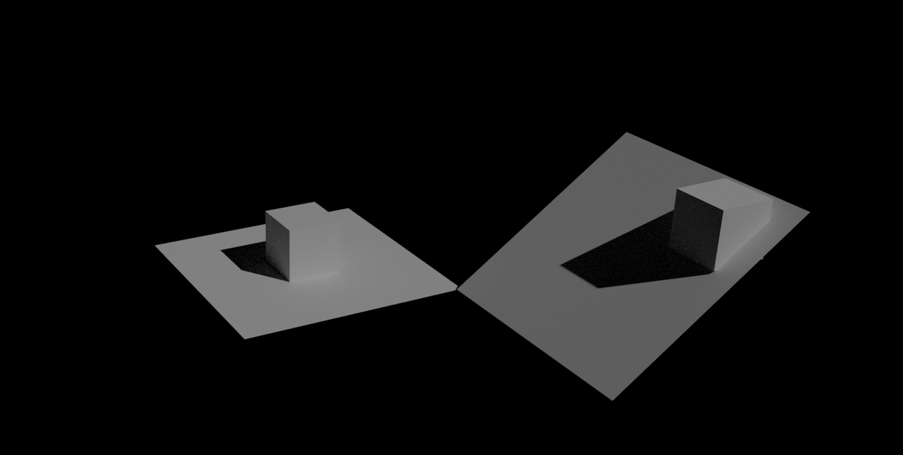
I think you are mistaken about the shadows coming form more than one light source...the shadows are just cast on differently angled surfaces:
Thank you all so much for the suggestions. I especially appreciated the detailed analysis from Liz. I think it came out much better this time.
Varied the pose, rigged the eyes and made materials more consistent, and kept tweaking the lighting. As well as adding those gradients in. I know there is much more room for improvement, but I'm happy the character doesn't look completely void of life.
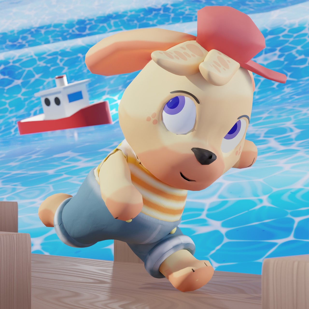
I have to say Awesome job!! I really like the changes!! It's lighter and brighter. You're character actually looks like he's watching something while he's running. I like the addition of the boat on the water too!! You softened the creases around his cuffs, etc. Excellent job!!

