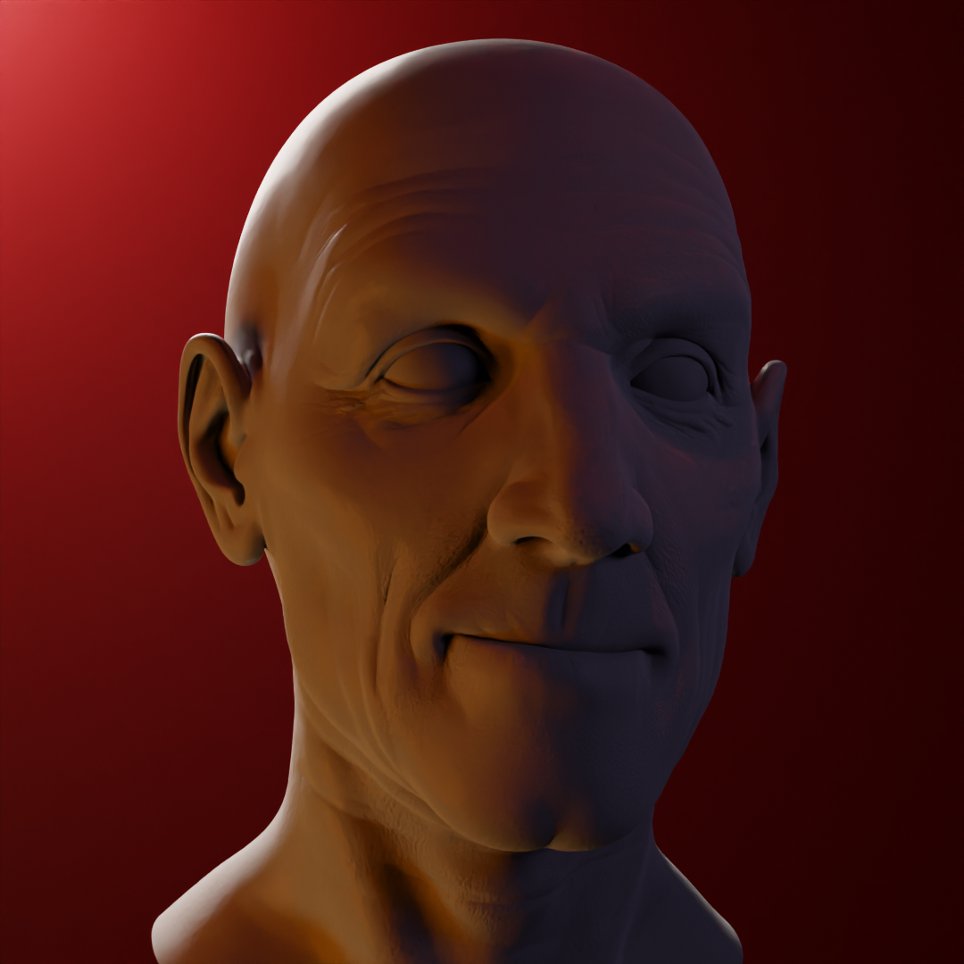
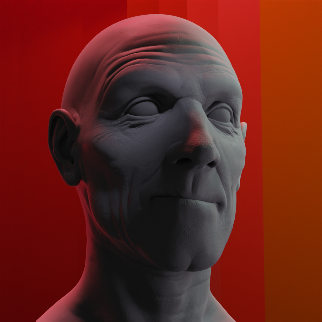
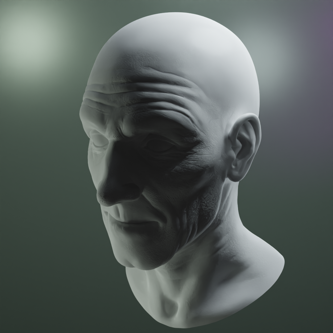
Posting my result so far. Want to see how they look on here before final submission as it looks a bit different each time I look at them, lol.
My computer kept crashing working in the lighting, I think it doesn't like what I'm doing, its probably right, I think I'll need to tweak somethings as I was putting it together.
Anyone is welcome to critique.
Thanks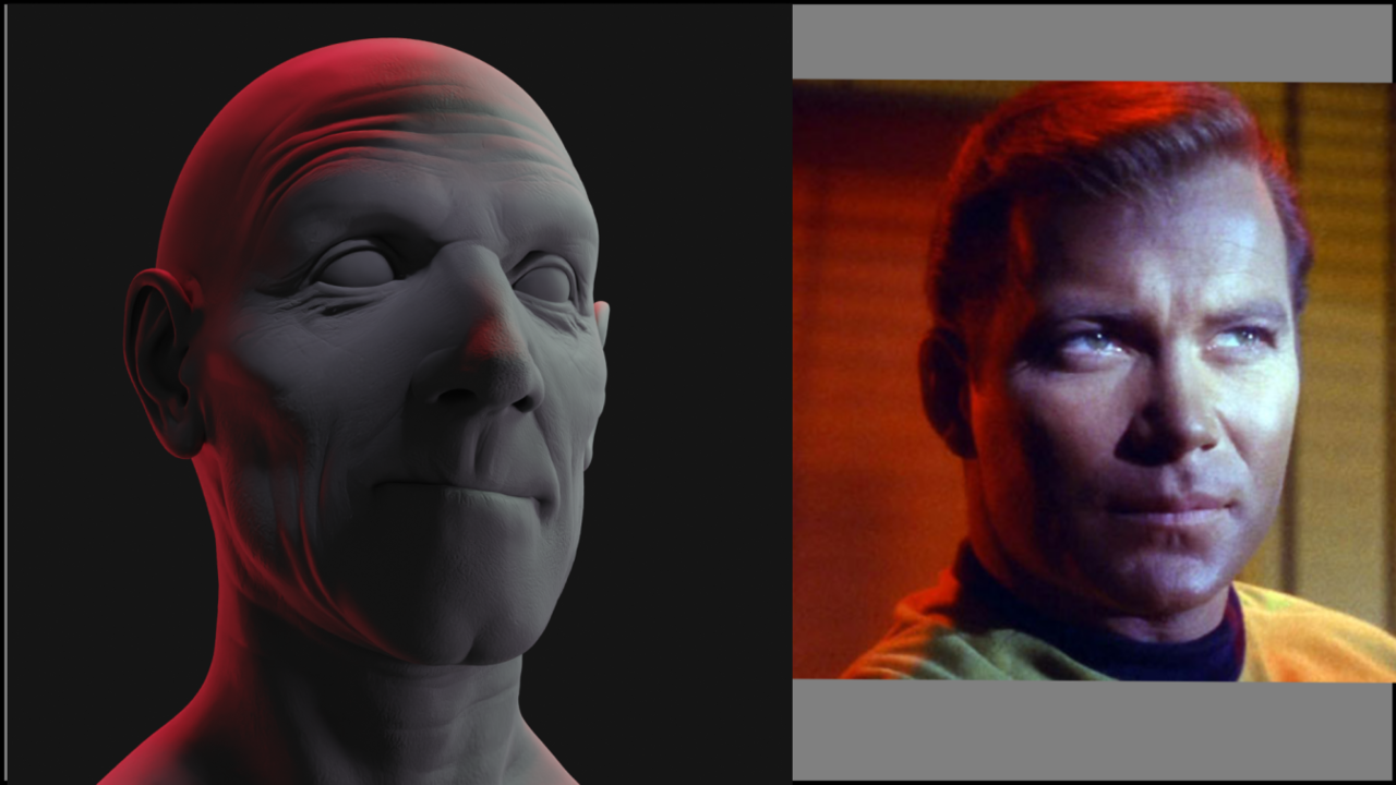

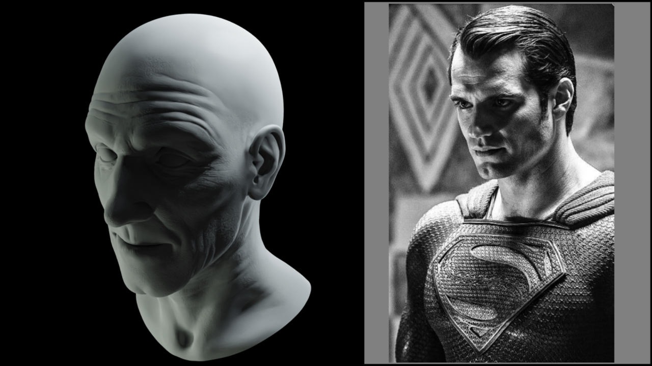
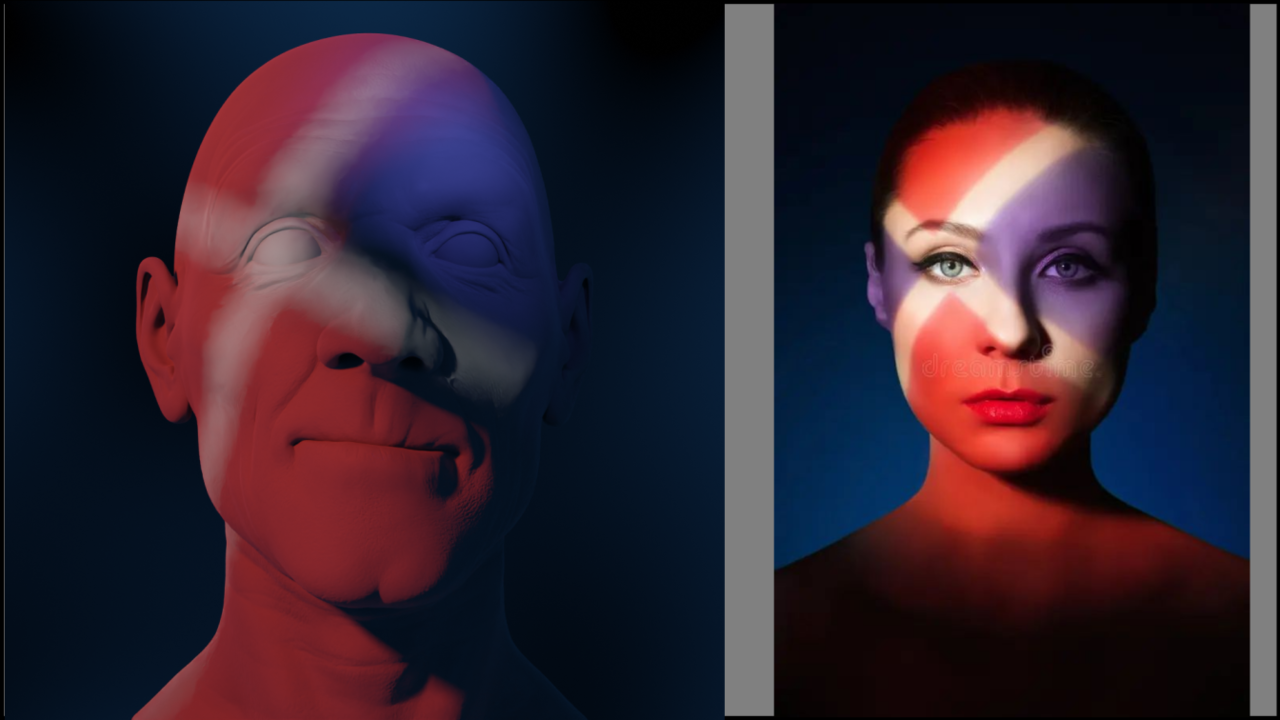
Hi Martin,
Yeah, I saws that as well when I saw the blown-up version here and it gave me a great idea how to more simply do it I'm going to try. I thought it was makeup myself but thought it would be an interesting challenge
Posting pics here really shows the flaws I don't see at my end. But thanks for the review.
I tweaked and pinched and will probably submit these with a blurb about them.
My computer must be overheating or something, it's crashing like every few minutes and super sluggish. The lag at times to do anything is a pain. It took me a long time to just make some adjusting's. ay, yi, yi
I'll take another pass/look on these post pics, make last adjustments and submit. I hope these will make more sense with my final blurb about the pics and why I made them like this. I see that when they are blown up this big they do look quiet different then when modeling.
I se I can resize the pics, this size is more appropriate.
