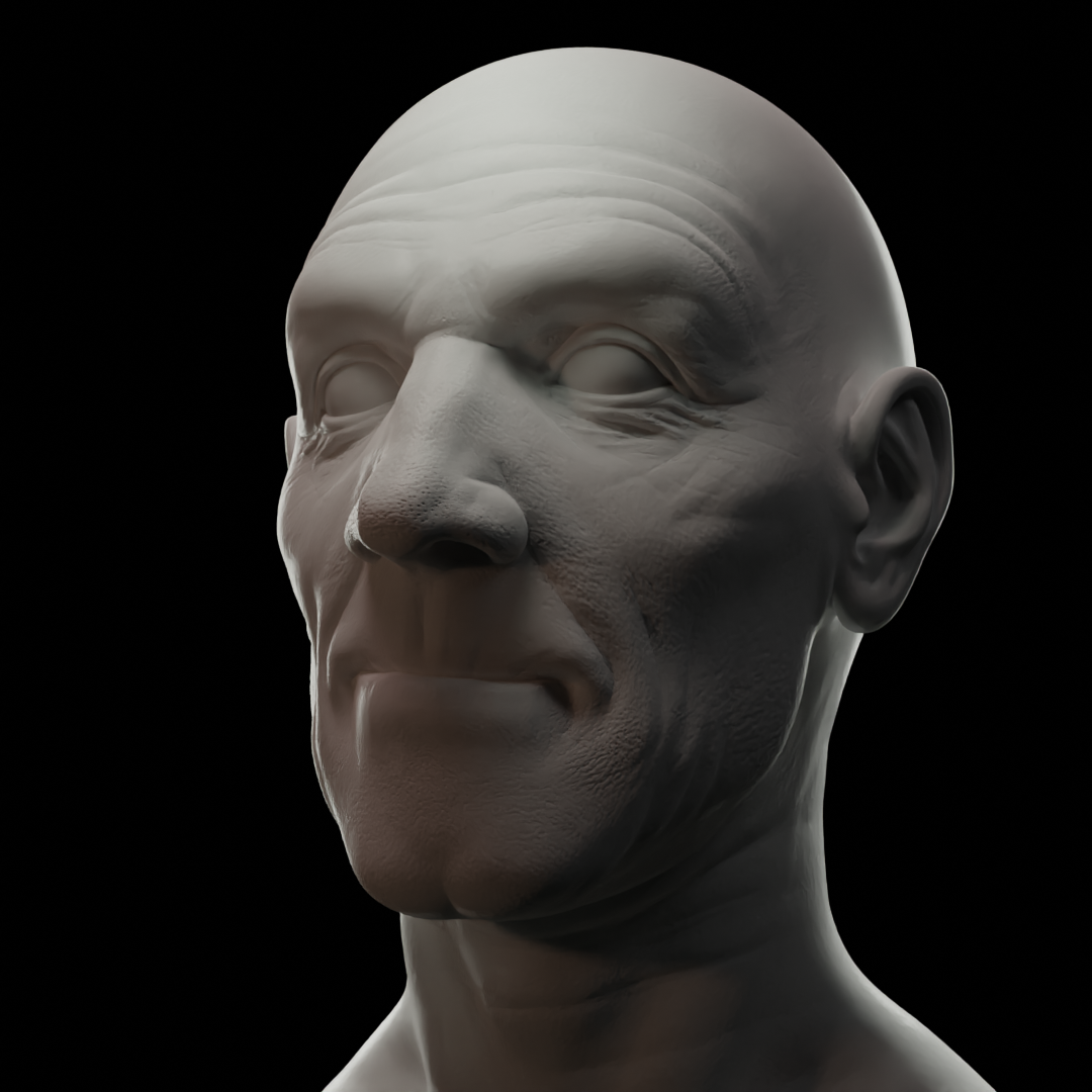
My attempt at the portrait exercise, just before the main assignment, in the digital lighting course.
I made a villain and hero type of portrait lighting in cycles.
For the villain I tried using reds and blues to ‘enhance’ the ‘feeling’ of narcissism and malevolence in his persona. He is someone who has no problem of hurting someone.
The hero, to me, looks kind of like Capt Picard. I tried using yellows and greens to enhance his warmth and virtue. I made his portrait with a more pronounced with back lighting to try and sort of simulate a ‘halo’ kind of effect/feeling enhancing his virtuousness
I tried to go easy on the lighting and have definitive shadows on the faces.
I’m just learning this both technical and artistically so any suggestions are welcome. I spent quiet a bit of time experimenting and trying different things. I know I can spend days just on these 2 but I think I am getting a basement level understanding and have a huge amount of room for improving.
The question is can you tell who is who?? 8^]

Thanks Martin.
Yeah, the lighting sure makes a difference It reminds me of this classic...
https://www.youtube.com/watch?v=TFeUrC2gR30