rabbit hole, of the unexpected kind...
: D
for people knowledgable and kind, thanks in advance...
which approach would you consider optimal?
optional... why??
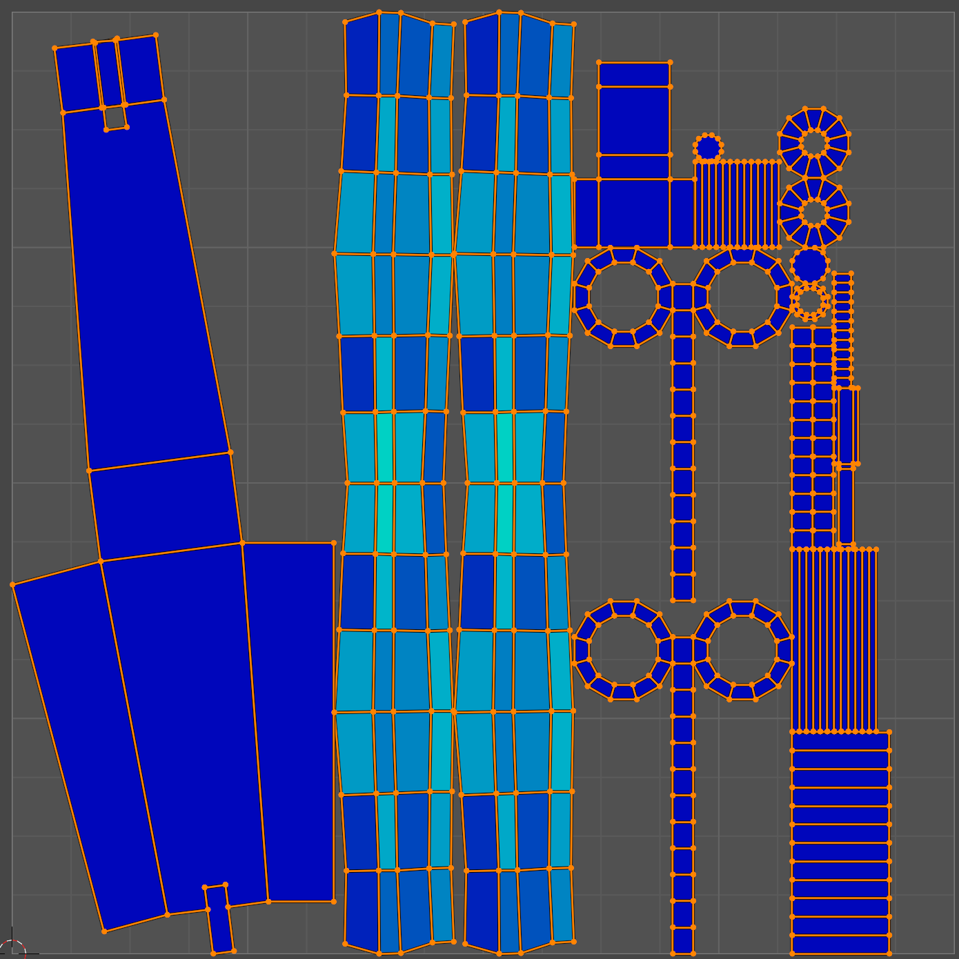
a)
b)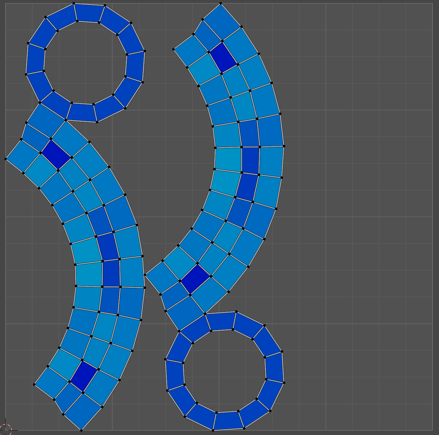
c)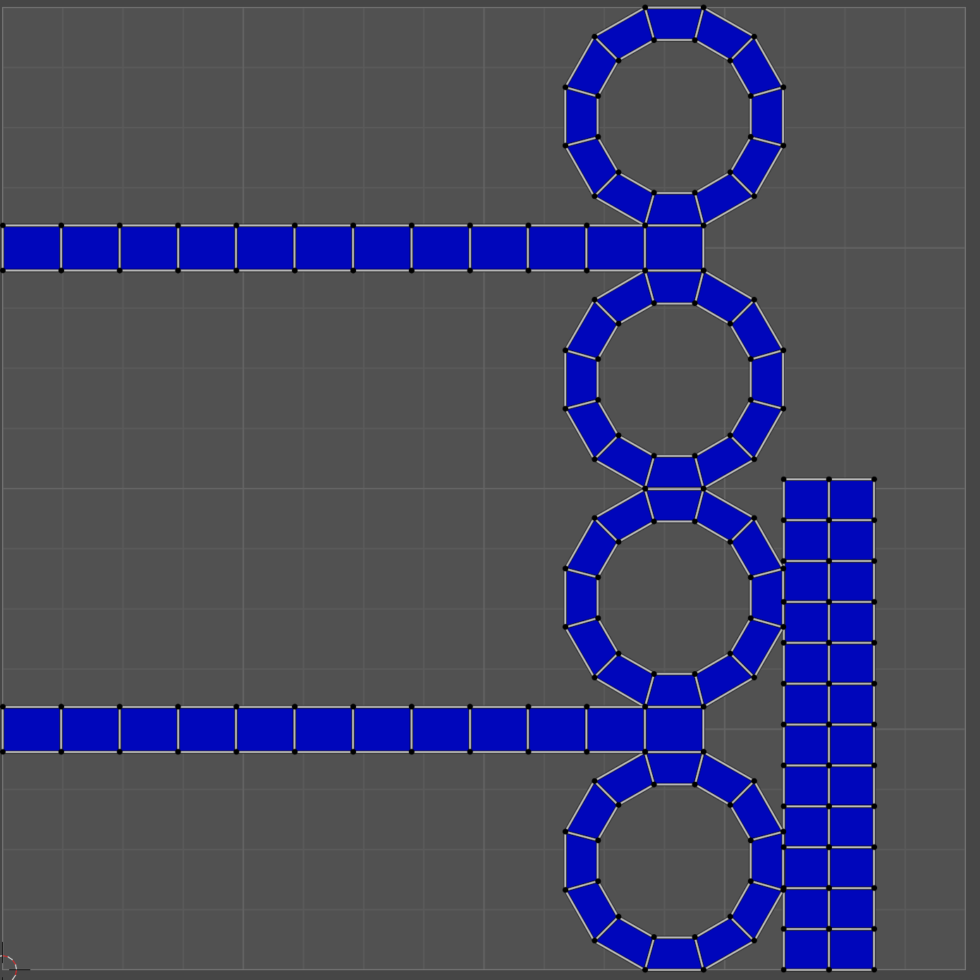
or, am I "overthinking it" and the approach below is actually good enough?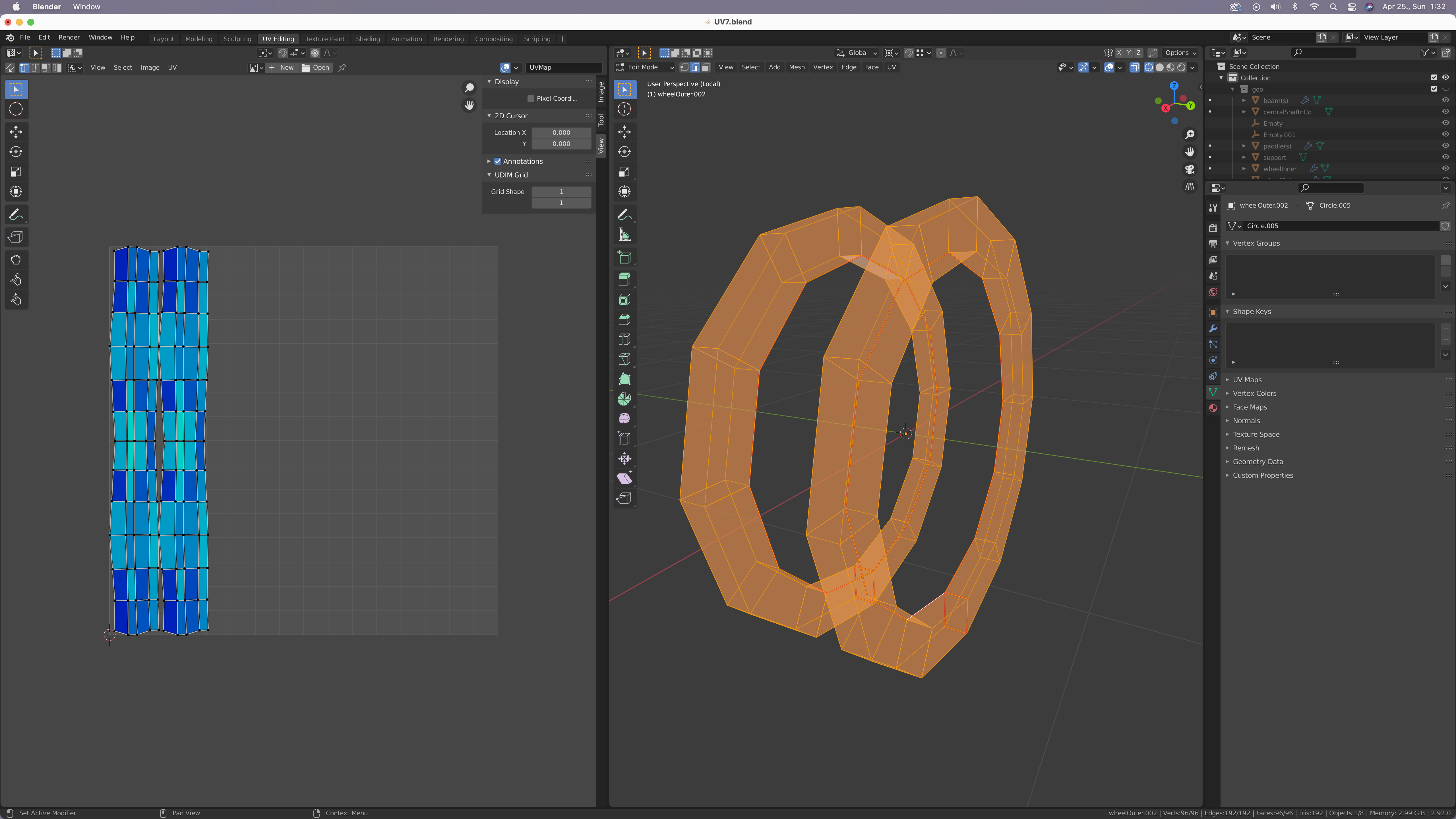
LoL... not what I was expecting (area management above all; the circle in the upper left is there just to make sure that I get no sleep ; )
anyway...
how does this fare?
insufficient experience to have any feel (order of magnitude) of just how objectively good or bad this actually is...
ANY feedback is valuable... need it for homework decision(s)...
: P
thanks!
I'm not terribly well versed in this, but I believe:
The more filled in the better, because you're making the most use of your space. Which consequently means you get more resolution out of your image size. If your using tiled textures, where you place the seams matter a bit more because they'll be visible, but for our purposes i believe the best thing to do is aim for the best use of limited real estate in your image. Theres a lot of blank space you could be using in the last image.
what I am settling for...
(calling it a day)
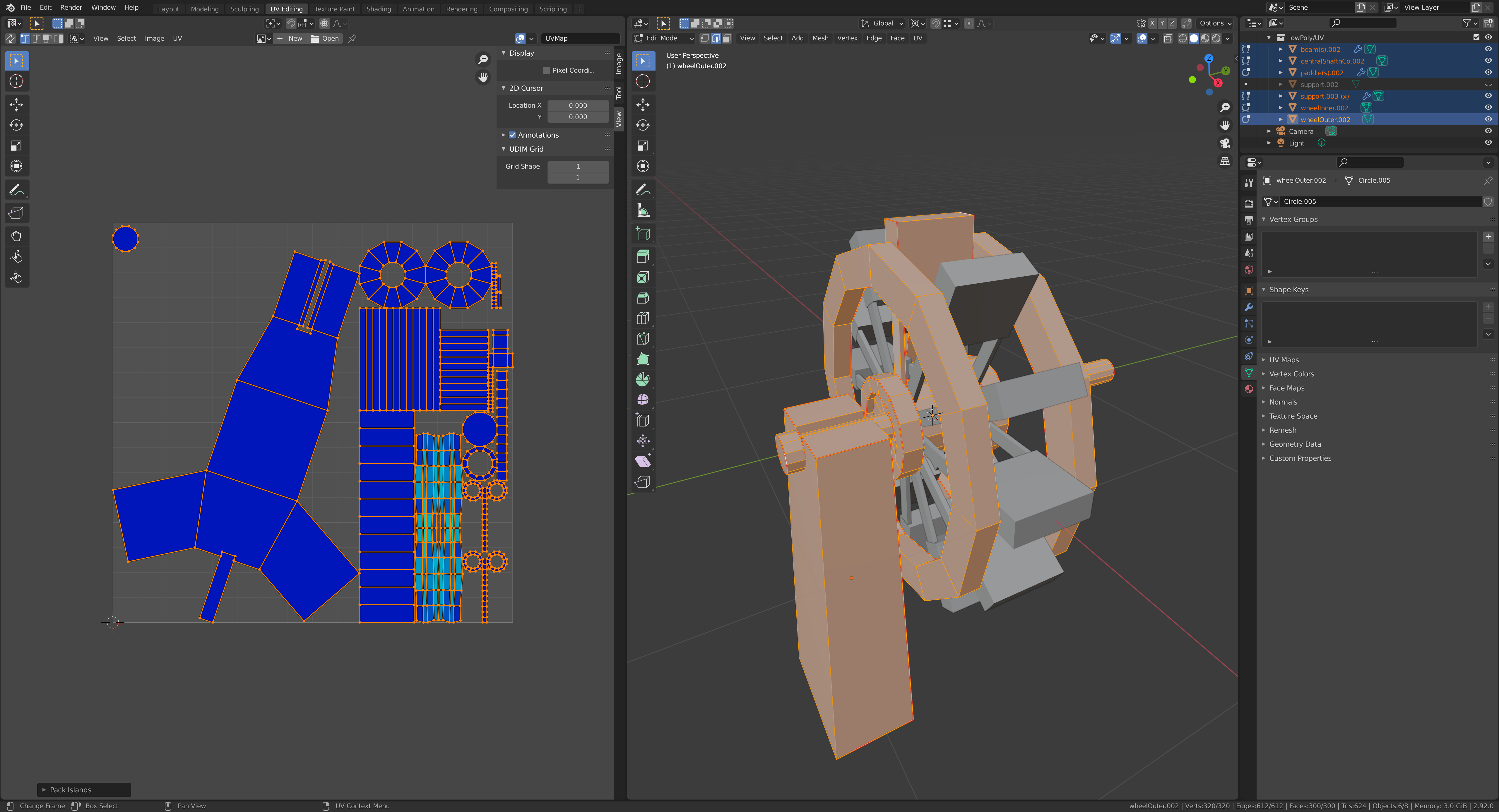
any tips, general feedback, remarks and ridicule is very much appreciated, for, the bakery opens tomorrow!
: )
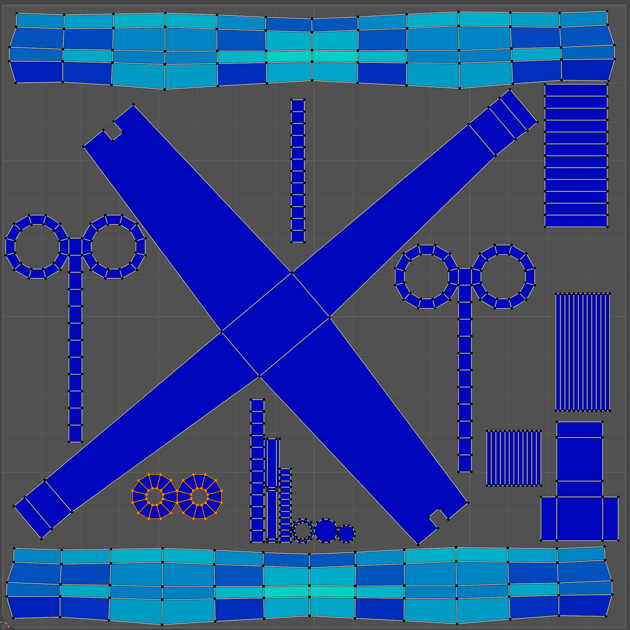
final!
; )
new unwrap, "automatic placement":
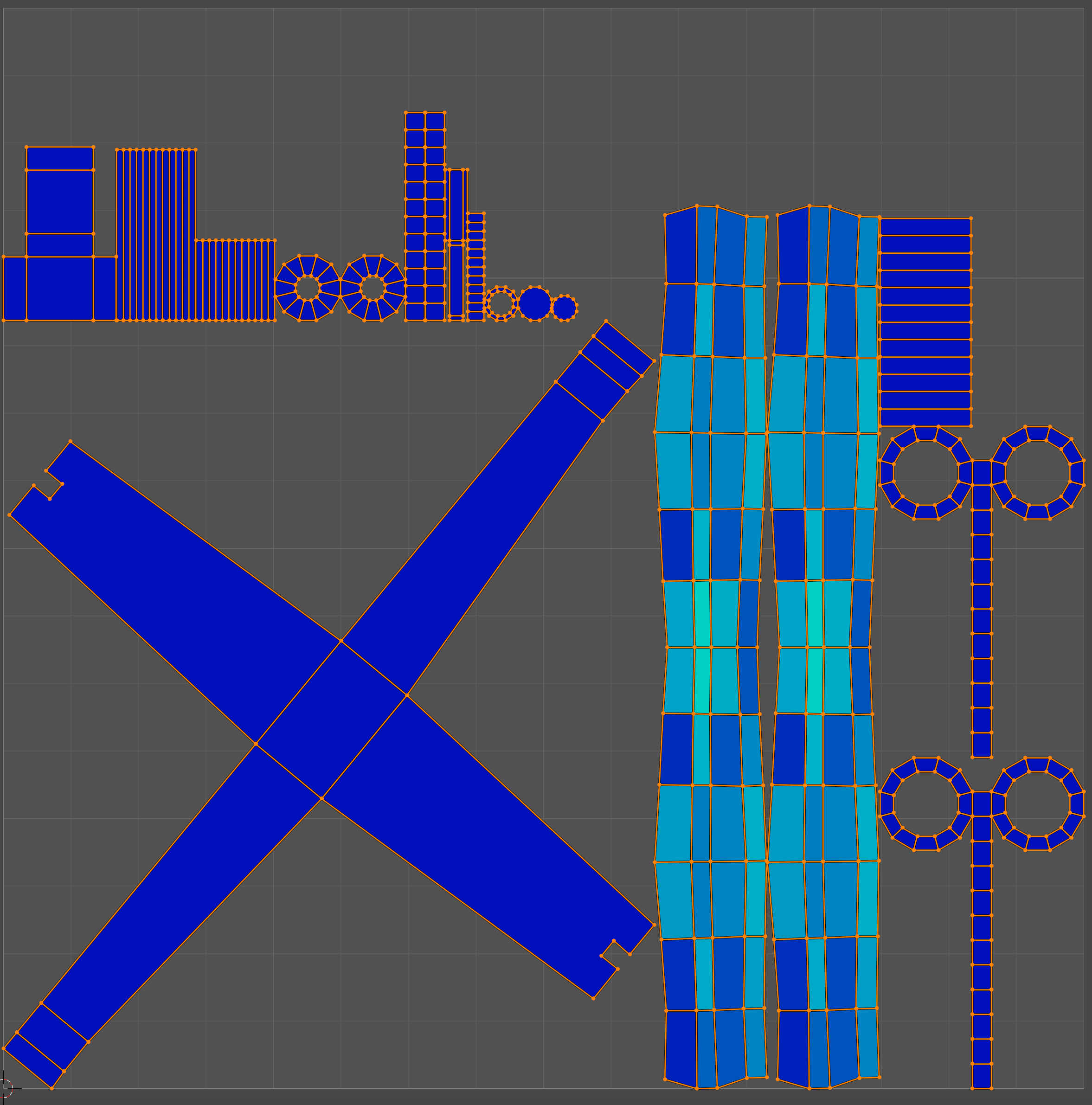
...and some manual scaling and packing:
What I usually do is plug in an Image Texture, set to UV Grid, or even a Checker Texture, to see how it looks on the model.
You can better see the evenness of the detail size..For the rest, like already mentioned, try to minimize the empty space.
(It would be nice if Blender could show the percentage of the space used...)
![]() rationalrats I really like your option b) UV layout. I would go a step further and stack the waterwheel UVs exactly on top of each other if you are not planning to make each side unique. Also, I would cut seams for the waterwheel support that isolate the parts that won’t be seen. This way the parts that are visible can have larger UV space and have more detail than the unseen parts.
rationalrats I really like your option b) UV layout. I would go a step further and stack the waterwheel UVs exactly on top of each other if you are not planning to make each side unique. Also, I would cut seams for the waterwheel support that isolate the parts that won’t be seen. This way the parts that are visible can have larger UV space and have more detail than the unseen parts.
I like the lack of UV stretching you’re getting. Pretty blues and teals!
thanks ![]() ullreym !
ullreym !
still building any "intuition" through trial and error... input from people ahead in the game is very helpful...
fwiw the thing I would offer here is that because of trying to get optimum performance
out of minimum resolution and such
is to try and keep the UV space organized from a top to bottom fashion
and try not to arrange things on a diagonal across the UV space...
it helps in the line of not having to antialias the verts in the texture space
hope this is helpful
![]() me1958424 That is really good to know about the diagonal arrangement. By the way, should there have been happy birthday wishes sent your way on the 24th? 🥳
me1958424 That is really good to know about the diagonal arrangement. By the way, should there have been happy birthday wishes sent your way on the 24th? 🥳